TOKY Projects in the AIGA St. Louis Design Show 21
For the second year in a row, TOKY projects are featured in the AIGA St. Louis Design Show.
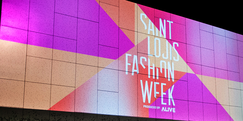
Saint Louis Fashion Week
Saint Louis Fashion Week already had an impressive reach and lineup, but needed a look worthy of the event itself, which aims not to only showcase fashion, but to tell the behind-the-scenes stories of the designers and processes that inform the fashion. This sense of process is reflected in the logo’s cut letterforms, which visually “seam” together the four words, “Saint Louis Fashion Week.” The brand is applied to clever t-shirts, hashtagged tote bags, and animated videos that bring the entire fashion community into the fold, from students to designers to manufacturers.
Catholic Health Association
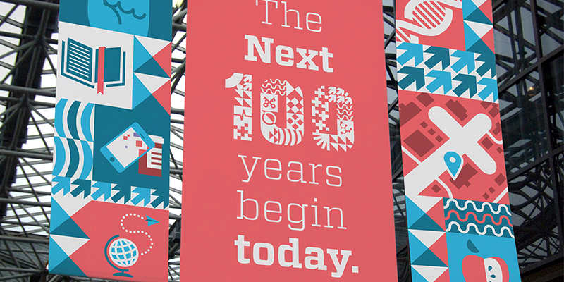
Catholic Health Association (CHA) is the largest group of nonprofit healthcare providers in the nation. Each year, CHA hosts the Catholic Health Assembly, a gathering of decision makers from the Catholic healthcare industry. The 2015 event marked the organization’s 100th anniversary, and with that, the opportunity to envision the next 100 years of healthcare.
We developed an intricate event branding system that provides not only a nod to the past, but more importantly, a look forward to the next 100 years in Catholic healthcare. Illustrations and icons appear throughout the event branding to punctuate CHA’s core values: faith, outreach, guidance, and ethics.
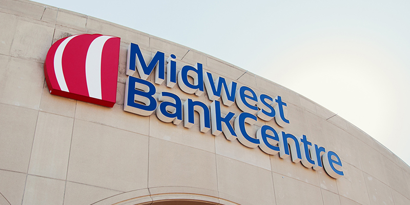
Midwest BankCentre
As a growing brand, Midwest BankCentre needed a new identity that would reinforce its commitment to community-focused banking. The existing balloon logo carried strong brand equity, but was dated and proved problematic across various mediums. The new identity references the updated tagline, “Rising together,” and works flawlessly in all applications, from outdoor signage to mobile devices.
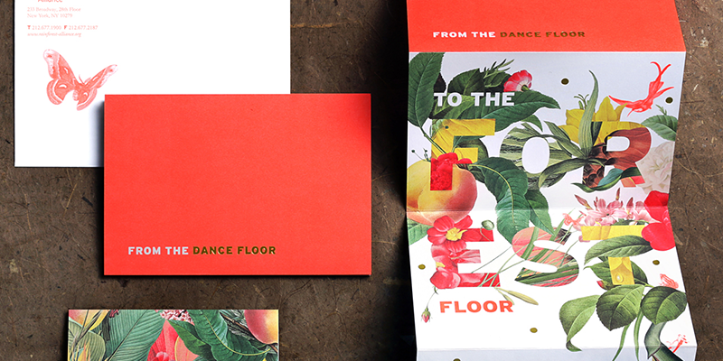
Rainforest Alliance
Rainforest Alliance’s annual gala is not just a party, but a vital and purpose-driven fundraiser. The event materials needed to pull in the organization’s mission to conserve biodiversity. Flora and fauna are intertwined into the typography — a reference to the idea that every decision we make as consumers is intertwined with this sustainable mission. The “frog’s eye view” illustrated across event materials is a call back to the organization’s iconic frog logo.
Live in the Alley
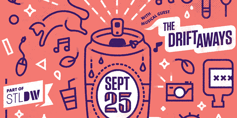
Live in the Alley is Midtown Alley’s biannual street festival. The inspiration for the posters comes from the street itself, with texture and mono-lines reminiscent of lane markers. The poster also references iconic elements of the Midtown Alley neighborhood, from its roots in the automotive industry to its current stock of restaurants, boutique shops, and design agencies.
Wight & Company
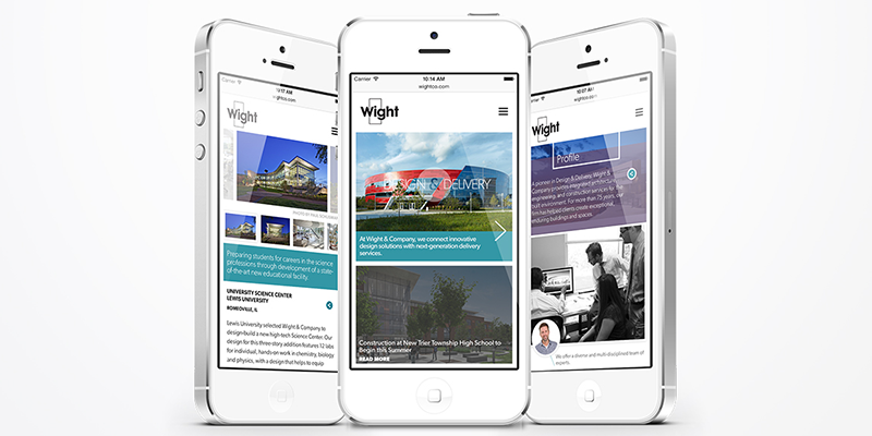
Visitors to the new Wight & Company website can access two separate portfolios — one that focuses on sophisticated design, and one that focuses on quality construction. The redesigned site is responsive and highly interactive. Animations and surprising features are throughout — including the menu built into Wight’s signature ampersand. To highlight the process behind Wight’s award-winning portfolio, the site incorporates sketches, blueprints, renderings, and behind-the-scenes video.
These honors follow last year’s inclusion in AIGA St. Louis Design Show 20. For all the details on the projects included last year, read the individual behind-the-scenes in our recap.
