Sneak Peek: Hugo’s Pizzeria Branding
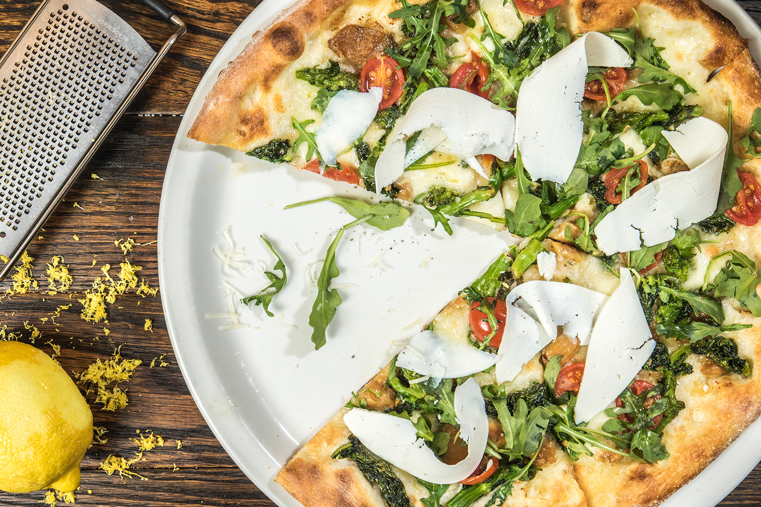
Our new favorite neighbor (and lunch locale) is now open in Midtown St. Louis: Hugo’s Pizzeria!
Our good friend David Bailey, with whom we’ve worked on branding for a few of the Baileys’ family of restaurants (including Small Batch, Baileys’ Range, and Shift Test Kitchen & Takeout), asked us to create a brand for his newest venture: Hugo’s.
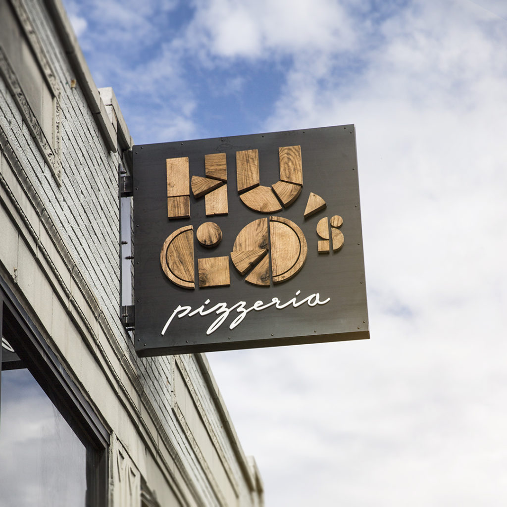
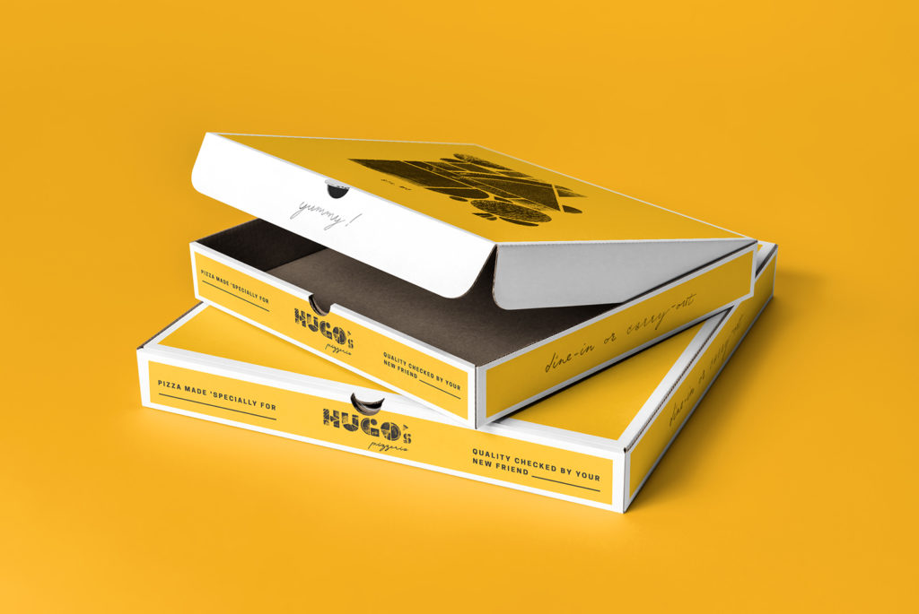
Inspired by his five-year-old son, Hugo, David wanted the brand to evoke a lively, creative, and vibrant spirit. With that, TOKY began illustrating what we like to call building blocks: simple shapes that arrange in many ways to communicate different ideas.
![]()
The style evolved into a logo that really stands out.
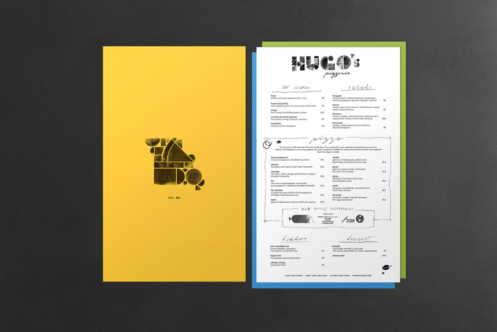
Next, we wanted to create a menu that looks as good as Hugo’s pizza tastes.
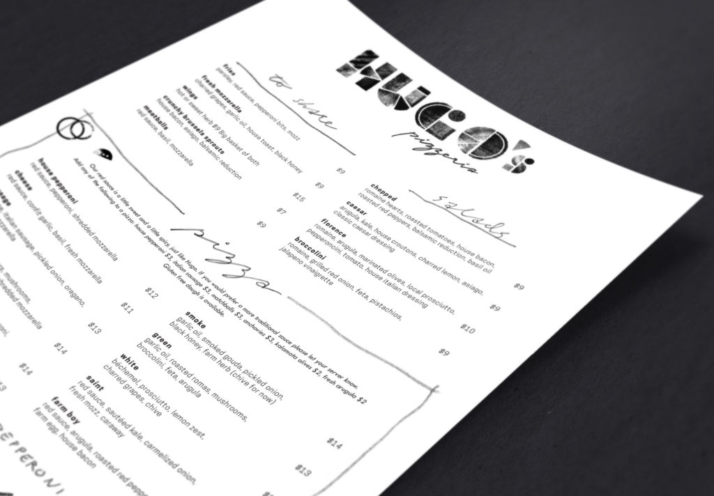
Seriously — it’s so good, you’re going to want to take it home.
Welcome to Midtown, Hugo’s. We’re excited to have you!