Creating an Interactive Map for Your Arts & Culture Institution

These days most of us delegate recreational navigation to Siri and Google rather than Rand McNally, but there is still one industry where the paper map remains ubiquitous: museums.
At TOKY, we appreciate print maps just as much as (probably more than) the next guy. Lately though, we’ve been exploring ways to innovate the interactive map to help institutions engage with patrons and tell deeper stories about their spaces. We’ve found a handful of ways to upgrade the digital wayfinding experience while working with clients in the arts and culture space.
1. Building Interactive vs. Static
While paper maps will always have a home on museum brochure racks, a still image or downloadable PDF isn’t the most exciting or intuitive way to guide digital visitors through a space. Interactive maps are easier to navigate on all devices, can include supplemental content, and even invite active participation from the viewer.
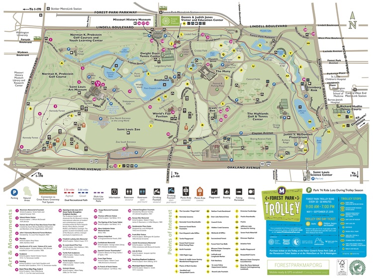
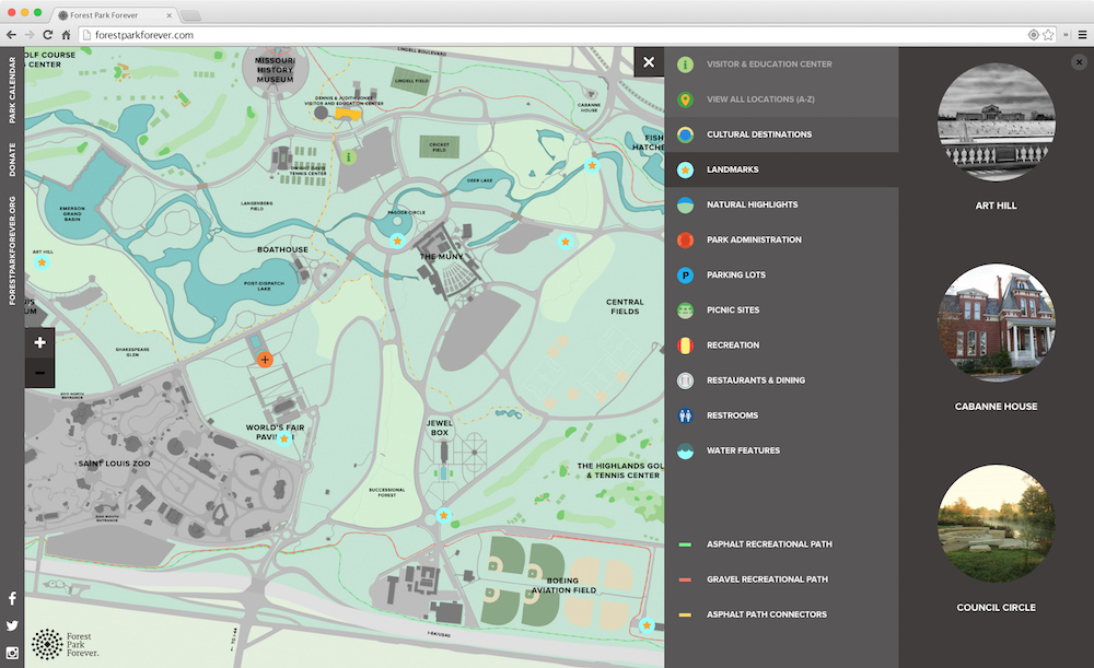
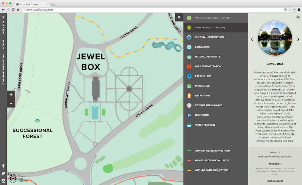
Below are two versions of the Forest Park Map — the first a static JPG that lived on the navigation page of forestparkforever.org, and the second an interactive version that TOKY designed for forestparkmap.org.
2. Custom Design
Google Maps and OpenStreetMaps offer great design and functionality, but out-of-the-box approaches like these can be limiting. For example, the long list of items typically included on an institution’s map — paintings, ponds, parking lots, and so on — typically aren’t listed on Google Maps or OpenStreetMaps.
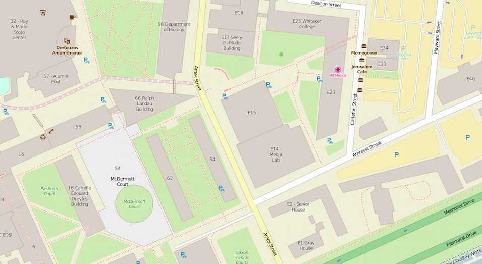
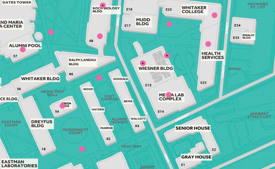
We considered OpenStreetMaps as a solution for MIT List’s Public Art Map, but quickly discovered that plot points for the campus’s vast collection of public art — from Alexander Calder’s La Grande Voile to Sol LeWitt’s Bars of Color within Squares — are nowhere to be found on the map.
Designing the Public Art Map gave us the ability to pinpoint each and every one of the school’s sculptures, murals, and architectural works (represented on the map by clickable pink dots). We were also able to control the overall look of the map, ensuring that it fit MIT List’s bold new brand.
3. Mobile First
Eager visitors may plan out their museum route by desktop beforehand, but for the most part, people will view digital museum maps on a smartphone as they explore the space in person. We saved smartphone visitors the trouble of excessive pinch-and-zooming by making the Bellefontaine Cemetery Map, MIT List Public Art Map, and Forest Park Map fully responsive.
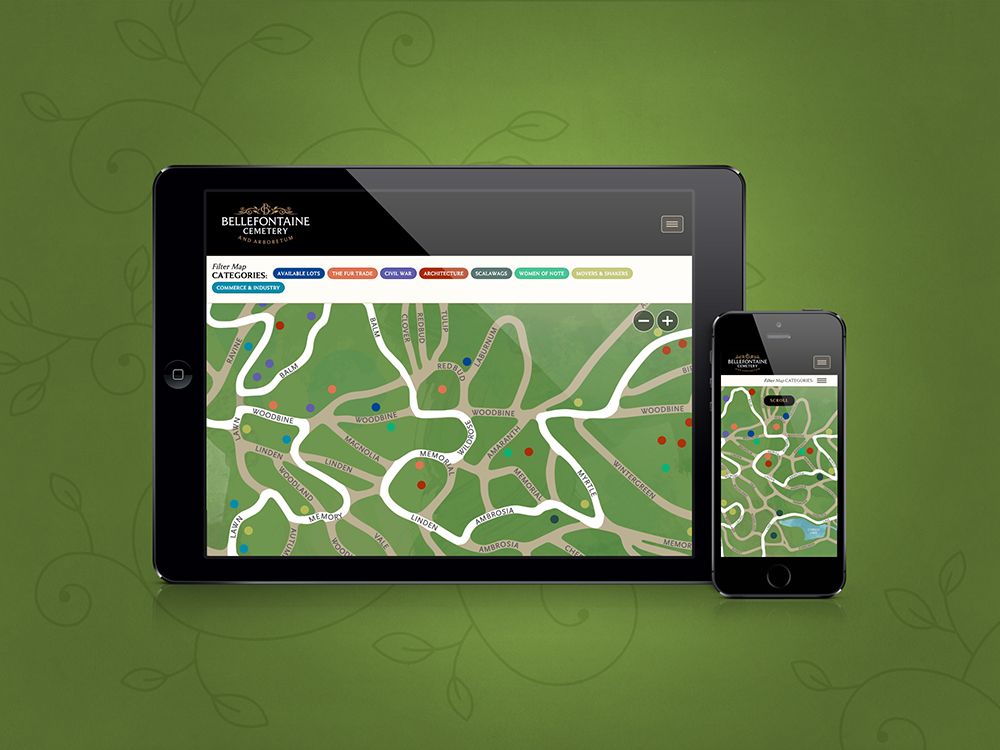
For the Forest Park Map, we also took advantage of retina tiles — a brand new development in mapping software that was not yet available at the time of our previous map projects. The retina tiles ensure that users get a crisp, clear view of the map, even when they’re zoomed in at the highest level.
4. Web-Based vs. Native Apps
We built the Bellefontaine Cemetery Map, MIT List Public Art Map, and Forest Park Map as web apps rather than a mobile apps for three important reasons:
- While time spent on mobile apps is high for the average user, most of that time is spent on the top 25 most-used apps (Facebook, YouTube, Pandora, etc.). Meanwhile, the majority of US smartphone users download zero apps in a typical month.
- If a person only plans on visiting a destination once (which may well be the case), it probably doesn’t make sense to expect them to go to the App Store and download an app just to access the map for a few hours.
- Mobile app updates have to be pushed through the App Store — an extra step that can cause hassle and delays.
Built right, a web app can look, feel, and function a lot like a native application, but without all of the issues listed above.
5. Geolocation
The “You Are Here” dot plays a vital role in print maps, and it’s of equal importance on an interactive map. Geolocation is a key feature of the new Forest Park Map, allowing users to see exactly where they are as they wander the grounds, from the St. Louis Zoo to the Missouri History Museum.
6. Location Detail Popups
General navigation is important, but context is also key. Adding basic details to the map — for instance a piece’s name, artist, and year — will help visitors accurately identify their surroundings.
For the Forest Park Map, we discretely stored landmark data — including a brief description, hours, admission info, and more — in location detail popups that open on click. This way, the map contains an extra layer of data without sacrificing overall readability.

7. Multimedia Resources
While basic details will help visitors put names to places, more inquisitive guests will be hungry for additional information about the collection. Links to these resources can be tucked into an institution’s map for further exploration.
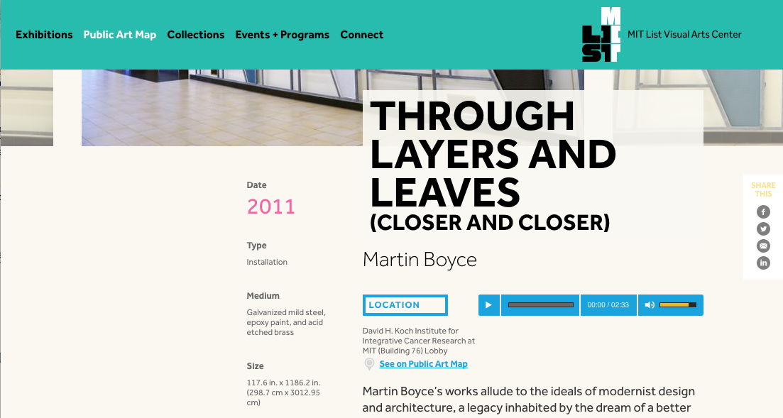
Within each MIT List Public Art Map location detail popup, users see a link to that piece’s full detail page, which includes a wealth of information, from medium and size to the story behind the work. The List’s detail pages also include audio tours for each work so that visitors can to tune into commentary from artists, architects, scholars, and curators as they wander their way through the grounds.
8. Map Filters
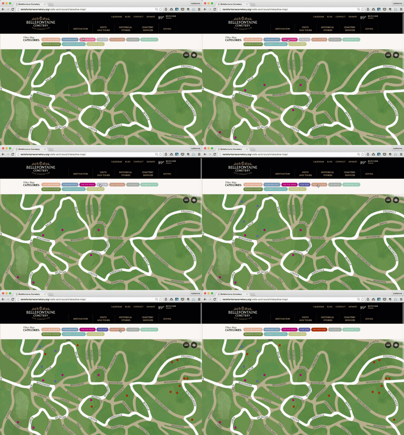
Map filters invite users to dig into collection data and explore the relationships between individual pieces — whether function, form, or time period. This active involvement gets people thinking and allows them to alter the map’s visuals to fit their own unique interests.
Bellefontaine Cemetery visitors can create their own personalized tour of the cemetery and arboretum by selecting the categories they’re interested in — say, for example, “The Fur Trade,” “Civil War,” and “Architecture.”
9. Auto-Pan to Show Location
On the MIT List Public Art Map, we gave users the ability to see a full list of works alphabetized by artist. When an individual work is clicked, the map auto-pans to that item’s location of the map — an interactive feature that reconnects data to place.
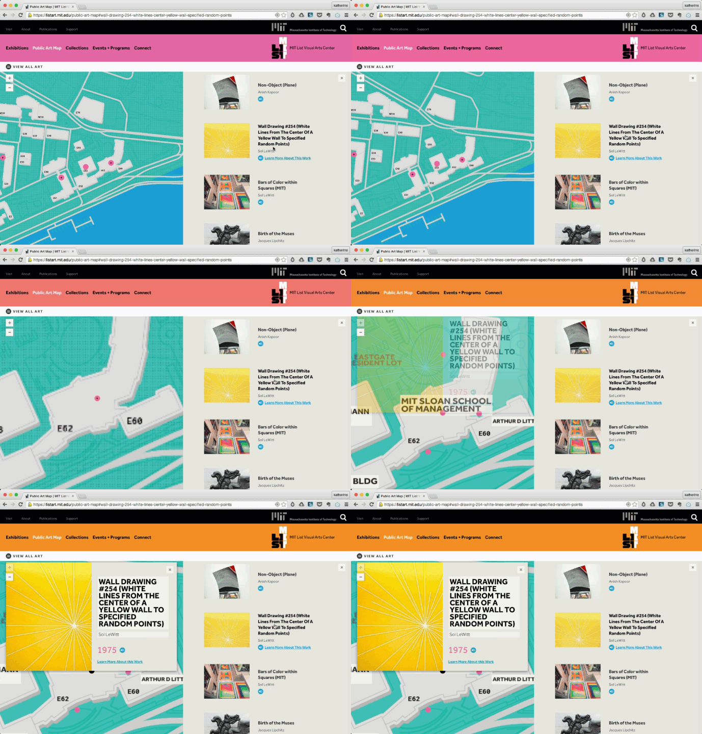
10. Mobile vs. Desktop Gestures
The way a map responds to gestures like scroll, swipe, pinch, and zoom will make a big impact on the tool’s overall usability. We used these gestures in different ways on our three recent arts and culture maps.
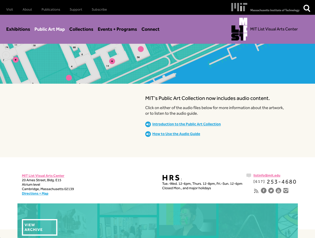
The MIT List Public Art Map and Bellefontaine Interactive Map both exist on their institutions’ full websites and include additional page content below the actual maps. This meant we needed to turn off the scroll-to-zoom functions to ensure that desktop users can access the full page by scrolling their mouse. To zoom on these maps, desktop users can tap “+” and “-” toggles, while mobile users can either tap the same toggles or use the pinch-and-zoom gesture.
The Forest Park Map exists on its own microsite with the actual map taking up the full screen width and height. Without any additional content below, we were able to let the scroll wheel perform zoom functions similar to those on Google Maps. Desktop users can scroll down to zoom in, scroll up to zoom out, or simply tap the on-screen “+” and “-” toggles.
Looking for interactive map inspiration from outside the museum industry? Check out A World of Belonging on Airbnb or the Sochi 2014 Interactive Map.
