The Art & Science of Craft Beer Label Design

In 2017, brewers debuted more than 2,000 new products, 1,800 of which were craft beers. At grocery stores and specialty shops across the country, shelves are lined with craft options, each vying for the eyes of would-be drinkers.
While this growth is great news for the industry at large, it leaves many small brewers wondering how to stand out among the ever-increasing clutter. A big logo and flashy can may sound like the logical approach, but a truly successful beer label does more than shout from the already saturated shelves. A great label speaks the language of its prospective drinker, emphasizing the right elements to convey personality and meaning.
This article covers everything you need to know about creating a beer label that connects, from common components to studies on how craft drinkers shop and examples from real beer brands.
The Anatomy of a Beer Label
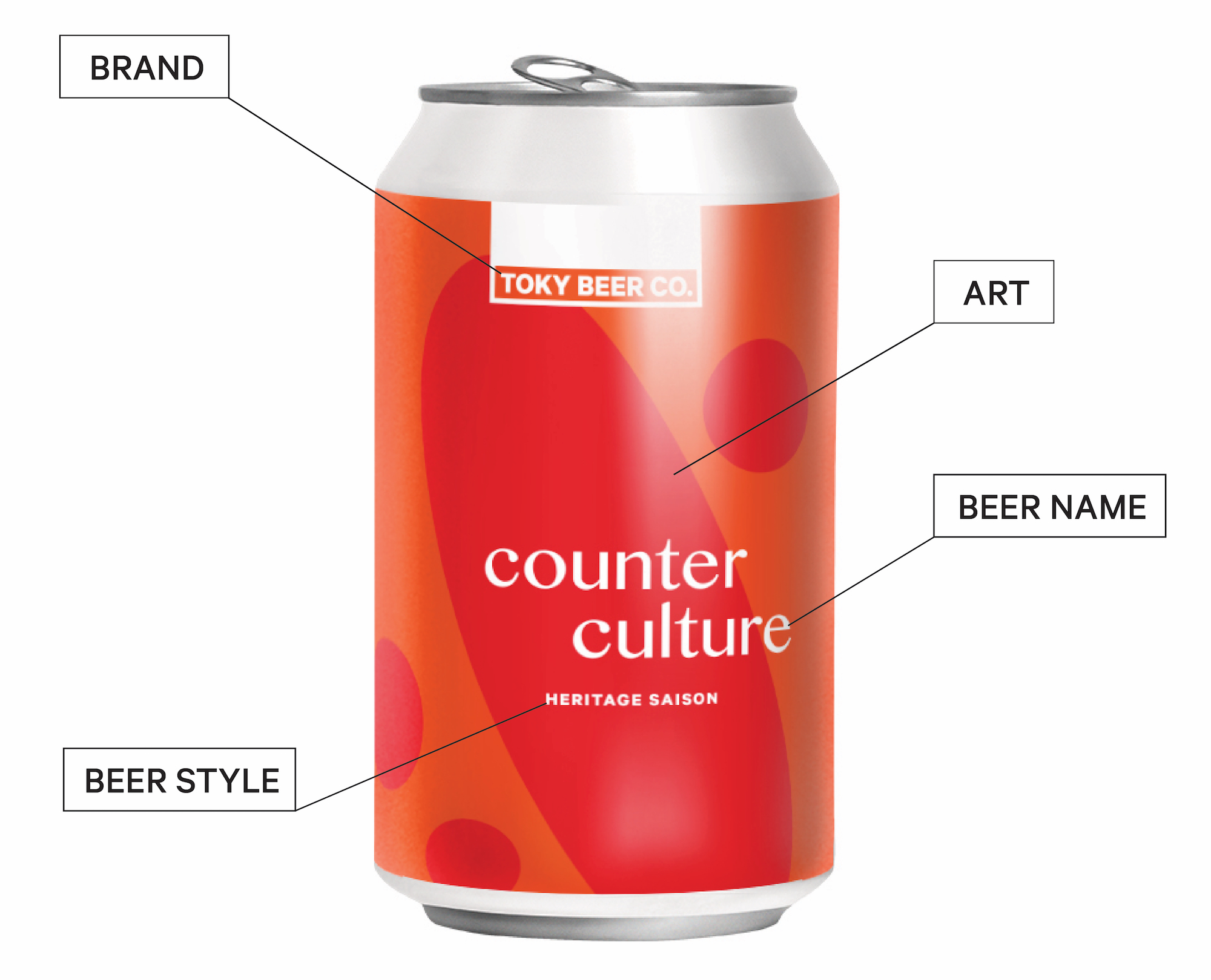
First, for clarity’s sake, a few definitions. Below are some of the components commonly found on a beer label.
- Brewery: This is the brewery’s brand identity (e.g., Modern Times, Omnipollo, Yo-Ho).
- Beer Style: This is the type of beer inside the vessel (e.g., IPA, gose, pilsner).
- Beer Name: Not to be confused with the beer style, the beer name is a creative moniker for this particular beer (e.g., Southside Blonde, Tropic King, Cygnet).
- Art: This is the design on the can.
What Beer Shoppers Look For on a Label
According to Nielsen’s 2017 Craft Beer Category Design Audit, 66 percent of American craft beer buyers say that a beer’s package/label is “very” or “extremely” important for getting their attention. Sixty percent of those same buyers say that the package/label is “very” or “extremely” important in convincing them to buy.
In the same study, Nielsen looked at the packaging components that craft drinkers notice while shopping for beer. Researchers asked, “When you are at the store choosing a craft beer, which physical attributes of the packaging tend to make the strongest impression on you?” Results show that the strongest impression comes from the design of the carrier/box, closely followed by information about where the beer is produced and the logo/brand name.
When you are at the store choosing a craft beer, which physical attributes of the packaging tend to make the strongest impression on you? 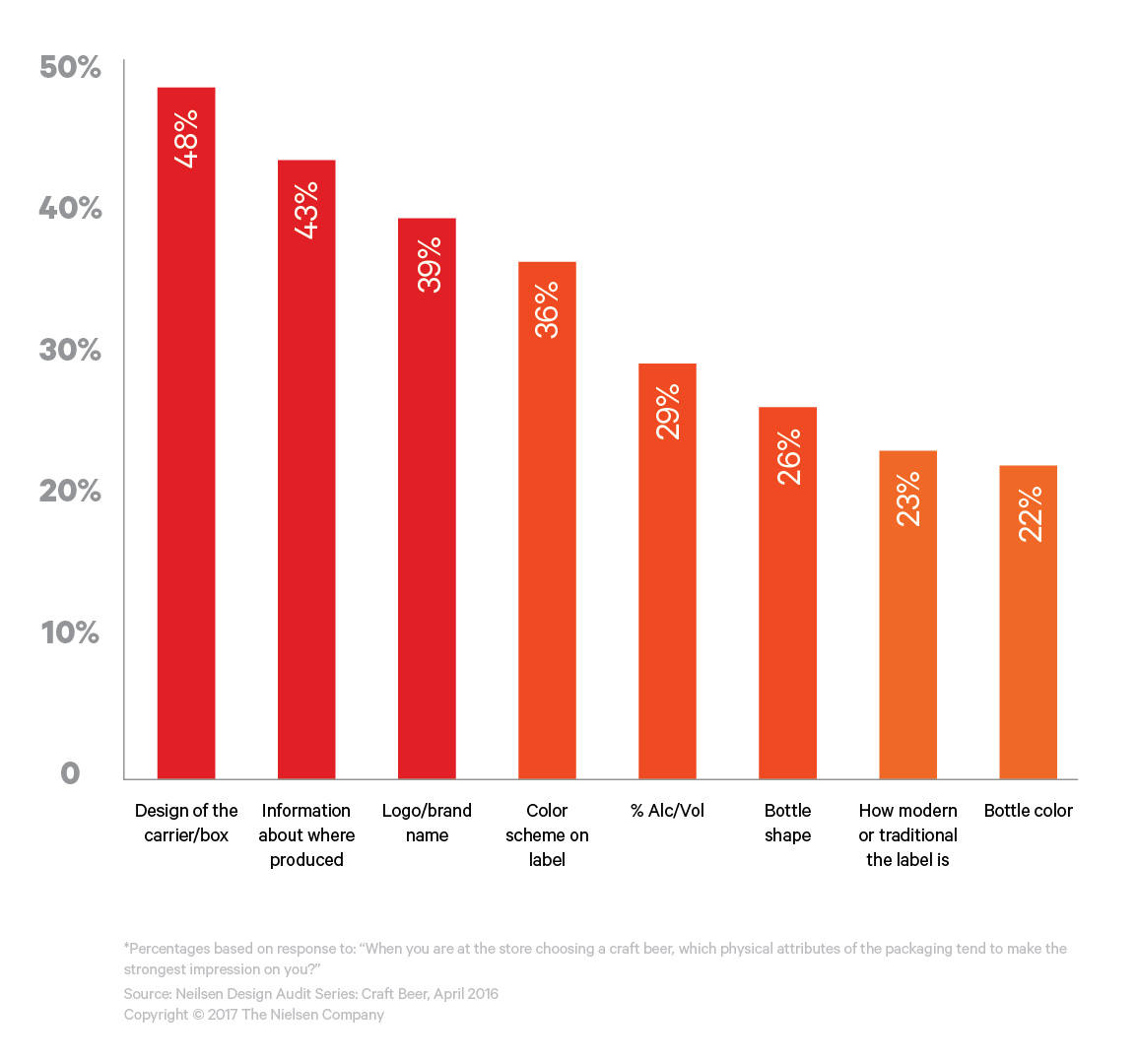
A separate Nielsen study from 2018 focused on the label elements that beer drinkers look at while shopping for beer. According to that study, 60 percent of weekly craft beer drinkers look first at the beer style. The remaining 40 percent look first at the brand.
Finding Your Voice through Beer Label Design
Research tells us that different drinkers base their decisions on different beer label components. By emphasizing different elements, your bottles and cans will attract different drinkers. The questions below can help you think strategically about what should be prioritized in design.
- Who is your ideal drinker? Describe them demographically and psychographically.
- Is it more important that drinkers know your brand name or your flagship beer?
- How much do your beer names say about who you are as a brewery?
- Are you a traditionalist, or do you have a bit of a rebellious streak?
These are big questions. The answers will inform not only your label design, but also who you are as a brewery, the way you brew, and the way you interact with your drinkers. As you go through this exercise, it can be helpful to look at what’s already out there in the craft beer world. What are other breweries emphasizing on their labels, and what does that hierarchy say about their brands? Below, we’ve grouped the craft beer label landscape into four buckets: brewery-forward, beer style-forward, name-forward, and art-forward.
The Brewery-Forward Beer Label
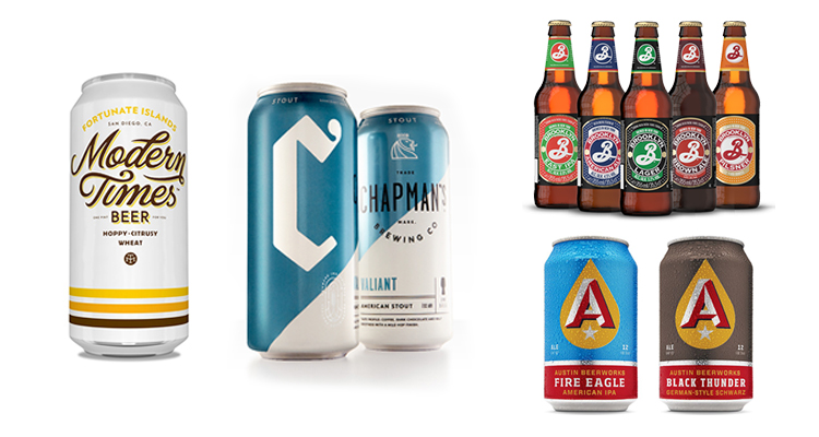
A brewery-forward beer label puts the brewery brand front and center. All other information, from beer style to name and origin, is secondary to the overarching brand. Drinkers are taught to recognize the brand name before a specific beer style. This brewery-first approach would appeal to the 40 percent of craft beer drinkers who look at brand first and foremost.
The Beer Style-Forward Beer Label
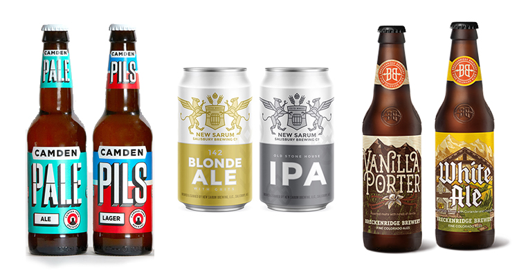
A beer style-forward label calls attention to the type of beer, whether a stout, pale ale, or otherwise. This hierarchy makes sense for a brewery with one or a handful of flagship beers, or specific styles the brand is known for within the market. Research tells us that 60 percent of shoppers look first to beer style, and the beer style-forward approach appeals to those shoppers.
The Name-Forward Beer Label
The name-forward label gives prominence to the name of a specific beer. Some breweries name it as they see it: pils, lager, IPA. Others see naming as a creative exercise of its own; an opportunity to express their brand personality through humor and obscure pop culture references. Take Prairie’s Vape Tricks or Off Color’s Float Trip. On name alone, you can start to formulate a personality for these two breweries.
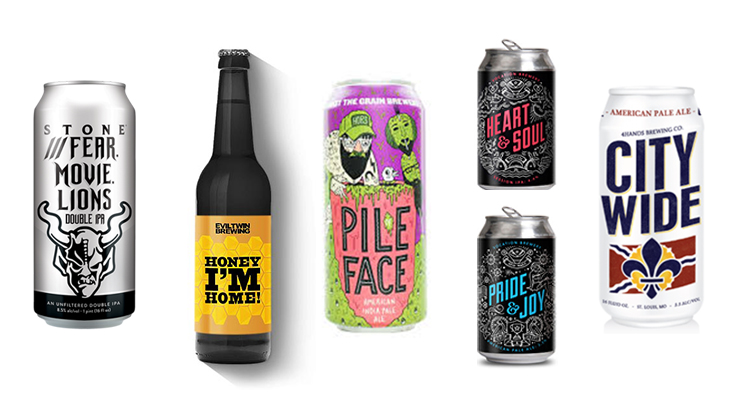
The Art-Forward Beer Label
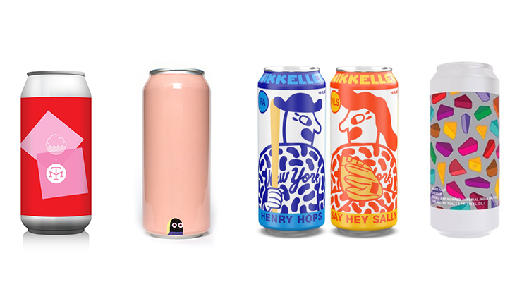
Center stage in an art-forward beer label is — you guessed it — art. Whether minimalist or complex, the art takes prominence over variables such as brand and beer style. An art-centric label can be a useful tool for expressing your brewery’s personality, be it traditional, experimental, or somewhere in between. This approach might appeal to the 71 percent of craft beer buyers who say they like to try brands with bold and interesting packaging.
—
The beer label is a chance to find your people and speak their language. Maybe that connection is made possible by an enticing illustration, an obscure reference in the name, or a rare style of beer. Whatever it is your people seek, use this platform to put that front and center.
Be sure to check out the rest of our drink series, including our branding case study for Rockwell Beer Co. For more, sign up for our newsletter below.