Americana Collections: A Microsite As a Tool

Americana Building Products has a long history of success providing furnishings for parks, playgrounds, sports fields, and other outdoor spaces. They came to TOKY with the need for a website that would catch the eyes of architects furnishing these spaces.
With the core audience established, TOKY dove into a robust discovery phase that included a review of the challenges, current site analytics, and the needs and desires of these architects.
The Challenge
Americana’s management team was interested growing their business by encouraging one-stop shopping. In an industry rife with thick printed catalogs, there was also an interest in a flexible digital solution that would stand out among the competition.
The Solution
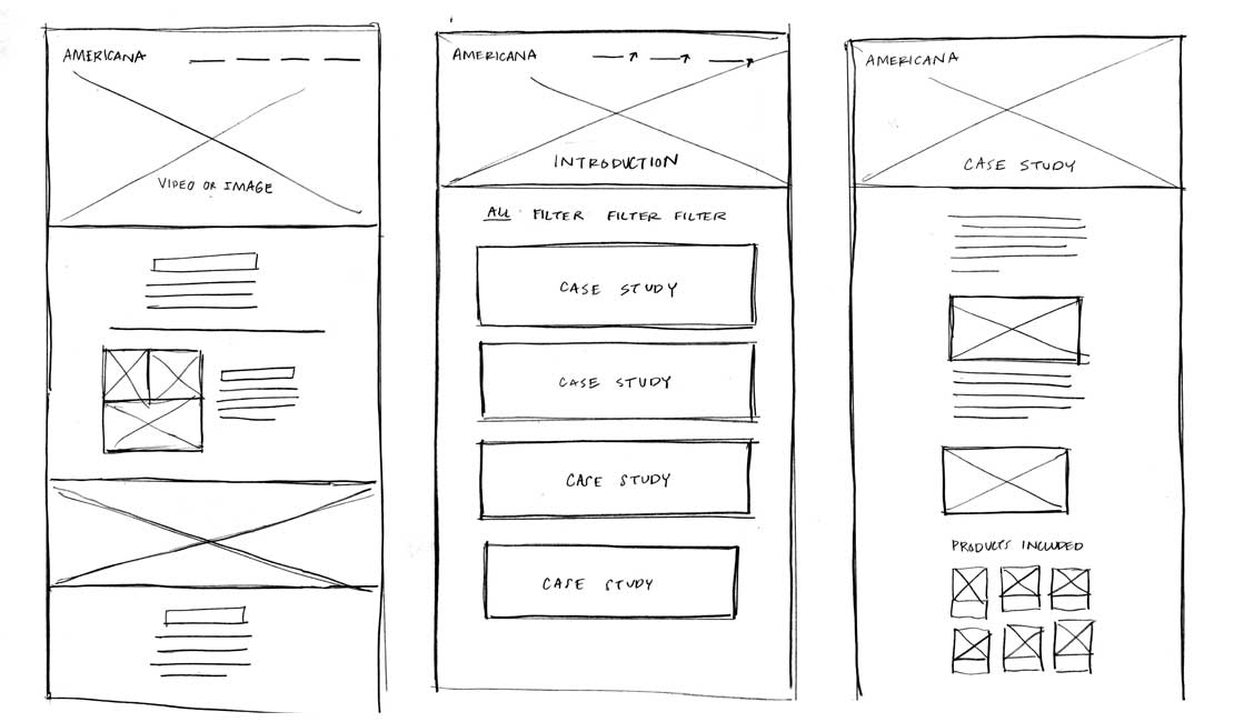
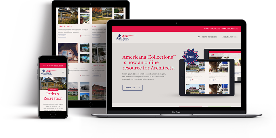
The TOKY team proposed building a microsite that highlights the variety of product designs available through the various Americana Collections. The user experience makes it easy for an architect designing, say, a park, to find all of the products they’ll need for that site in one place — rather than searching individually for trash cans, benches, gazebos, and more.
The “Pinspiration”
The TOKY team was inspired by the Pinterest model — so we designed a site that would allow architects to browse the site in a way that they prefer. By modeling it after a top platform used by architects, we were also able to encourage more engagement with Americana’s social media extensions.
Overall, we’re proud we were able to help Americana by creating not just a website, but a real resource that helps them fulfill a measurable business goal. Check out the site we designed here.


