Design & Delivery: A Lively New Site for Wight & Company
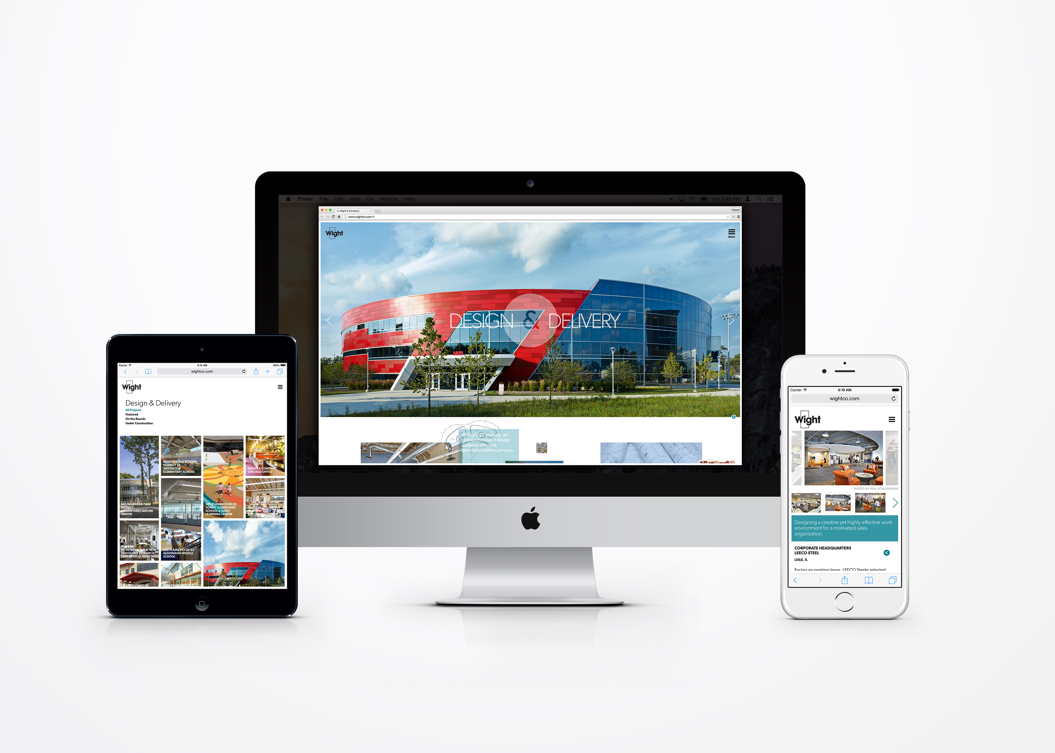
A slideshow of big, beautiful images: it’s what most architecture firms want to present online, and in many cases, what potential clients come to see. No matter how compelling the work, though, full-bleed slideshows of completed buildings can quickly drift into a sea of sameness.
So how can an architecture firm create an image-centric site that stands apart from the competition? Our latest foray into web design for architects went live last week, and thanks to a few thoughtful design and development considerations, the site looks and feels radically different from the seemingly interchangeable competition.
A Site to Influence the Brand
Wight & Company, an integrated architecture, engineering, and construction services firm with offices in Chicago and Darien, Illinois, was in the midst of a brand transition. They wanted to shift their positioning from a “get it done, design-build” firm to one that focuses on world-class design and quality construction — but not always both at the same time.
The wheels were already moving on the transition process when Wight approached TOKY, but they needed outside perspective for the website — a team that would push the site in a new direction and guide the future trajectory of the brand.
Wight identified several central goals for this site redesign:
- Introduce the new brand positioning
- Show the process and craft behind the work
- Make the content and visuals fully customizable
- Create a site that looks and feels different from the competition
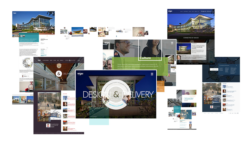
Like many of the architecture firms we’ve worked with, Wight was looking for a creative partner. With an internal creative team of their own, they wanted to be heavily involved in the design process. We worked through several rounds of design to create a site that has plenty of big, beautiful images, but clearly distances itself from the all-too-common aesthetic of competing firms.
A Unique Slideshow
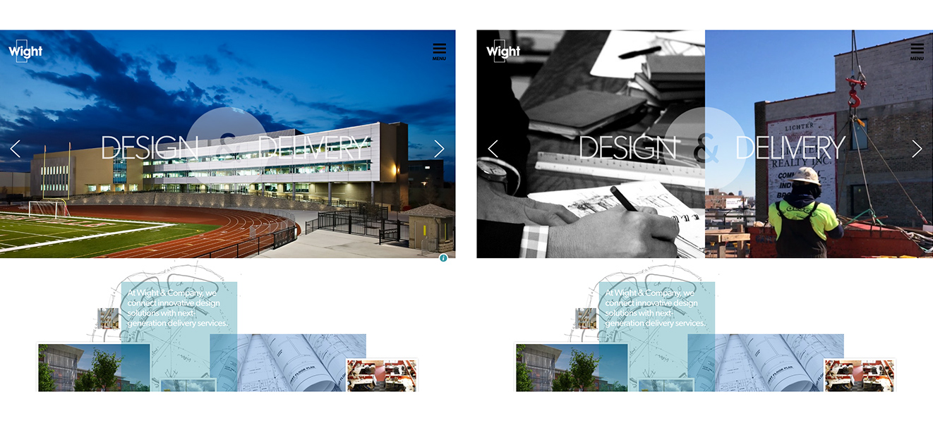
First and foremost, Wight needed a slideshow that would hold its own against the full-page, basic transition slideshows common on the sites of competing firms. Rather than using a template or plugin, we built the slideshow from scratch so it can accommodate one image, two images, one video, or one video and one image.
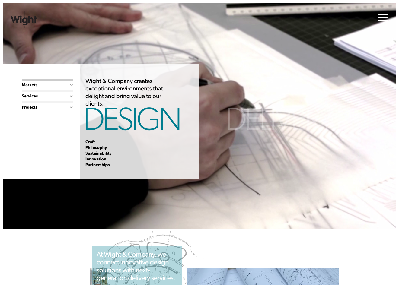
Adding further complexity to the slideshow is an interactive rollover system that splits Wight’s “Design” and “Delivery” functions into two separate portfolios. When a user rolls over the “Design” side, she sees links to the markets, services, and projects that fit under design. When she rolls over “Delivery,” she sees a different set of links directing her to the markets, services, and projects relevant to delivery.
Inspiring Curiosity
From the beginning, Wight wanted to tell its story in a stimulating way — to inspire curiosity in users through thoughtful and unexpected details within the page design. Moments of surprise are scattered throughout the site, including atop the prominent Home Page ampersand. When a user hovers over the symbol, it becomes a navigational item pointing to various process-centric pages on the site.
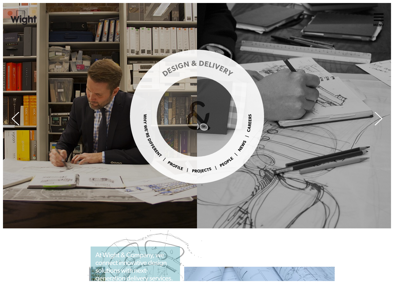
Balancing Complexity and Simplicity
Between the slideshow transitions and the rollover navigation, the Home Page is packed with interactivity. To avoid overwhelming the visitor, we simplified the experience in several ways. For one, the main navigation is contained within a menu icon. To make the Home Page more approachable upon arrival, the Wight & Company logo animates in at load then seamlessly transitions to the “Design & Delivery” tagline. From there, the slideshow transitions into a showcase of projects and process, including both video and still images.
Highly Customizable
Wight has over 150 projects in its portfolio, and as is often the case with an architecture firm’s portfolio, the projects represent a wide range of content. While some projects lend themselves to an in-depth case study with a full slideshow of big, beautiful images, other projects are not as photogenic, and may not require detailed descriptions. We provided Wight with two separate project templates to suit these needs. In each version, staff can turn fields on or off based on available content.
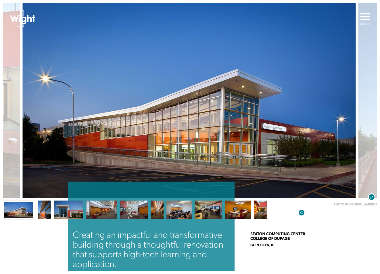
We gave Wight’s internal staff the ability to exercise creative control over a number of additional site features, including the color of rollovers throughout the site.
Viewable from Any Device
The new site is fully responsive and all pages — including the complex Home Page slideshow — look great on desktop, mobile, and tablet.
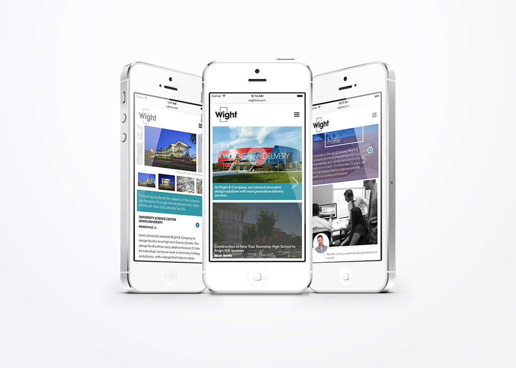
Congratulations to the team at Wight on the launch! For more architecture website inspiration, check out our work for HOK, KSS Architects, SWT Design, and Christner Architects.