Micro/Macro: Going Green (and Neon) for Rainforest Alliance
One of TOKY’s client verticals, dear to many of our worldviews here in the office, is one we call “world changers.” These organizations and individuals actively work toward making the world a better place than they found it. So when the global authority on sustainability, Rainforest Alliance, came to us for a visual identity and invitation assets for its star-studded Annual Gala, it was a match made in tropical paradise.
Rainforest Alliance was familiar with our work for the St. Louis Public Library Gala and knew we could deliver a fully branded and immersive suite of materials for its signature event.
Roots: The Client Identity
We began our assignment like we do most others at TOKY: getting to know the organization inside and out. What drives it? How do people engage with it? What’s its reason for existence? How can we use these personal details to inform our design? If we’re doing our job well, these answers help guide our thinking and our final design.
Rainforest Alliance’s mission simply states that it works to “conserve biodiversity and ensure sustainable livelihoods by transforming land-use practices, business practices and consumer behavior.”
But how would we support this statement with branding for a wildly fun (and wildly formal) gala? How would we appeal to NYC’s Upper East Side? We spent a lot of time dissecting this mission and distilling what it truly means to the people, plants and animals that share this planet.
We quickly learned that an “ethical shopper” is just one side of the sustainability equation. The other side — the side from which we often find ourselves several degrees removed — is the farmer half a world away: a cocoa farmer in Ghana, for example, working to provide for his family and pay his crew a fair living wage. RA partners and works extensively with these farmers, teaching them more sustainable methods that benefit the land, their workers, and their bottom lines. Its growing list of RA-certified food, products, and services like tourism, brilliantly bridges the gap between sustainable supply and conscientious demand. Turns out, it is possible for ethics and profits to go hand in hand.
Inspiration struck during one of our brainstorming sessions when we saw a promotional video for RA’s #FollowTheFrog campaign, a brilliant call to action for U.S. consumers. The video cuts right to our sense of powerlessness over “saving the rainforest.” We all know it’s important and the right thing to do. But how? The task is overwhelming, and each of us, only one person. How can one person save the rainforest?
As RA puts it, it’s not by quitting your job, leaving your family, or moving to Africa and becoming a tribal activist (though these are all good options, if that’s your calling). Saving the rainforest is as simple and as powerful as choosing products stamped by the RA frog. That’s doable. That’s power every single one of us has. And these small, everyday choices of purchasing RA-approved food and products add up to tremendous impact. It puts the power of saving the rainforest in each of our hands with products we consume every day, like coffee, tea, cocoa, and paper.
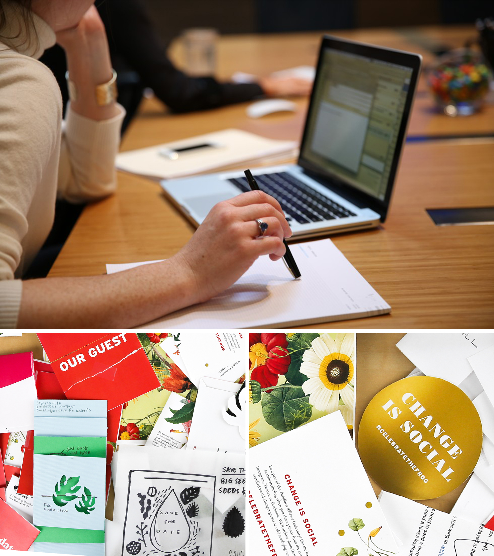
Shoots: Our Concepts
After extensive research about the organization, values, and practices, we presented a series of conceptual directions for the suite of materials that would include a save-the-date, invitation, and event program.
Two concepts quickly made it to the front of the herd. The first playfully paired the social awareness of conservation with the social nature of the event, while the other concept played on scale — starting with a frog’s-eye view and slowly pulling out to a bigger picture.
This simple concept, Micro/Macro, ultimately became the base of operations. Small choices, small gestures — big impact. Actions (and donations) can become the seeds of change.
Branches: A Creative Suite of Event Materials
The resulting visuals are both elegant and modern. Lush, traditional florals contrast with of-the-moment neon in a chic combination of elegance and whimsy.
The floral illustrations take a frog’s-eye view into a lush world of ferns, birds, and blooms on the rainforest floor. It is immersive and exotic. Interspersed throughout are gold-foiled dots, suggesting tiny glowing bugs, and adding richness and dimension. It feels special. Typography is straightforward, but playfully weaves into the illustrations. A neon coral helps anchor the botanicals.
This suite would be sent to an elite guest list courted by a litany of NYC charity balls and galas. The Rainforest Alliance Gala materials needed to captivate from the first peek in the mailbox but remain elegant enough to compete among the NYC gala scene.
Save-The-Date
The date announcement served as a teaser to the event, both in anticipation and visual design.
Here, we showed how the small act of marking this event on one’s calendar could, in the grand scheme, “Save the Rainforest.” Rich florals creep in from the edges, a tease for the invitation yet to come.

An elegantly simple concept, the self-mailing design saved paper waste and created a kinetic opportunity for interactivity.
Invitation
We carried this theme into the main invitation suite with copy that again suggested the impact our actions can have: “From the Dance Floor… To the Forest Floor.”
The simple front gives way to an accordion-folded card bursting with dense greenery and floral shapes. Even the invitation’s physicality starts small and grows into something lush and expansive, mirroring the Micro/Macro concept.
Made to mimic the undergrowth of the forest floor, winding vines, budding flowers, and lithe grasses intertwine with the copy as if the words themselves were growing from the page.
Tiny whimsical additions are hidden in the leaves. The gold foil dots are obvious, but can you find the neon snake or the couple ballroom dancing among the leaves? We wanted to set expectations for a magical and unexpected evening.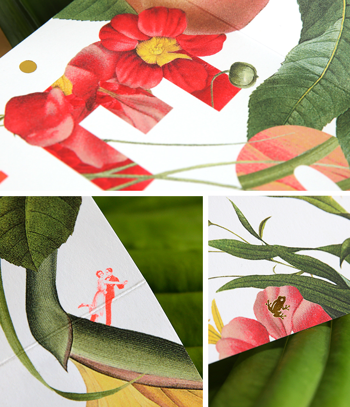
The paper was graciously donated by Domtar — the RA and FSC-certified sustainable company that specializes in postconsumer recycled content papers.
All materials were printed in St. Louis by the solar-powered Advertisers Printing Company, another FSC-certified company, and one of Missouri’s industry leaders in sustainability.
With the exception of the envelopes, the entire invitation suite fit onto a single press sheet, minimizing waste.
Program and On-Site Assets
Simple night-of-event ephemerals helped draw the visual theme through the gala evening.


The visual language continued to play out on the table arrangements and event programs, speaking to “a night of revelry / a lifetime of change.”
Auction App
We applied the style to their third-party, in-event live auction mobile application. This provided the opportunity to carry the visual elements into a digital space.

The tablet-based auction app again cut down on paper waste, and the clarity of design really sparkled — whether it was on a hand-held tablet or on the large feature screens.
Canopy: A Lushly Green Gala Event
Every effort was made to create a beautiful suite of event papers that were ethically produced, yet remained glamorous. We wanted to emphasize that going green is as chic as it is responsible.
The suite perfectly matched the glitz and fun of the evening and helped set the tone for the night.
Of the gala itself, Rainforest Alliance marked another successful year. As for TOKY’s part in the process they had this to say:
Everything came out beautifully. The cohesive design concept created a great common thread running from the save the date all the way to the dinner tables and auction.

Rhapsody in Green: A Project Manager’s Wrap-Up
A green gala from start to finish and in every way possible, TOKY’s work for Rainforest Alliance delivered elegance and a bit of the unexpected to guests’ mailboxes all over the globe.
We weren’t content to simply create a beautiful invite. We knew we could do that. It had to say something. It had to entice.
As a project manager at TOKY, I’m always struck by the degree to which our creative team pushes what’s possible and thinks bigger than what we’ve been asked to do. The tough questions and, at times, spirited debate that characterized the concepting of this project ultimately pushed us to a better place. And the client was absolutely floored by the results.