Backstage with Saint Louis Fashion Week Branding

When our friends at ALIVE magazine came to us last March about a possible rebrand for Saint Louis Fashion Week, we knew this was something we wanted to be part of.
We always jump at the opportunity to work with creatives from different disciplines, and this sounded like a fun way to elevate an important event for our creative peers.
“Saint Louis Fashion Week is about more than the event itself,” says Geoff Story, Creative Director at TOKY. “It’s about representing St. Louis as a world-class city — putting us on the map creatively and culturally.”
Since its founding in 2006, Saint Louis Fashion week has grown steadily to become an important platform for local and national designers. With an impressive reach and lineup, it was clear that this was the year to upgrade Fashion Week’s branding. The rebrand would take many forms — from the logo itself to web work, video, and the all-important Fashion Week swag. Here’s a behind-the-scenes look at the inspiration and process that went into the new look for Saint Louis Fashion Week.
Logo & Branding
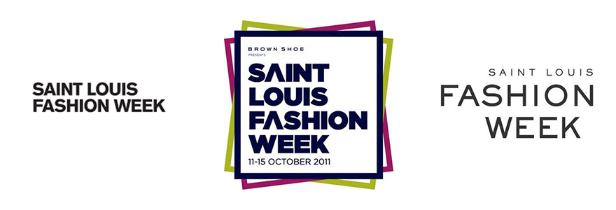
In years past, Saint Louis Fashion Week used the marks below.
This year, the team was ready for something different — something colorful, surprising, and representative of an event packed with creativity. As our own Geoff Story put it, “Fashion Week needed a look worthy of the event itself — something bright, forward-thinking, and of course fashionable.”
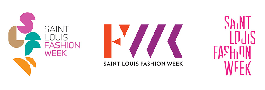
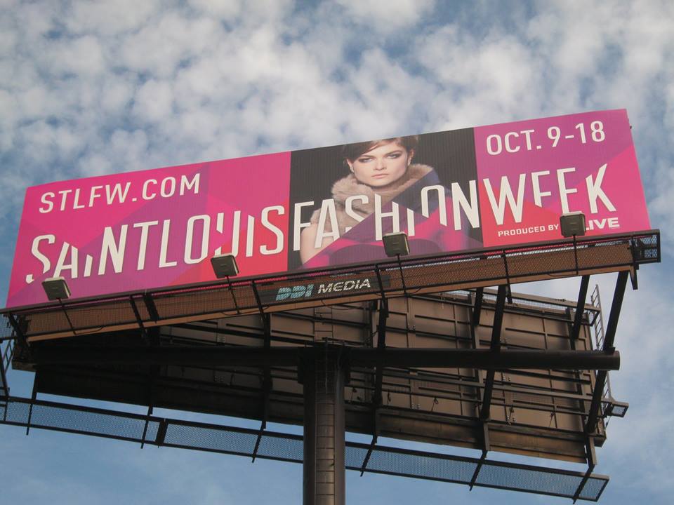
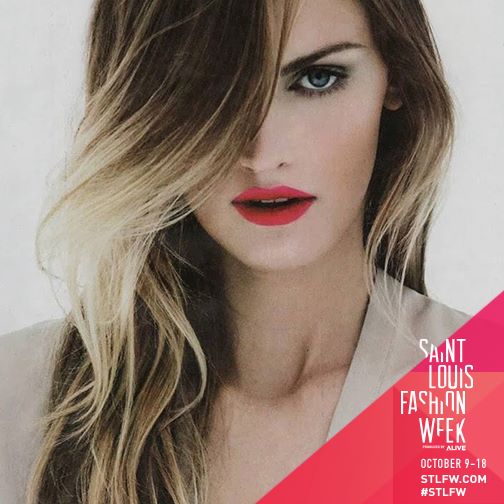
Our team provided several directions in the first round of designs, and the client went with a variation of the third option shown above. The logo was applied in dozens of places, from social media banners to projections at events, to quick screens and billboards.
Web
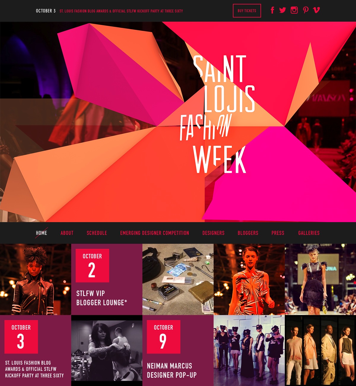
The Saint Louis Fashion Week website also needed a refresh, and the team was looking for a site that put video front and center. Just as importantly, they needed a fully-functional calendar to give guests the who, what, when, and where for dozens of upcoming events.

As you can see from the initial sitemap above, the structure of the site would be fairly simple but incorporated important elements like video, social feeds, and the ability to purchase tickets.
Video
The client needed video assets that could be used both on their website and as ambient background animations for in-person events. Interactive Designer Robert Paige used existing Fashion Week footage, which he combined with an origami-like animation of the event logo. You can watch the full video on the Home Page at saintlouisfashionweek.com.

T-Shirts and Swag
No Fashion Week is complete without swag, so we were also tasked with concepting and design for t-shirts and totes for conference-goers, bloggers, and volunteers. The client wanted something that was both witty and worthy of wearing in normal life — not an easy task for a free event tee.
Our team bounced from a story told through hashtags (from #ootd to #bespoke), to a sort of style-your-own t-shirt concept, but finally settled on three separate shirts for our three different audiences: “Workin’ It” for volunteers, “Now Trending” for conference attendees, and “Shine On” for bloggers.
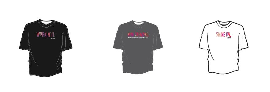
As Designer Kelcey Towell explains, with these concepts in place, “We wanted the copy to really shine through and stand out, so we opted for a more straightforward approach to the typography — keeping the letterforms simple, legible, and eye-catching from a distance.”
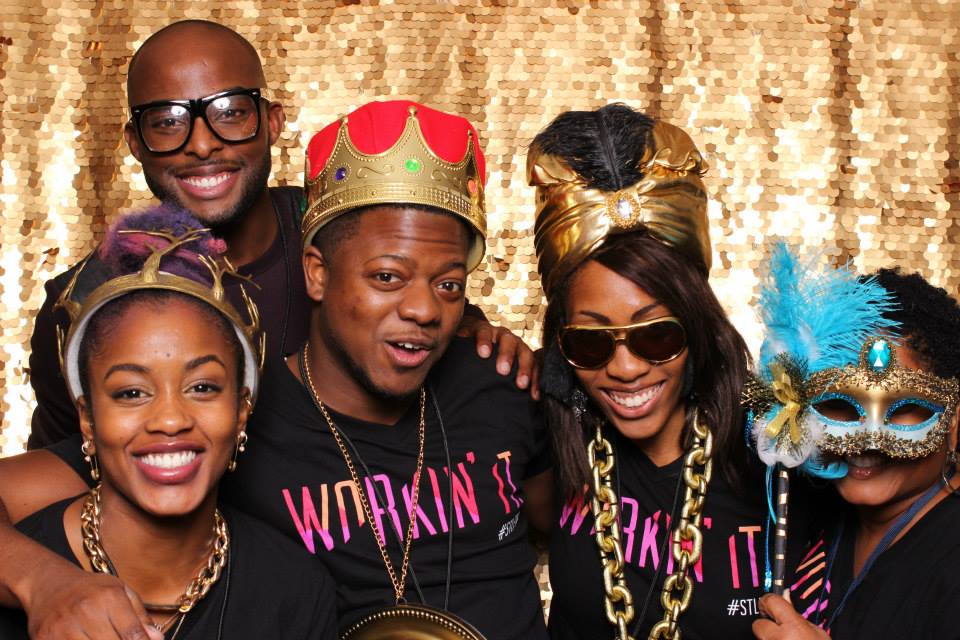
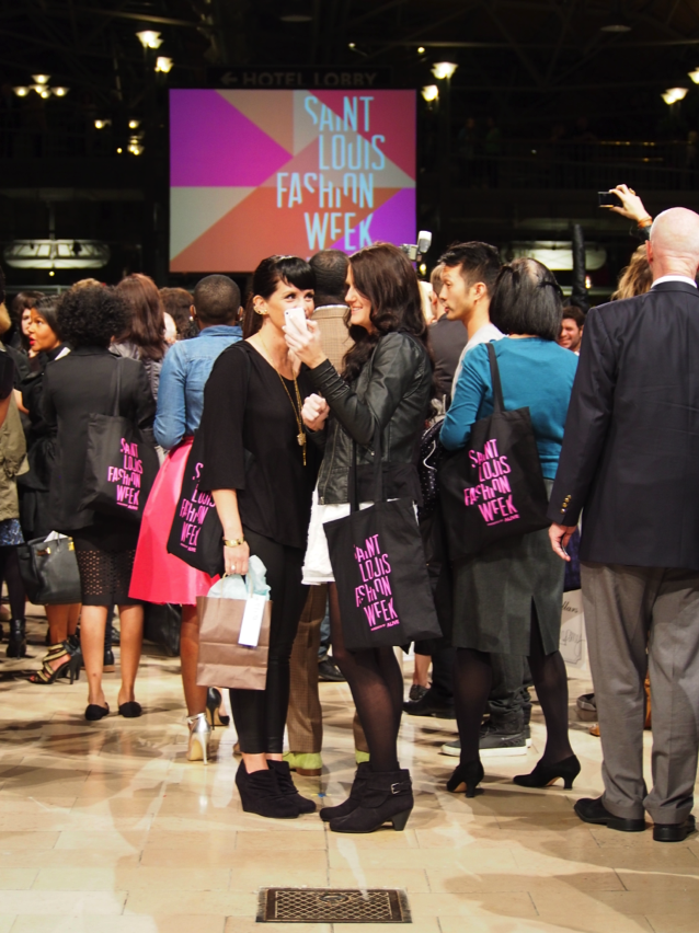
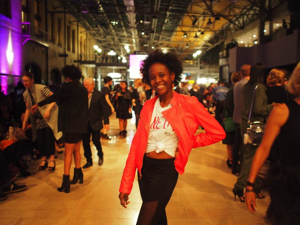
For more images of the branding in action, check out our Saint Louis Fashion Week 2014 Facebook album.