TOKY Takes Home Nine St. Louis ADDY Awards
Last Thursday night, we joined St. Louis’ creative community at the Caramel Room at Bissinger’s for the annual ADDY Awards Gala.
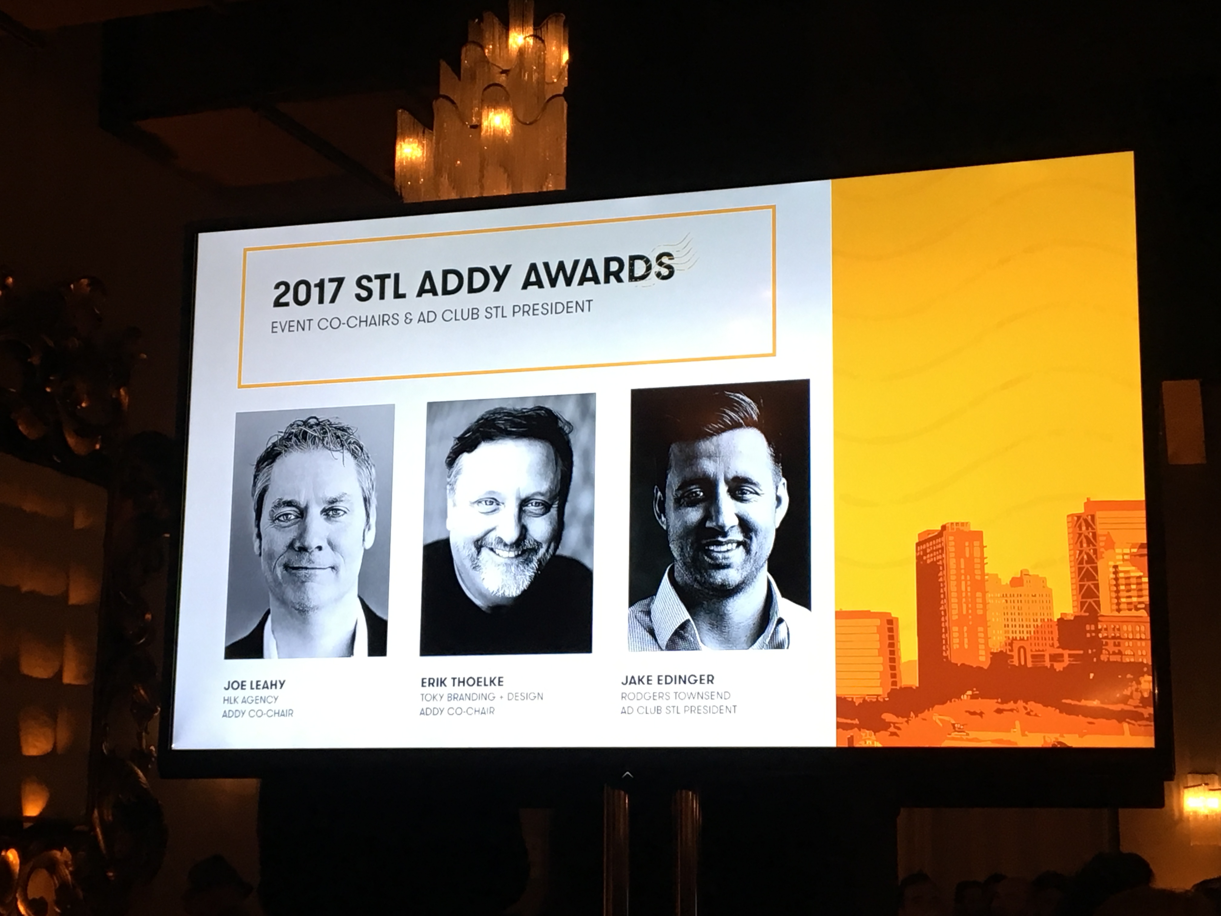
It was a gorgeous night for rooftop views, all-around great creative work, and a few minutes onstage with ADDY Co-chair and TOKY President, Eric Thoelke. Good times (perhaps a little too good) were had by all.
And the winners are…
When all was said and done, TOKY walked away with nine awards, including six silvers and three golds.
 RNL Design
Gold: Digital Creative Technology Interface & Navigation
Silver: Online and Interactive Websites, Consumer
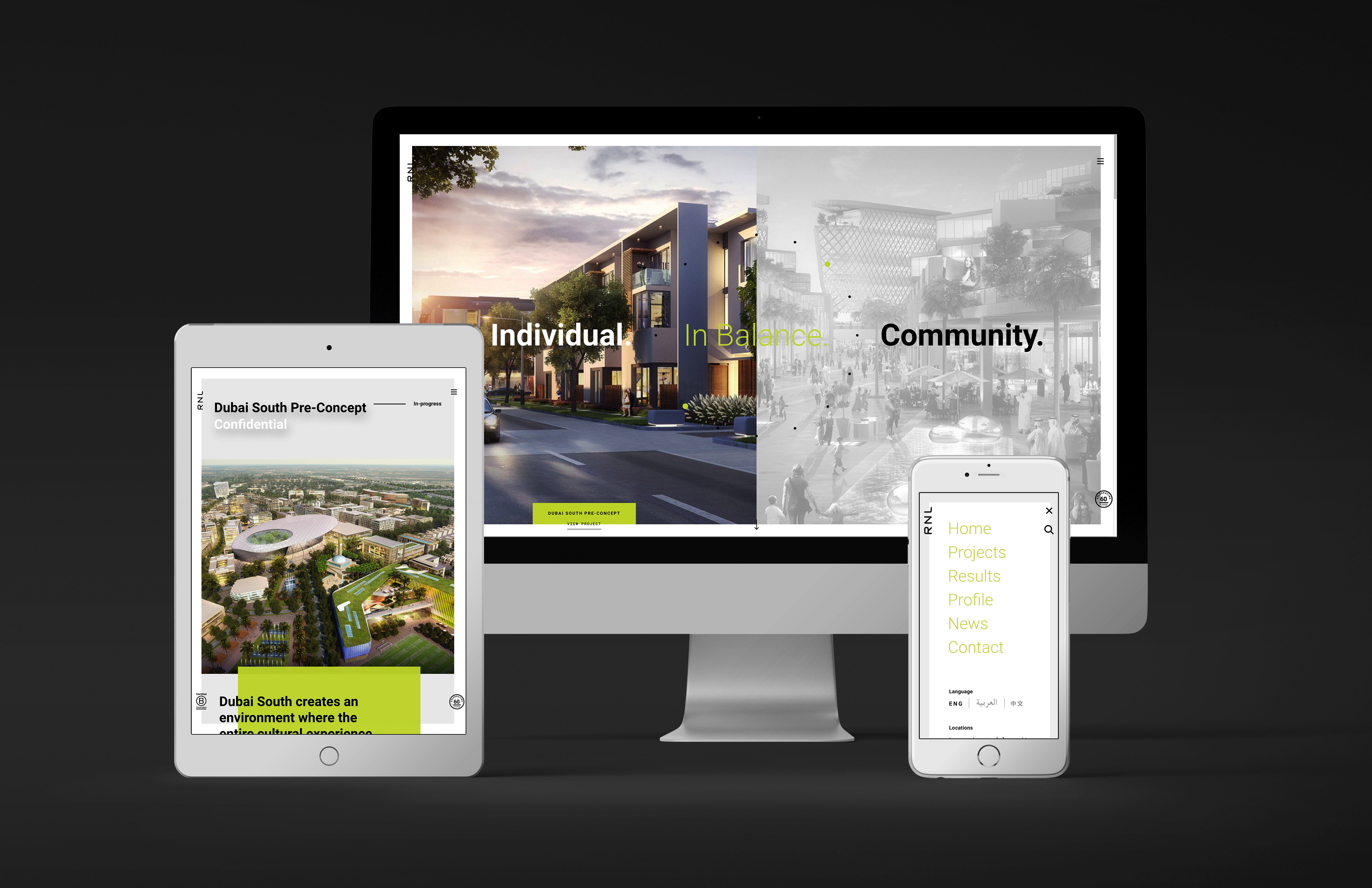
RNL is a deeply thoughtful architecture practice headquartered in Denver, Colorado. Like the firm’s work, the website is built with balance in mind. The Home Page features a slideshow illustrating how projects “balance” key values for clients: “Context and Detail,” “Insight and Inspiration,” “Performance and Aesthetics,” and so on. The site incorporates large images, quick-hitting stats, and short value statements with more in-depth text to ensure that every project story is told in a detailed, yet engaging and highly visual way.
 Rainforest Alliance Gala 2016
Gold: Card, Invitation Announcement, Single
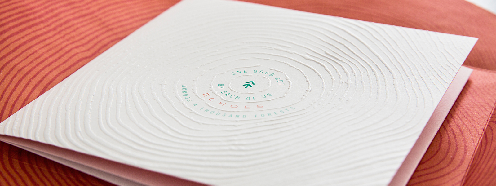
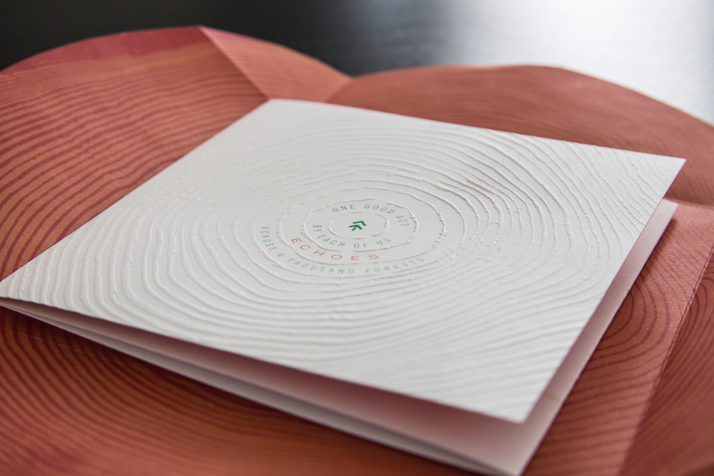
After undergoing a recent rebrand, Rainforest Alliance needed an annual gala invitation that celebrated not only its new look, but also the ripple effect small donors have on the organization. The invite uses the tree rings as a metaphor to show the impact that the efforts of individuals — not just big corporate donors — have on Rainforest Alliance’s important mission.
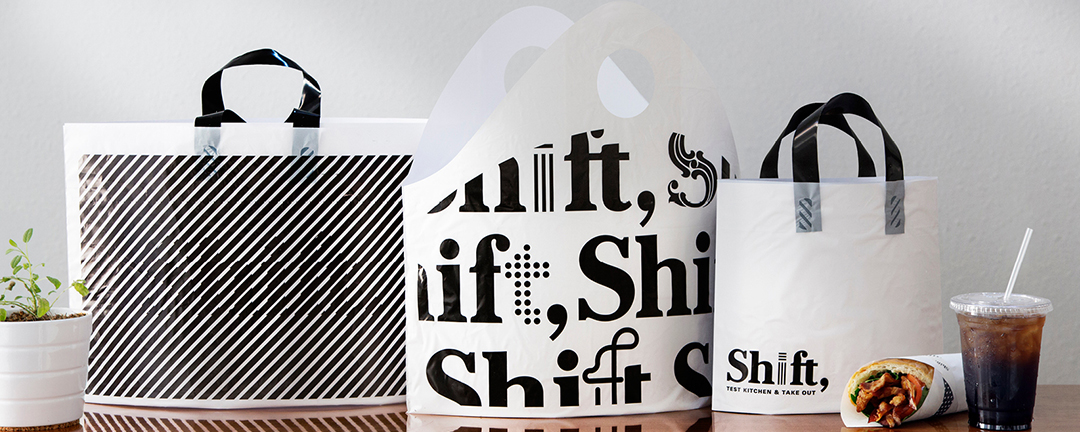 Shift, Test Kitchen & Take Out
Gold: Cross Platform Brand Identity Campaign
Silver: Packaging Campaign
Shift, Test Kitchen & Take Out serves a menu that rotates daily, giving its chefs the chance to experiment with a range of different cuisines. The restaurant needed a brand that would reflect the menu’s constant evolution while creating an approachable, lunch-friendly aesthetic. The identity “shifts” between traditional and experimental typefaces, creating a look that feels familiar, but with a touch of the unexpected.
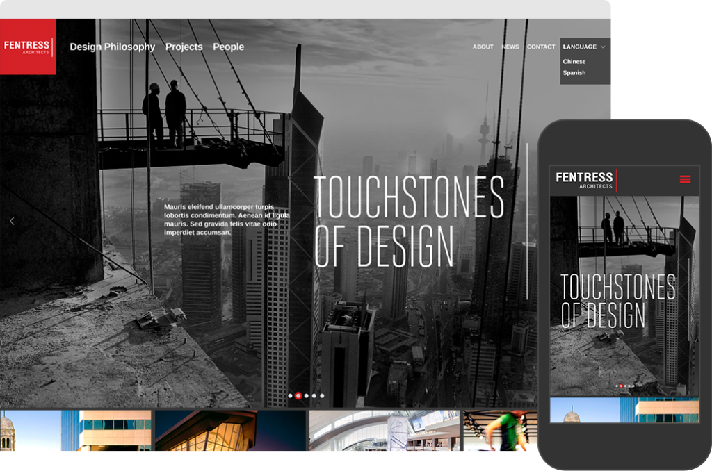 Fentress Architects
Silver: Online and Interactive Websites, Consumer
With a portfolio full of iconic built environments, international design firm Fentress Architects needed a website that would illuminate its broad range of work — from tall and narrow skyscrapers to sprawling international airports. The new design puts Fentress’ recognizable work front and center, minimizing the number of clicks required to dig deeper into the firm’s portfolio and approach.
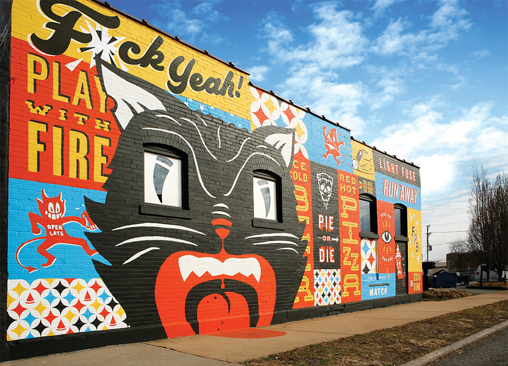 Firecracker Pizza & Beer
Silver: Elements of Advertising, Illustration, Single
Firecracker Pizza & Beer is a new, lo-fi, and beer-forward restaurant. This exterior mural is a representation of the playful, energetic Firecracker brand. Inspired by vintage firecracker labels, the mural echoes the pizzeria’s punk rock vibe with playful copy and illustrations throughout.
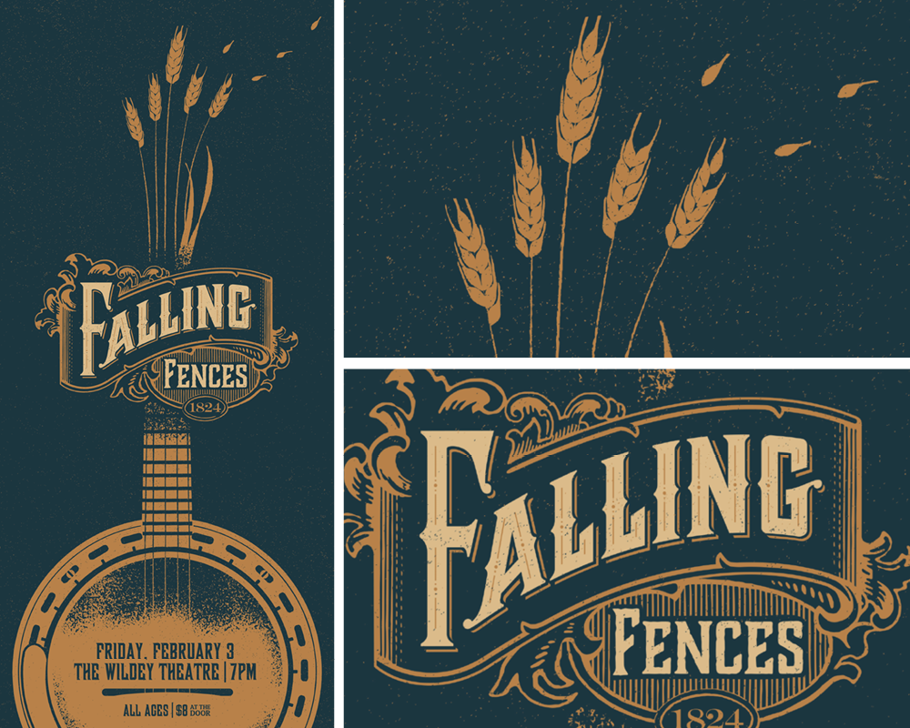 Falling Fences
Silver: Out-of-Home and Ambient Media
Falling Fences plays music that brings people together, reminding us that we are a nation of travelers at our core. They describe their music as “growing from deep in our soil, evoking the same romantic hopefulness found in the unique worlds of Hemingway, Whitman, and Melville.” This roots-deep aesthetic is portrayed in the poster, which unites corn and instrument.
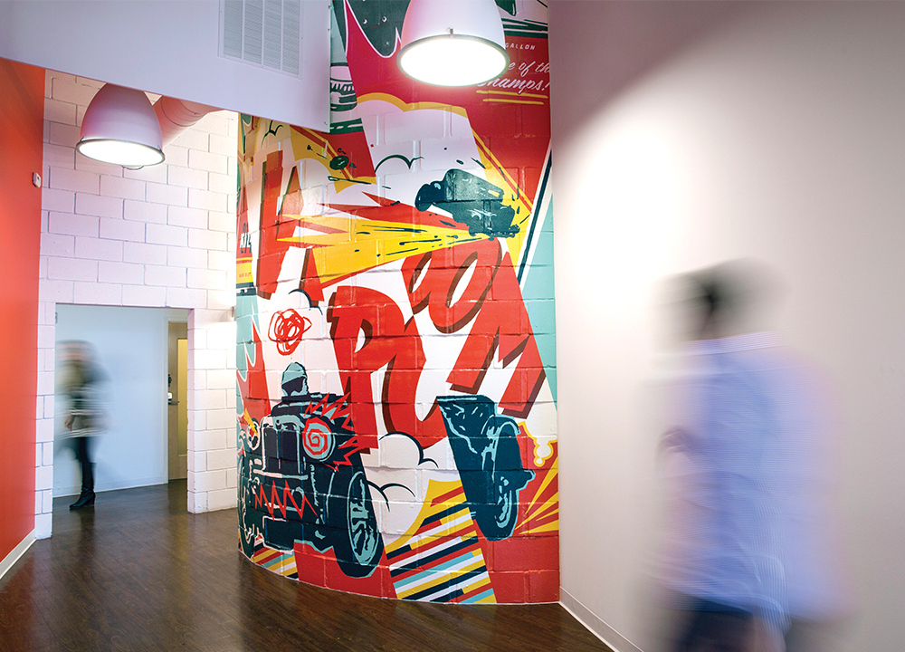 REO Lofts
Silver: Elements of Advertising, Illustration, Single
The REO Lofts are located in St. Louis’ historic automotive district, Midtown Alley. The mural in the building’s entrance is inspired by the area’s automotive heritage, conjuring the reckless and gutsy legacy of early hot rod racers.
These entries will move on to represent St. Louis in the American Advertising Awards’ Regional and National competitions. Congrats to our hard-working team and wonderful clients on the wins!