Shift Earns a Spot in CA’s 2017 Typography Annual
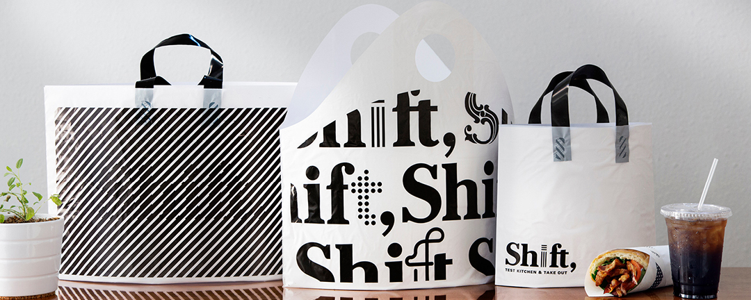
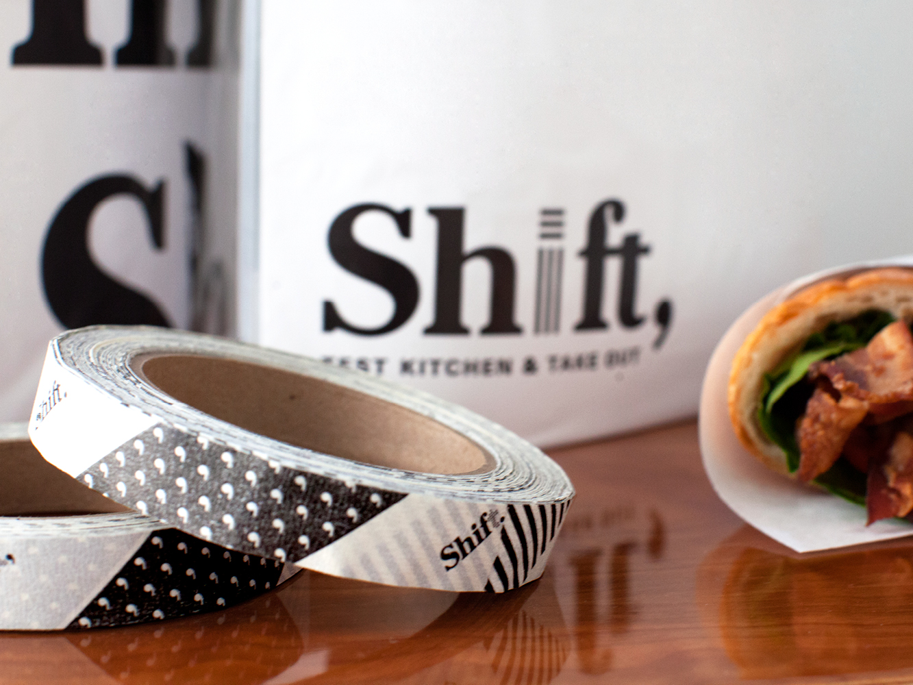
For the fourth year in a row, TOKY will have work included in Communication Arts’ juried Typography Annual. This year, the judges have selected our branding for Shift, Test Kitchen & Take Out.
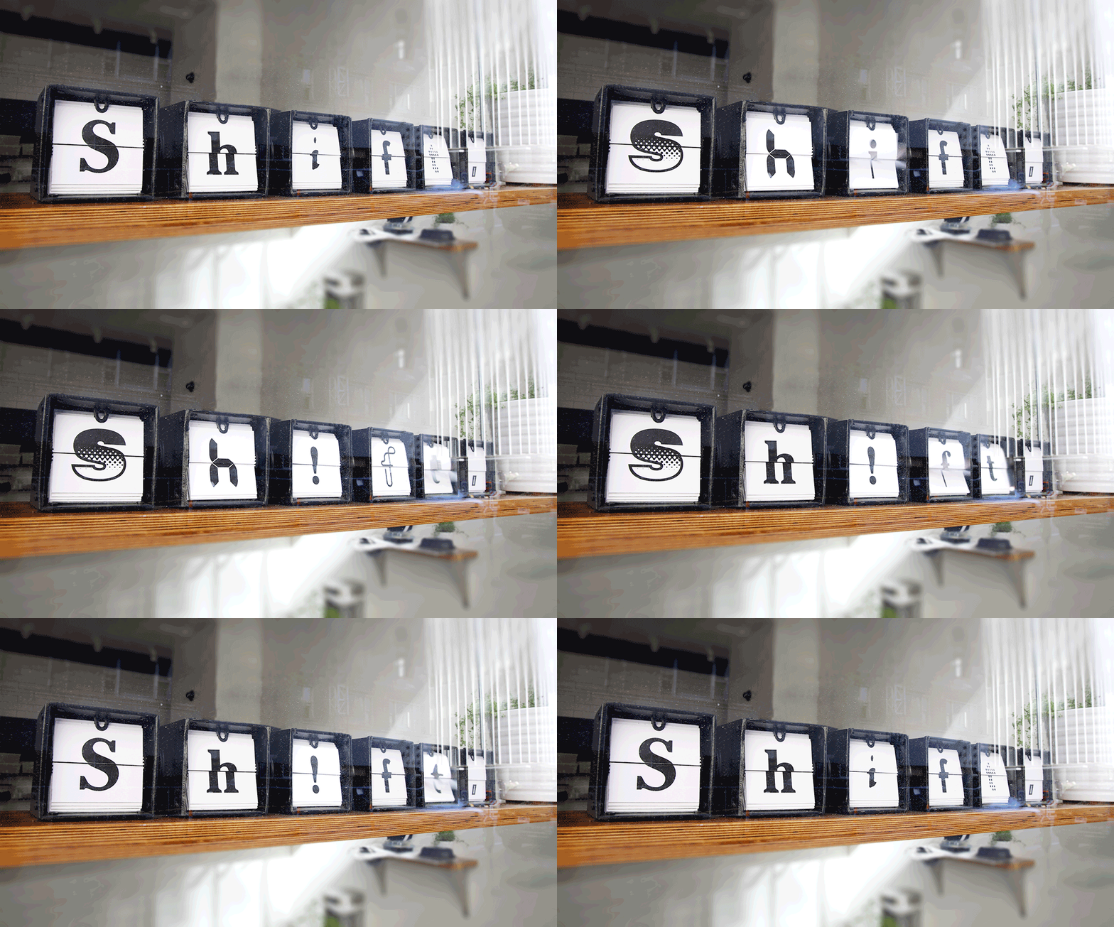
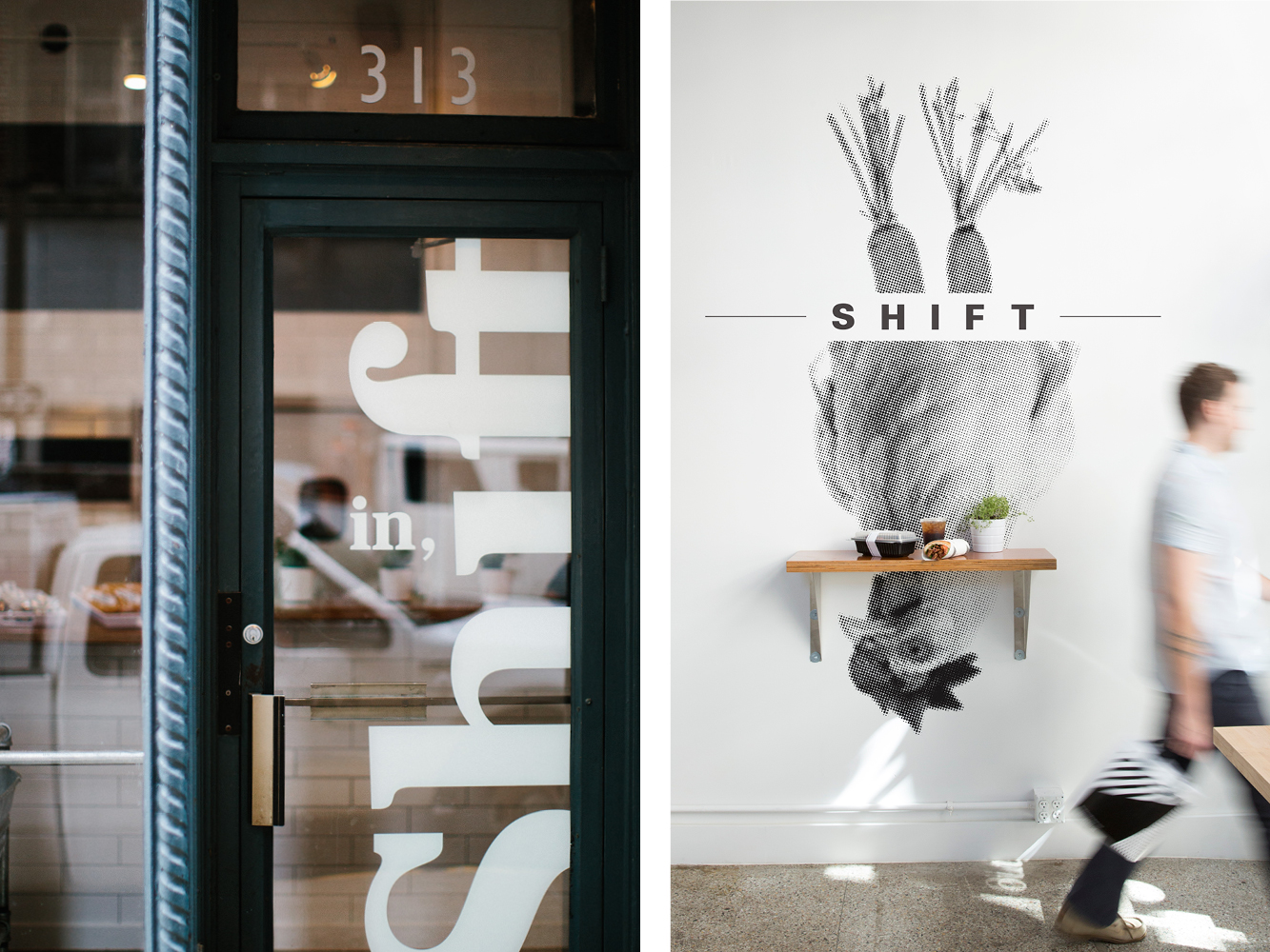
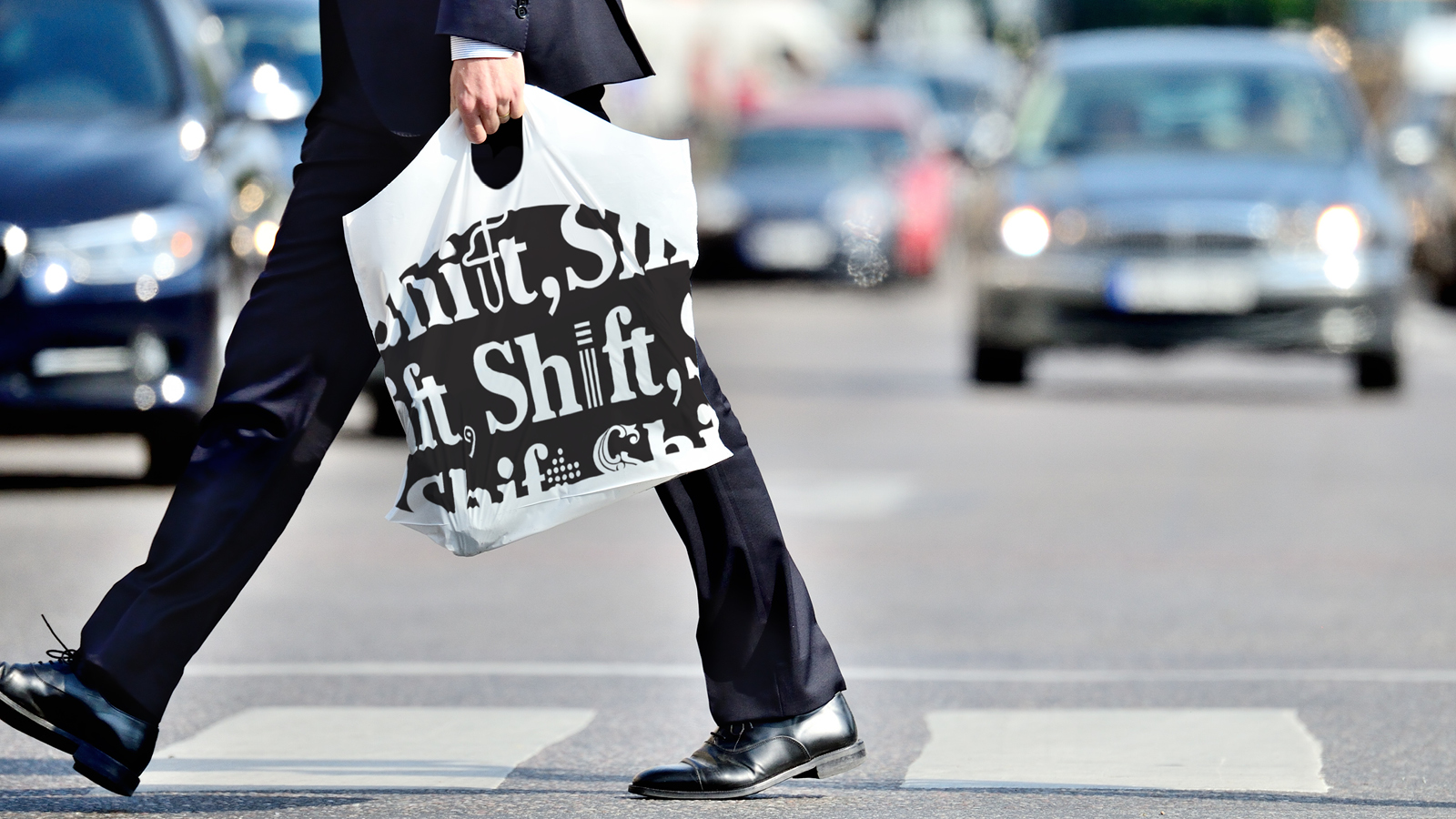
Shift’s menu rotates from day to day, giving chefs the chance to experiment with a range of different cuisines. The restaurant needed a brand that would reflect that constant evolution, while also creating an approachable, lunch-friendly aesthetic.
“I want [Shift] to be an incubator, essentially, for restaurants we’re opening in the future and different types of cuisine we want to try out and experiment with, whether it’s a new restaurant or our existing restaurants.”
– Dave Bailey, Owner at Baileys’ Restaurants in an interview with Feast
TOKY created an identity that “shifts” between traditional and experimental typefaces. The resulting look feels familiar, but with a touch of the unexpected.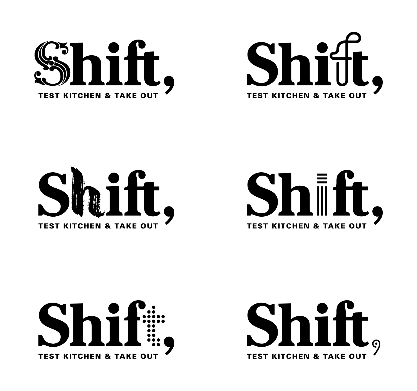
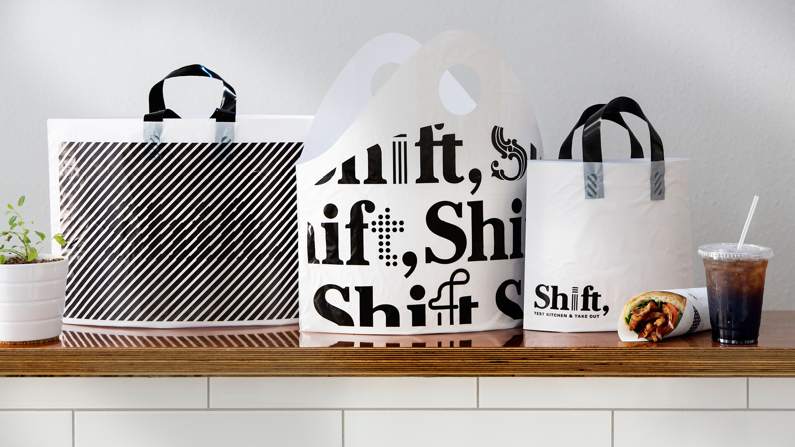
Shift marks TOKY’s seventh inclusion since Communication Arts Typography Annual’s inception in 2011. Past honorees include:
2011: Miles Davis Jazz Festival Identity
2012: Core of Discovery Identity
2014: Woody Guthrie Center Identity
2015: Le Chat Putain Identity, Mound City Brochures
2016: SWT Living Design
To see our Shift work in action, check out the always-rotating menu at 313 N. 11th Street in St. Louis.