Rebranding Midwest BankCentre
For more than a hundred years, Midwest BankCentre has guided St. Louisans through important financial decisions. From the young entrepreneur looking to start a business in Bevo, to the family preparing for homeownership in Meramec Bottom, or the established customer in Oakville wanting to protect her assets, Midwest BankCentre (MBC) branches have focused on building St. Louis communities one customer at a time.
In 2014, Midwest BankCentre announced an entrepreneurial move of its own: the acquisition of Southern Commercial Bank, another of the area’s oldest financial institutions. As two banks became one, MBC leadership seized the opportunity to reconsider the brand’s look and language.
“The merger in my mind was not so much about who Midwest was historically or what Southern was historically, but what we want to be going forward as a combined organization,” says MBC Chairman, President, and CEO Jim Watson. “It was the perfect time to question all of that and get some help in doing so.”
MBC selected TOKY to develop a new brand communications platform and identity system that would say something deeper about the bank’s purpose and personality. As Watson explains, the bank wanted to update its look and messaging “so that employees could rally around something new as we went out into the marketplace together.”
Fred Dyer, Regional President of Consumer Banking and Corporate Services at MBC, echoed that thought. “It was a great opportunity for us to do some soul searching and to really ask ourselves who we are as a bank. What do we want to communicate? What do we stand for?”
A New Way to Talk About Community Banking
TOKY kicked off the project with research, and a lot of it. Our team conducted interviews with the leaders of MBC and Southern Commercial to identify common strengths and goals between the two organizations. When TOKY’s strategists paired these findings with data from a broad customer survey, several themes came to the forefront: local focus, deeply personal financial partnership, and a commitment to personal service.
Our strategy team culled these themes into brand promises — pledges of performance to be used by the team that supports the MBC brand day in and day out, from senior leadership to tellers and mortgage brokers.
“The very first promise the bank makes to its customers is ‘St. Louis is home,’” says TOKY brand strategist Seán Collins. “Of course, for most banks, assets and decision makers are far away. Not so with Midwest BankCentre: the ownership is local, the investment is local. These are bankers who know the neighborhoods of our community and understand the challenges and the joys of doing business here. These folks are committed to the success of their neighbors.”
TOKY then developed the tagline — a single thought to accompany the new visual identity and articulate the core value of the bank. The new positioning theme — Rising Together™ — is a reference to the balloon icon, and also to the two banks coming together in a forward-thinking merger. Most importantly, though, it is a nod to the company’s renewed community focus. As Watson explains, “it represents our connection with the communities and the work we do every day through our banks to try to help improve people’s lives, businesses, and the communities in which we operate.”
The Balloon, Evolved
When it came to the company’s existing look, as Watson puts it, “not everyone was thrilled.” The hand-drawn balloon felt dated, and some described the mark as “amateurish” or “cartoonish.” Overall, the executive team agreed it was time to move on. “I thought it was important to move away from the balloon, but to retain a bit of it for the context of our roots,” says Watson.
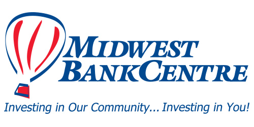
With that in mind, it was up to TOKY’s designers to find a new way to symbolize the balloon, without abandoning the equity tied to the existing mark. “Many organizations use the balloon,” says Geoff Story, creative director at TOKY. “We needed a way to make it ownable and modern.”
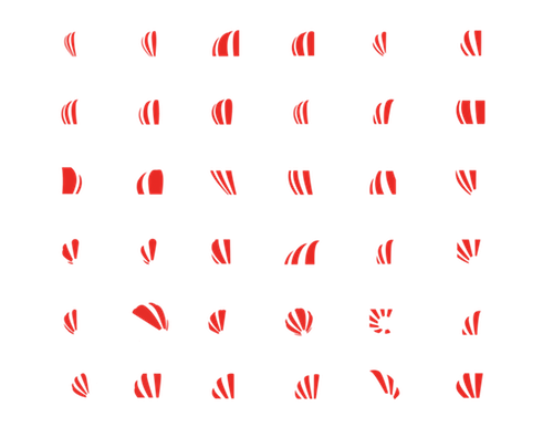
Throughout the creative process, the TOKY design team drew upwards of 75 balloon abstractions. “We gave them a number of options, ranging from similar to the existing balloon, to drastically different,” says Laura McCarthy, account manager at TOKY.
The recommended design, as TOKY designer Kelcey Towell explains, was “a literal crop of the balloon. It stays true to that shape and implies a rising — something you might see at a balloon race as the balloons crest over the trees. It works perfectly on large scale signs and tiny, on smartphone screens. It also speaks to the new tagline, and to the bank’s new beginning.”
Dyer describes his team’s selection as another way to bring new life to an organization that is more than 100 years old. “If we’re making a bold step with the bank — which we are — let’s make a bold step with the brand,” he says. “It has a much more professional look and gives us flexibility.”
While the abstracted look doesn’t scream “balloon,” it does retain a subtle reference to its predecessor. Customers and employees can see the full balloon-to-abstraction transition in the animated video below, which loops throughout the day in the lobby of MBC’s headquarters.
Legible, Modern Type
Exaggerated serifs made the existing typeface hard to read from near and far, so TOKY’s next challenge was to find lettering that was both readable and modern.
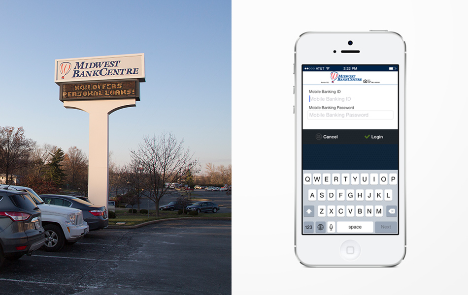
After experimenting with close to 50 typeface options, TOKY’s design team settled on a contemporary sans serif that is legible on both the app and billboards. The solution is clean, simple, modern, and highly functional.
Regional Signage
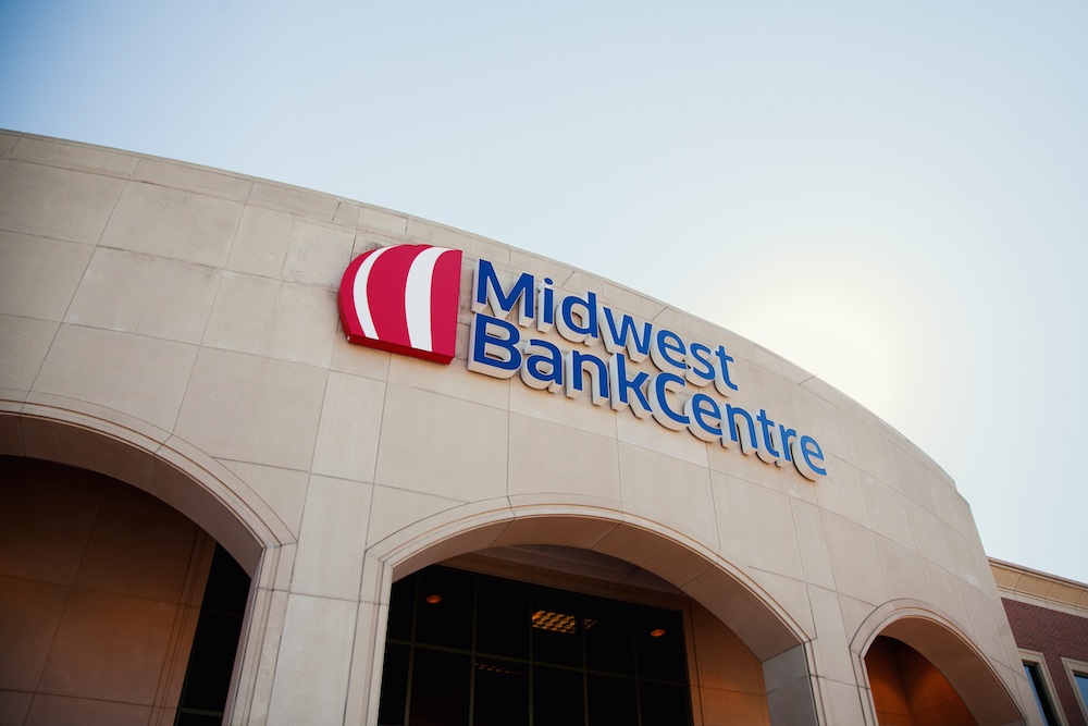
With seven existing Midwest BankCentre branches and nine Southern Commercial buildings scattered throughout the region, the rebrand presented a diverse range of signage challenges. The new logo would need to be clearly visible on pillars, light boxes, awnings, and raised letter signage from a distance and at any time of day.
We sent one of TOKY’s in-house photographers out into the field to collect photos of the existing materials, then assessed the bank’s real-world requirements.
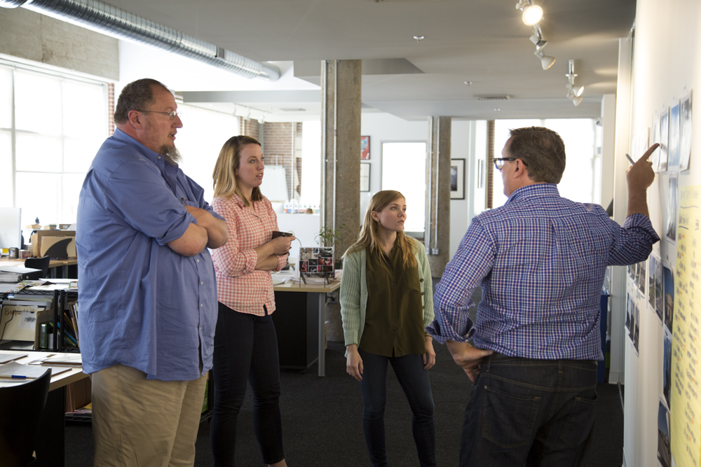
With our recommendations, MBC invested in new signage to ensure prime visibility from all angles and at all hours.
Bringing in the Team
Before officially revealing the new identity to the public, MBC’s leadership “took the show on the road” to share the transition with employees at branches across the region. “We brought information about our rebrand and refreshed logo and lettering,” Watson says of the branch meetings. “We talked about our three pillars of service, the customer promise, and the long-term corporate mission. That really tied it all together.”
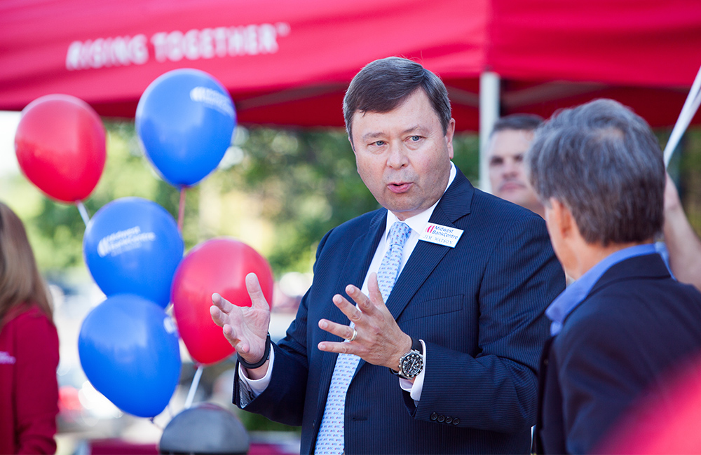
“When we went out to the team, we felt so passionate about this that people came away going, ‘I get it, I understand.’ It was fun and it told the story of us coming together as one bank,” Dyer adds.
Along with the new language, the executive team brought plenty of branded materials including pens, scarves, and shirts. “Before the merger, we were never a big logo-wear bank,” Dyer says. “Now, we’re seeing people wear them all over the place. There’s a new buy-in from the team that you can actually see.”
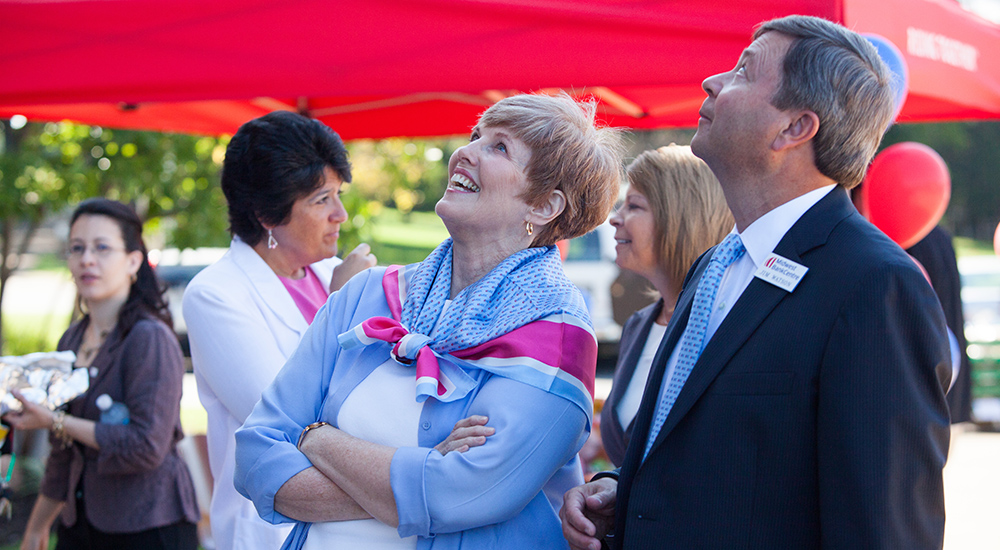
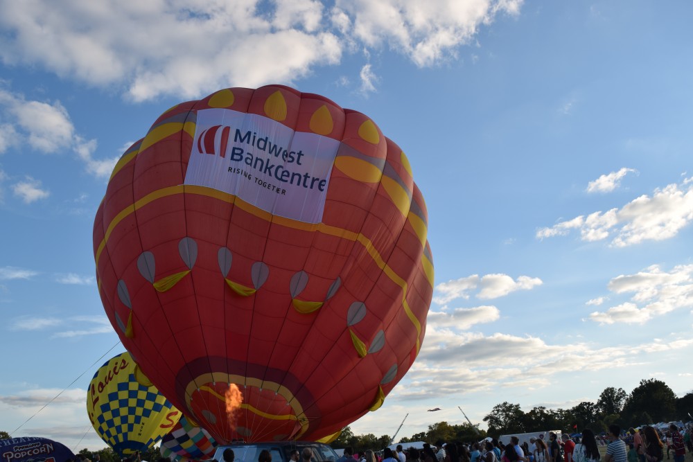
Keep your eyes peeled for the new Midwest BankCentre look around St. Louis — the signs and billboards are up, and the logo made an appearance at this year’s Forest Park Balloon Glow. Congratulations to our clients on rising to new heights!
