An Interactive Look at Mid-America Transplant Service’s “Lifesaving Innovations”

In late 2014, we stopped by the offices of our longtime clients at Mid-America Transplant Services. It was once again time to get the ball rolling on the organization’s annual report — but this year, they wanted something different.
The CEO envisioned a clinical piece that would speak not only to registered donors and donor families but directly to MTS’s partners in the medical community. Meanwhile, the organization’s marketing department aspired to produce an evergreen piece that would break the traditional annual report mold, trading PDFs and bare-bones statistics for interactive storytelling. They pictured a site that seamlessly incorporated video, photography, statistics, infographics, and staff and partner insights in an interesting, visual layout.
In terms of messaging, past MTS annual reports focused on transplant recipients — the heartwarming stories of lives touched by the generosity of donors and donor families. While these stories would continue to play a vital role in 2014’s report, this year the organization wanted to lead with stories of innovation, giving a behind-the-scenes look at the programs and processes that touch so many lives.
Building a Concept
The client wanted the site to launch in early 2015, and with the 2014 holiday season quickly approaching, the timing was already tight. Back at the office, our team regrouped for an initial round of brainstorming. What format would this report take? How could we bind these seemingly unrelated stories together with a common theme?
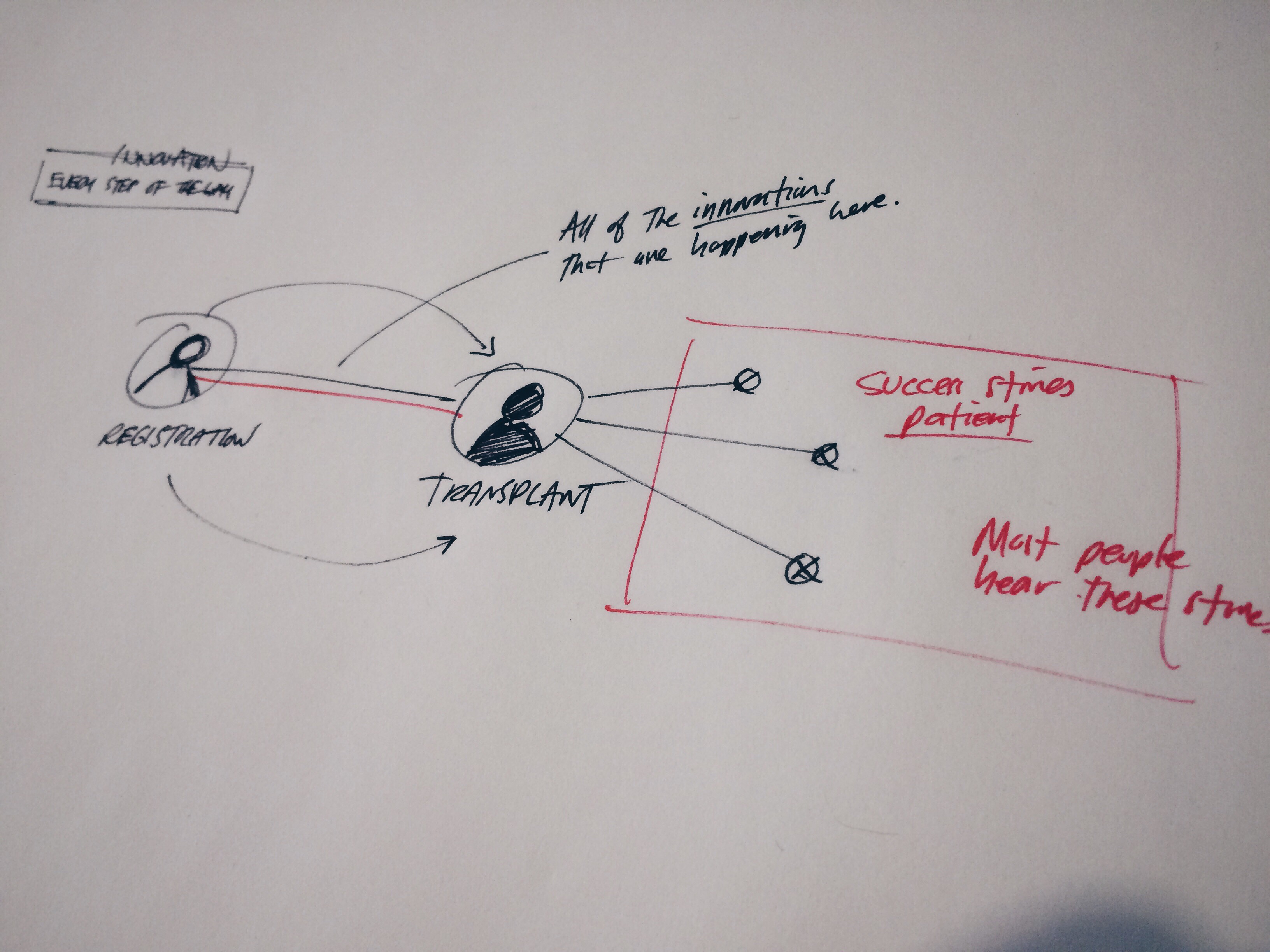
Time and again, we circled back to the mysterious middle ground that lies between donor registration and organ and tissue transplant. To the general public and even medical partners, the bulk of the organ and tissue donation process — what goes on within the four walls of MTS — is completely unfamiliar. The annual report presented the opportunity to shine a much-needed light on this important work.
An Interactive Introduction
With that in mind, we developed the concept for an interactive infographic that would introduce MTS’s work. We envisioned a timeline illustrating the full process of organ and tissue donation, from donor registration to referral, lab work, organ and tissue recovery, and finally transplant. Each step would include a quick text and image-based explanation of all the complex bits and pieces that make donation and transplantation a reality.

Story Pages
To highlight the organization’s 2014-specific innovations, we created three dedicated story pages, each of which would take a deep dive into one of the three topics identified by MTS. Content was as-of-yet undeveloped, but we knew these story pages would incorporate video, photography, text, and data.
By the Numbers Page
To illustrate the impact of these innovations, and to satisfy the needs of our left-brained audiences, we added a “By the Numbers” page, to spell out the quantified results of MTS’s 2014 innovations. This page would take a data-based approach, reminiscent of the traditional annual report.
This initial content outline — an interactive introduction, three story pages, and a by the numbers page — evolved into a final sitemap for the annual report microsite.
Crafting the Content
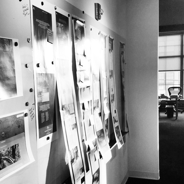
While we typically like to start the design process with content in hand, the tight timeline for this project meant that copywriting and design would need to happen in tandem. Once the site’s skeleton was in place, we started fleshing out what the site would look like from a storytelling perspective.
Our content strategist used client-supplied assets, including spreadsheets, PowerPoint presentations, and existing videos and photos to build rough outlines for three separate innovation stories:
Onsite Organ Recovery + Lab: Examining how MTS delivers a higher quality and quantity of organ and tissue donations using an innovative approach to donor management
Medical Examiner Referral System: Covering the high tech medical examiner reporting system that allows MTS to field previously untapped donor referrals
DMV Operation + Donor Registration: Explaining how MTS registers more donors as the owner and operator of three local license offices
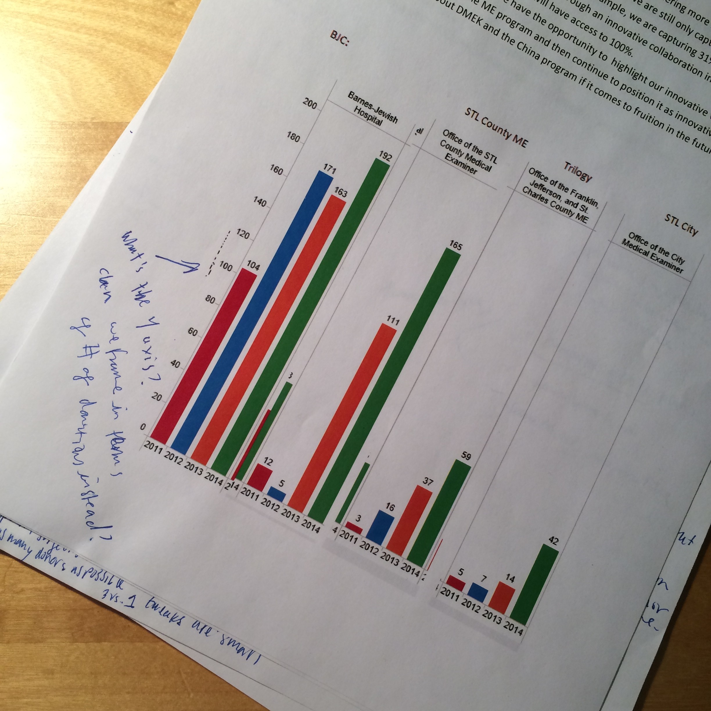
To support each story with data and details, we headed back to MTS’s offices to interview subject matter experts, including the organization’s Director of Organ Procurement, Director of Laboratory Services, Director of Eye Bank Operations, and Director of Human Resources and DMV Operations.
One of the primary copywriting challenges was explaining these very technical innovations in a way that anyone could understand. Because this report was intended for both medical partners and the general community, we needed to strike a careful balance between technical and non-technical language. Industry terms, such as “critical care medicine” proved important, but we also needed to include a quick explanation of the concept for audiences who might be unfamiliar with this terminology.
Designing the Site
As the stories developed, our content strategist and designers worked together to transform the narrative into a layout that could incorporate video, images, and quick hits of data. At this point, content was still a work in progress, so in a sense, we were designing for a moving target.
In terms of design, the site needed to feel on-brand, but we also wanted to introduce subtle evolutions that fit the tone of this innovation-focused special report. We made subtle tweaks to the typography and the ways that images are used, but overall we stayed true to the brand.
The connecting lines graphic that overlays the image on the Home Page (pictured below) ties into the interactive infographic on the “Innovation Every Step of the Way” page. The graphic illustrates how MTS’s entire process is connected and reveals points along the way that many people are unaware of.
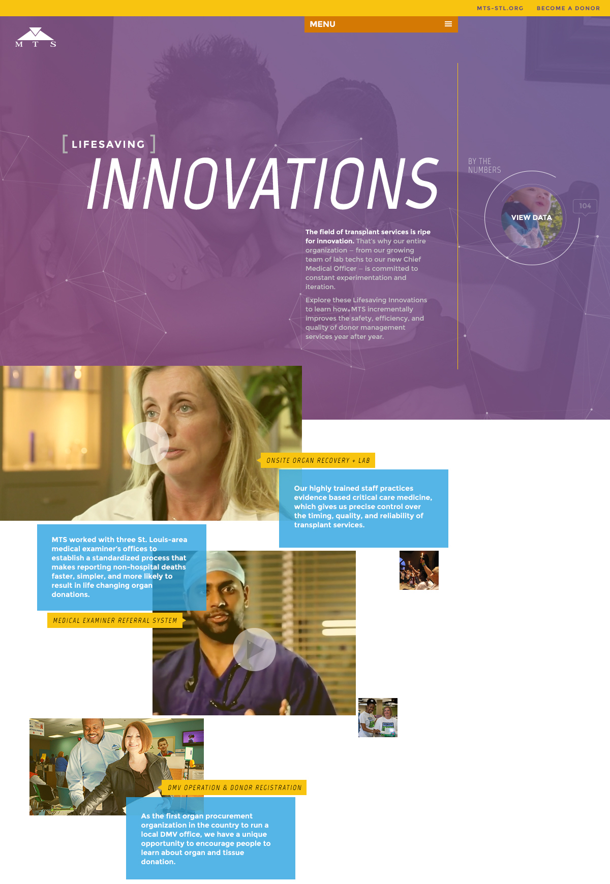
The site needed to feel innovative from a usability perspective, too. We focused on delivering a site that would be quick to respond, easy to use, viewable on any device, and easily scannable.
Adding Video and Photography
From the beginning, one of the primary goals of this project was to visually show MTS’s process, rather than just describing the steps with large blocks of text.
Onsite Organ Recovery Still Shoot
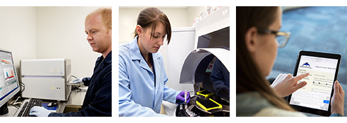
We planned a still photography shoot to provide a behind-the-scenes look at MTS’s onsite recovery facility, including the operation room, laboratory, and Eye Bank.
DMV Story Video Shoot
DMVs have a rather mundane reputation, so we jumped at the opportunity to liven up this story with a video highlighting the friendly service, clean facilities, and technology-based efficiencies found at MTS-owned DMVs. We developed a script that showed the experience from a customer’s point of view, and our team headed to the Northside DMV for a day-long shoot to capture the visual details.
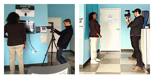
The result was a quick video that documents a trip to the DMV — not only as a more pleasant customer experience but as an opportunity to save a life by registering to become an organ and tissue donor.
Medical Examiner Referral Story Video Interview
The medical examiner referral story is packed with details about what it took to exponentially boost referrals from coroner’s offices, but what this story needed was a bridge back to what matters at the end of the day: the transplant recipients. To capture that insight firsthand, we interviewed Dr. Sean Edelstein, a cornea transplant surgeon who witnesses the benefits of this program on a daily basis.
Launching Lifesaving Innovations
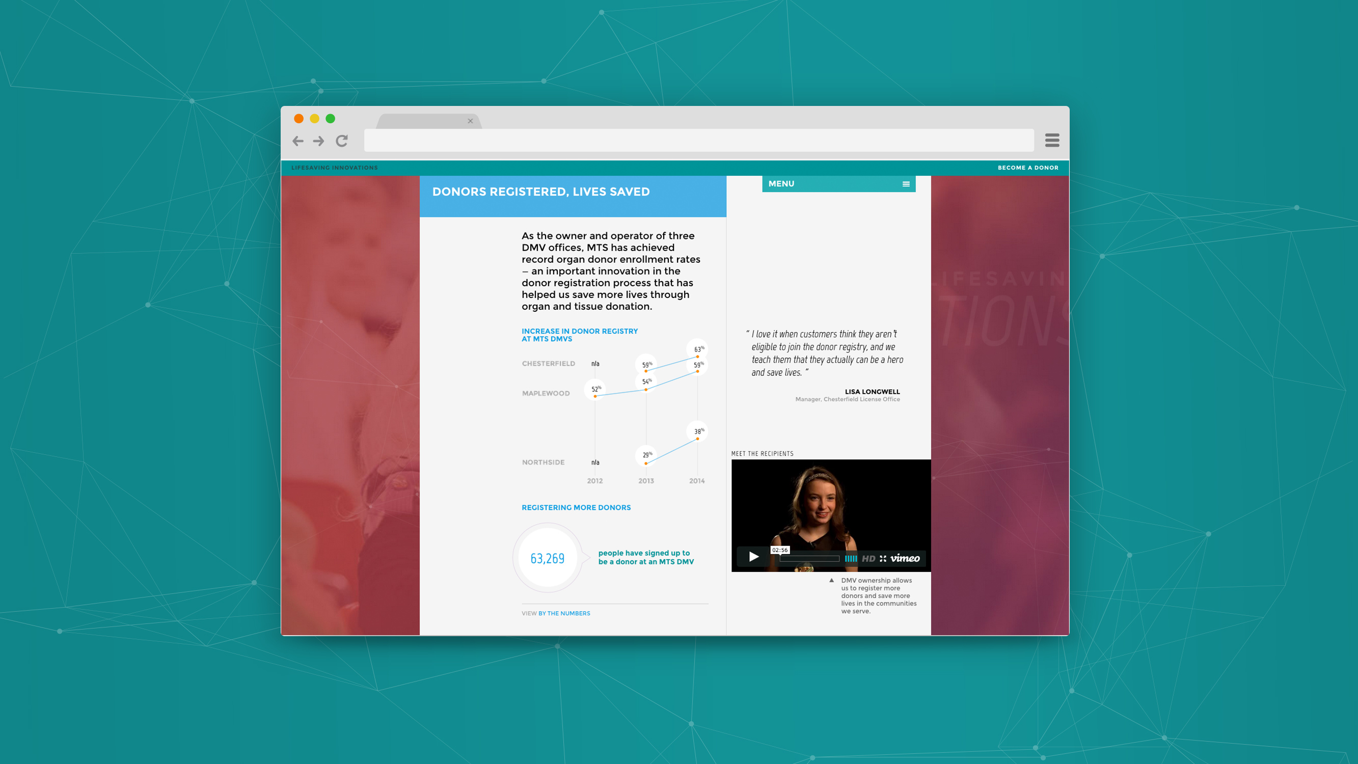
With content, design, photography, and development work complete, we launched MTS’s Lifesaving Innovations in February of 2015.

Promoting the Site
With the site built and ready for action, the client needed a way to get this report in front of the intended audiences. We wrote, designed, and developed two email templates to announce the microsite launch — one for the medical partners, and one for MTS volunteers, supporters, and donor families.

Congratulations to the team at MTS on the launch of Lifesaving Innovations! Explore the site to learn more about their important and innovative work in the field of organ and tissue donation.