Driving Recruitment on the New Christner Architects Site

Several years back we had the pleasure of working with the great team at Christner Architects. We were deeply engaged in all aspects of developing their brand messaging, identity, and all the necessary rollouts of print collateral and the website.
The site was a great tool for them at the time, but as they continued to evolve as a company – and as web browsers evolved – it became time to rethink how they were presenting themselves and their work online.
We had the advantage of knowing the team well and working with many of the same people who were involved in the previous launch. After a couple of discovery meetings, we presented a new direction for christnerinc.com, building on the brand we established many years ago.
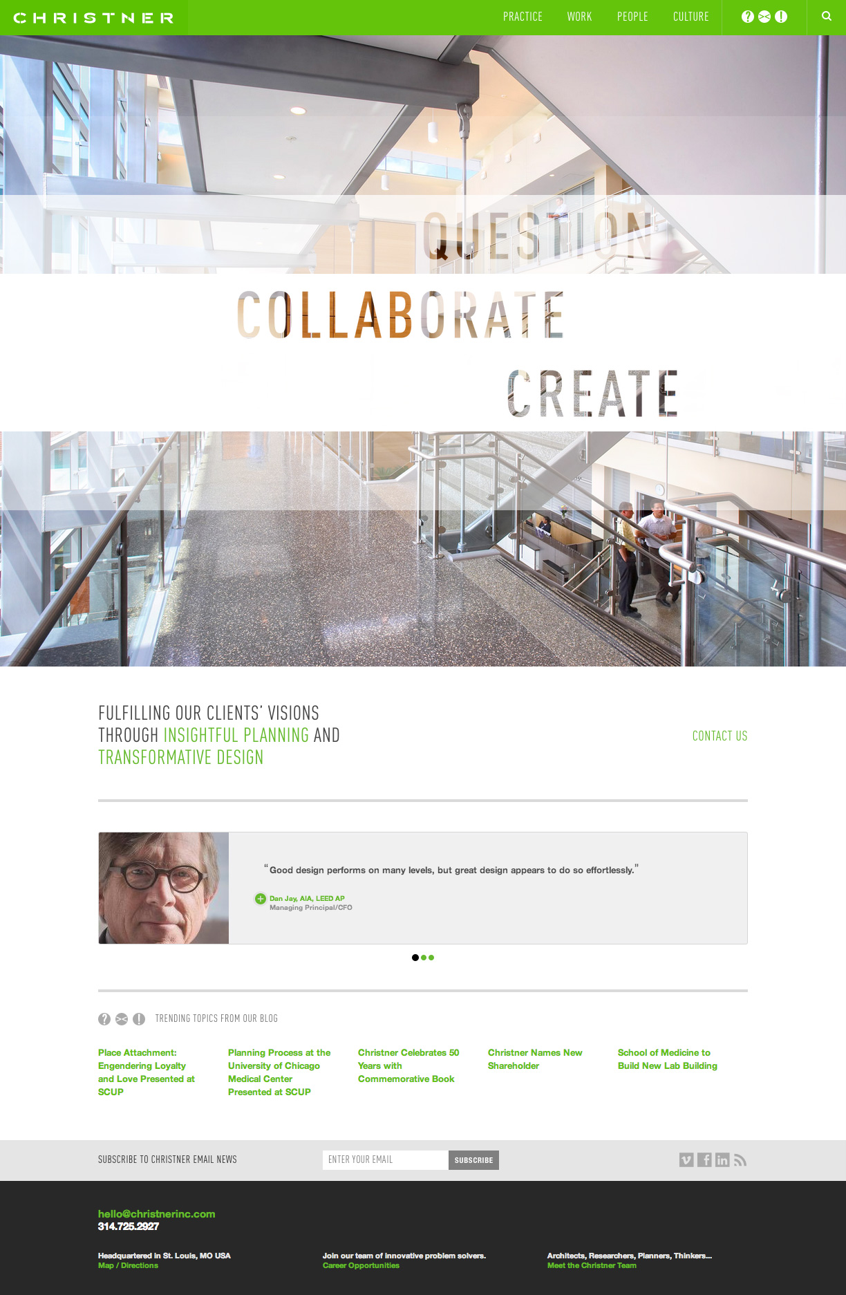
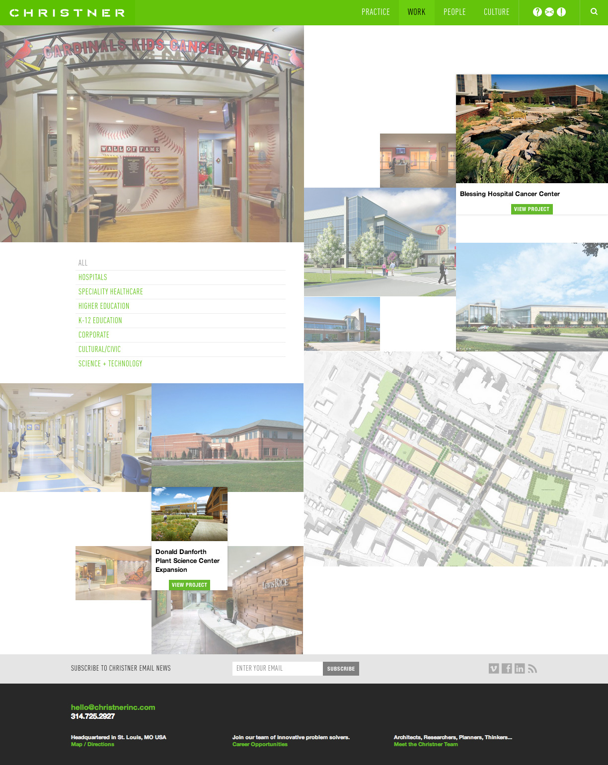
One of the most noticeable differences in the new site is a drastic enlargement of images. The home page starts by reinforcing their “QUESTION. COLLABORATE. CREATE.” messaging, then presents full-screen images in an area that is built to accommodate forthcoming time-lapse videos of people interacting with the spaces they create.
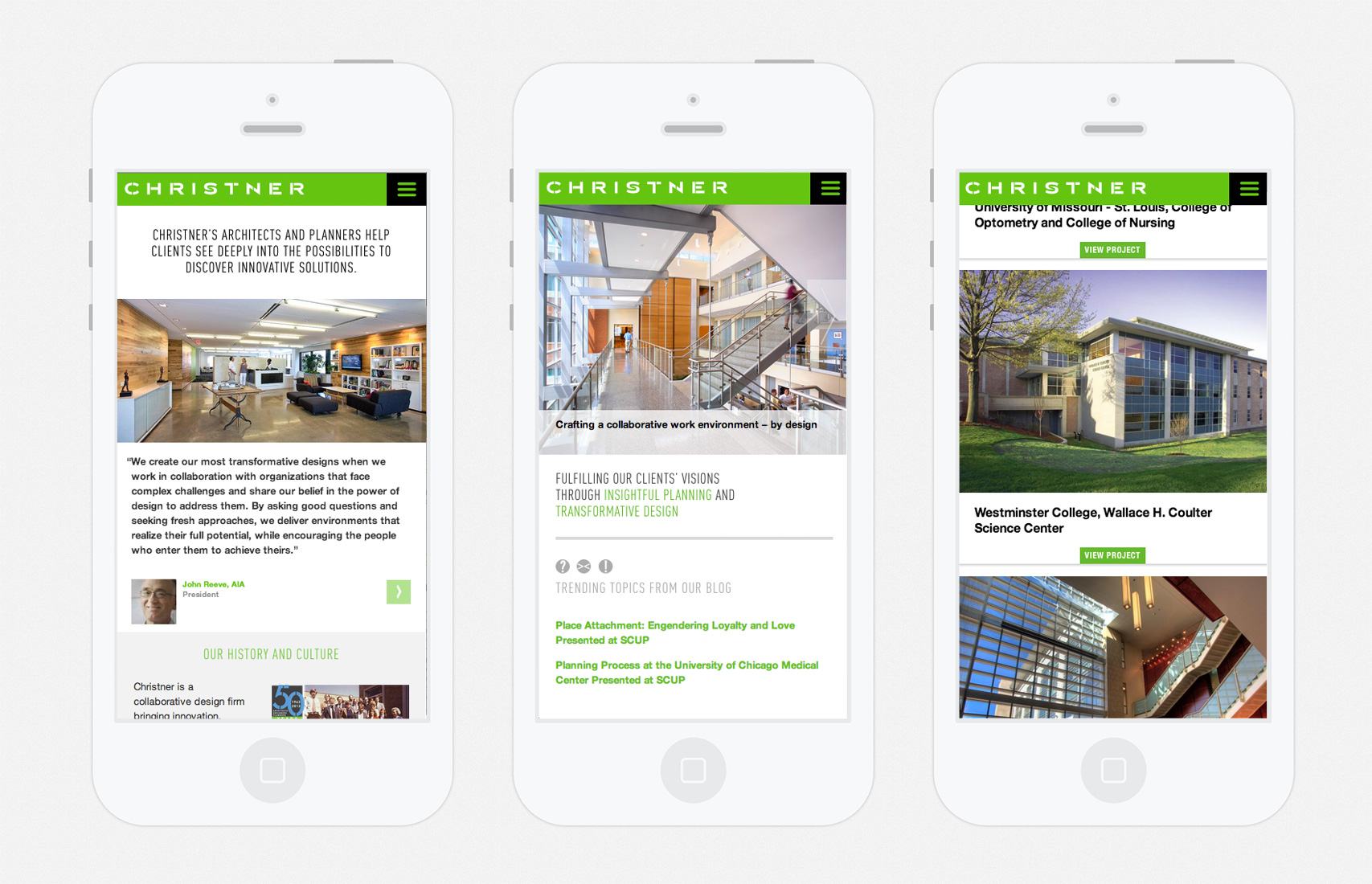
The site is now fully responsive, with specific content that works on any screen size. We also made a variety of subtle user interface improvements throughout the site.
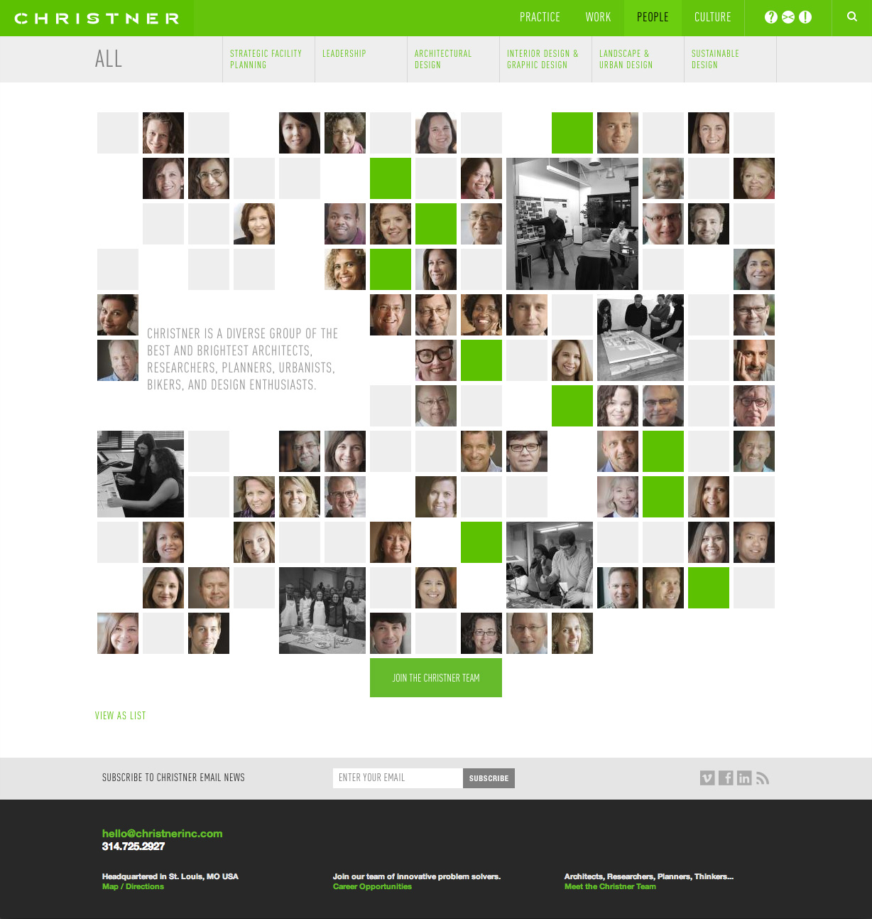
The people section — one of the more popular pages from the old site — was updated to accommodate more bios, more images, and more interactivity. This section now offers a much better glimpse of who they are, how they think, and how they work together. We know how important it is for clients to learn about the team they will be working with — and the new Christner site does just that.


