Corgan Rebrand
Overview
Corgan — ranked the 7th largest architectural firm by ENR — tasked TOKY to take an in-depth look at the business and develop a visionary strategy for growth across the enterprise. This engagement led to foundational changes that will impact the firm well into the future.


A Studio-First Approach
Experience told us that a top-down brand strategy for a firm of Corgan’s size and structure would fail. Instead we took a studio-first approach based on Corgan’s distinct areas of practice. This would ensure an integrated suite of brand messages, crafted with each market segment’s audience in mind.
Brand Platform
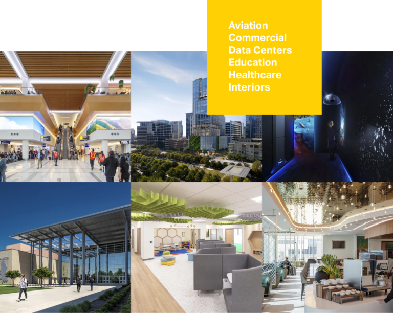
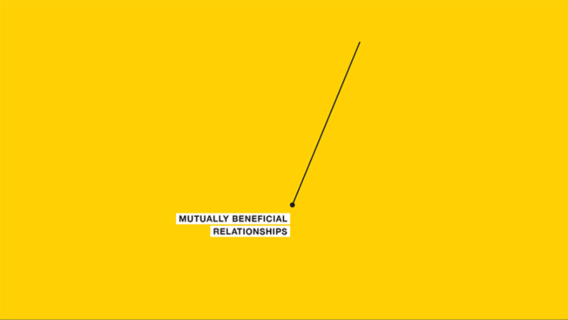
The developed messaging platform is designed to serve all Corgan’s market sectors — Aviation, Data Centers, Interiors, Commercial, Education, Healthcare — and the Corgan enterprise itself.
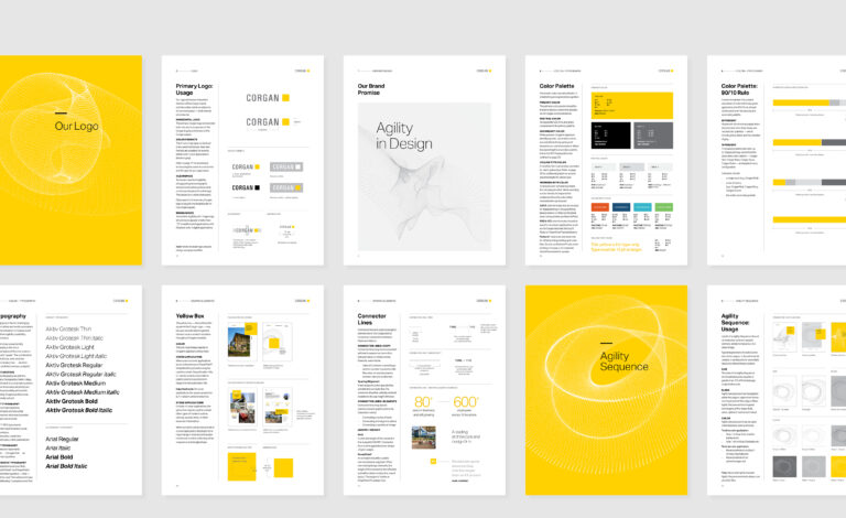
A Subtle Evolution
Corgan’s identity was well-established with measurable equity. TOKY modified the proportions and letterspacing to achieve maximum legibility across all media — from mobile to signage — and modified the Corgan yellow to convey more confidence and energy.
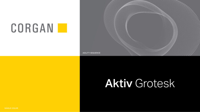
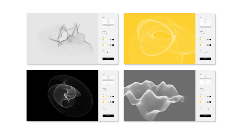
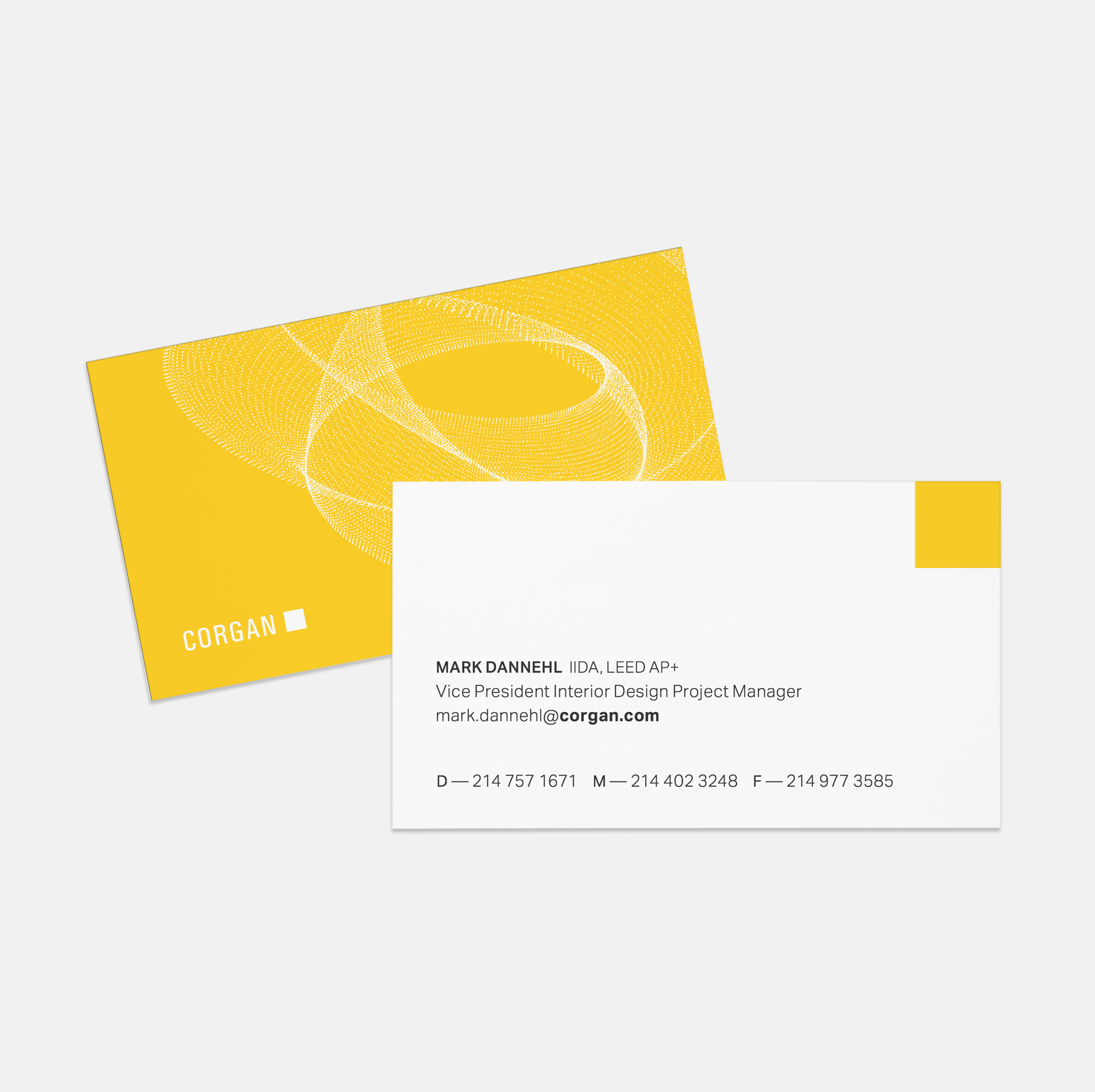
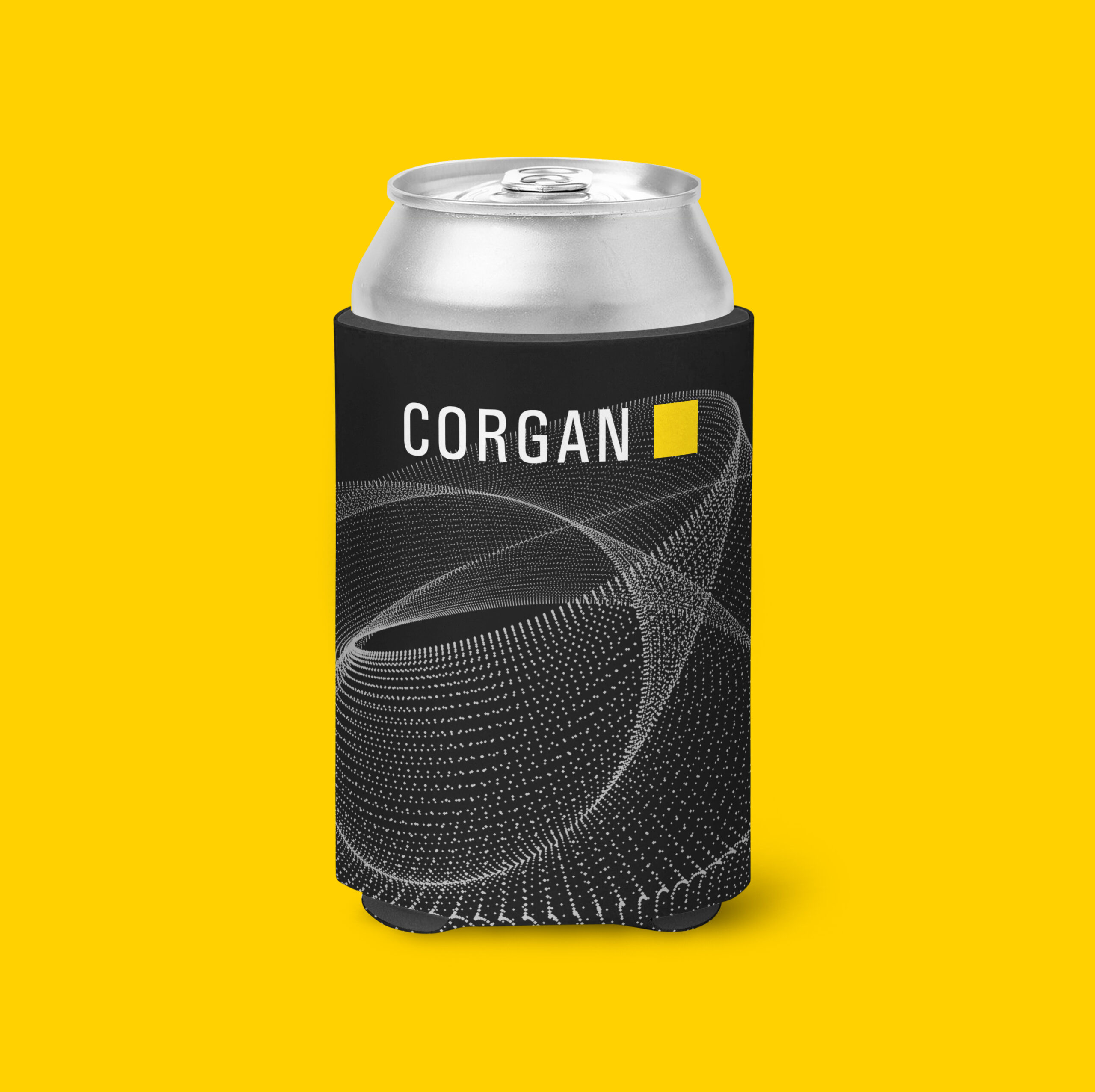
Agility Sequence Animation
In contrast to its inert, passive square logo, Corgan is always innovating, always agile in the face of change. To bring this sense of movement to the brand — we burst the square logo open into a series of complex geometric forms that move unexpectedly, like a murmuration. At the end of an animated sequence, these particles return to the familiar yellow square.
The “Agility Sequence” Generator
A custom rendering engine was created to offer endless variations of the “agility sequence” visual. These complex graphics appear on everything from printed business cards, to animation, to VR headsets.
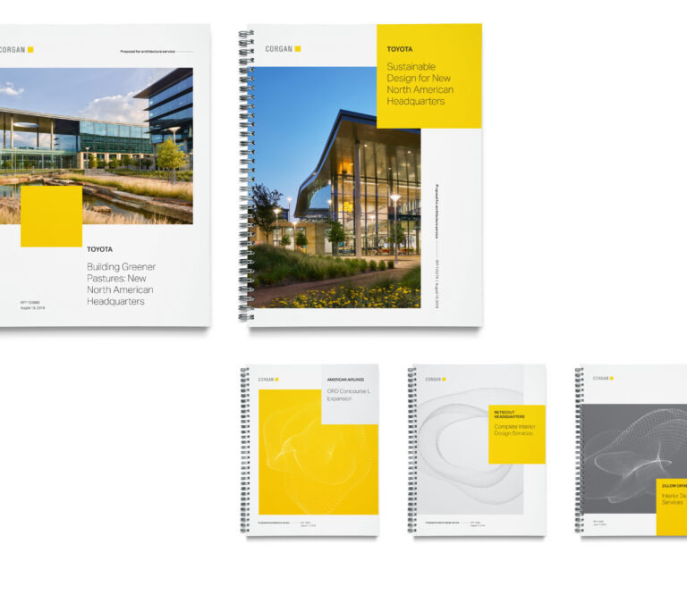
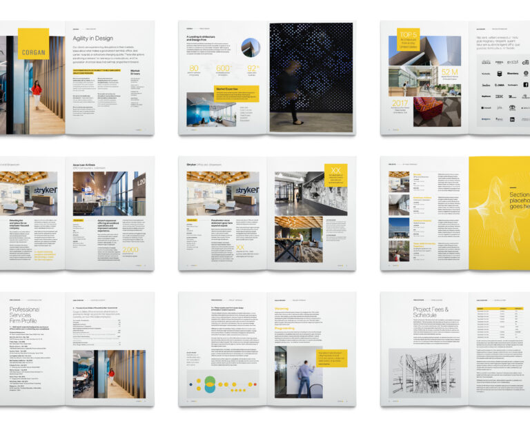
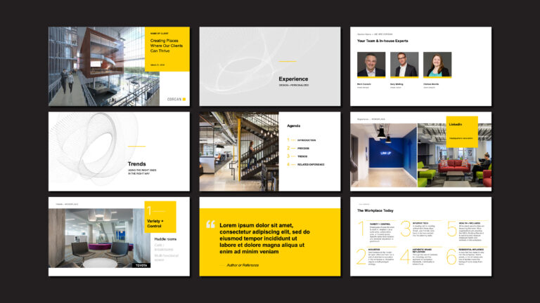
A Flexible System
A series of proposal templates were designed with flexibility in mind. Materials were conceived to be tailored based on audience — whether that’s a fast-paced startup, or an established Fortune 500. Beyond proposal templates, the design strategy for all brand touch points was guided by simplicity, flexibility, and ease of use.

Feedback
Corgan’s brand refresh not only feels like an authentic expression of who we are, but positions us for what’s next. TOKY made the process fun and easy — and they gained such a strong understanding of who we are that they became an extension of our Marketing team!
Services
Brand Strategy
Brand Identity Refinement
Visual Brand Language
Brand Guidelines
Market Positioning
Business Consulting
Content Strategy
Copywriting