Introducing PGAL’s New Brand and Website
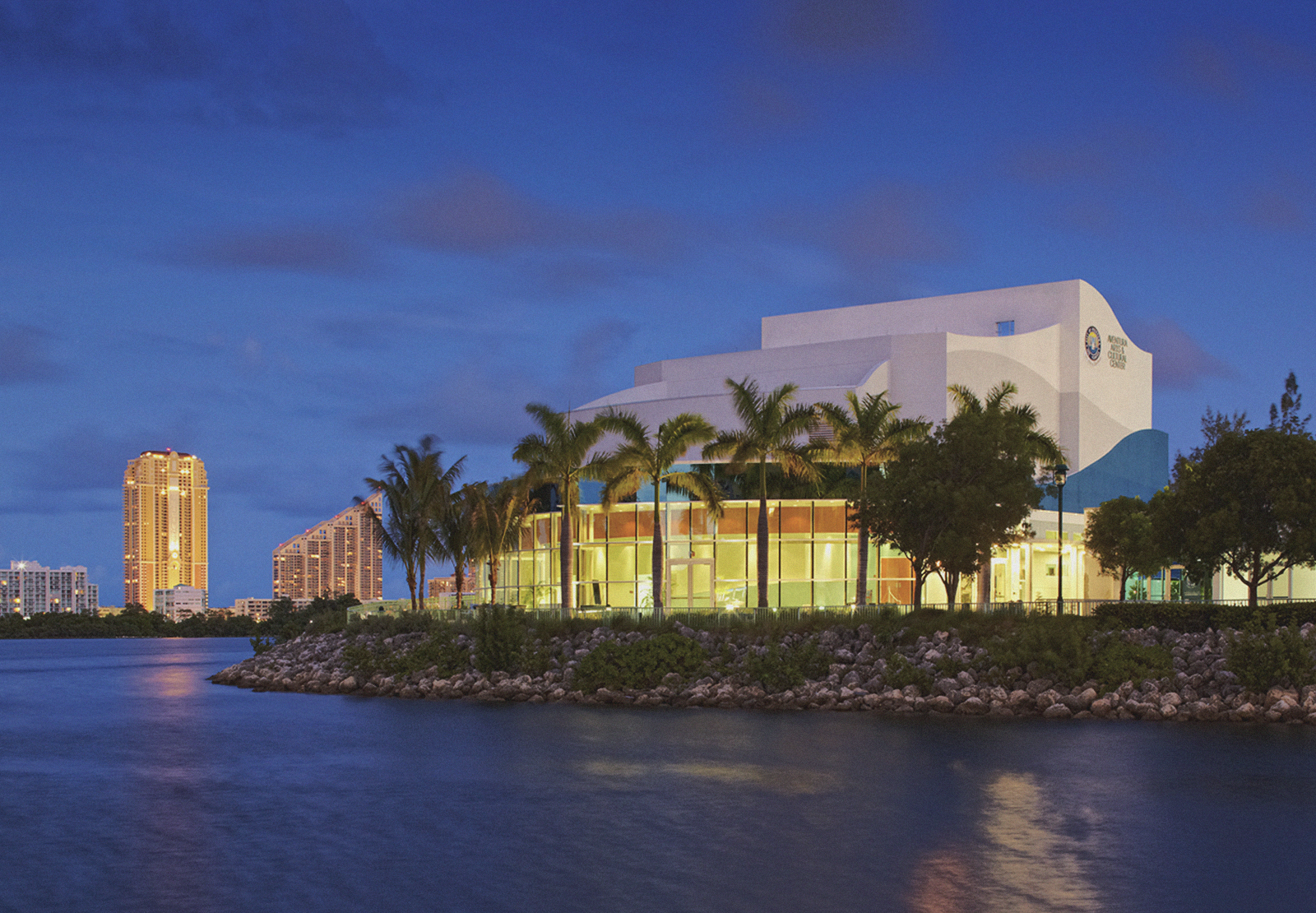
PGAL is an international design firm specializing in architecture, interiors, engineering, and planning. Over the past several months, TOKY has been busy collaborating with PGAL’s marketing and executive team on a comprehensive rebrand.
The growing firm needed an identity and website that would better represent who they are today, after 70 years of award-winning work for a diverse range of public and private sector clients. As Veronica Enders, Senior Associate at PGAL, explains, the rebrand was a long time coming. “We’ve long been faced with challenges in conveying a unified and consistent brand across 11 office locations, each of which provides a unique architectural service offering to varied clients.”
The rebranding project began with in-depth qualitative research, then continued on to logo refinements, marketing materials, and a redesigned website that brings the new look and work to life.
Logo Redesign
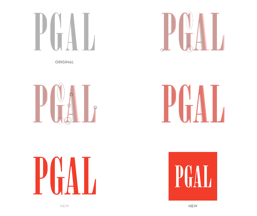
After conducting competitive analysis, review of current brand assets, best practices recommendations, and interviews with the firm’s leadership, we began refining PGAL’s identity. Despite its strong brand equity, the mark presented a few issues. The condensed font could be hard to read in small sizes, and the thin strokes were hard to reproduce, especially on mobile devices and in small full-color printing applications. There was also some perception that the look was dated or old fashioned.
Early on, we determined that the identity needed to be updated without sacrificing the existing brand equity. We reworked the letterforms and added a container, making the logo legible across a broad range of applications.
Signature Style & Business Papers
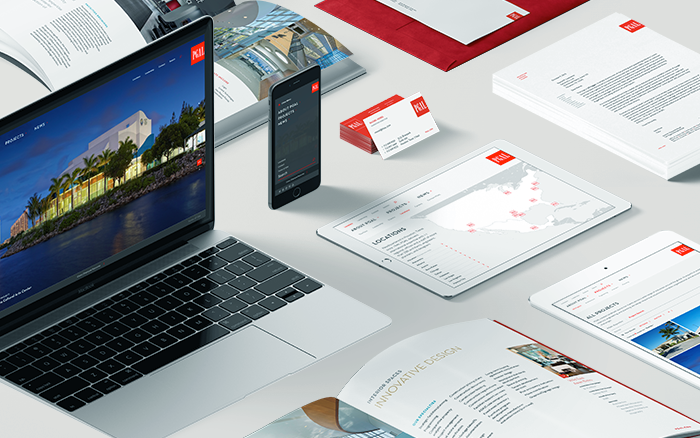
“Much of our existing marketing collateral was dated and conservative in design, while newer graphic pieces had a lighter, contemporary aesthetic,” Enders explains. “The combination of these various marketing materials generated mixed messages and a sort of disconnect between our locations and markets.”
To create a unified look and feel across offices, we designed a full business suite for PGAL, including business cards, letterheads, and various corporate marketing materials.
Website
Last but not least, we took the new brand online in a fully redesigned, responsive website. Early on in our deep Discovery process, we uncovered a few key goals:
- Give priority to the work with large images
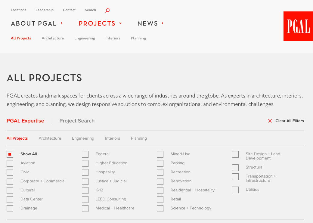
- Give visitors an intuitive way to quickly find the project they’re looking for
- Create a site that’s accessible (and easy to read) from any device
We accomplished this, first and foremost, with big, beautiful images on the Home page and individual Project pages, where we let the user interface and subtle animations take a back seat to the work. “This use of beautiful, large imagery . . . translates seamlessly from our website and carries through to our newly branded brochures and other marketing materials,” says Enders.
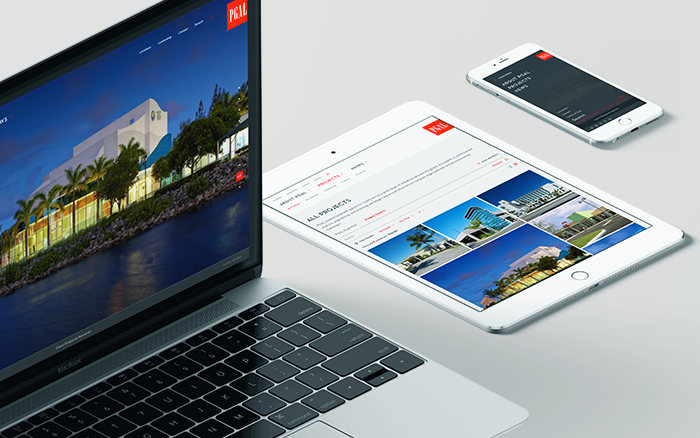
We also paid close attention to the ways that users can explore PGAL’s projects, whether casually browsing or through a targeted search. On the old site, the user was forced to select a category before seeing any work at all. The new site lets users jump right in and explore all projects, and from there, narrow down their exploration using filters or project search.
The site is now officially live at pgal.com. Congrats to our friends and clients at PGAL on the big launch. And thanks for the kinds words:
“The TOKY team — from start to finish — has proven to not only be incredibly knowledgeable and creative, but a true partner throughout our journey. I have not only created some amazing professional relationships throughout this process, but friendships as well. Their patience and ability to listen and incorporate our vision and goals is what made our rebrand a success.”
/ Rachel Morel, Marketing Director at PGAL