New Work: Introducing Caravus
In early December 2011, TOKY began working with SEBS Midwest, a full-service employee-benefits firm with the full name Strategic Employee Benefit Services. The SEBS team — led by Paul E. Flotken, J.J. Flotken, and Sandy Gartland — had decades of experience in the industry, respect and trust from their clients, and a smart and team-oriented staff. But they needed a complete brand overhaul, as they prepared to transition away from the Northwestern Mutual benefits group and operate fully on their own.
In just three months, TOKY crafted an entirely new brand — new name, new graphic identity system — and delivered a suite of business papers and a custom, modern website that’s just gone live. Before we get there, though, let’s go back to the beginning…
Review of Brand Assets and Competitive Review
As with all branding projects, TOKY began this one with a thorough review of SEBS’ existing brand identity materials, from business papers and brochures to website and e-newsletter. Our strategists also spent a few weeks undertaking a competitive review and analysis, examining the branding and messaging of several companies in this space. The result was a 20-page report exploring how nearly 10 regional and national competitors position themselves within the benefits industry.
Discovery Interviews and Competitive Analysis
Concurrently, TOKY strategists held a series of “discovery” meetings and conversations with SEBS leadership, additional SEBS team members, and their clients. Our report on this phase included a great deal of valuable information about what SEBS values (transparency, clarity, attentiveness), how they carry and present themselves (with a kind of robust positivity), what inspires them, how they work and think, and ultimately how their clients view their firm and offerings.
Naming & Identity
This whole project was fun, but this part was especially fun. After significant work here at TOKY HQ, we regrouped with the SEBS leadership and presented three dozen names for the new firm, along with rationales behind them. There were some standout winners right away — which the SEBS team spent another few days considering.
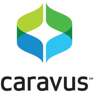
In the end, there was one all-hands-in-the-air, everyone’s-pumped decision: Caravus. It’s a name everyone felt well represented how much personal passion the company has for assisting, protecting, and taking care of their clients’ benefit needs.
Design work followed immediately, with some more difficult decisions. As these things go, eight designs were winnowed down to four, which were winnowed down to two …. and then one:
We all shared enthusiasm for the design’s stylized “C” letters, the levels of transparency (a Caravus tenet), and the visual nod to hands in the act of caring for what’s between them.
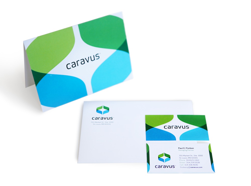
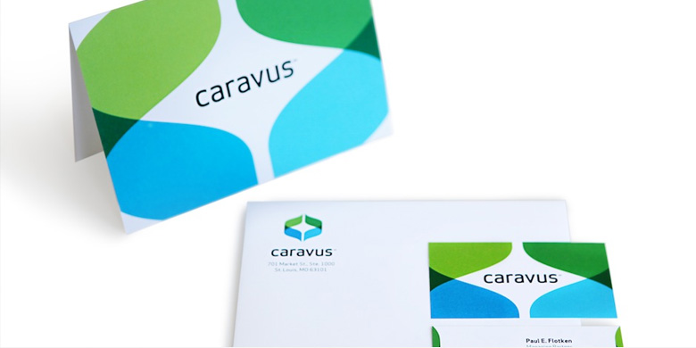
Business Suite Papers
TOKY’s design team immediately began creating a Business Papers Suite, crafting note cards, business cards, letterhead, and a presentation folder. Although by this point the core logo was locked down, the Caravus team still had the very pleasant challenge of choosing the exact treatment from the options we presented. As Managing Partner Paul Flotken eyed two options for the Business Papers Suite, he told us, “I love the logo so much, this is like having to decide between your children!”
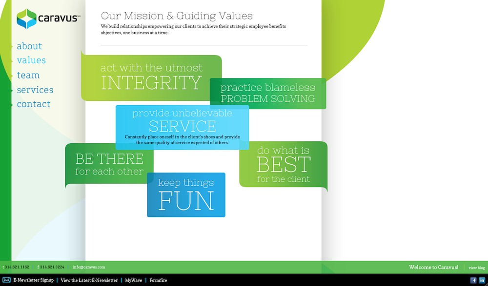
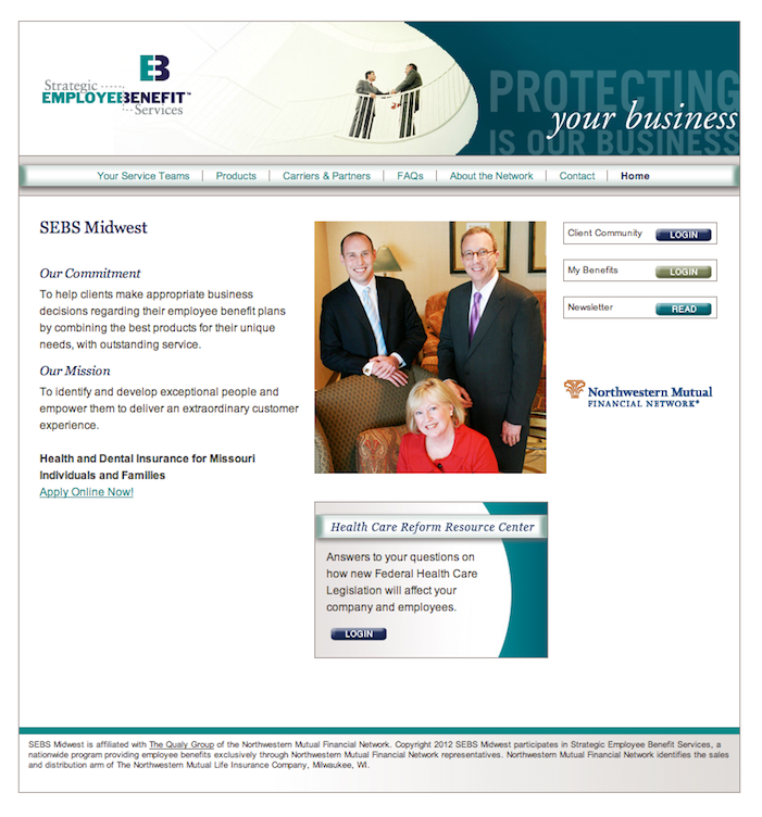
Website
The Caravus team’s attraction to the bright, clean design carried through to the website, which offers a vibrant color scheme, strong and legible type, and an upbeat personality. The home page messaging (second image below) has an interactive touch, with visitors on any device being able to click through to read a series of key Caravus promises.
Conclusion & Client Response
The SEBS → Caravus rebrand project was on an extraordinarily tight timeline, but the energy, excitement, and engagement of the Caravus team softened whatever scheduling nerves we might have had and helped create work our whole team is proud of. Company Partner J.J. Flotken, with whom we worked every step of the way, recently offered his own words about the three-month project:
It is awfully ironic that the TOKY team created the name and brand “Caravus” for us, when in the end, they proved that the name suits their organization just as well. We truly feel that TOKY did in fact take care of us — skillfully guiding us through what could have been a complex and challenging process. It was clearly evident in our Discovery Phase, as we digested TOKY’s breadth of work, that our final result would be thoughtful, sophisticated, and on-target. Even so, we failed to recognize at that early point just how easy they would make the process. I can honestly say that every person we worked with at TOKY brought a strong, unique skill set and, most importantly, a passion for what they do: Create. Thank you, TOKY, for making us cool!
Thanks to J.J., Paul, Sandy, and the entire Caravus team! We’re delighted to witness firsthand your enthusiasm for the new brand — it’s palpable — as you introduce your new self to the world.