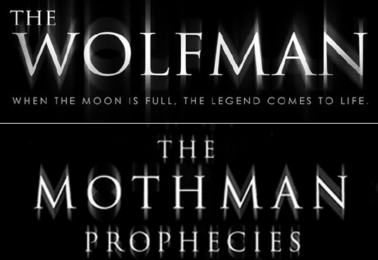
Trajan Must Die

Some people collect figurines. Some collect bottle caps, or baseball cards. We collect movie titles using the typeface Trajan. And there’s a whole lot to collect.
What is it about this one typeface that makes it so ubiquitous in Hollywood? It gets sliced, diced, shattered, drop shadowed, dimensionalized, metallicized, extended, extruded, and lit from behind with holy light, but it’s still just Trajan, over and over and over. Which is why the title for next year’s “Wolfman” looks just like the title from the seven-year-old “Mothman Prophesies.” That’s either design ignorance or laziness.
Find an example of Trajan in a movie title? Send it to us here and we’ll post it. Maybe we can shame Hollywood into buying a second typeface.