Architecture Websites: Seeing Past the Industry Standard

Anti-branding: it’s the trend du jour for architectural firm websites.
Big name firms around the world from Michael Van Valkenburgh to SOM and KPF are eschewing color, messaging, and personality on their websites in hopes that the work will speak for itself. This approach has become so ubiquitous among architecture sites that some may even call it the new “industry standard.” But when your brand and website look identical to that of every other firm, what’s left to set you apart? Your work doesn’t look like everyone else’s, so why should your website?
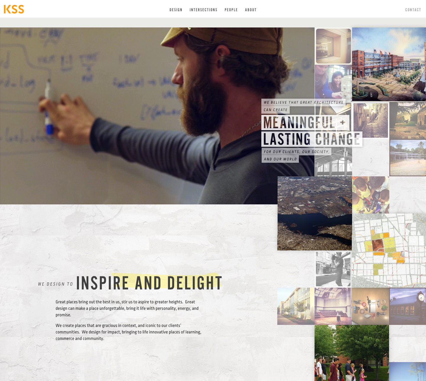
These are the questions we pondered while designing and developing the new site for KSS Architects, an architecture, planning, and design firm with offices in Princeton, New Jersey and Philadelphia, Pennsylvania. From the beginning, the team at KSS was looking for something different — something that would set them apart from their competition on the East Coast and beyond. Here are a few of the principles we applied to deliver a site that puts KSS in a league of its own.
Make messaging the foundation of your site.
The purpose of your website is to tell your firm’s story — who you are, what you do, and just as importantly, why you do it. Starting a web project without answers to these questions is dangerous — and that’s why we recommend kicking things off with a brand messaging program. This establishes the base of the brand, from prioritized message to differentiating qualities.
Through employee interviews and reviews of current assets, we established the firm’s mission, vision, values, goals, attributes, and ultimately a brand platform that helped us — and the client — fully understand who they are as a firm. This informed the design of the site from the earliest phases — making appearances on the site map, in the wireframes, and in the final site copy.
Projects should have a beginning, middle, and end.
Every project has a story, but often, firms do those stories injustice by leaving out the beginning and the end. Think of the life of a building in three phases. Right in the middle of that timeline, you’ve got the completed project in all its pristine, unpopulated glory. But what about the process leading up to completion, and just as importantly, the life and value of this space after completion?
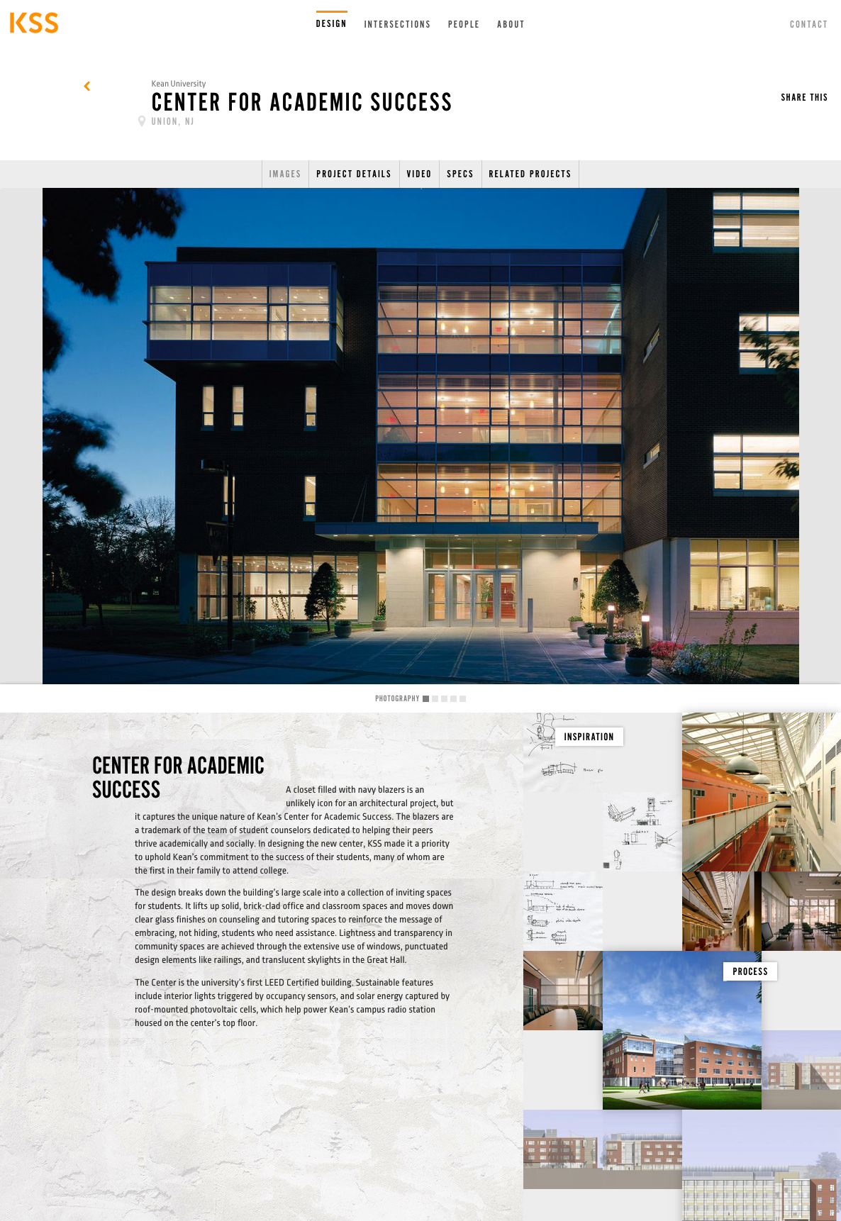
A lot of firms pay lip service to their “collaborative approach” to architecture, but KSS actually works this way, and they have the evidence to prove it. As their design partner, we encouraged KSS to showcase this collaborative approach online. You’ll see evidence of KSS’ process throughout the site, whether on the Process page itself, or on individual Project pages, which offer a glimpse at the inspiration and work behind the ideas.
KSS also noted the importance of showcasing the life of their work after completion. These spaces are made for people — so why leave that element out on the website?
Consider social media as a way to keep your content fresh.
Architects aren’t typically known for their social media savvy, but that doesn’t mean the practice is off limits. Take Instagram — it’s a visual, low-maintenance network that happens to be incredibly popular among young architects and other creative types. We encouraged KSS to integrate Instagram into the site as a way to pump a continuous stream of fresh, lively, and visual content into the site — all without the hassle of resizing and uploading images to the CMS.
Take a tour of the redesigned site at kssarchitects.com, and check out our other recent architecture work, including Christner Architects and wight75.com, a celebration of 75 years for Wight & Co.

