Le Chat Putain
This is the story of TOKY’s cat.
They say that all work and no play makes for a dull life. We’re lucky enough that much of our work feels like play – even more so when the project is one that’s just for us. Then we can really let loose, have some fun, and let our sense of humor run riot.
As part of a side event during St. Louis Design Week, TOKY participated in an “Agency Brand ‘n’ Brew” competition. A number of area creative and advertising agencies were invited to submit an original brand identity for a faux beer. TOKY was assigned a French farmhouse style ale (a Saison). This isn’t our first foray into beer branding. Some of our beer designs have even brought home accolades.
We tossed a lot of ideas around – ranging from witty interpretations of Marie Antoinette to sleek and cheeky puns based on Vidal Sassoon. Ultimately, a simple concept emerged: one really obnoxious, semi-feral, tomcat. And so began the life of Le Chat Putain, literally, “that f*cking cat!”
As our creative director, Katy, explains it,
“We wanted to take the essence of a roving French alley cat and throw him into the rough and tumble world of a country farmhouse – he’s out of his element, a shit disturber, (he thinks he’s) a big fish stuck in a small pond. So, round out the edges with elegance and a bit of a dangerous, earthy bite.”
But how could we represent this visually? Was our little tom best served through bright surrealistic colors or creepy vintage iconography reminiscent of Victorian Halloweens? We thought about what the cat would have to say for himself (because cats always have a very distinct opinion of themselves, of course). Sparse, literal, a little uncomfortable and dissonant, but still elegant. Everything that a savvy street cat conveys.
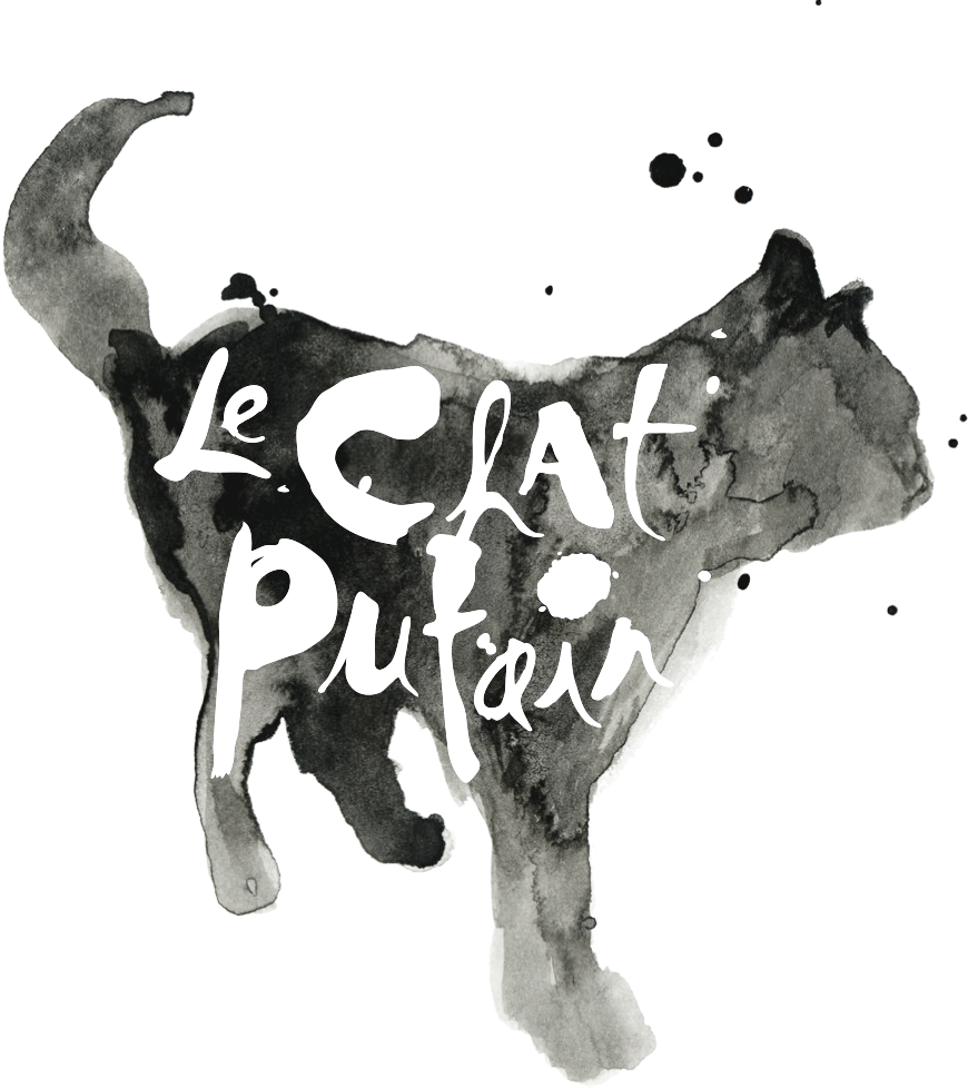
Our Senior Designer, Dan, took a decidedly old-school approach to Le Chat Putain’s creation, picking up some ink pens, a brush, and a solid block of ink.
“It is always good to get your hands dirty. Stepping away from the computer and getting my hands covered in ink helped bring out the subtleties and emotion we wanted to convey through the image. Creating by hand brings out different facets of a design that you can’t quite achieve digitally.”
The resulting iconography felt high-end, chic, and just a tiny bit tipsy – nearly vibrating with restraint.
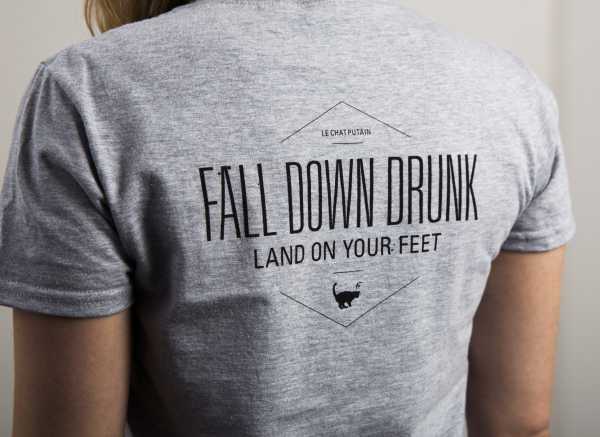
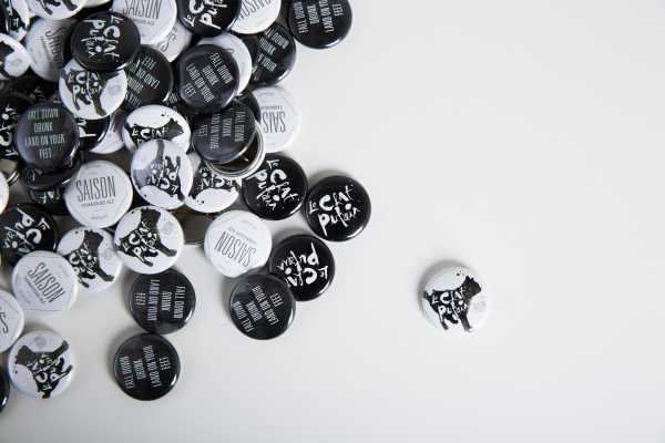
Applied to different mediums, Le Chat Putain’s logo took on a life of its own. It got a little swagger in its tail and little more defiant. The “hair of the dog” was for wimps. We had the “hair of the cat”. Le Chat Putain fell down drunk and still managed to land on his feet. And it beat the heck outta milk.
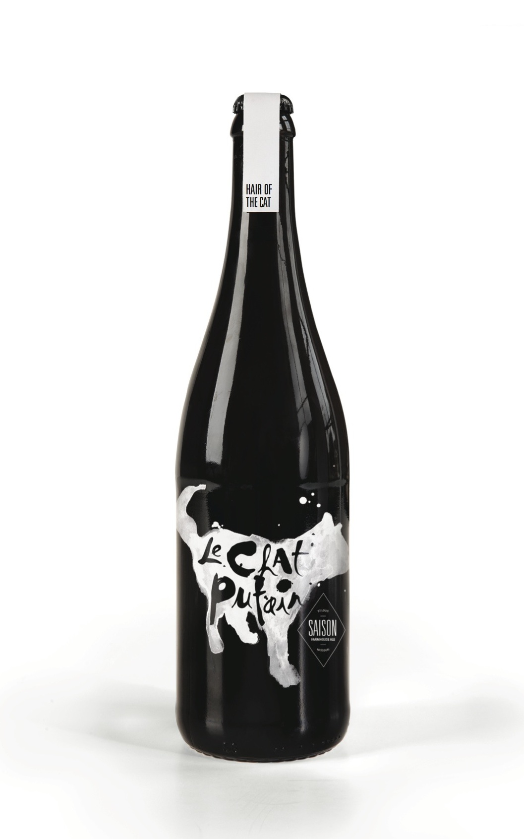
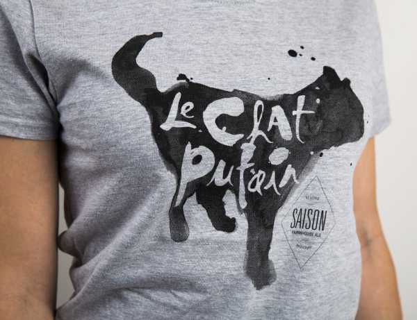
Le Chat Putain brought home first place in the inter-agency “Brand ‘n’ Brew” – so we obviously did something right. We like to think that this little tom had his own celebration with plenty of catnip and some flirty-eyed lady cats, and, as always, he landed on his feet.
