Case Study
Withered Oak Whiskey
OVERVIEW
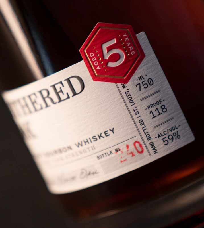
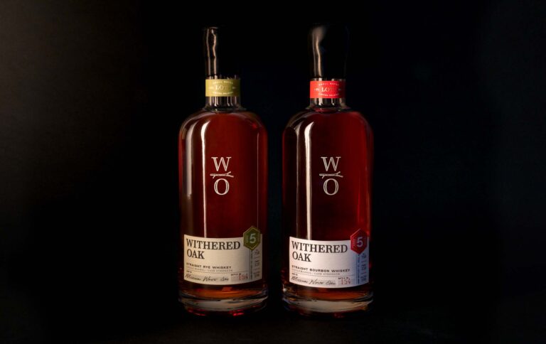
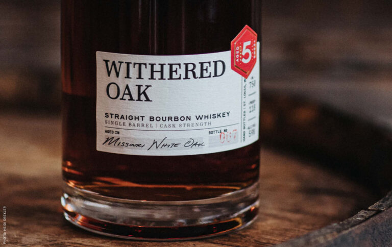
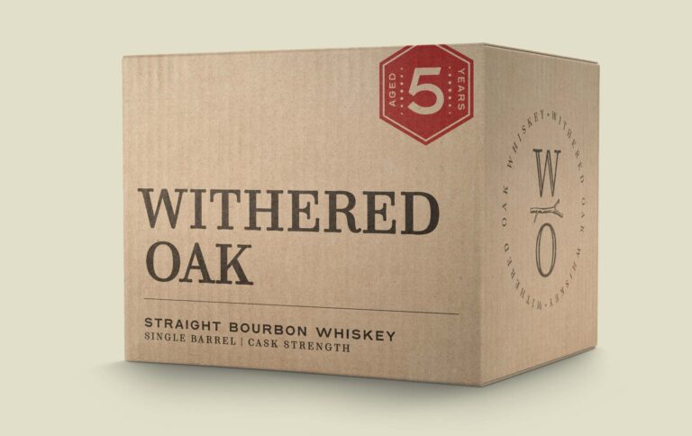
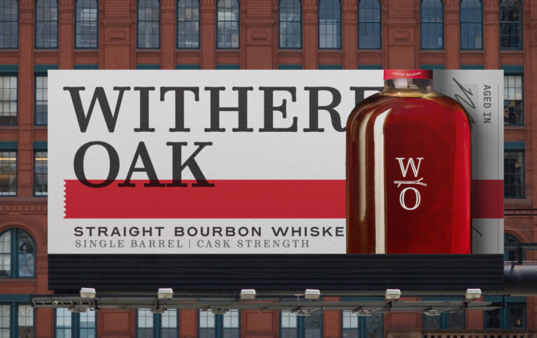
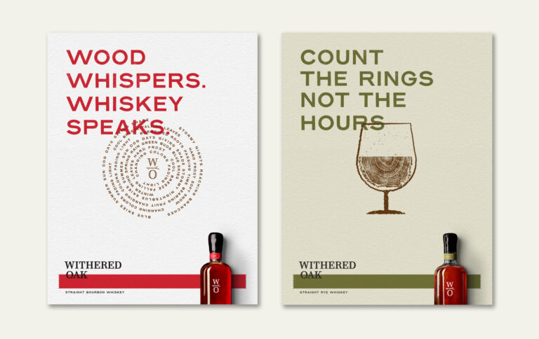
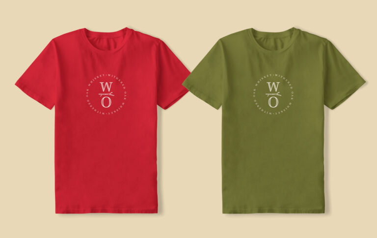
Withered Oak needed branding and packaging that reflected the premium quality and patience that goes into every bottle of their 5-year bourbon and rye whiskies.
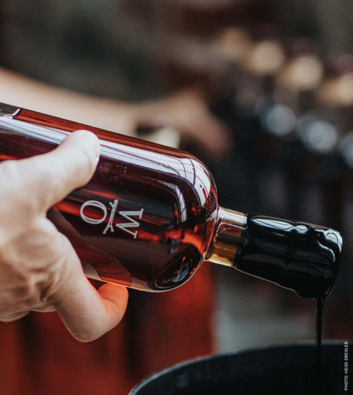
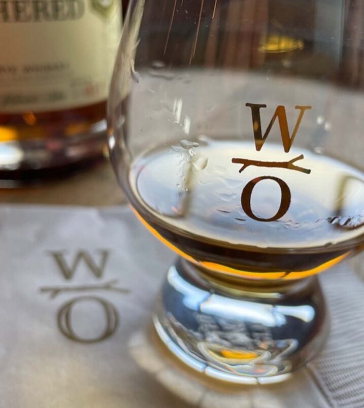
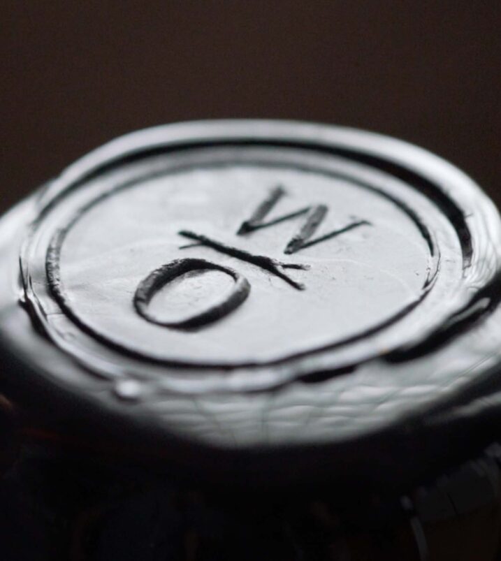
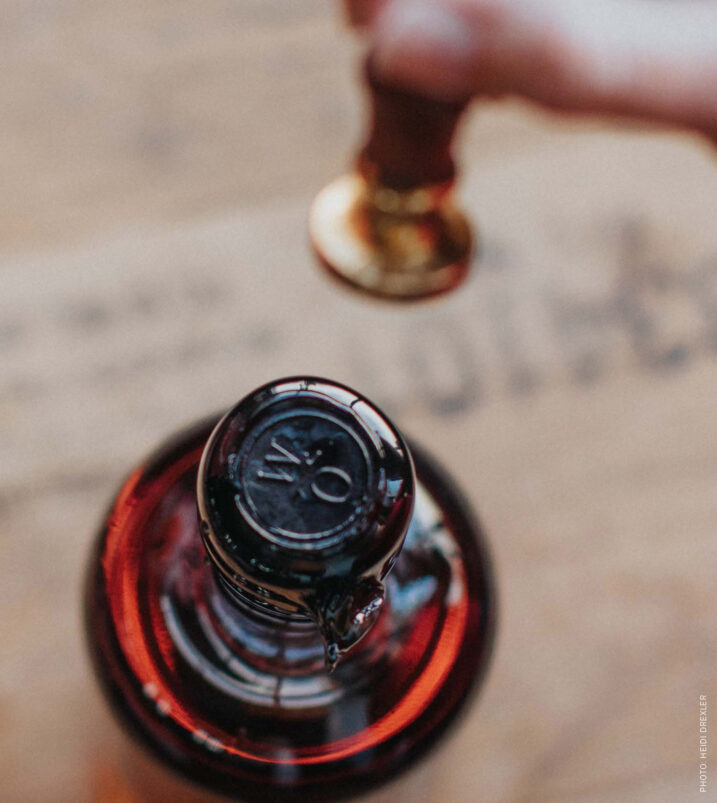
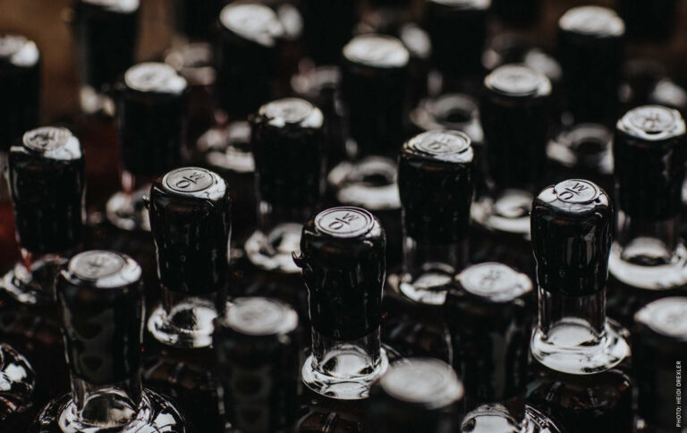
To help differentiate on crowded retail shelves, we went against the grain of ornate and decorative typography that’s so common in the whiskey category. Instead, simple and clean typography gives the label a distinct, elevated appearance, while a painted logo and open bottle let the warmth of the whiskey shine through, emphasizing its color and character. A wax seal and a batch number are applied by hand, signaling the craftsmanship and small-batch rarity this brand is built on.
Awards

Silver
Graphis Packaging 10
