Wildhorse Village
OVERVIEW
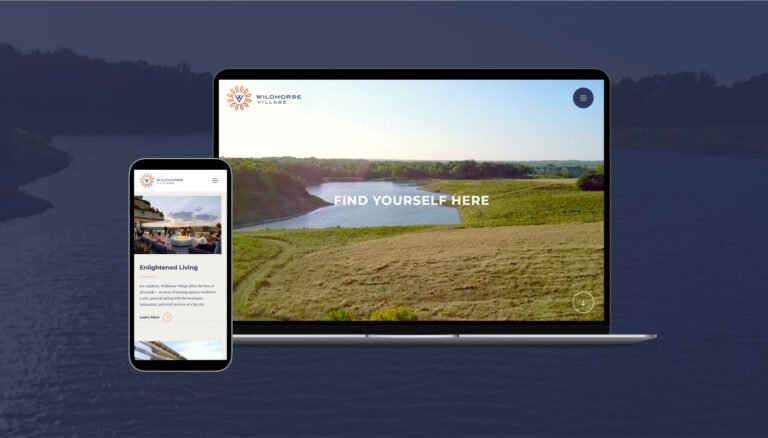
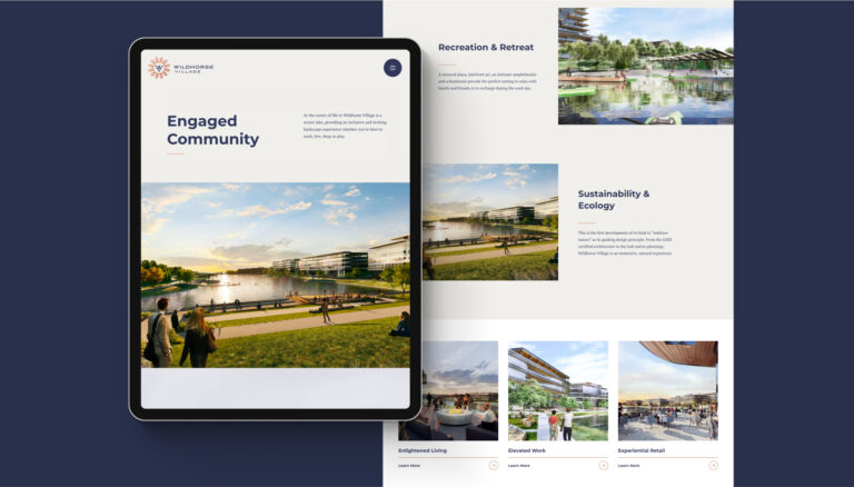
The developers behind Wildhorse Village envisioned a community of elevated residential, work, and retail space unlike anything in the area. To connect with potential buyers ahead of construction, TOKY built a seamless web experience to immerse users in the very place where they could soon be standing. We also created a brand identity that evokes the pastoral elegance of the development’s setting and the high-end rates these properties command.
SEAMLESSLY RENDERED REALITY
Transforming a lake surrounded by trees and empty fields into a fully-imagined, mixed-used community isn’t usually something a website does — but it was the most compelling approach to help users realize what kind of community they could be a part of. We collaborated with Wildhorse Village’s architecture firm to create sweeping rendered camera moves that inspire viewers and let them experience the breadth of this new property with a simple, seamless scroll.
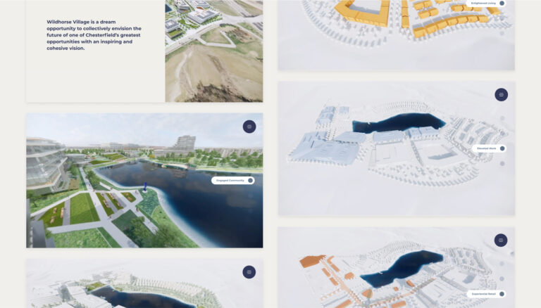
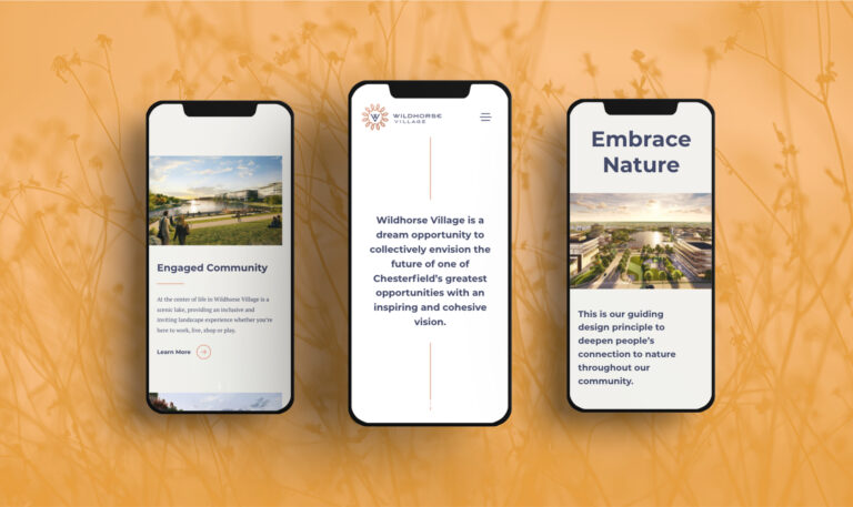
NATURE CONNECTING COMMUNITY
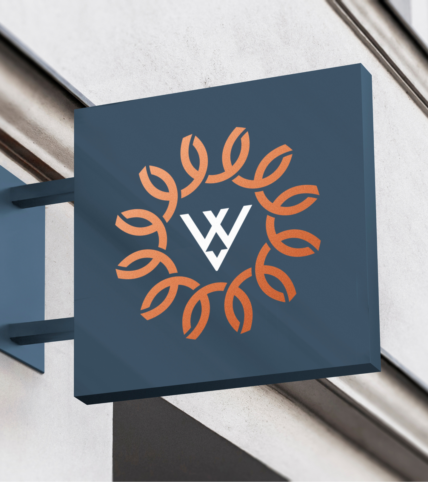
With multiple businesses in the area drawing on Wildhorse Creek Road to inspire their name—and most often depicting a horse in their logo—our client wanted an approach that was less visually direct. In the final design, 12 copper-colored horseshoes were interlinked to form an abstract sun—a reference to the property’s year-round connection to nature and community. The mark is anchored by logotype that balances modern sensibilities with suburban approachability.