TYLin
OVERVIEW
TYLin, the eponymous global engineering firm with one of the most revered names in long-span bridges and infrastructure, approached TOKY looking for clarity around its brand architecture and a brand platform that would rally its sectors, services, and growing family of firms. Our work pointed to a strategy of much-needed alignment under one flag, leveraging the firm’s global reach and brand equity, and positioning it for continued growth and market share.
ELEVATING COMMUNITY
As we delved into an extensive brand research engagement, we discovered a firm that, on its surface, appeared rather disparate from one part of the world to another, but at its core was comprised of people deeply passionate about connecting and elevating communities through their work.
RESEARCH & STRATEGY
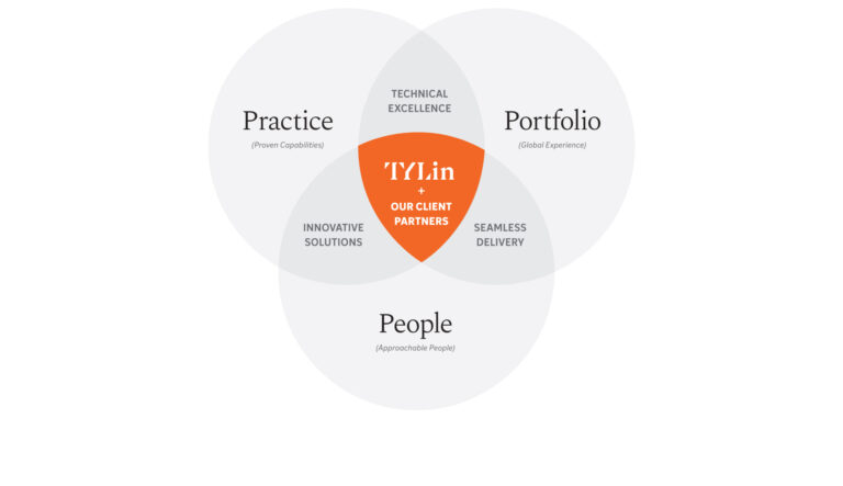
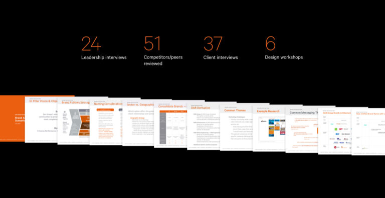
TOKY conducted qualitative and quantitative research across all stakeholder groups to uncover how the family of brands fit together and contributed to the greater whole. In the process, we noticed a pattern of key intersections among the brand’s core characteristics and the combined benefits they enabled.
After a comprehensive research process, the path was clear: Align certain parts of the family under one brand — TYLin.
A CREATIVE PLATFORM BUILT ON CONNECTION
TOKY worked with TYLin to distill its essence to one word: Connection. This is what TYLin does and the value it provides. Connection is about bringing people, places, and ideas together to elevate communities, and it represents the global alliance of resources and experiences within the brand. From there, TOKY developed a comprehensive messaging platform — including brand promise, value proposition, brand pillars, and brand story — to guide all written communications.
EMPLOYEE BOOK
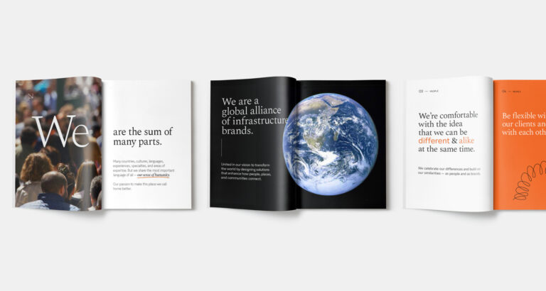
TOKY wrote and designed an Employee Book, pulling key concepts and tone of voice directly from the messaging platform. Part culture book, part proverbs, the pocket-sized tome is a handy, poignant reference for what it means to be part of TYLin.
STEEPED IN EQUITY
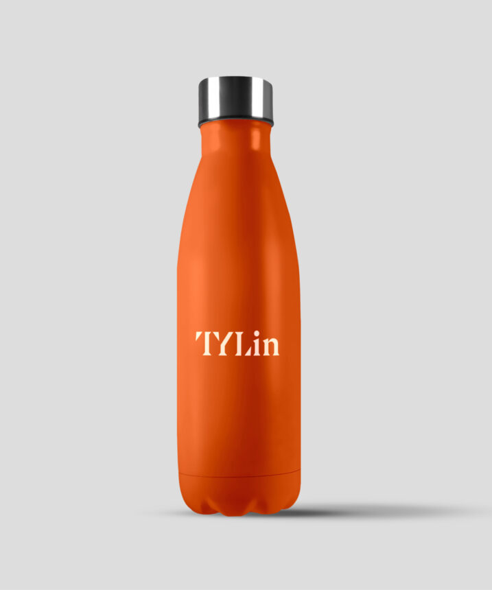
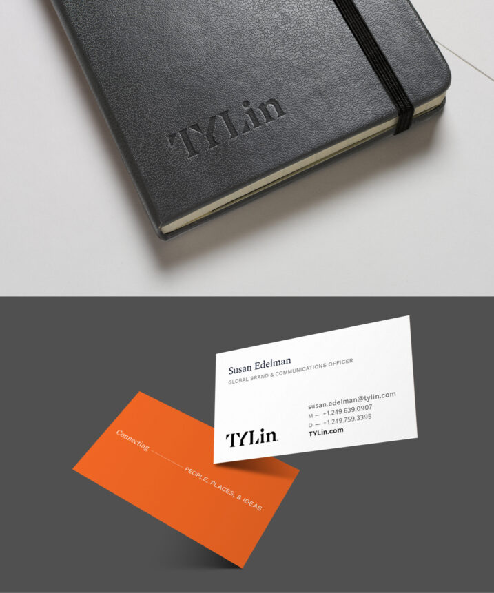
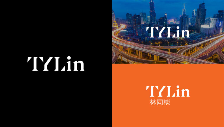
Now it was time to breathe new life into the brand in a way that would feel authentic and relevant for everyone, and unify its global presence. Formerly “T.Y. Lin International,” we streamlined the moniker to simply “TYLin” — already a common abbreviation. The legacy orange was dialed up to a more energetic, modern shade and paired with a basic black, bold photography, and a new secondary color palette. Merging the “T” and “Y” is a subtle nod to connection and community, while the triangularity of the letterforms feels grounded and stable. We included a complimentary Chinese lockup for the Asia-Pacific markets.

THE CONNECTION POINT
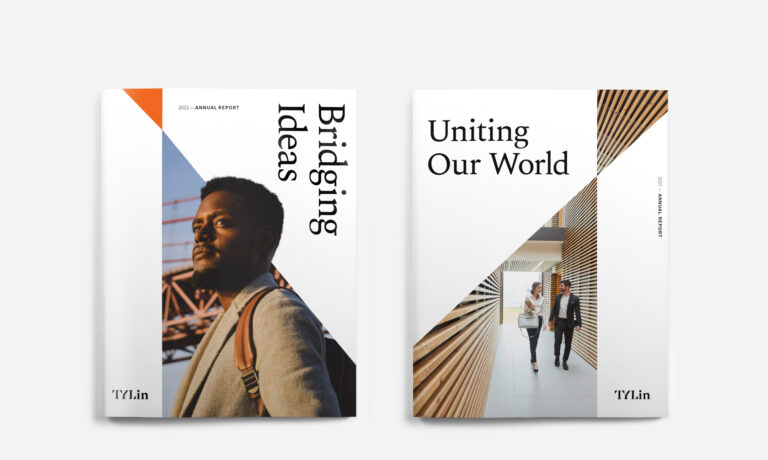
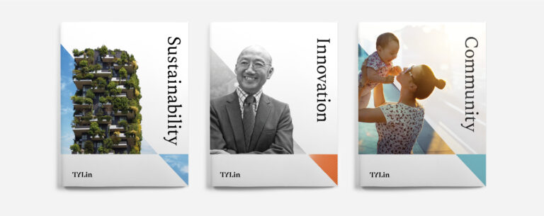
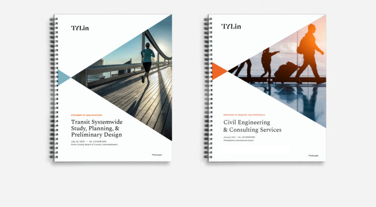
A core motif of the visual brand is a graphic and compositional device of two planes converging at a single point of connection. Intended as a visual expression of TYLin’s brand promise to Connect People, Places, and Ideas, The Connection Point was designed to be flexible and ownable, while simultaneously conveying focus, collaboration, and vision.

BRAND GUIDELINES
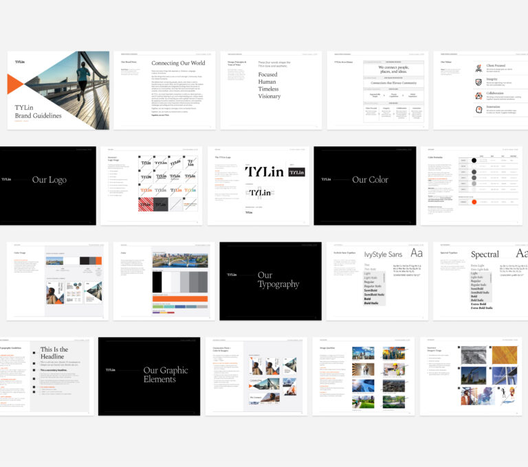
For a brand that spans multiple geographies, sectors, and disciplines, it’s crucial to maintain clarity and consistency. TYLin’s brand guidelines offer a comprehensive, easy-to-use resource for the corporation’s internal marketing, communications, and sales teams as well as external partners alike.
WEBSITE
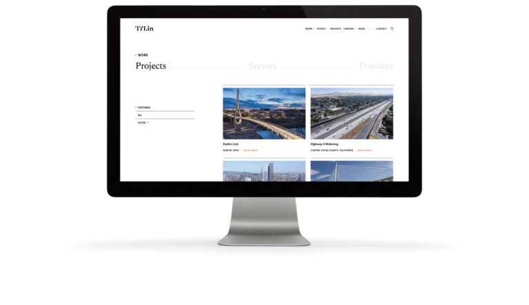
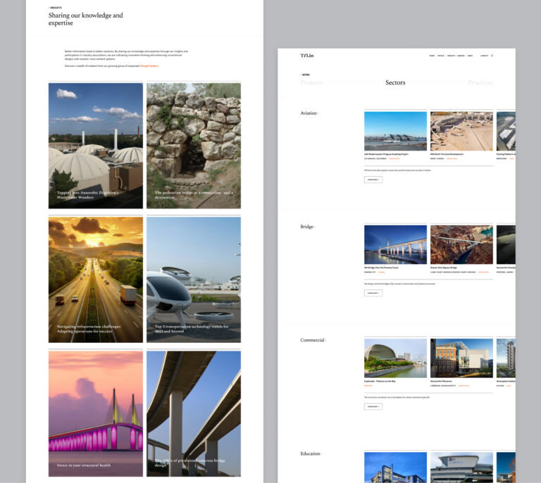
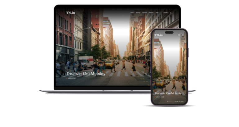
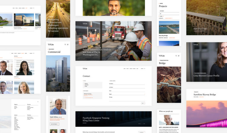
TOKY designed and developed a flexible, modular website that allows TYLin to easily adapt layouts to meet a wide variety of content needs. Imagery reinforces the human connection and spotlights bold, beautiful project photography.
SEAMLESS PORTFOLIO NAVIGATION
Featuring a work section that connects projects with sectors and practices, tylin.com offers an integrated, intuitive approach to exploring TYLin’s robust portfolio.
