The Phillips Collection
OVERVIEW
As America’s first museum of modern art, the Phillips Collection houses a world-renowned collection of modern and contemporary pieces. The museum’s leadership selected TOKY to develop an identity that would depict founder Duncan Phillips’ unique philosophy.
Please to display this content.
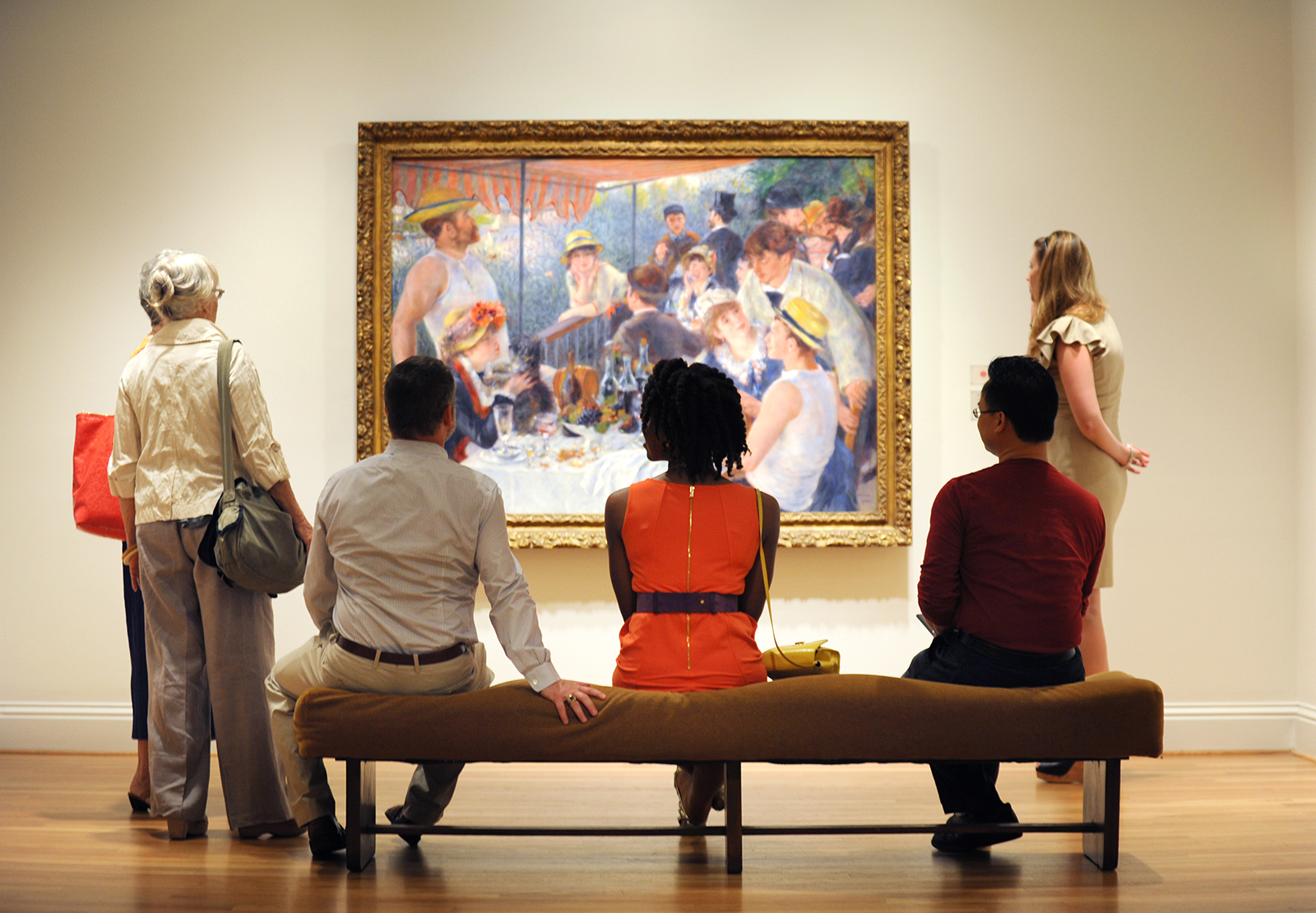
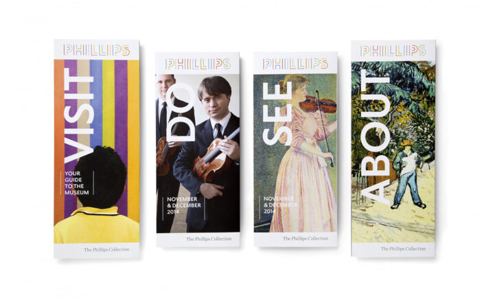
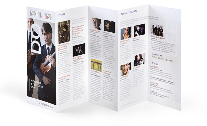
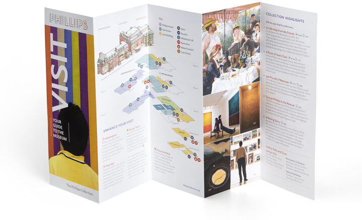
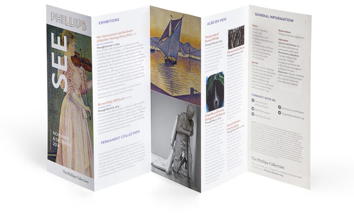
REFLECTING AN INTIMATE GALLERY EXPERIENCE
The space itself — with intricate pathways and open rooms — is an essential part of Phillips’ identity. TOKY used typography to recreate the museum’s unique physical characteristics.
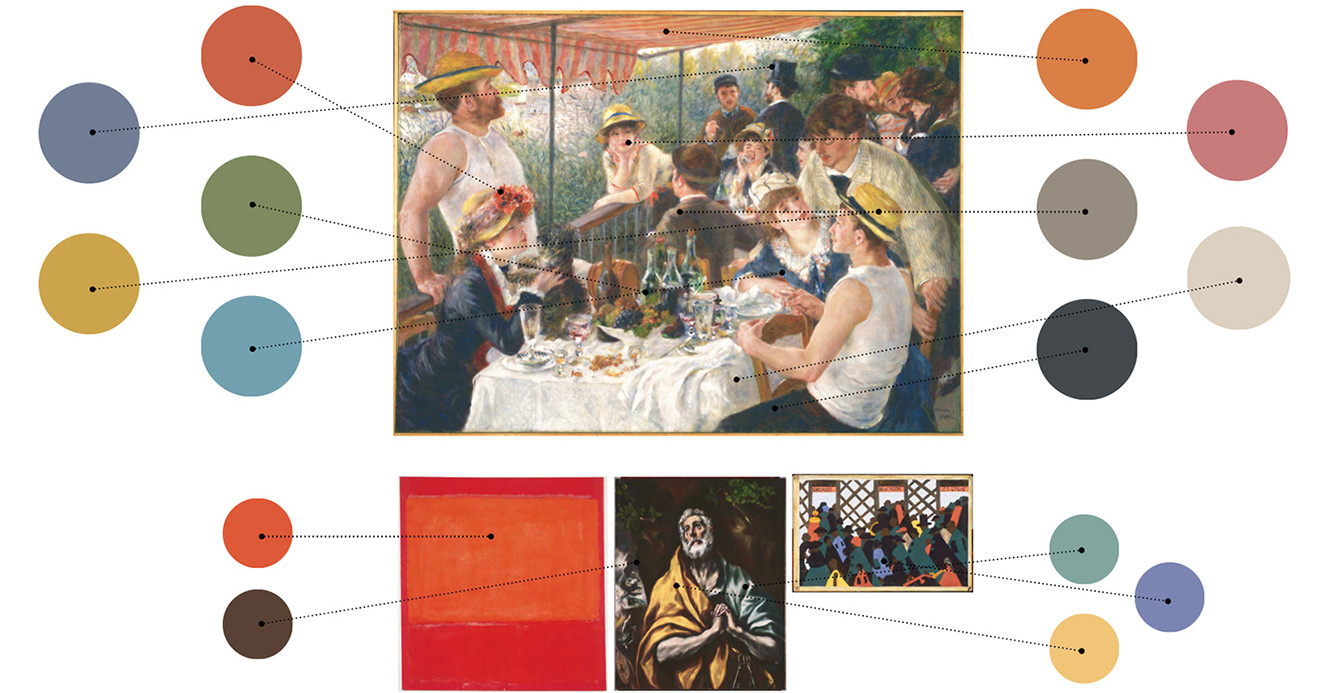
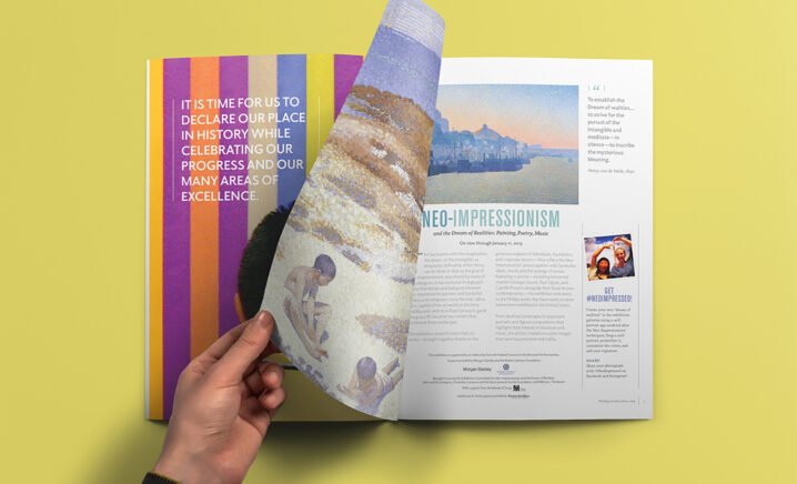
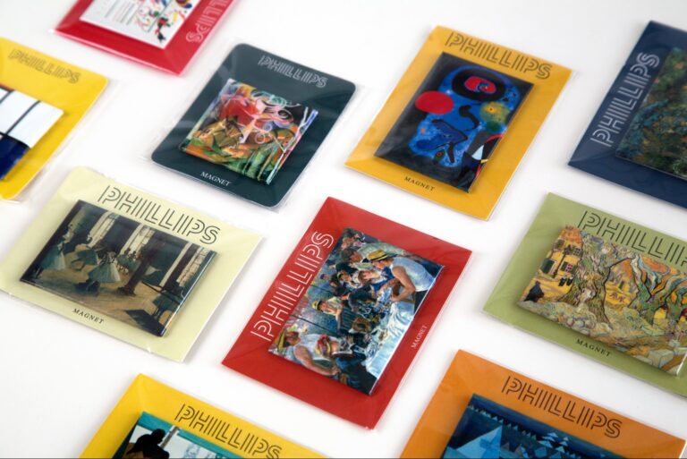
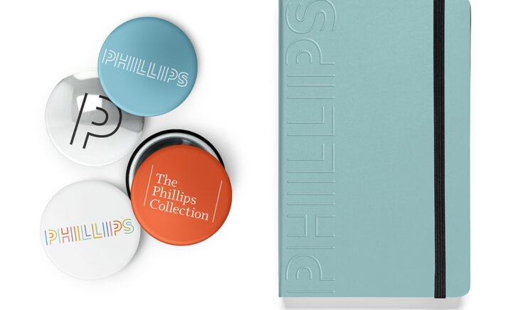
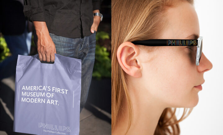
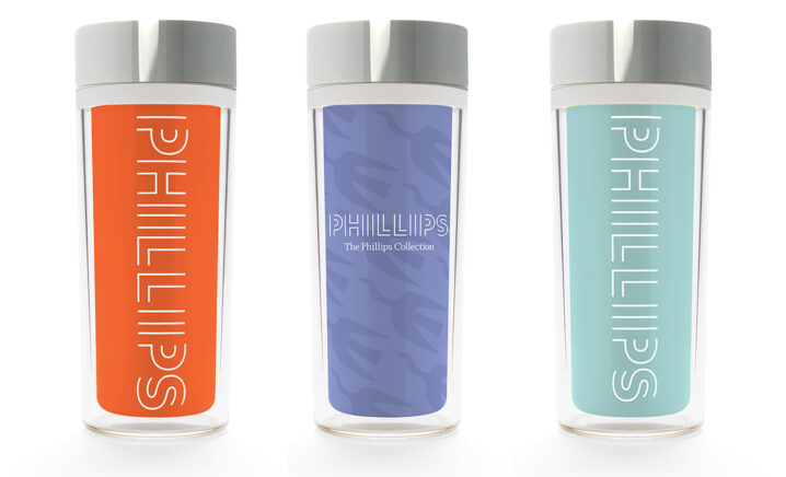
A CRAVING FOR COLOR
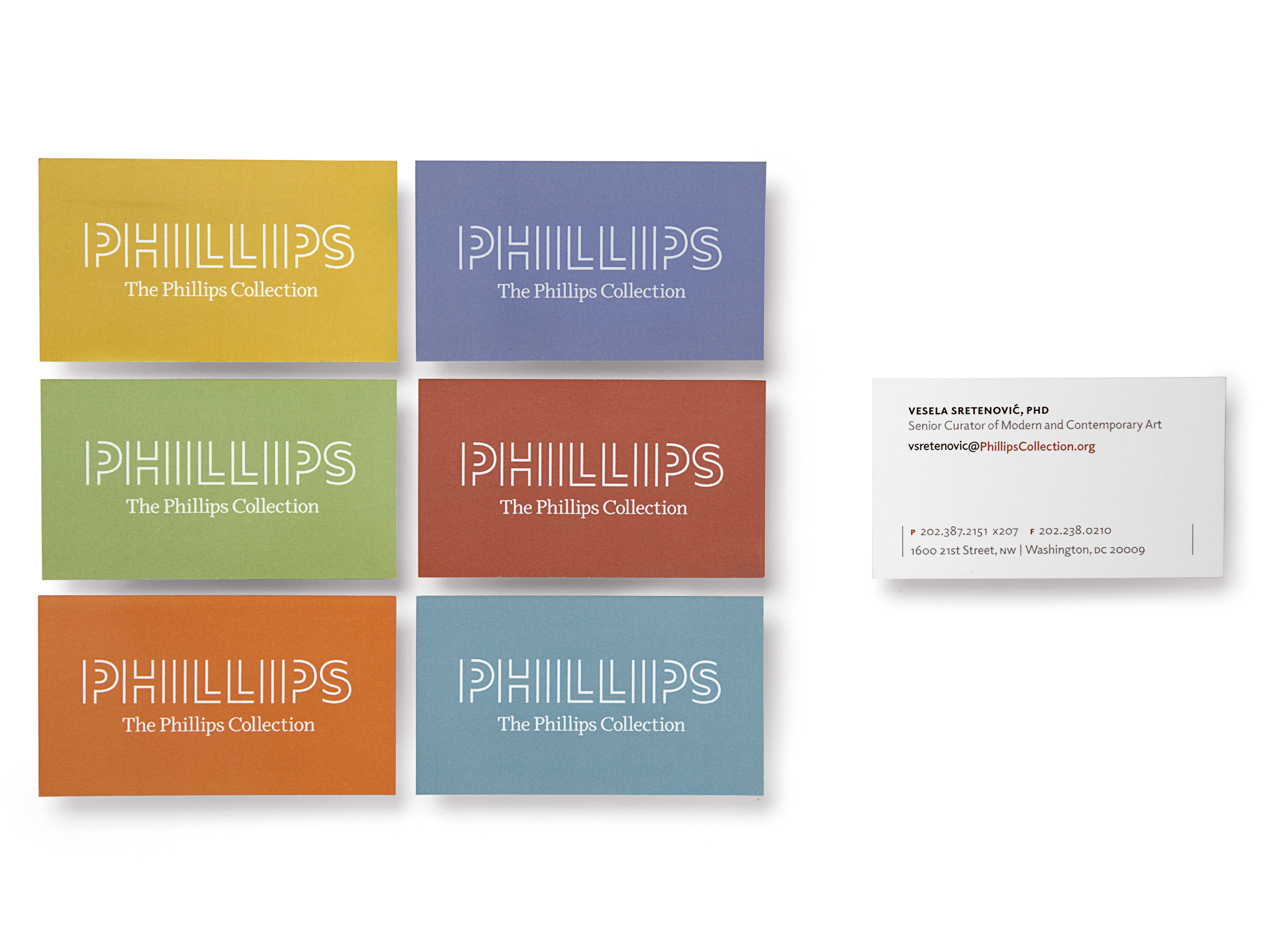
Duncan Phillips was known for his intense appreciation for color. TOKY’s identity solution embraces a color palette drawn directly from some of the Collection’s most notable work: Pierre-Auguste Renoir’s Luncheon of the Boating Party, Jacob Lawrence’s The Migration Series, Panel No. 1., Mark Rothko’s Orange and Red on Red, and El Greco’s The Repentant St. Peter.
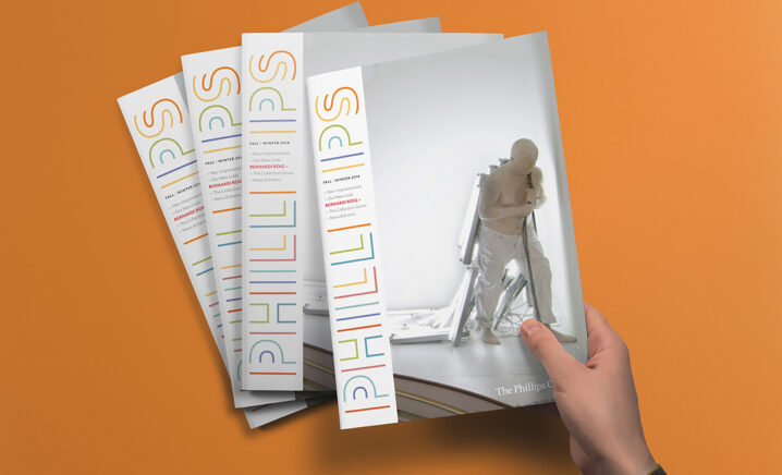
UNIFYING A GLOBAL BRAND
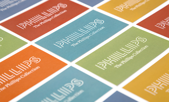
Duncan Phillips once said of his collection, “I avoid the usual period rooms — the chronological sequence…my arrangements are for the purpose of contrast and analogy. I bring together congenial spirits.” That contrast is reflected in the new logo, which creates a complete wordmark while remaining an incomplete rendering of the letterforms.
Feedback
“The mark offers both sophistication and a little quirk, which definitely speaks to the institution’s unique personality. It feels ahistorical. It pushes boundaries.”
Services
Brand Platform
Brand Identity
Print Collateral
Signage
Awards
Featured
PRINT Magazine Regional Design Annual, Brand Identity
Silver
St. Louis ADDY Awards, Branding