The Barton
Overview
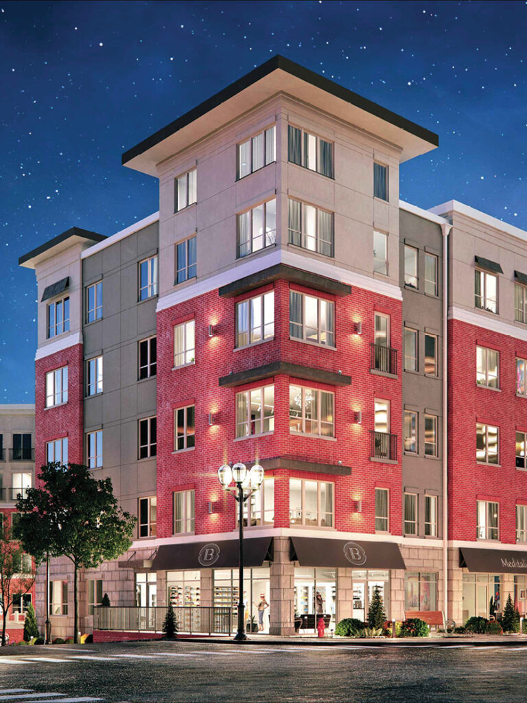
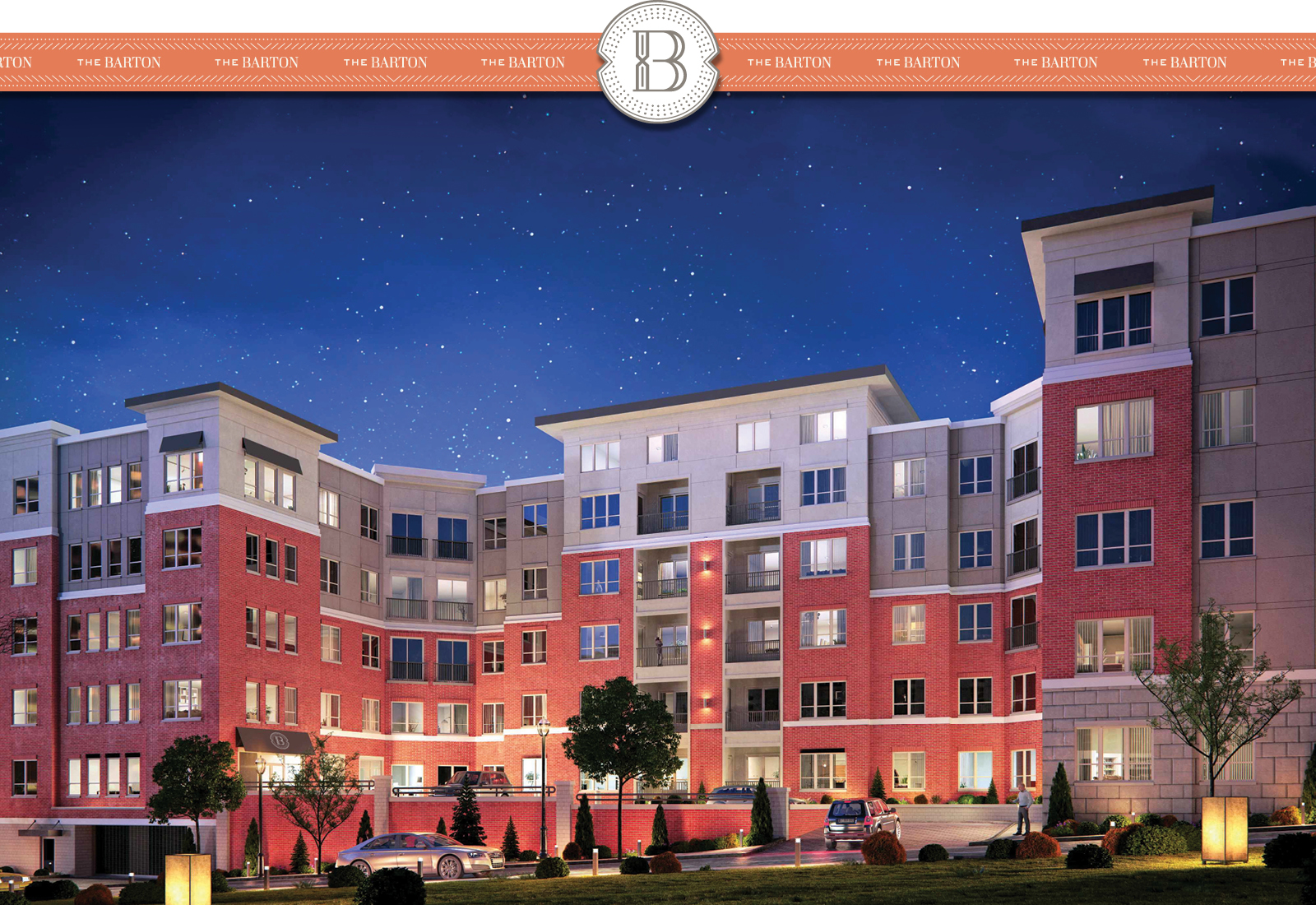
The Barton is a luxury apartment development in Clayton, Missouri, an upscale suburb just west of St. Louis. Boasting all the amenities of a luxury condo, the apartments needed to catch the attention of well-to-do young professionals. The developers, Covington Realty Partners, turned to TOKY for a sophisticated name and brand.
APPROACHABLE ELEGANCE
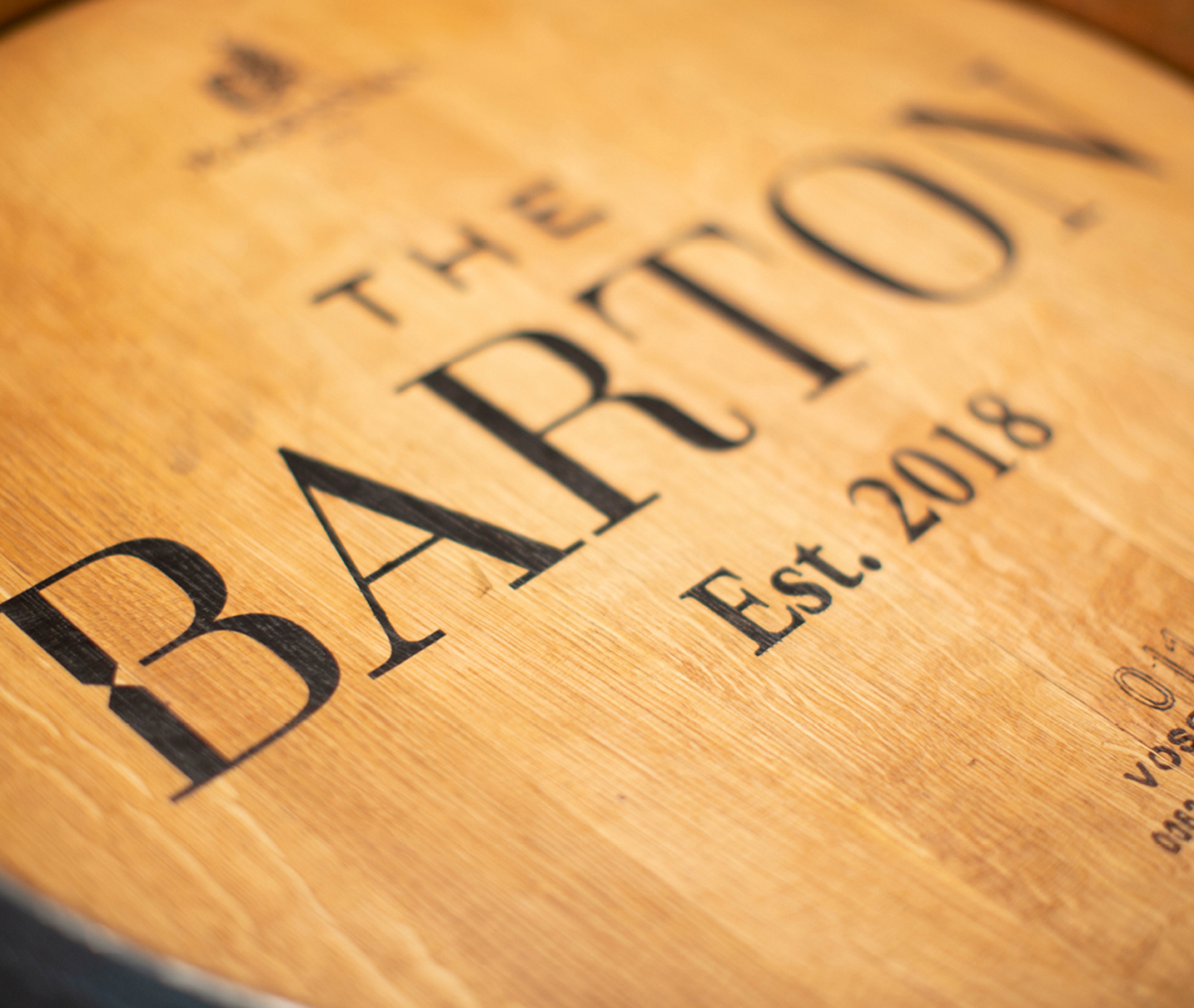
Upscale. Urban. Suburban. The property called for a name that would speak to these qualities and stand out to up-and-coming St. Louisans. Inspired by a flowering species of the Missouri dogwood tree, “The Barton” lends a local touch with the distinguished ring of a boutique hotel.

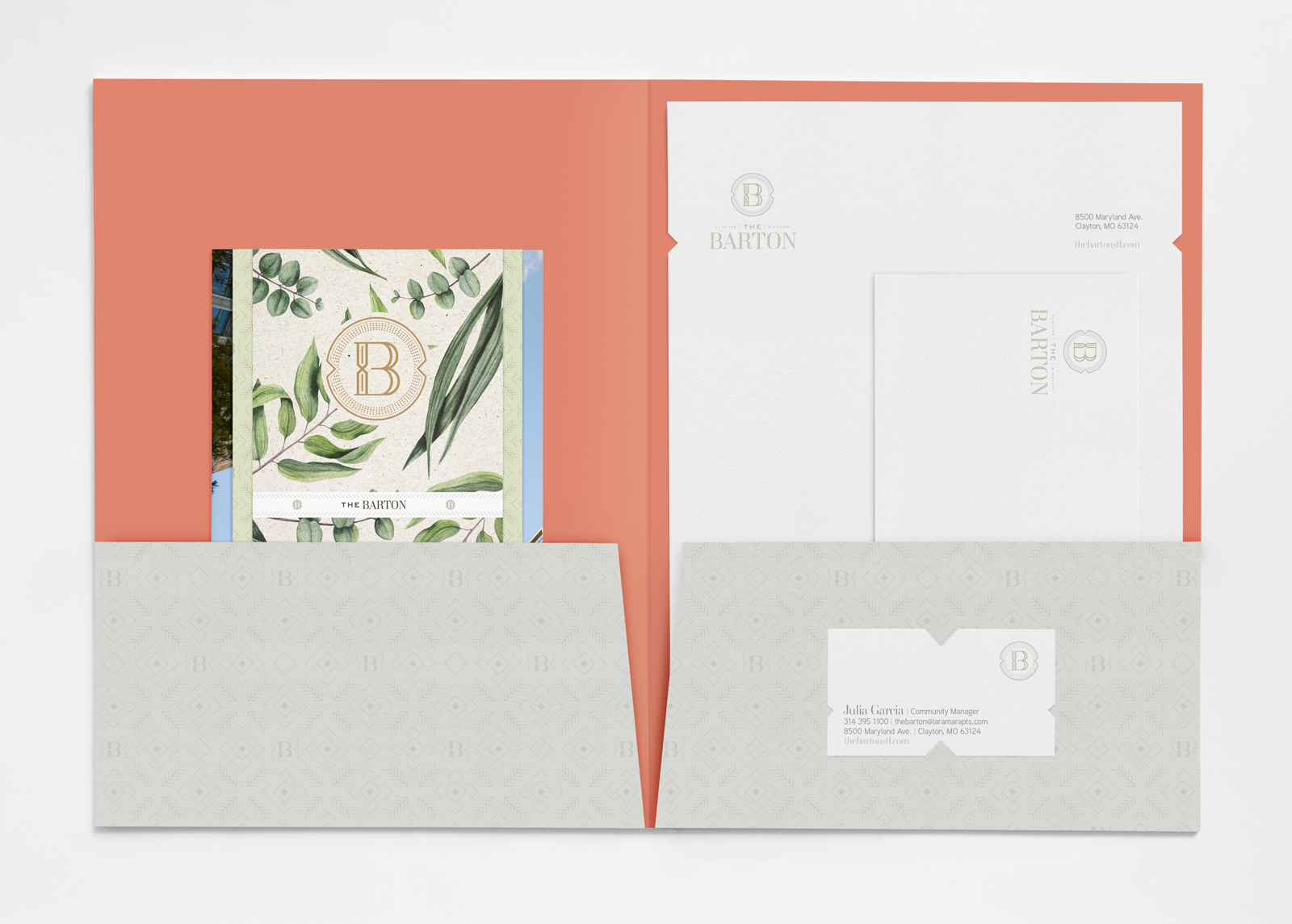
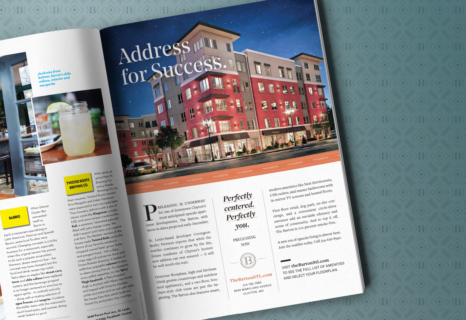
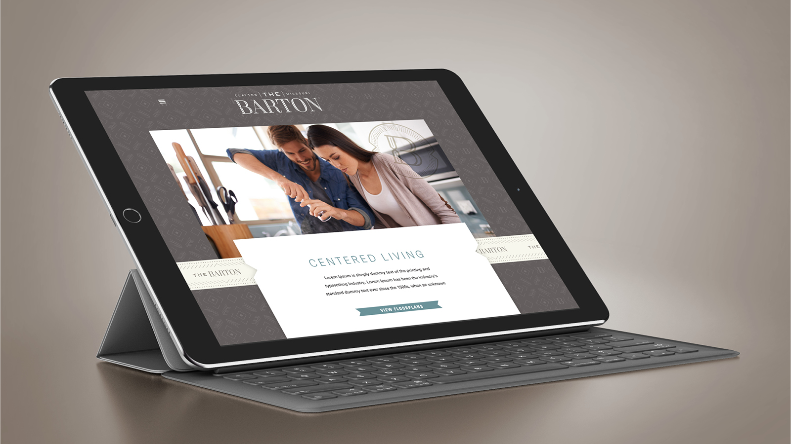
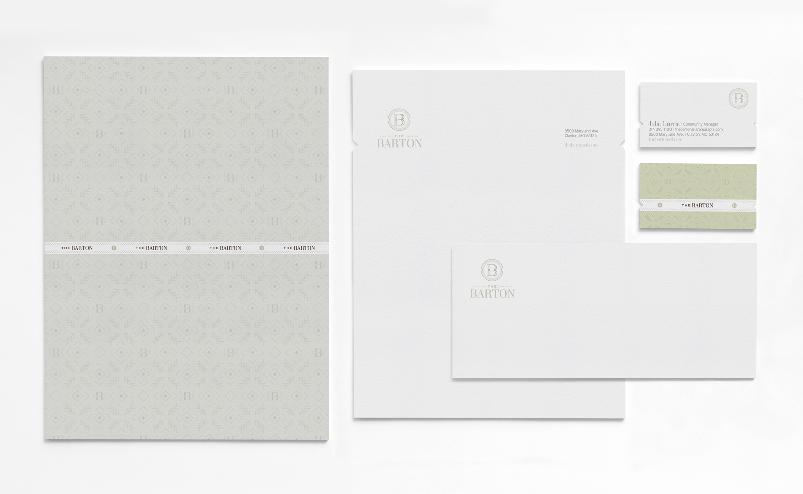
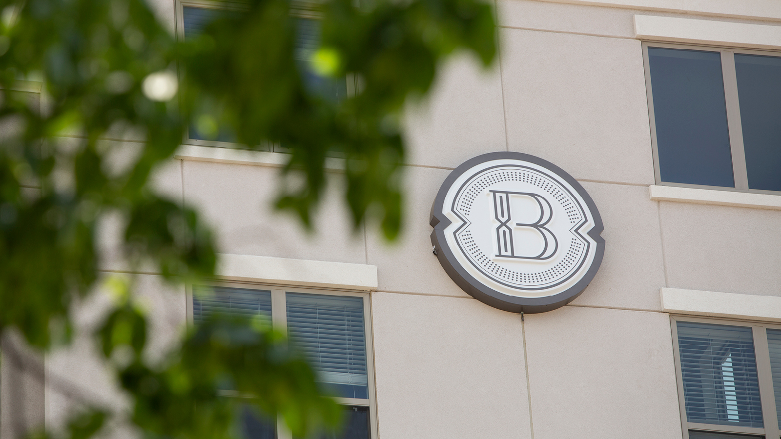
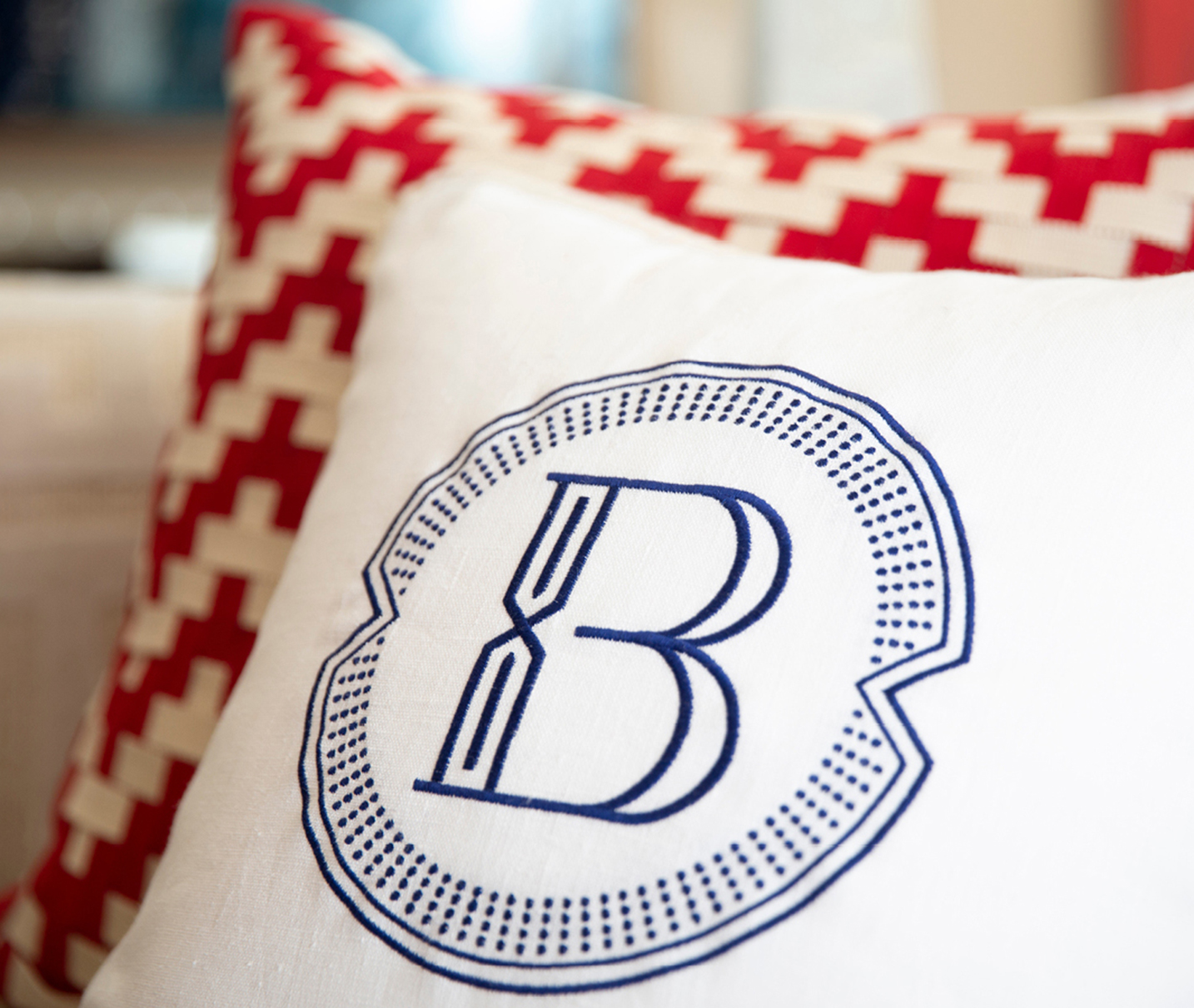
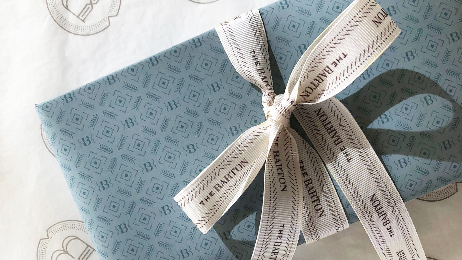
GRAND & CENTRAL
Set in a refined modern serif, The Barton’s logo conveys the elegance of a city dwelling with the comfort of a suburban locale. The construction of the “B” is customized to create the arrow motif that is carried throughout the brand, hinting at the property’s sought-after central location.

Feedback
“The Barton brand goes a long way to ensure the elegance of the community is felt long before anyone visits or tours. Having the story behind the name is not only impactful in sales but also with internal team members to help them know they are a part of something very special.”
Services
Naming
Brand Identity
Signage
Print Collateral
Advertising