The Aster

Overview
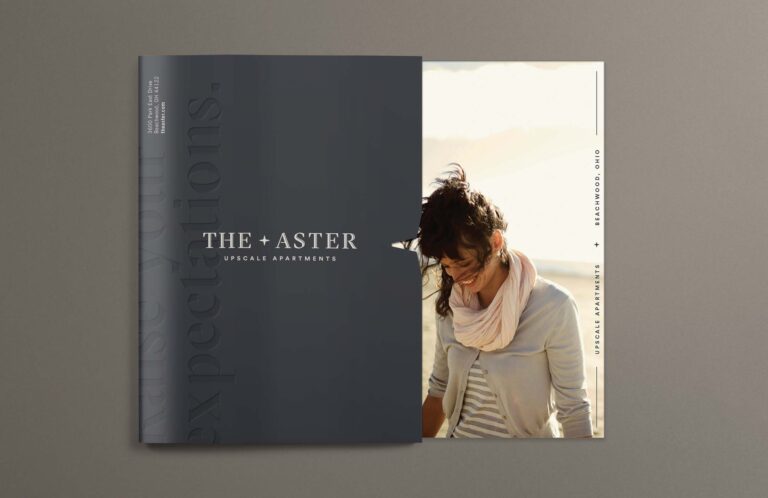
Located in Beachwood, Ohio, an upscale suburb of Cleveland, the Aster is a luxury apartment development highly sought after by up-and-coming professionals. As the property itself moved through the construction phases, the developers turned to TOKY for a brand that would mirror the stature of the neighborhood and property amenities.

RAISING EXPECTATIONs
After a site visit and in-depth demographic research, TOKY’s strategy team created the structure for a refined brand, starting with the name. Chosen for its simplicity and dual meaning, “Aster” is a genus of wildflower common to the Ohio prairie, as well as Latin for “star.” This foundation inspired the overall brand vocabulary, which incorporates the star shape and aspirational language.

ASPIRATIONAL, YET ESTABLISHED
The logotype carries on the elevated tone of the brand with engraved inline and angular serifs reflecting the shape of the star. The logo icon offers a minimalistic alternative for more subtle applications.


STAR QUALITY
The Aster’s promotional materials convey the same sophisticated look and feel, with upscale metallic finishes and astral patterns that provide texture while bringing the concept full circle.

Services
Naming
Brand Identity
Signage
Print Collateral
Advertising