SMMA
Overview
On bustling Massachusetts Avenue in Cambridge, between Harvard Square and MIT’s Great Dome, SMMA has quietly been building its reputation as a unique AE firm since 1955. Founded by three MIT engineering alumni, the firm has successfully integrated deep technical acumen, imaginative design, and a friendly culture, growing into a 230-person enterprise with a reputation for solving the most complex design challenges. Their integrated approach has allowed clients to realize places that foster innovation, discovery, and success. These contributions have helped shape the foundation of Boston’s modern tech and education boom.
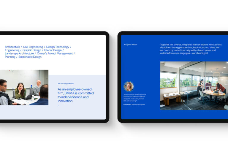
Collaborative yet independent
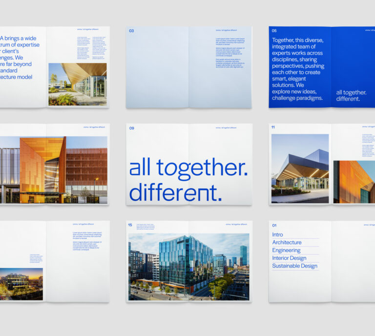
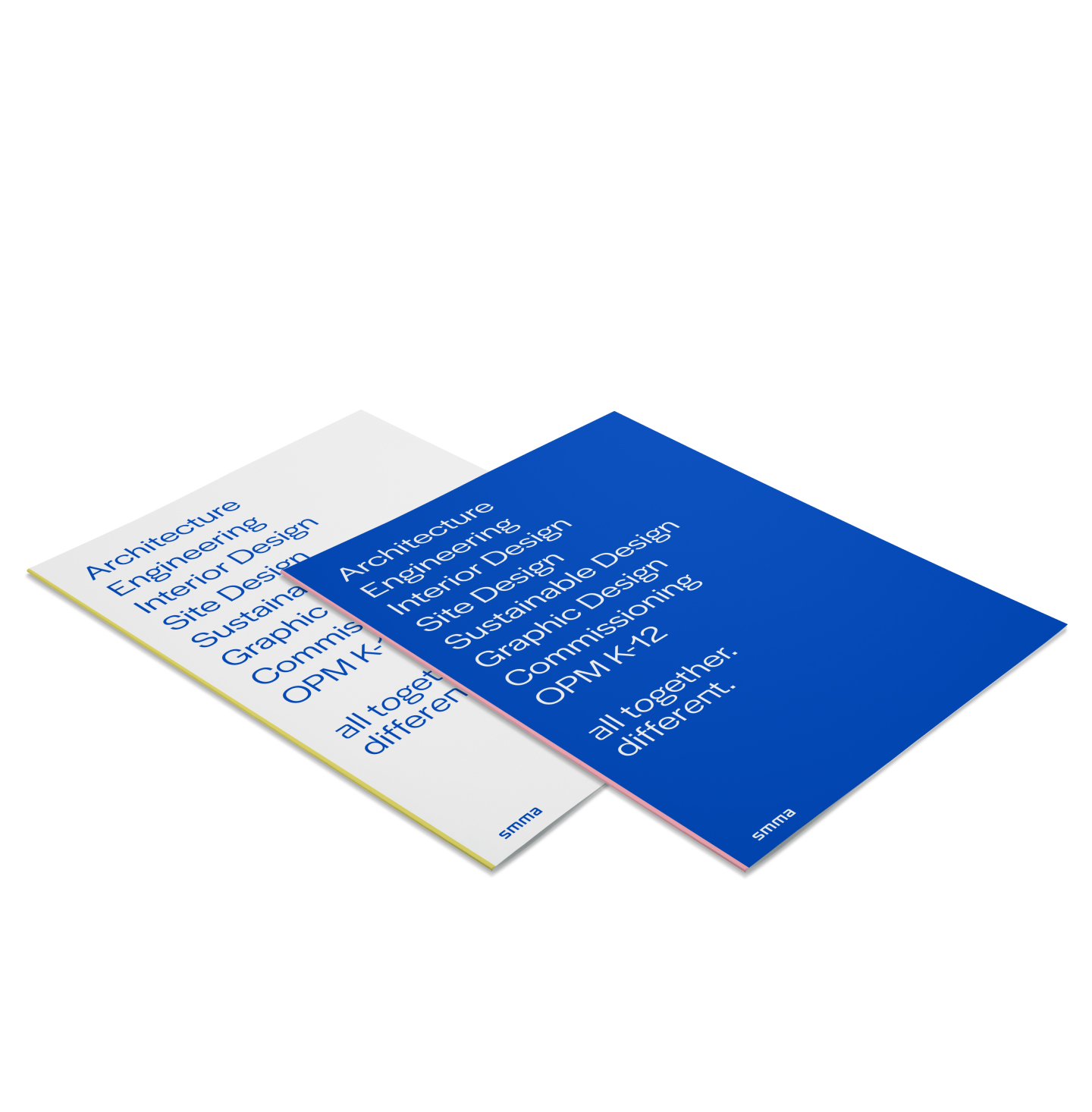
In 2021, SMMA set out to elevate its brand to reflect the firm it had become — a mid-size powerhouse with growing influence in science and tech, K–12, and corporate campuses across the region. Discovery research revealed a deeply collaborative culture, sharpened by complex projects and strengthened by authentic collegiality. Studios worked both independently and together, spanning disciplines from engineering to environmental science, high design to sub-basement infrastructure. With more than 20 languages spoken across the team, SMMA’s strength lay in its diversity — of backgrounds, expertise, and perspectives. They are, simply, “All Together. Different.”


Designing for the next era
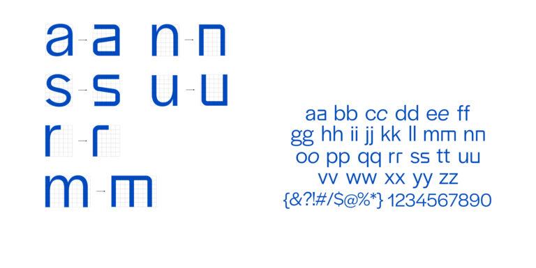
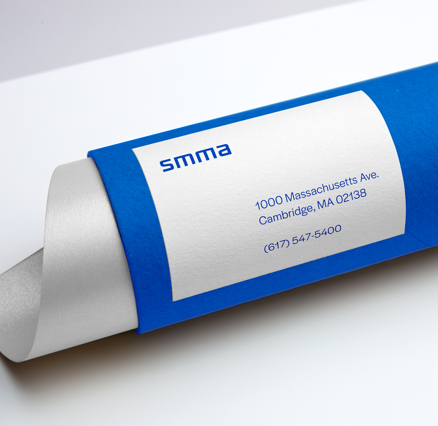
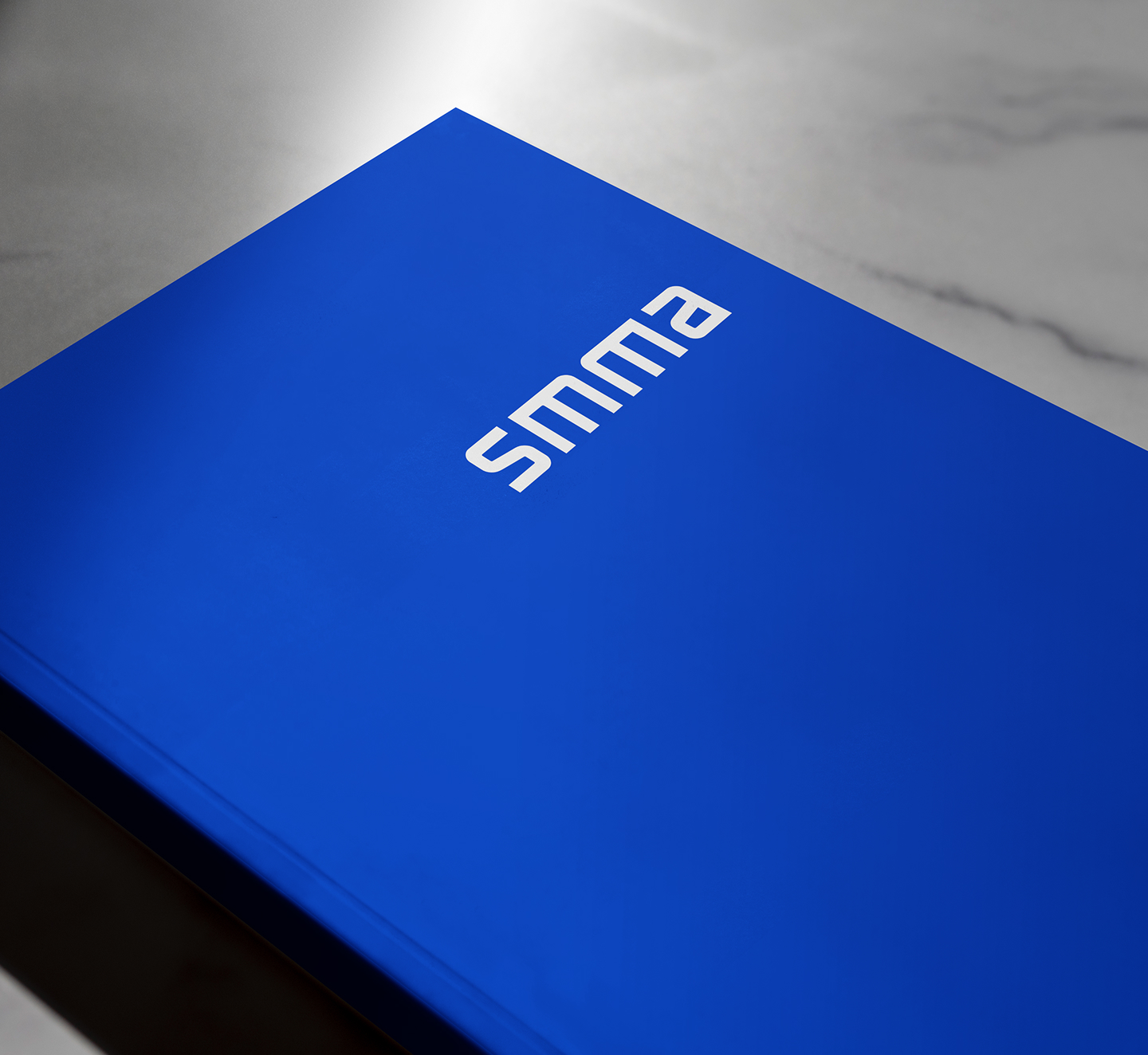
The previous SMMA logo felt rooted in an earlier era — with a traditional typeface that didn’t translate well across modern digital platforms. When spoken, “SMMA” could turn into a jumble. We crafted the divergent shapes of the S, M, and A letterforms to come together in a symmetrical, mirrored form that presented harmony where there had been dissonance, and a stacked version that helped speakers remember and articulate the back-to-back “M”s.
Crafting Character
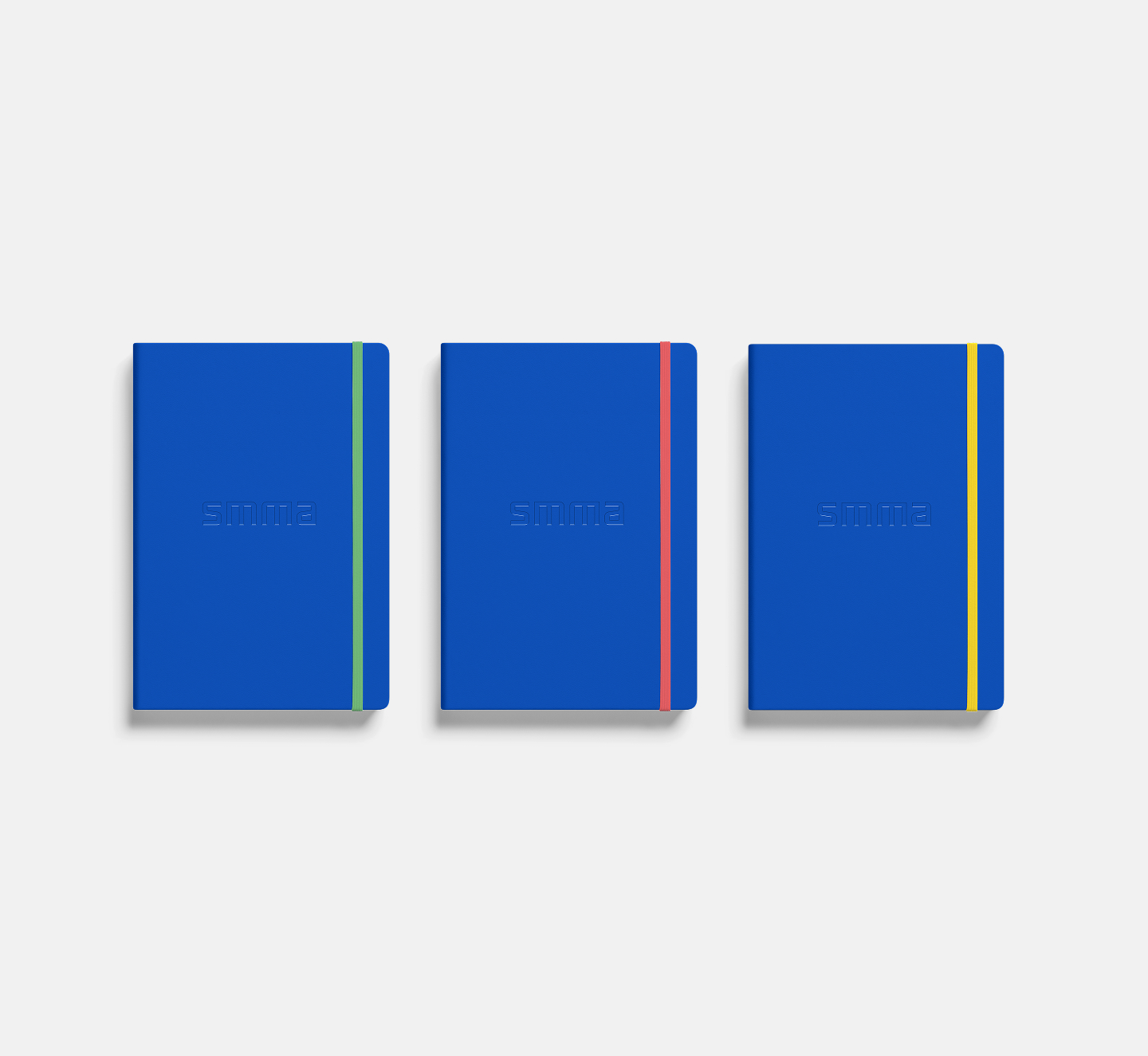
The goal of the new brand was to clearly define SMMA’s competitive edge — instantly signaling the diverse expertise coming together to create uncommon mastery. Small, deliberate tweaks to key letterforms in a custom alphabet added a subtle visual distinction, staying true to the brand’s minimalist aesthetic. A quiet but confident statement: All Together. Different.
A beautiful system, built for real life
True brand beauty comes from understanding both the vision and the challenges — creating a system where every element informs and respects the other. The result isn’t just a brand that looks good; it’s a brand that works beautifully, from the way it’s conceived to the way it’s experienced. We designed every aspect of SMMA’s new brand to be easily executed by their in-house design team. Because a brand isn’t truly effective — or cost-effective — if it relies on the agency that built it. We also coached the SMMA team on rollout strategies, ensuring they could bring the brand to life across all media, ready to launch smoothly from day one.

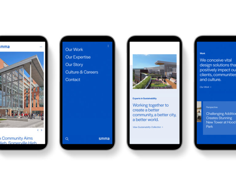
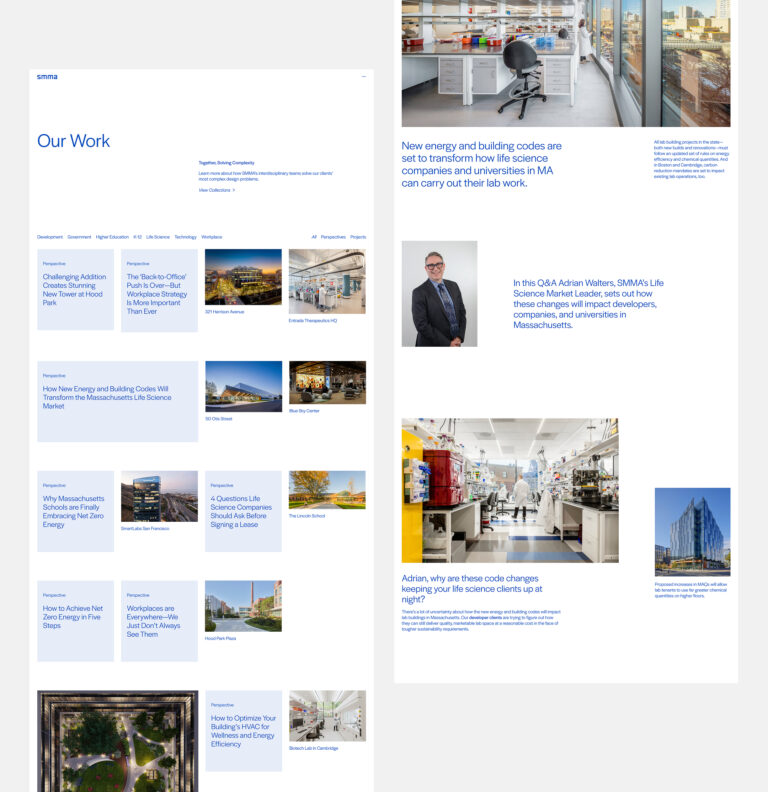
Flexible, focused, and built to grow
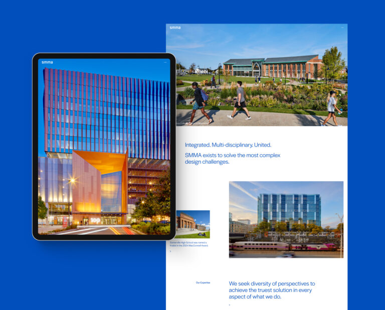
Clean navigation and an intuitive UI keep visitors engaged and connected to the brand story throughout the site. Thought leadership articles pair naturally with the portfolio, offering a more in-depth look at the firm’s interdisciplinary approach. Modular content blocks offer flexibility for storytelling that goes both broad and deep.
Minimalism that Scales
The brand’s minimalist focus creates a natural ease in translating the site across all screen sizes. Clean composition and thoughtful balance ensure that whether viewed on a phone, tablet, or desktop, the experience feels consistent, intentional, and true to SMMA’s story. The design’s simplicity doesn’t limit flexibility — it enhances it, allowing the brand’s personality and expertise to come through at every scale.