Shift, Test Kitchen & Take Out
Overview
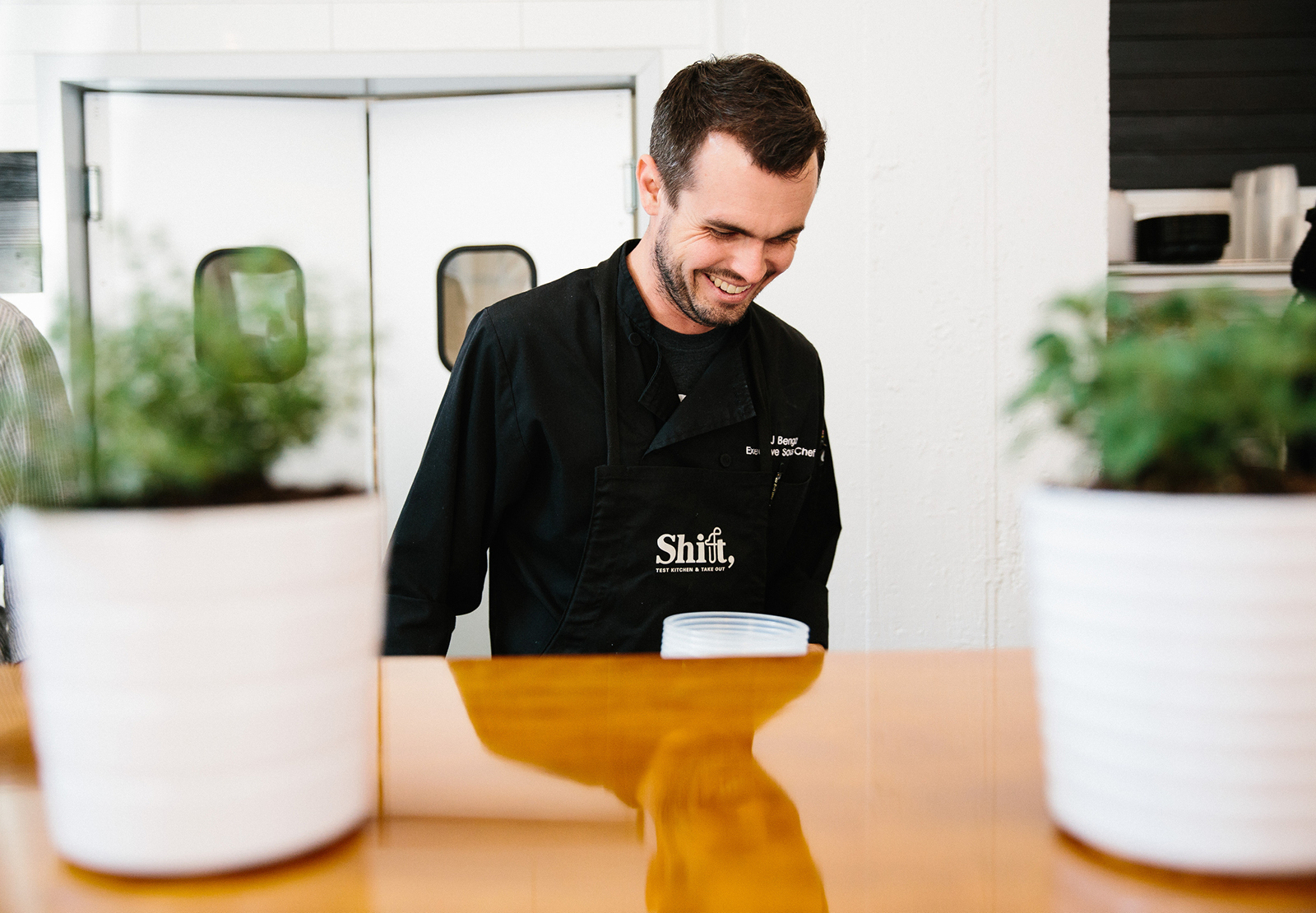
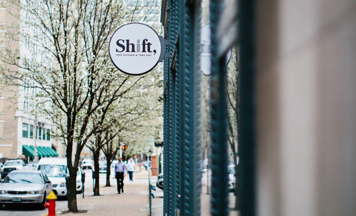
Tucked away in a tiny downtown St. Louis storefront is Shift, Test Kitchen & Take Out, the latest project from St. Louis restaurateur Dave Bailey. The eighth restaurant in the Bailey’s Restaurants family, Shift serves a rotating to-go menu, giving chefs a chance to try out new recipes for sister restaurants. TOKY tackled naming and branding for the experimental new concept.
EXPERIMENTAL, YET APPROACHABLE
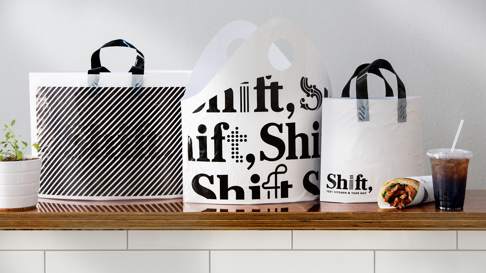
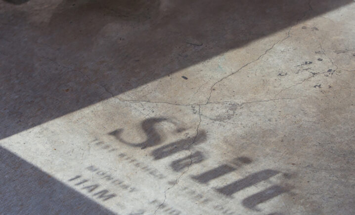
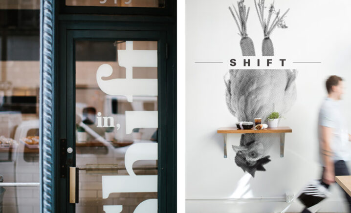
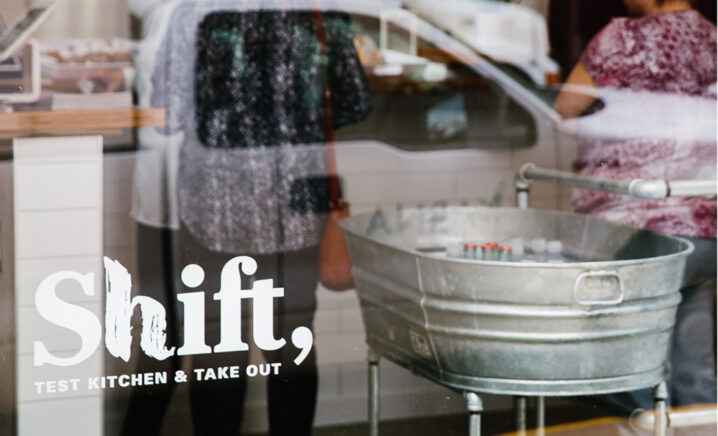
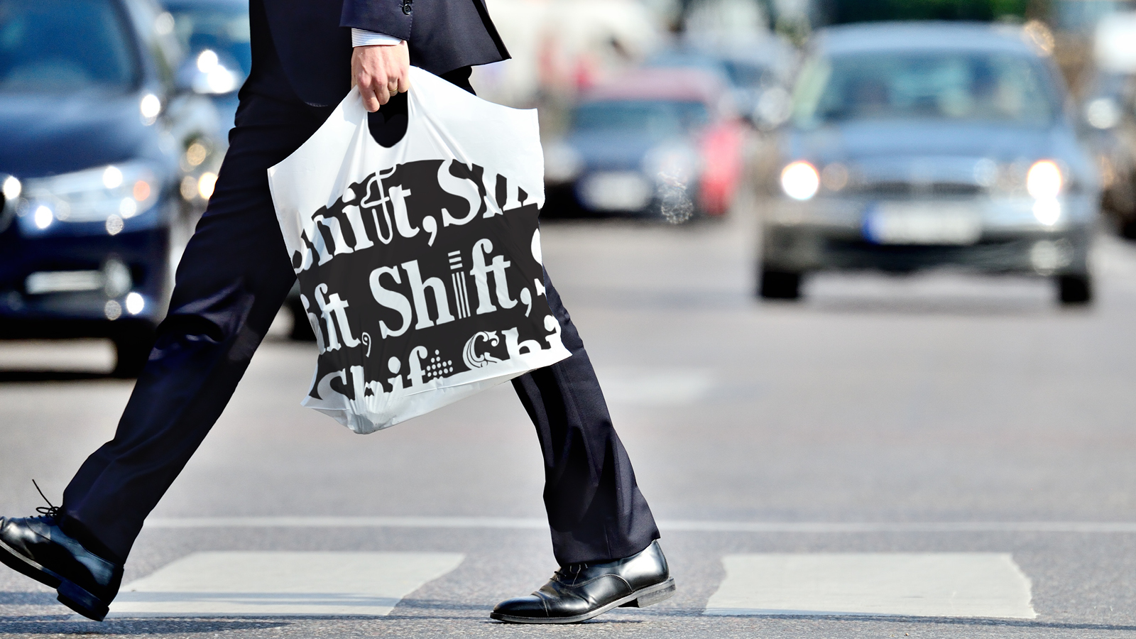
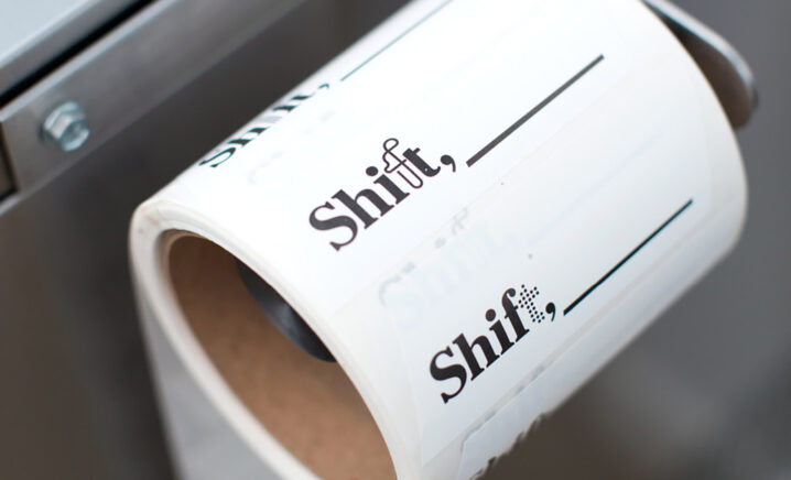
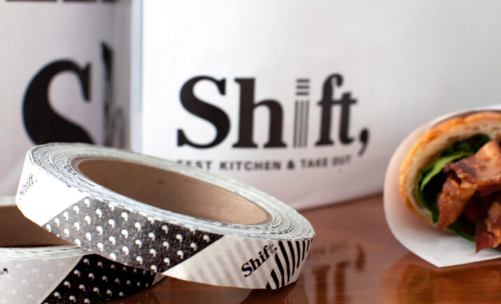
The brand needed to suit the constantly changing menu, while also creating an approachable aesthetic — that “old school New York deli” feel. The identity pairs the 100-year-old typeface used by the New York Times with interchangeable experimental faces. The result is a logo that feels familiar, but with a touch of the unexpected.
MENUS BUILT TO CHANGE
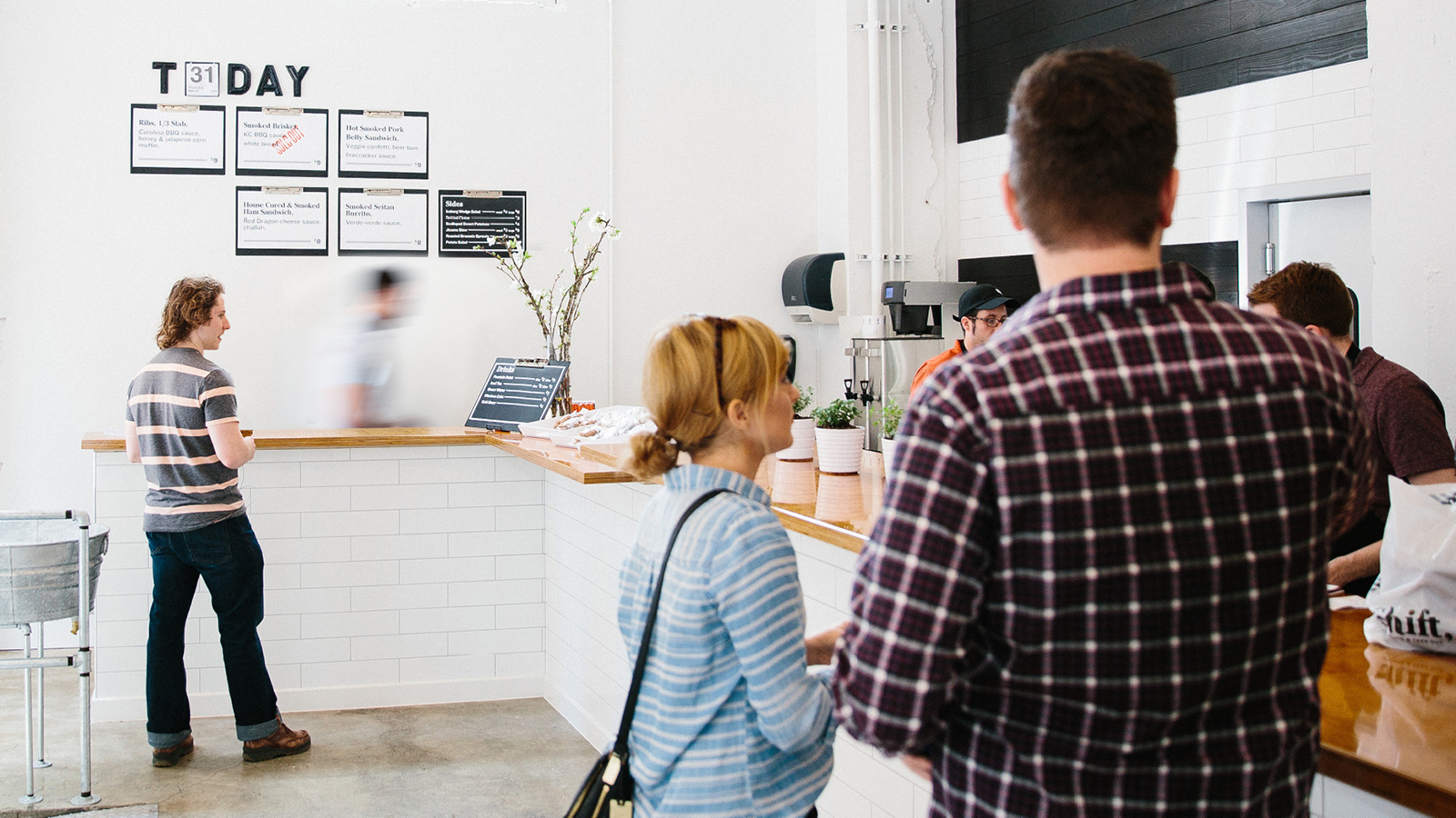
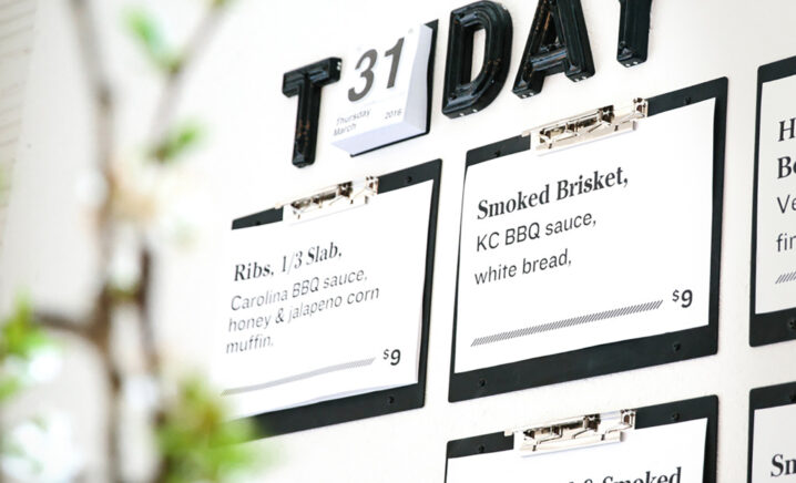
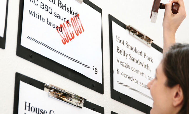
Given the fluidity of the menu, Shift needed a flexible way to present the day’s dishes. We created a clipboard system where staff can clip in daily offerings, then quickly stamp any unavailable items “SOLD OUT” in bold red ink.
EVOLVING LINES
Black and white diagonal lines appear throughout the branding — a nod to the constant evolution of a construction site. These lines can be found on the menu sheets and to-go bags, as well as on the tape, which is used to secure sandwiches wrapped in butcher paper.
Feedback
“I want [Shift] to be an incubator, essentially, for restaurants we’re opening in the future and different types of cuisine we want to try out and experiment with, whether it’s a new restaurant or our existing restaurants.”
Services
Naming
Brand Identity
Signage
Print Collateral
Website Design
Website Development
Awards

Gold
St. Louis ADDY Awards, Cross-Platform Brand Identity Campaign
Silver
St. Louis ADDY Awards, Packaging Campaign

Featured
Communication Arts Typography Annual, Branding
