Case Study
Origin Gin

OVERVIEW
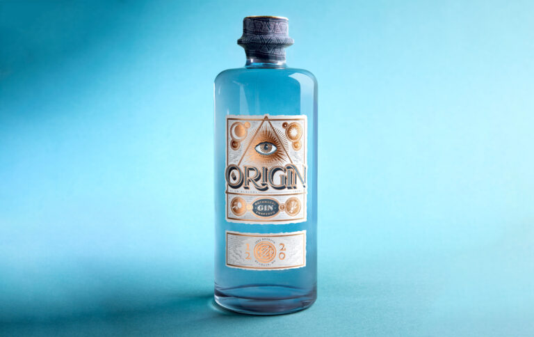
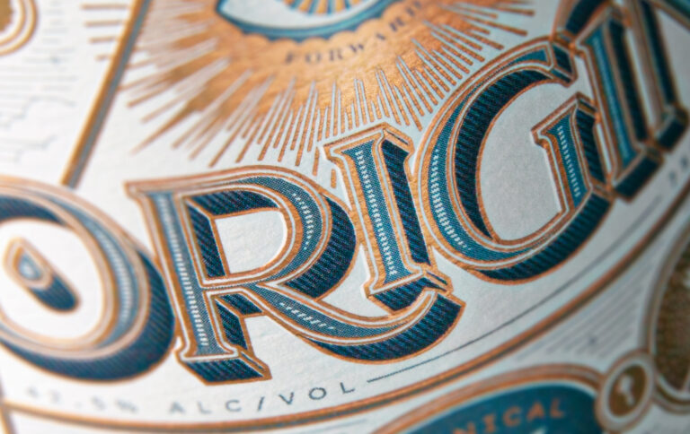
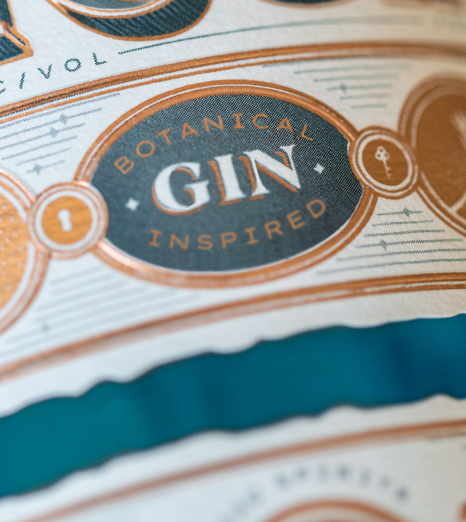
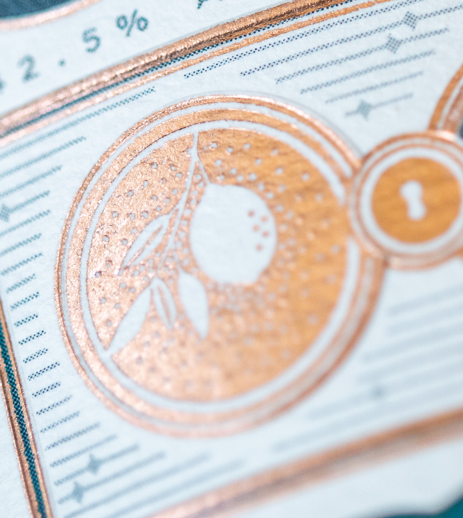
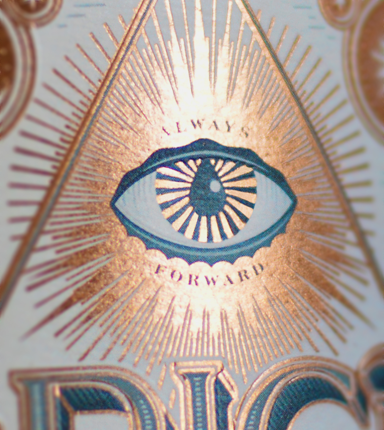
As a distillery inspired by secret societies, Origin’s branding and label needed to lure viewers into a rich clandestine ethos. The label was designed to cloak this botanical gin in secrecy and mysticism — an all-knowing eye, surrounded by cryptic shapes, hovers above custom typography bearing its name. Viewers are left to wonder where this spirit came from, and if buying a bottle will get them in the door.


Awards
Silver
Graphis Packaging 10