Midwest BankCentre
Overview
In the midst of a large merger, Midwest BankCentre asked TOKY to create an identity that would unite two longstanding institutions while reinforcing a commitment to personal, community-focused banking services.
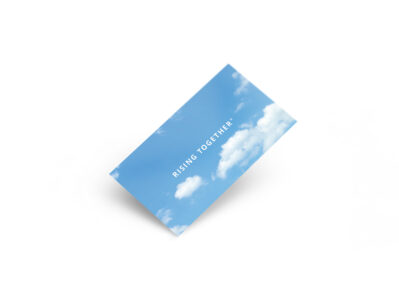
RISING TOGETHER
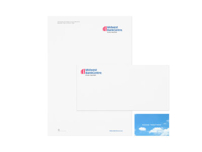
TOKY interviewed leaders of the two merging banks to identify common strengths and goals between the organizations. These findings were paired with customer survey data to develop a full brand platform, including the Rising Together tagline, which references the bank’s iconic balloon logo and commitment to community success.
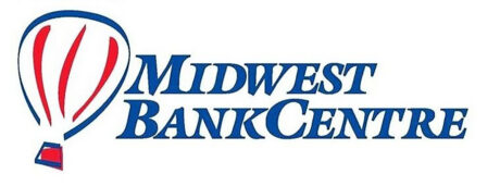
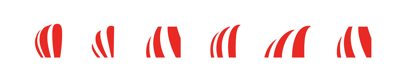
THE BALLOON, EVOLVED
The existing identity — a hand-drawn balloon — felt dated and ran into issues with scaling, both for large signage and small screens. TOKY modernized the logo, creating a mark that works in a variety of applications, from channel lettering to mobile devices.
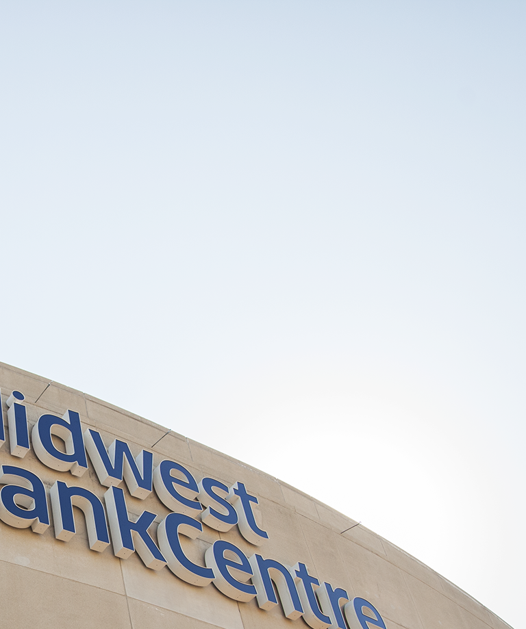
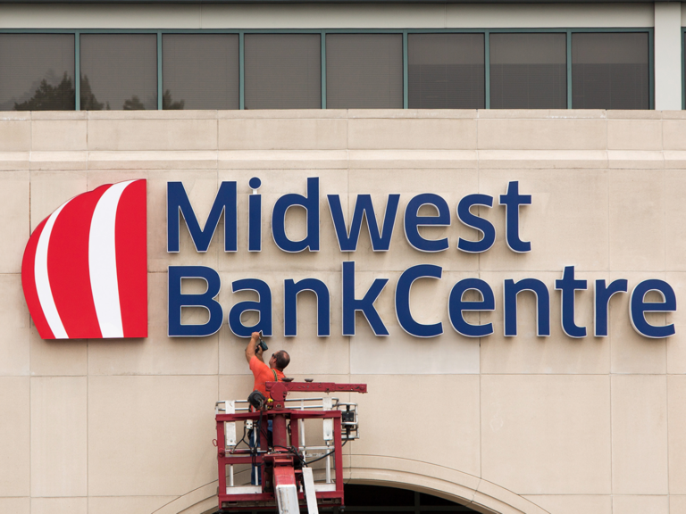
REGIONAL SIGNAGE
With more than a dozen existing branches located throughout the region, the rebrand presented a diverse range of signage challenges. After assessing the bank’s real world requirements, TOKY designed signage that is clearly visible across a variety of settings — from pillars and light boxes to awnings.
Feedback
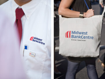
“When we went out to the team, we felt so passionate about this that people came away going, ‘I get it, I understand.’ It was fun and it told the story of us coming together as one bank. Before the merger, we were never a big logo-wear bank. Now, we’re seeing people wear them all over the place. There’s a new buy-in from the team that you can actually see.”
Services
Brand Platform
Brand Identity
Print Collateral
Branded Environment
Awards
Featured
AIGA St. Louis Design Show, Branding