KEB
Overview
KEB is a leading Midwestern accounting, consulting, and advisory firm with offices in Illinois, Missouri, and Wisconsin. To continue to grow and recruit the best talent, KEB needed a brand that would differentiate the firm in a crowded industry while uniting staff across offices and practices.
GUIDING SUCCESS
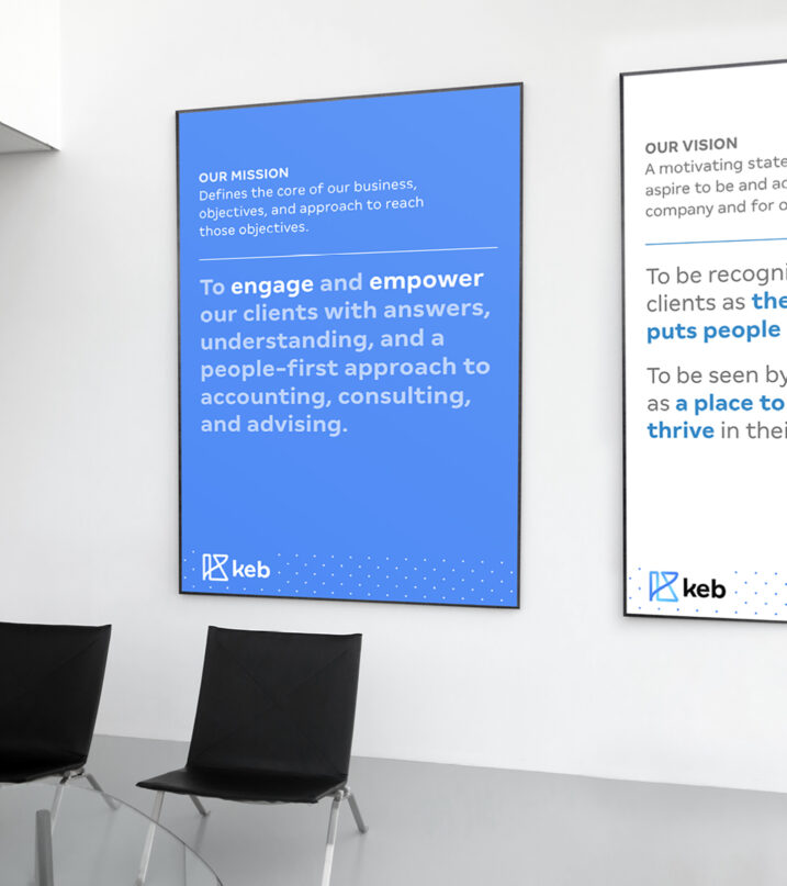
To better understand KEB’s strengths and weaknesses in the market, TOKY interviewed staff and clients across locations and service lines, while also conducting a review of the competitive landscape. Research showed that in an increasingly automated and fast-paced market, KEB is a firm that takes the time to engage and empower clients with answers, understanding, and a people-first approach to professional services.
- 10LEADERSHIP INTERVIEWS
- 5GROUP STAFF INTERVIEWS
- 4COMPETITOR REVIEWS
- 12CLIENT INTERVIEWS
CONNECTING THE DOTs
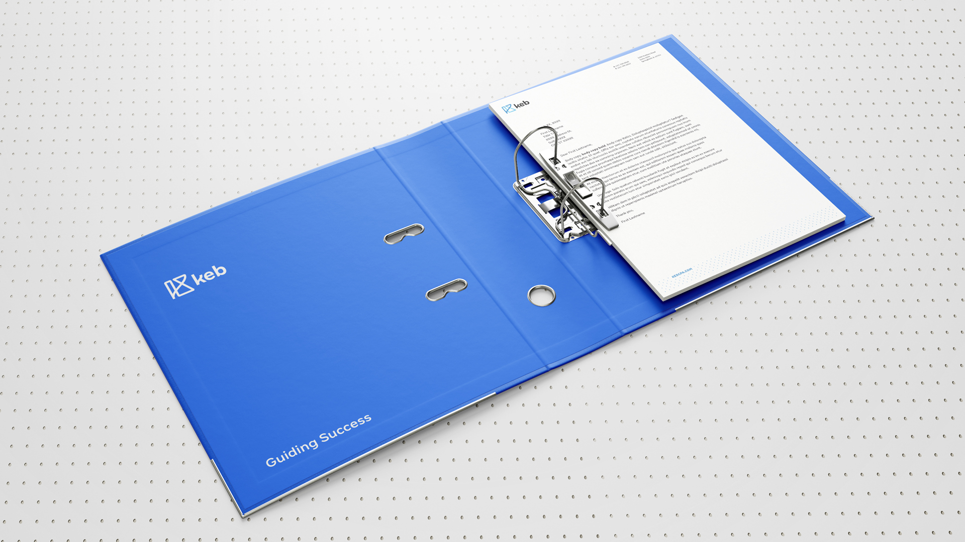
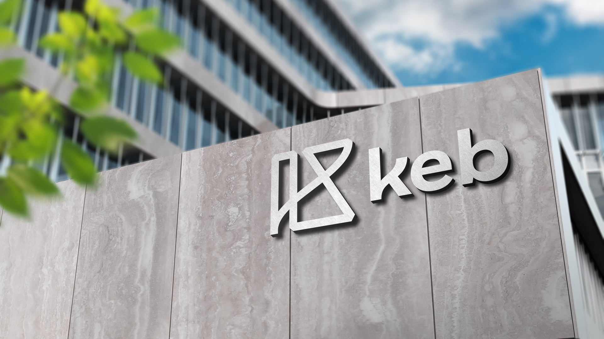
The identity is designed to reflect the firm KEB is today: active, approachable, and connected. The abstract “K” highlights the bonds KEB creates between data, people, practice areas, and office locations. TOKY partnered with renowned type designer Fabio Haag to create a custom brand typeface that communicates the utmost clarity and legibility with friendly human character. Throughout the brand, photography is used to convey optimism and confidence, while the dot pattern provides texture and a reminder of the firm’s commitment to accuracy and connection.


A PEOPLE-FIRST PRESENCE
With a brand focused on guidance and connection, KEB needed a site that would showcase the people who bring those values to life. From personality-driven profiles to more robust location pages, the new site gives KEB a place to shine — as individuals, offices, services, and most importantly, as one KEB.

Feedback
“Partnering with the team at TOKY uncovered what was needed to tell our story and improve our public image. A longtime lack of any coordinated marketing strategy soon pointed us on a unified path taking our firm into the future.”
Services
Research
Messaging
Brand Identity System
Website Design
Website Development
Copywriting
Photography
Video

