Goshen Coffee
OVERVIEW
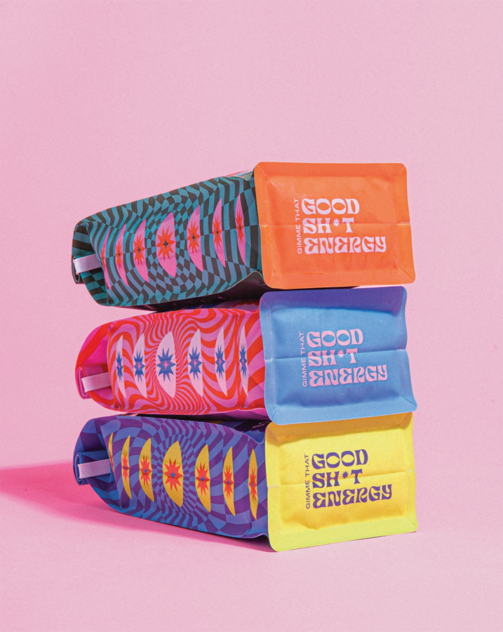
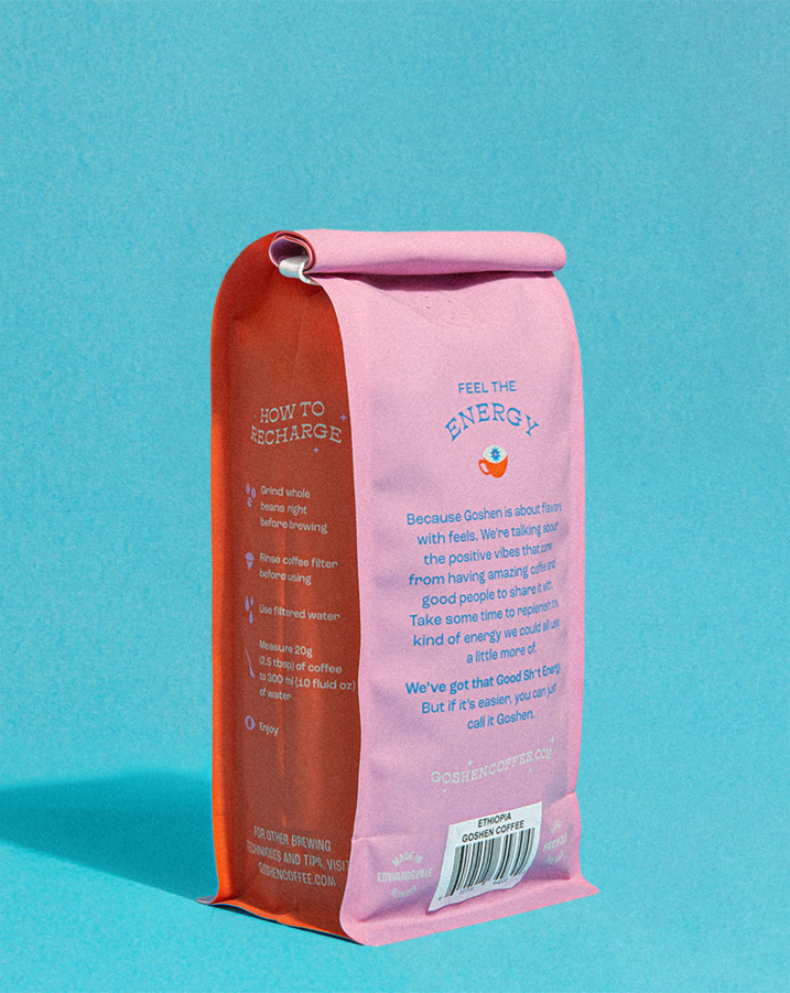
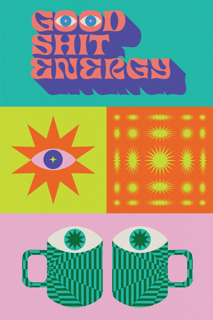
Twenty years of masterfully roasted coffee had earned Goshen a loyal following and plenty of potential to expand. What they lacked was a visual identity that resonated with their audience — and a brand idea to inspire it. To help Goshen stand out on intensely competitive retail shelves and draw more visitors to their cafes, TOKY infused unexpected meaning into the brand name. “Goshen” became a symbolic mashup of the words “Good Shit Energy,” and a North Star for the unapologetic and positive vibe of the new brand.
Visual Magnetism
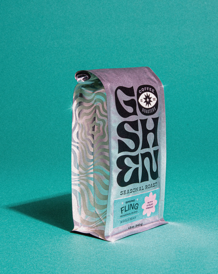
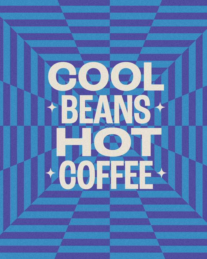
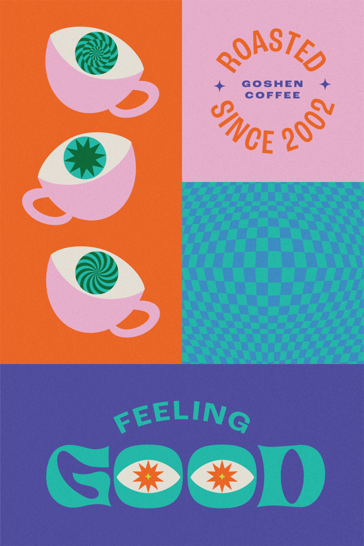
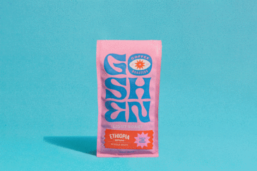
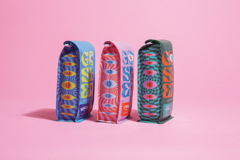
Bold, joyful colors; expressive, hand-drawn lettering; and patterns that radiate feel-good energy bring the brand to life with a magnetism that draws viewers in and keeps them there.
INSTANT ICON
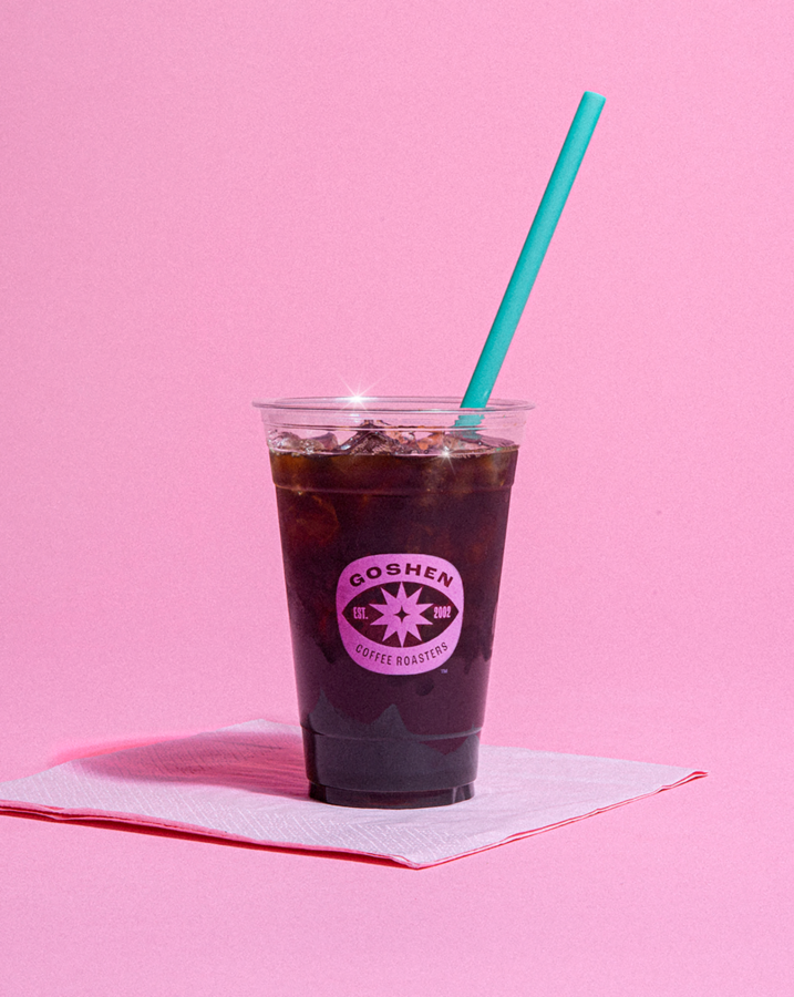
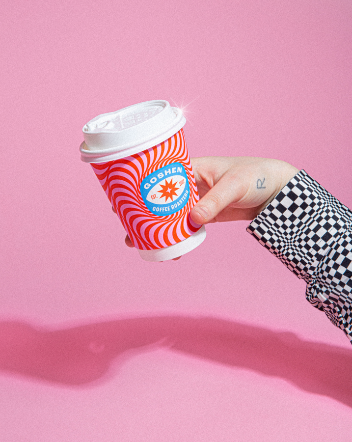
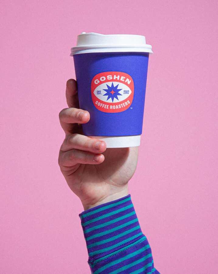
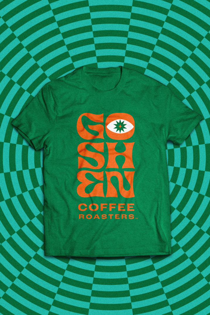
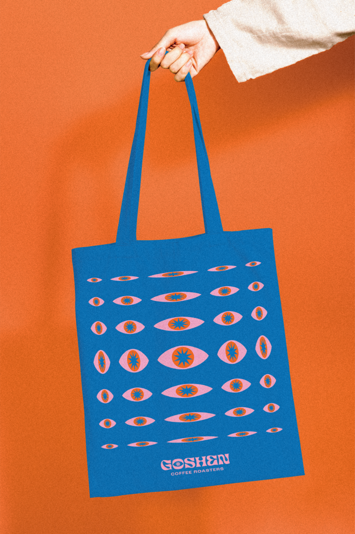
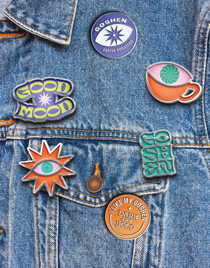
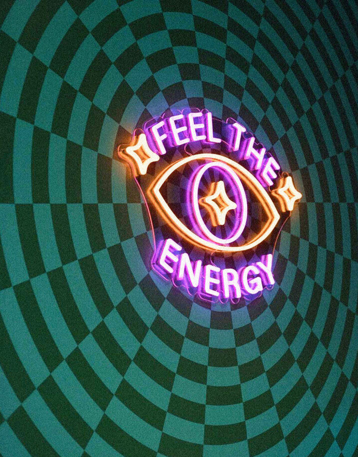
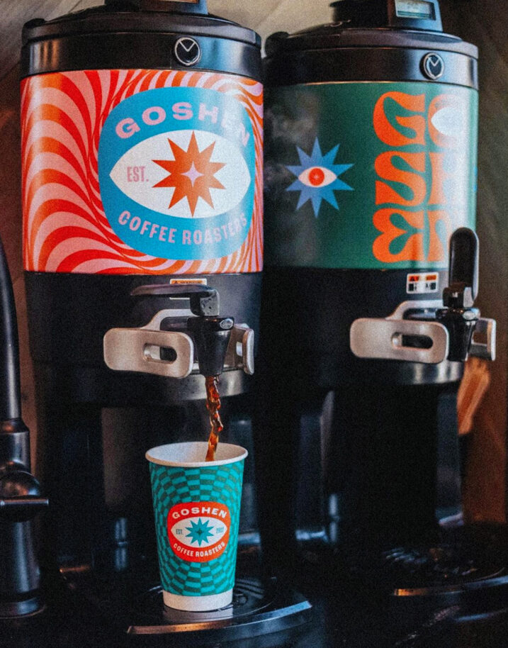
In retail, sales doubled and the new packaging quickly sold out. In cafes, the new brand permeated and energized the environment, with cups becoming an iconic element of the brand experience, neon signage adorning the walls, and t-shirts, stickers, and swag achieving lifestyle status.
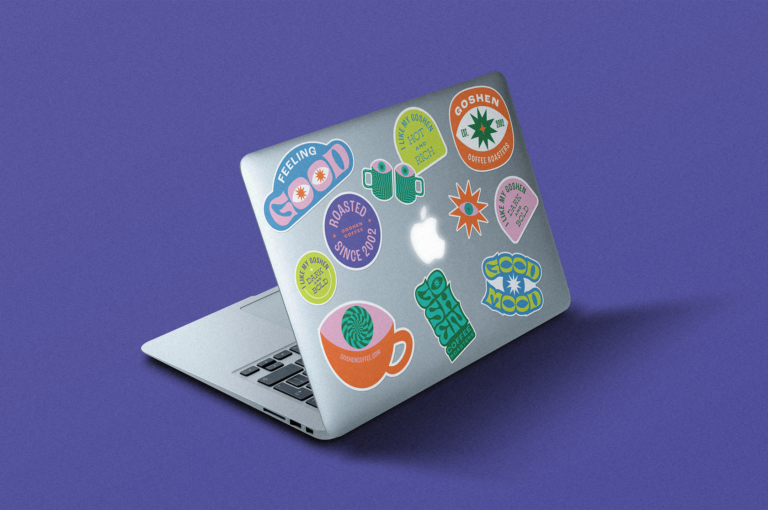
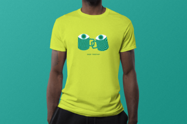
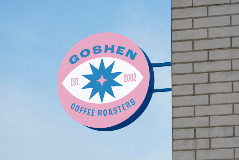
All dressed up
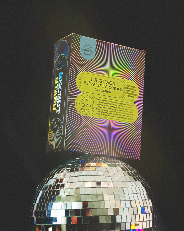
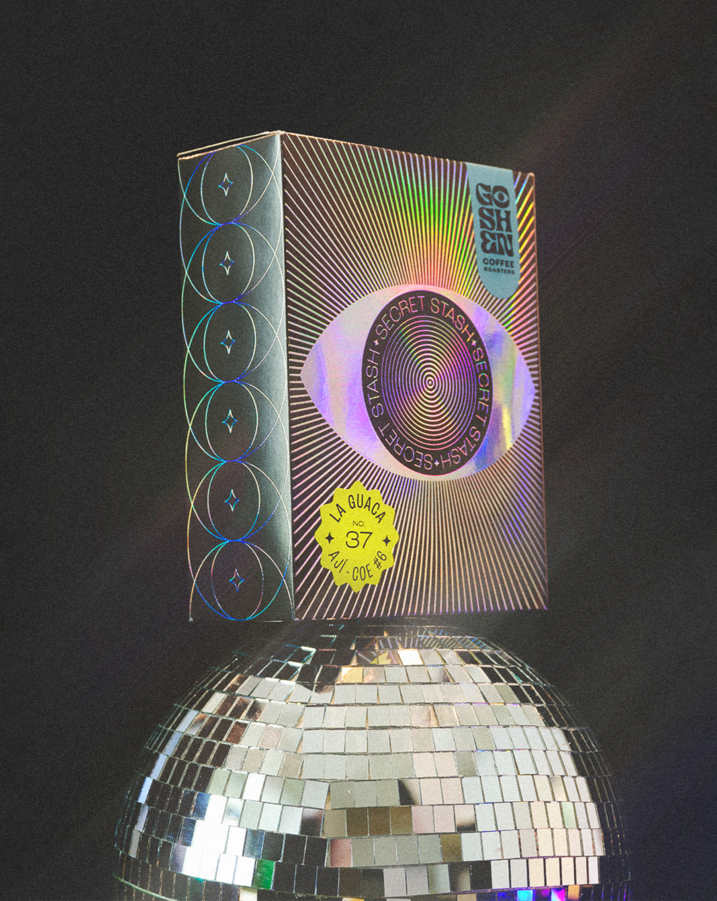
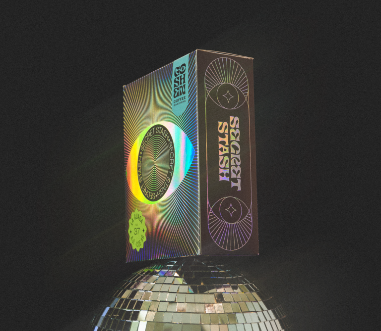
Extra special coffee calls for extra special packaging. For Goshen’s limited-run, high-end line, Secret Stash, we designed a hypnotic, iridescent box meant to stay on your kitchen counter long after its contents are gone.
Feedback
“Bought a travel mug and switched to Goshen because of this branding. Sorcery.”
Services
Brand Identity
Logo Design
Packaging
Copy Writing
Awards

Featured
2022 Communication Arts Design Annual

Silver
Graphis Packaging 10

Gold
St. Louis Addys

Featured
Type Director’s Club 69
