Fentress Architects
Overview
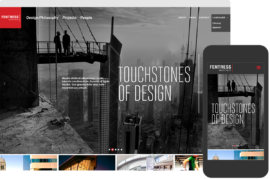
With a portfolio full of iconic built environments, international design firm Fentress Architects needed a website that would illuminate its broad range of work — from tall and narrow skyscrapers to sprawling international airports.
SPOTLIGHT ON THE SPACES
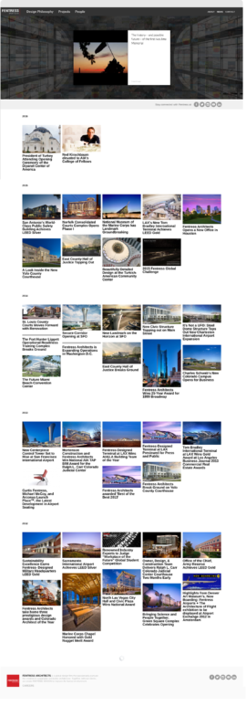
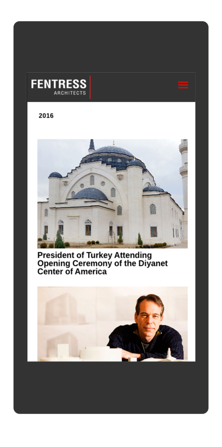
The new design puts Fentress’ recognizable work front and center, minimizing the number of clicks required to dig deeper into the firm’s portfolio and approach.
BUILDING STORIES
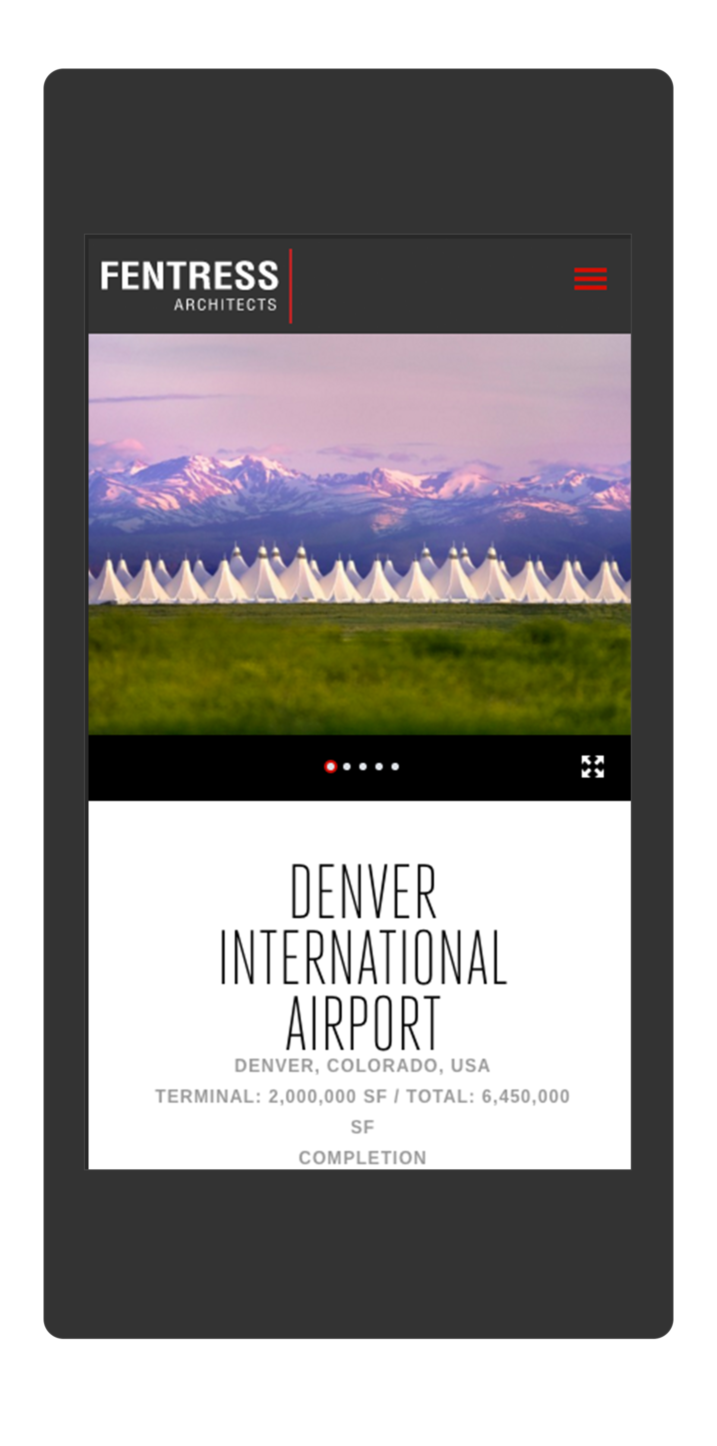
Individual project pages combine stunning photography, easy-to-digest statistics, and behind-the-scenes process images to tell a deeper story about the work.
HIGHLIGHTING EXPERTISE
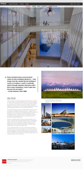
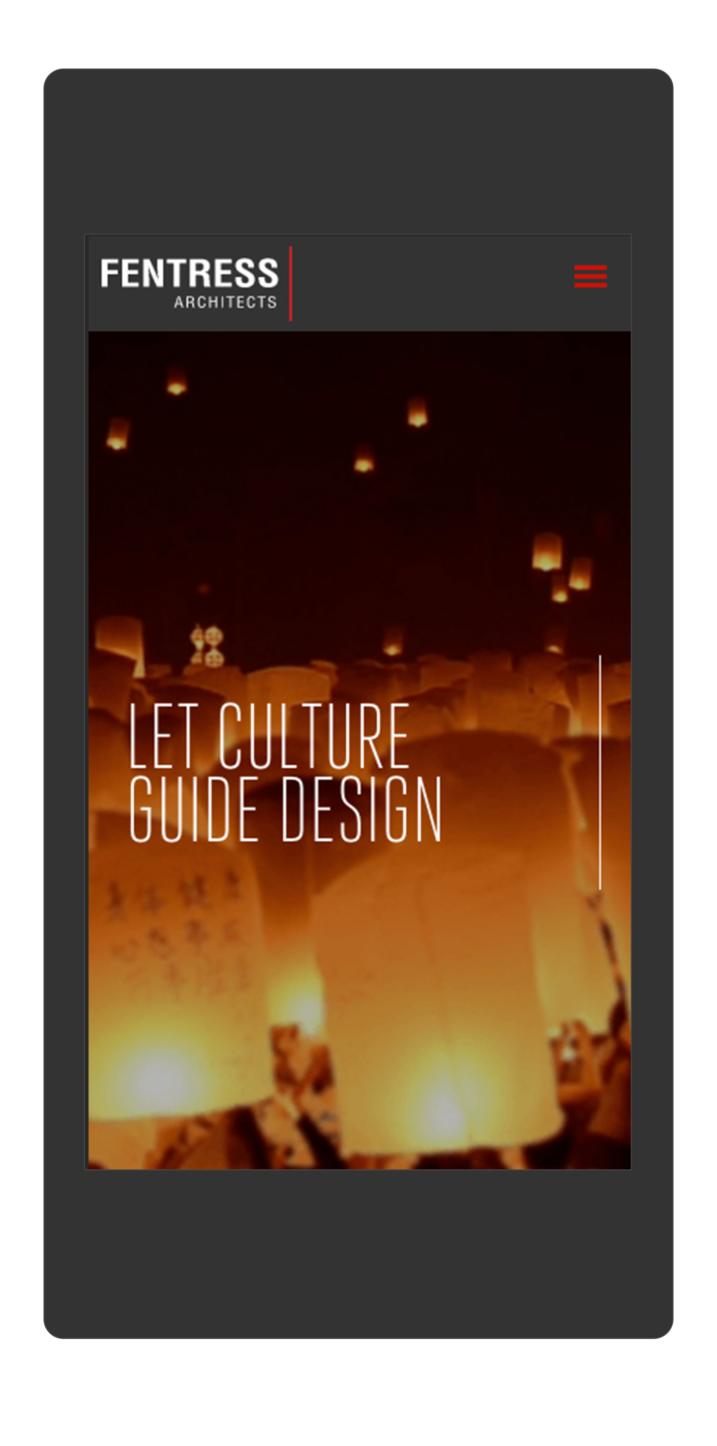
The site includes market-specific landing pages with customized messaging, statistics, and calls-to-action supporting the firm’s specialized expertise — which includes airports, museums, and higher education.
Feedback
“The site TOKY created is not only a beautiful portfolio, but an effective sales tool. We’re now able to showcase our market expertise and philosophy in a way that truly stands out from competing firms.”
Results
- 231%INCREASE IN TIME SPENT ON CIVIC & COURTS PAGE
- 132%INCREASE IN TIME SPENT ON CONVENTION CENTERS PAGE
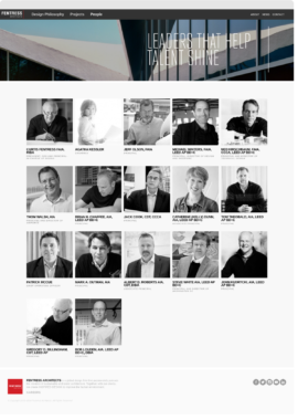
- 160%INCREASE IN TIME SPENT ON PEOPLE PAGE
Services
Website Design
Website Development
Awards

Second Place
SMPS National Marketing Communication Awards, Website

Silver
St. Louis ADDY Awards, Online and Interactive Websites – Consumer
