Case Study
Edera Italian Eatery

OVERVIEW
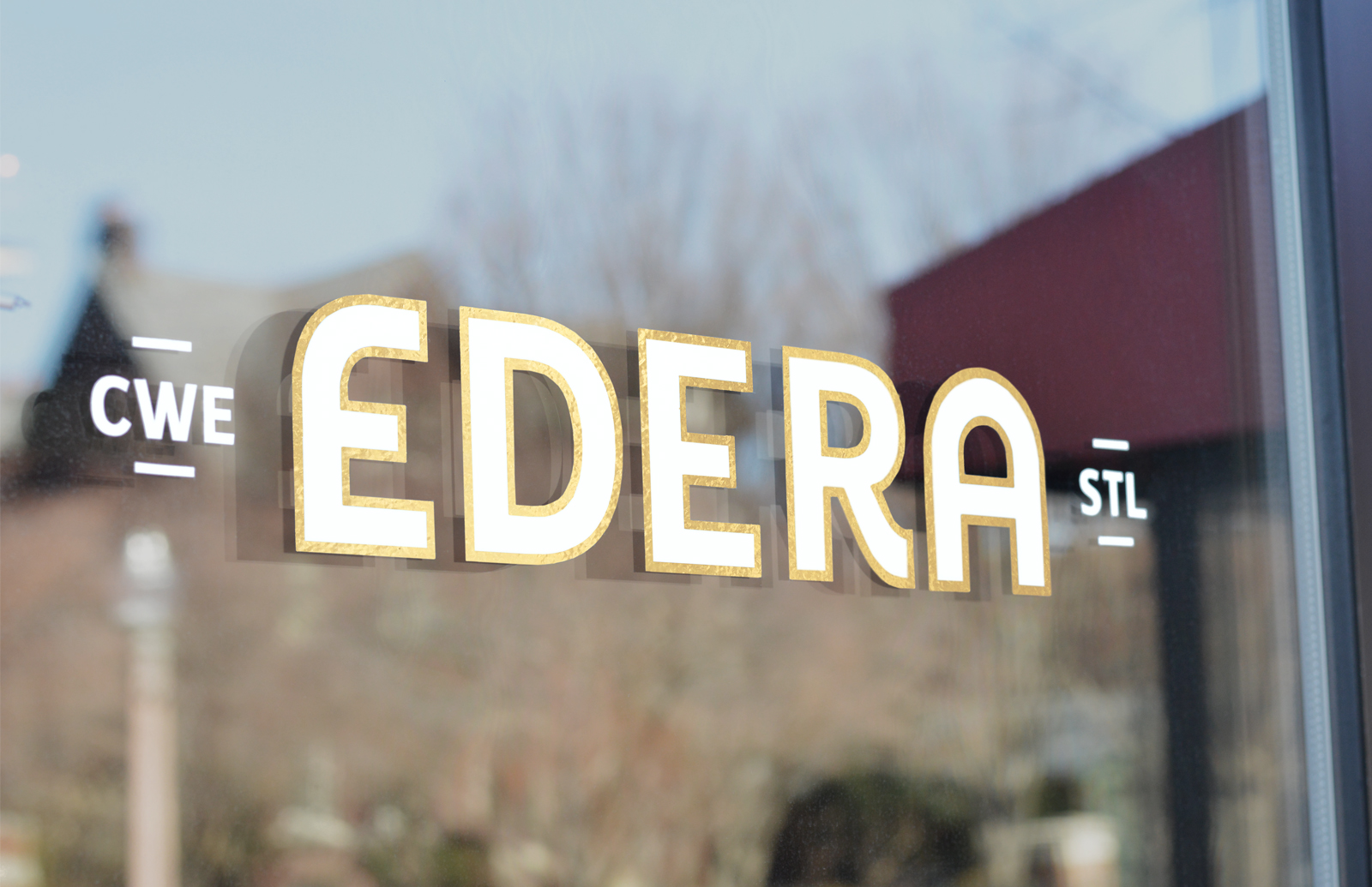
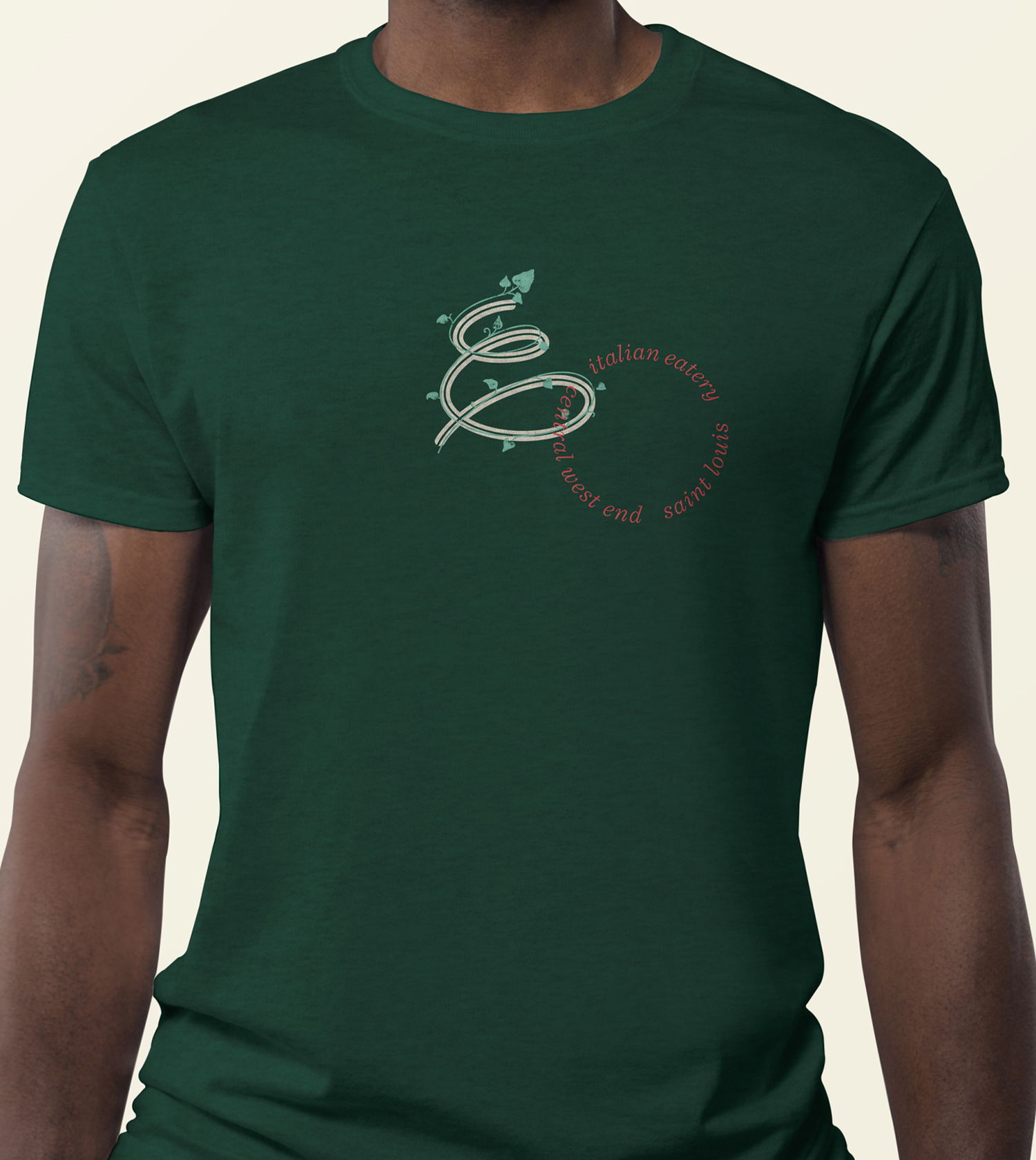
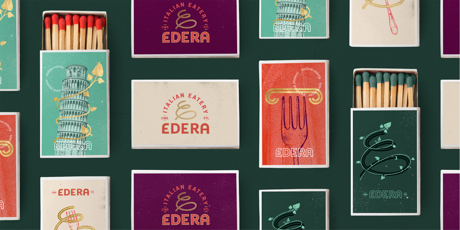
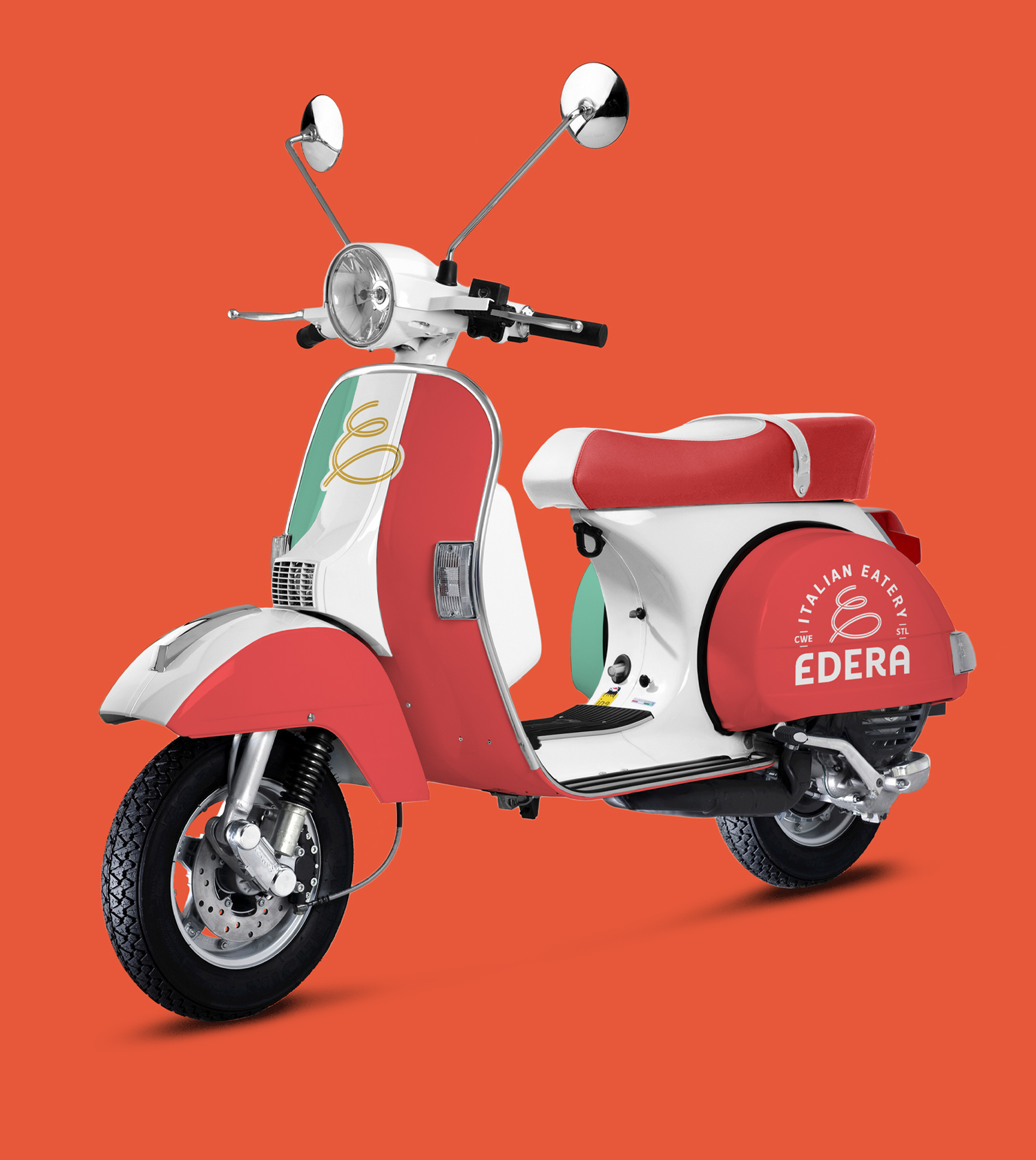
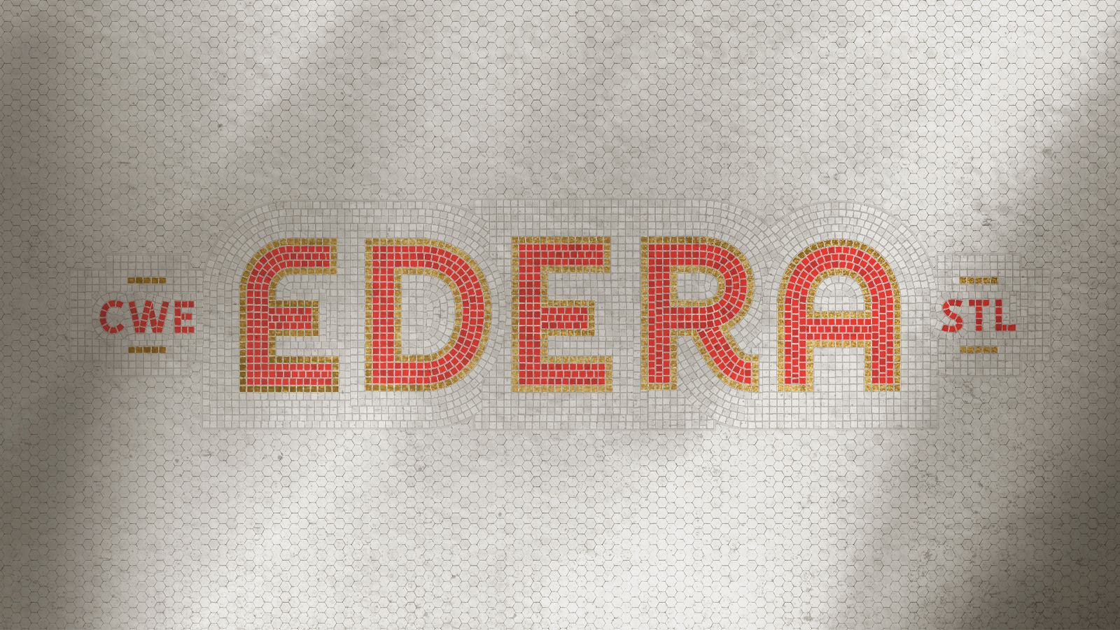
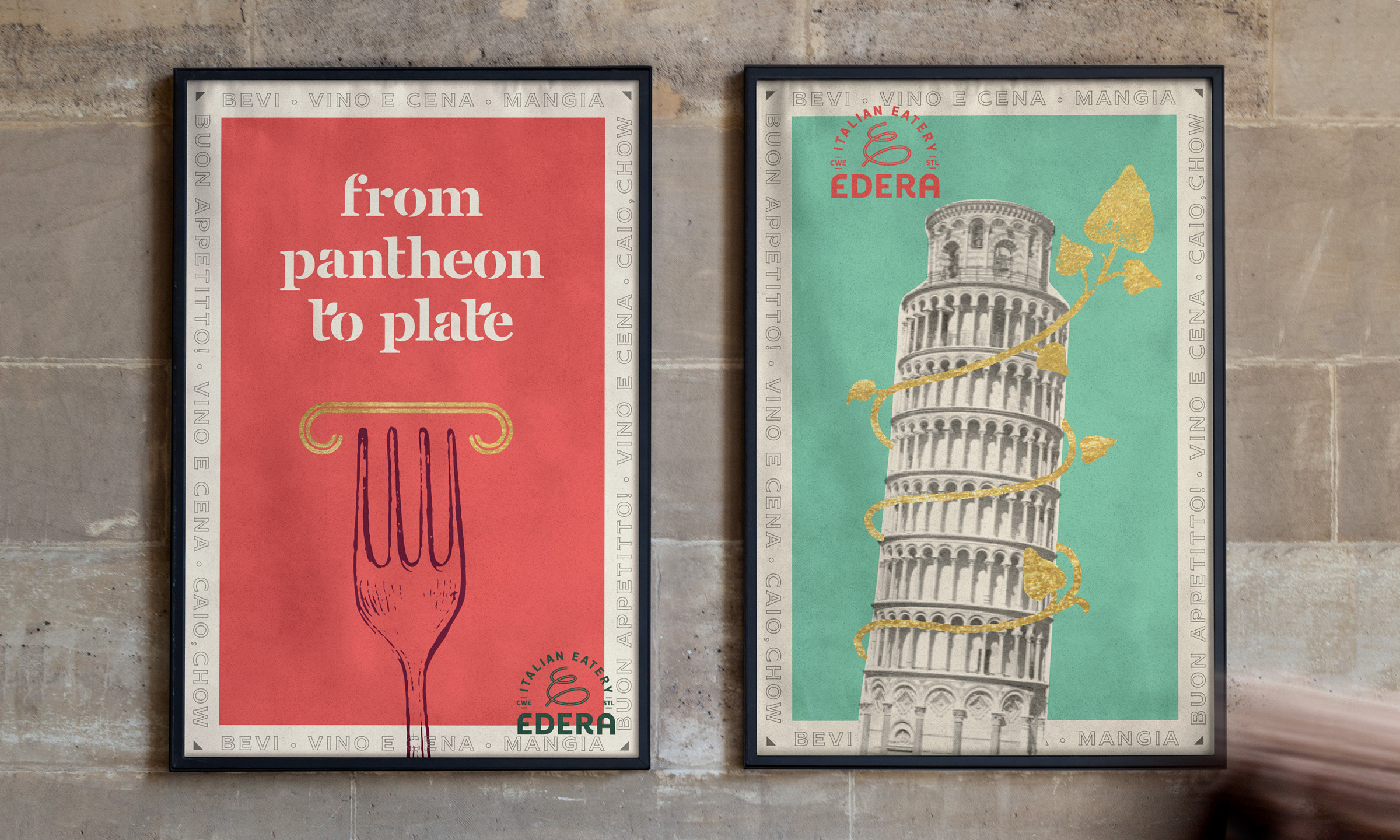
Edera (Italian for ivy), was inspired by the iconic ivy-covered walls surrounding the restaurant’s outdoor dining space. Much like the food, the Edera brand strikes a balance between upscale and approachable, combining traditional Italian typography with modern stencil lettering.
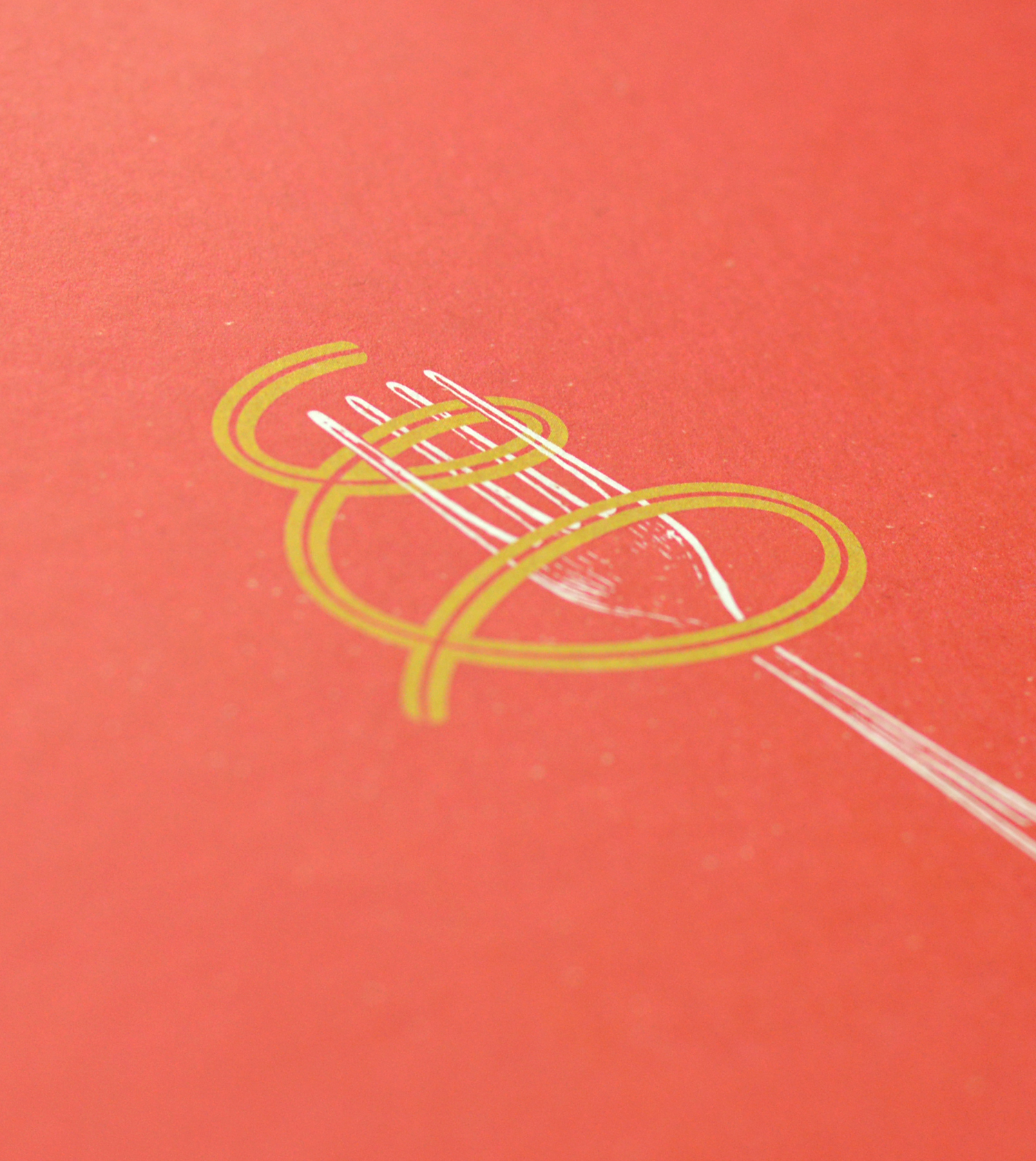
To evoke Edera’s iconic ivy and urban setting, elements of the stenciled typography were subtly embellished to reference budding plants.

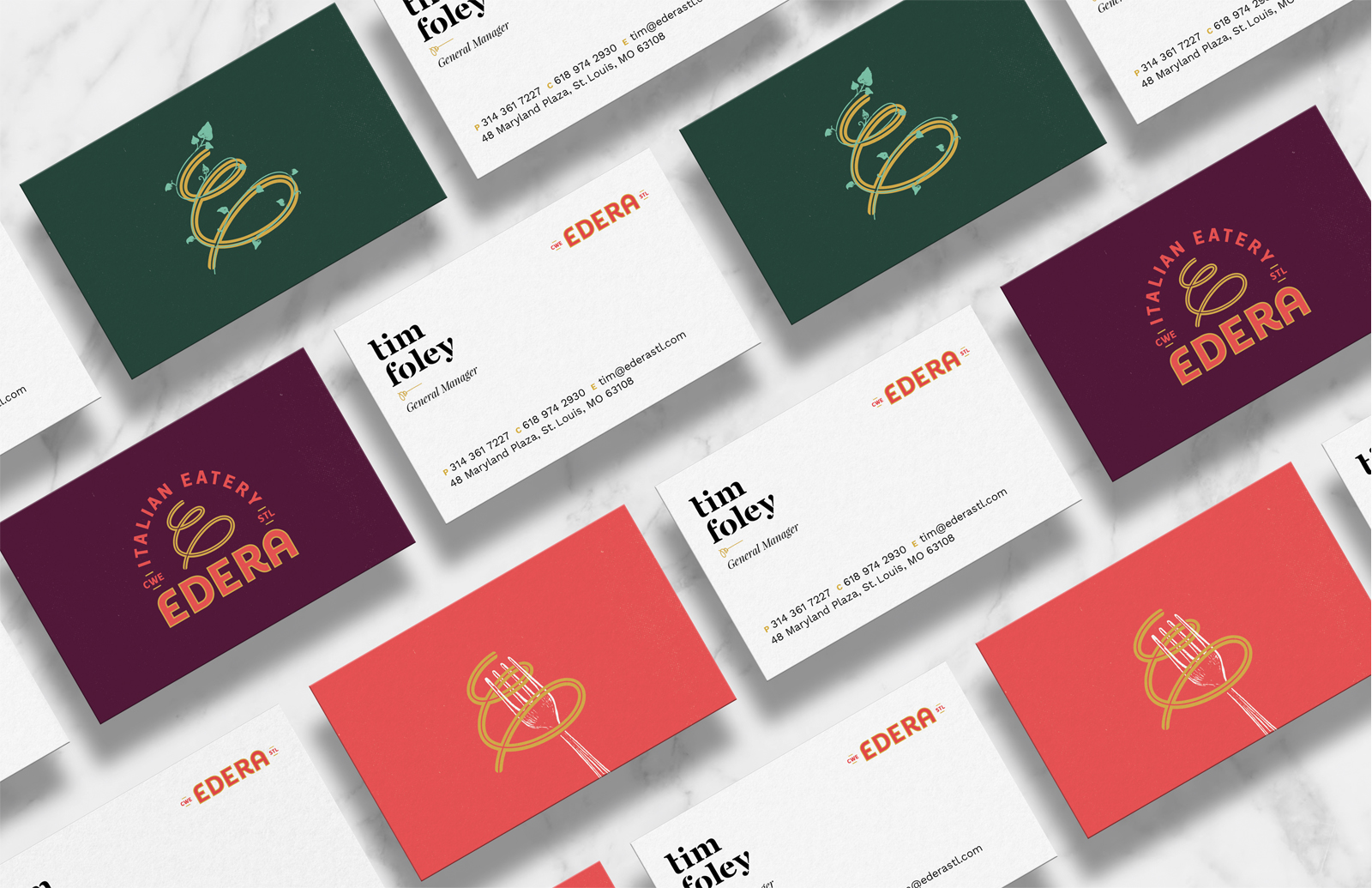
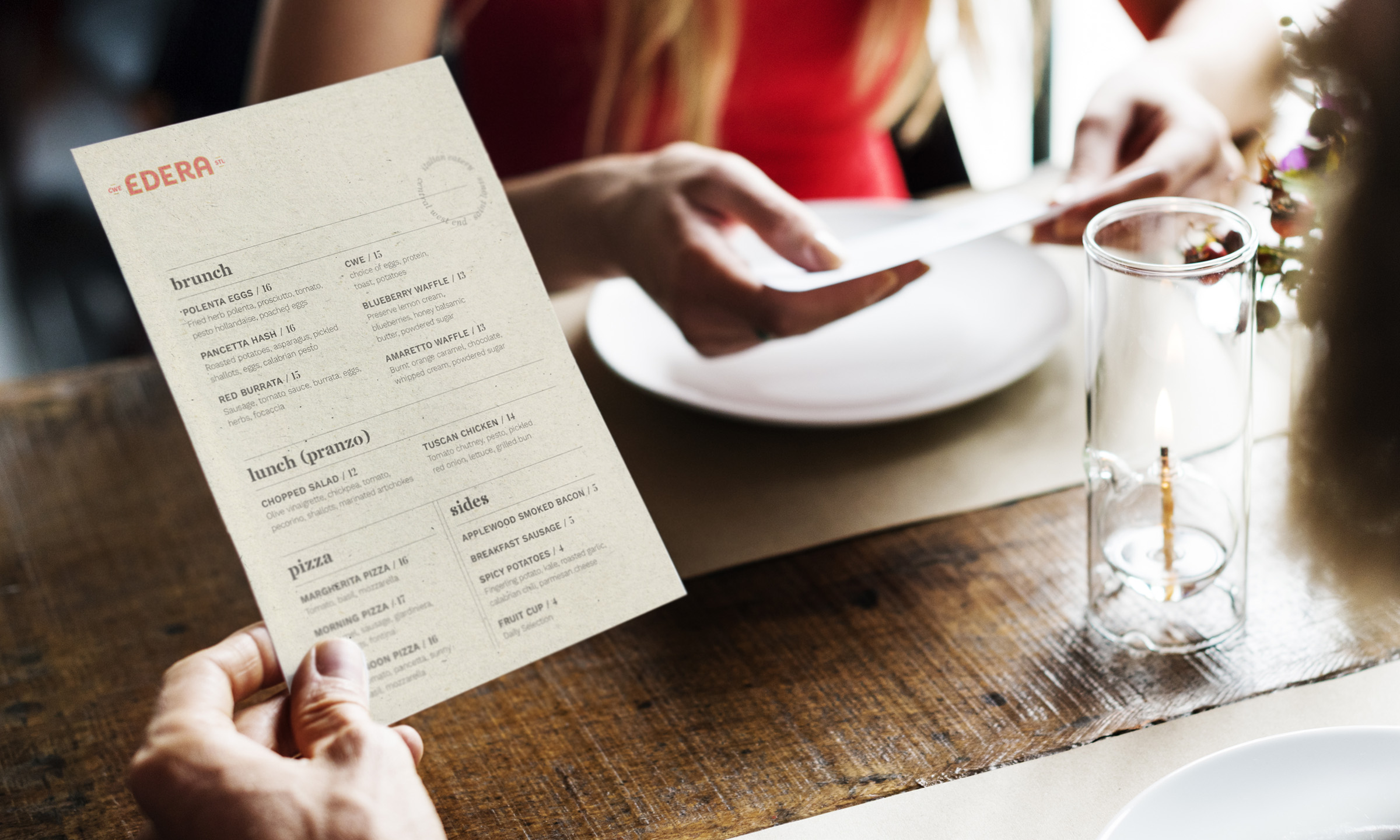
To support a frequently changing menu, we balanced an easily-updatable typographic template with a premium paper feel.

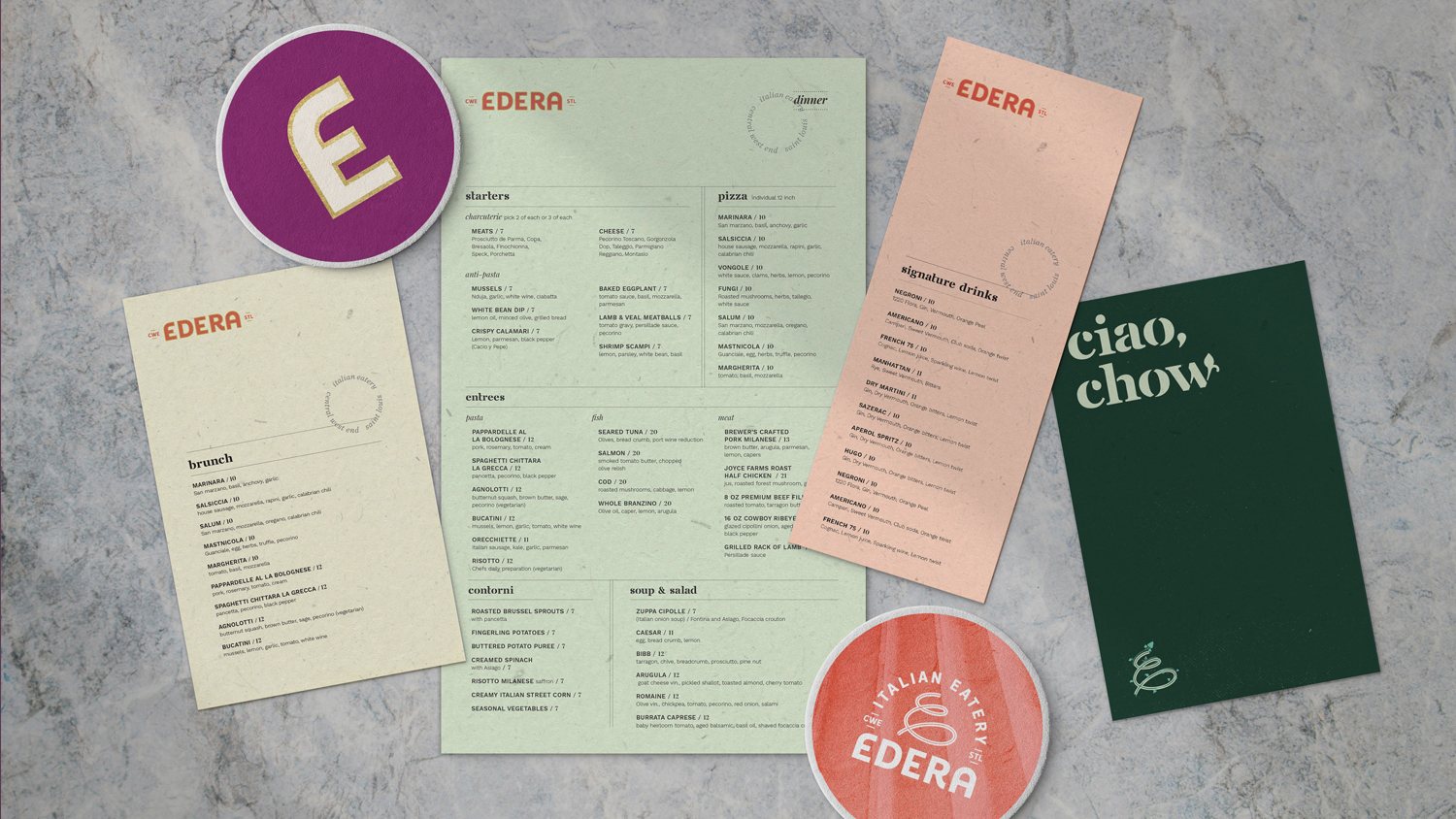
The playful personality of the Edera brand comes through at every touchpoint — from signage and matchbooks to take-out bags, T-shirts, and scooters.