Cline

Overview
Cline—a multifamily-focused design firm—found themselves navigating a leadership transition, growing their business in a new market and wearing a brand that no longer reflected who they had become. To plot the path forward, TOKY conducted research, refined their brand strategy, revamped their visual identity, and launched it all with a new website.
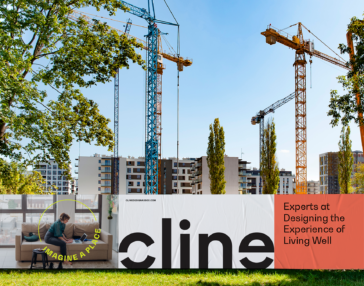
Filling in the blank
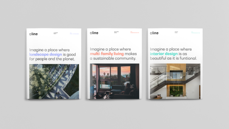
In the course of our work, we revisited a messaging idea Cline had developed years before: Imagine a Place. There was something to the premise of it, but the language that followed this lead-in typically failed to connect it to Cline’s expertise. We chose to build on what was already working by filling in the blank with messages that targeted potential hires, potential multifamily clients, and even potential tenants. It became a core aspect of the rebranding effort.

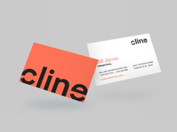
Wordmark
The new wordmark took inspiration from the concept of “Imagine a Place” by removing pieces of the “c” and “e” letterforms, prompting viewers to envision the whole. The “c” also bears resemblance to a reticle on a camera display, conveying a sense of framing and focus. We designed the wordmark in lowercase to convey a modern, yet friendly sensibility that reflected the firm’s personality.


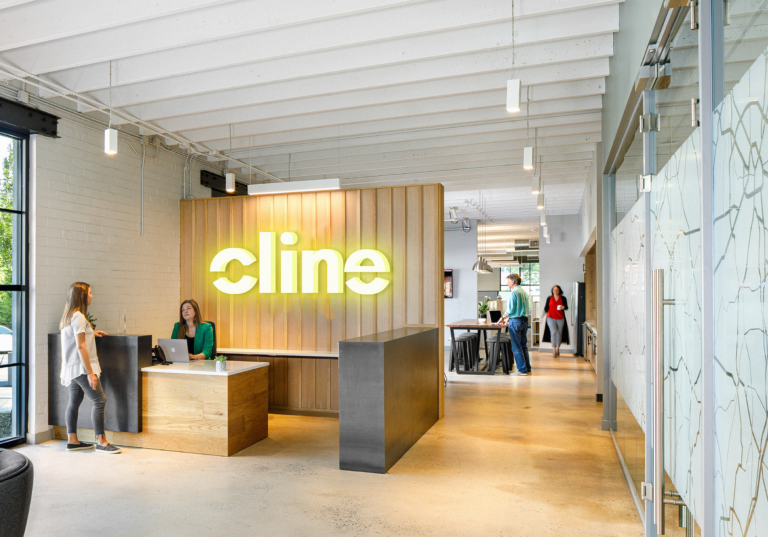
Structured but flexible
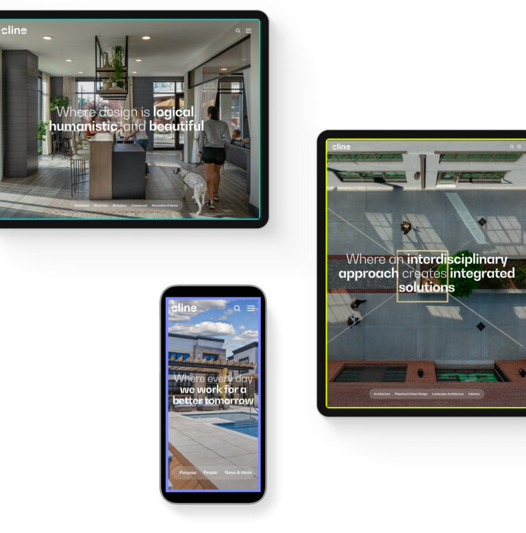
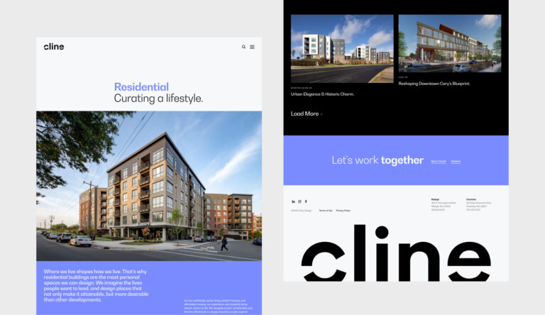
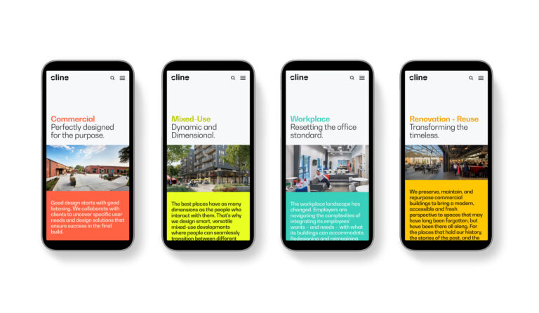
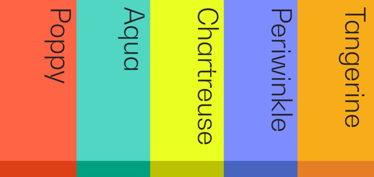
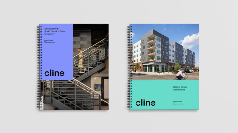
The visual system features an expanded palette to offer creative range, differentiate from competition, and to convey a sense of confidence that breaks through the confines of uniformity. A grid-based approach to composition also ensures consistency in the polish of Cline’s aesthetic, while allowing photography of the firm’s work to be presented without clutter or distraction.
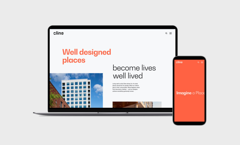
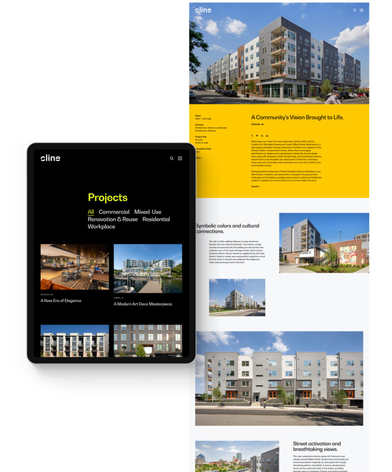
Clicking Into Place
Cline’s website aims to convey not only what they put into the portfolio of places they’ve designed, but how their values help to inform their work —particularly the idea of living well.