BridgeHealth

Overview
Listed among the Inc. 5000’s fastest-growing private companies, BridgeHealth is a Denver-based healthcare services firm working to improve health outcomes and lower costs for members. The company asked TOKY to build a distinctive brand that would support this trajectory of growth.

OUTCOMES BY AUDIENCE
To understand and articulate the benefits of BridgeHealth’s complex offering, TOKY interviewed key stakeholders and reviewed the competitive landscape. These findings paved the way for a new brand platform that speaks directly to the firm’s core audiences: members, plan sponsors, and healthcare providers.
SUPPORT REIMAGINED
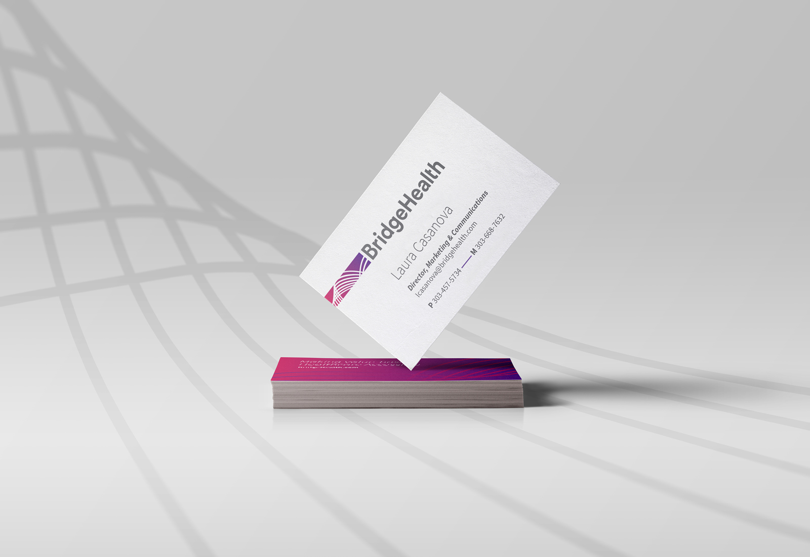
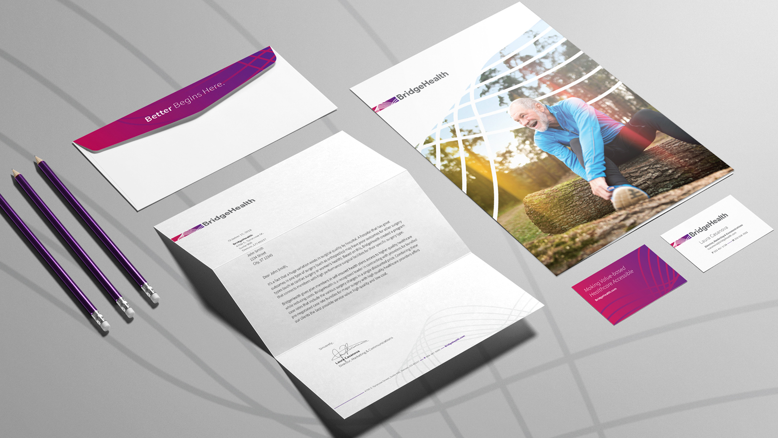
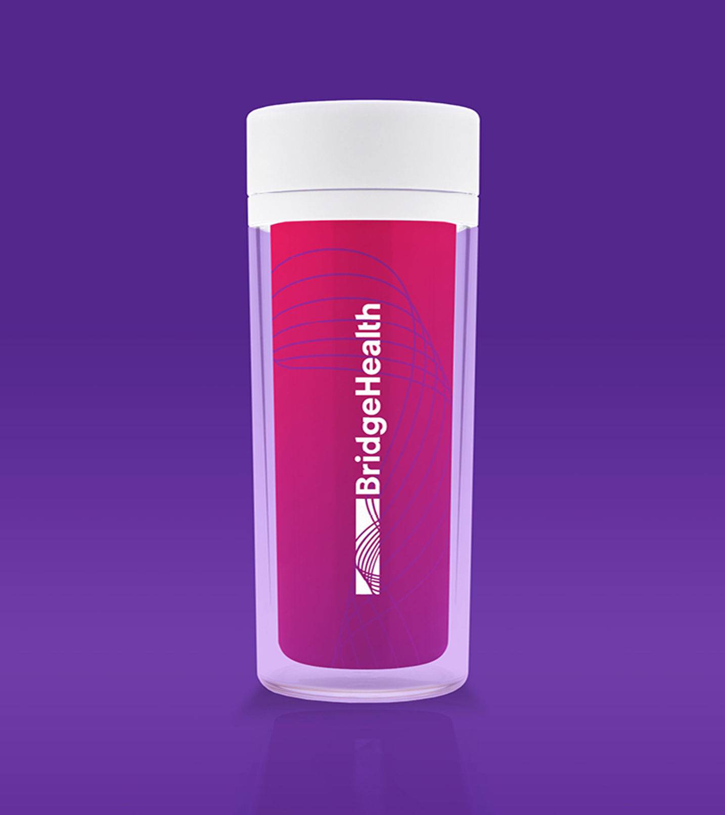
Inspired by the suspension cables of a bridge, the brand icon is a visual representation of the network of support BridgeHealth provides for clients. In landscape format, the identity is reminiscent of a horizon view, a metaphor for each client’s journey toward recovery.


ELEMENTS OF CARE
The ribbon used in the brand icon works as a connective element throughout BridgeHealth marketing materials, enveloping the subject to reflect the immersive level of support from start to finish.


Feedback
“TOKY delivered the updated, fresh brand identity we were looking for. We love the vibrant colors and how the design implies a bridge, making the look subtle but impactful. Thanks to TOKY, we are able to move forward with a new approach to our corporate marketing and identity.”
Services
Research
Brand Platform
Brand Identity
Print Collateral