Big River Footwear
OVERVIEW
Big River Footwear needed to walk a carefully drawn line in their test-market rebrand: They had remove “running” from the name without alienating runners. They had to attract a younger, more active customer base without scaring away a small, comfort-seeking audience. And they had to establish an updated brand without losing what they had become known for: helping customers get shoes that fit them perfectly. We helped Big River find their sweet spot, an evolved aesthetic, and steady footing for their future — starting with a more modern and active logo.
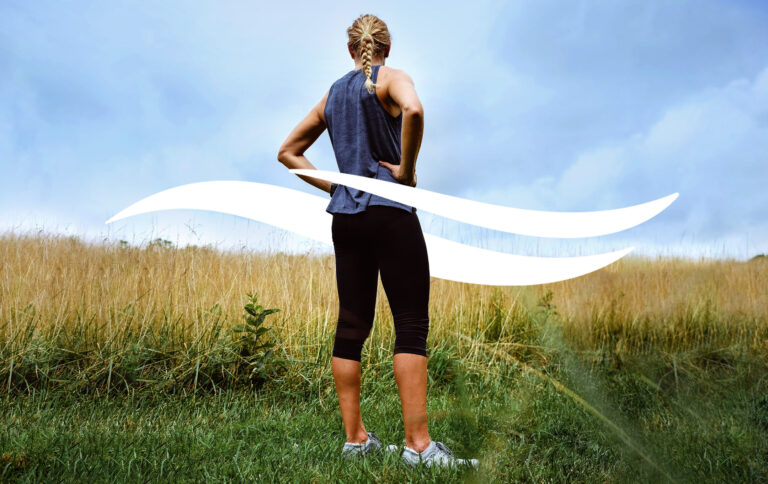
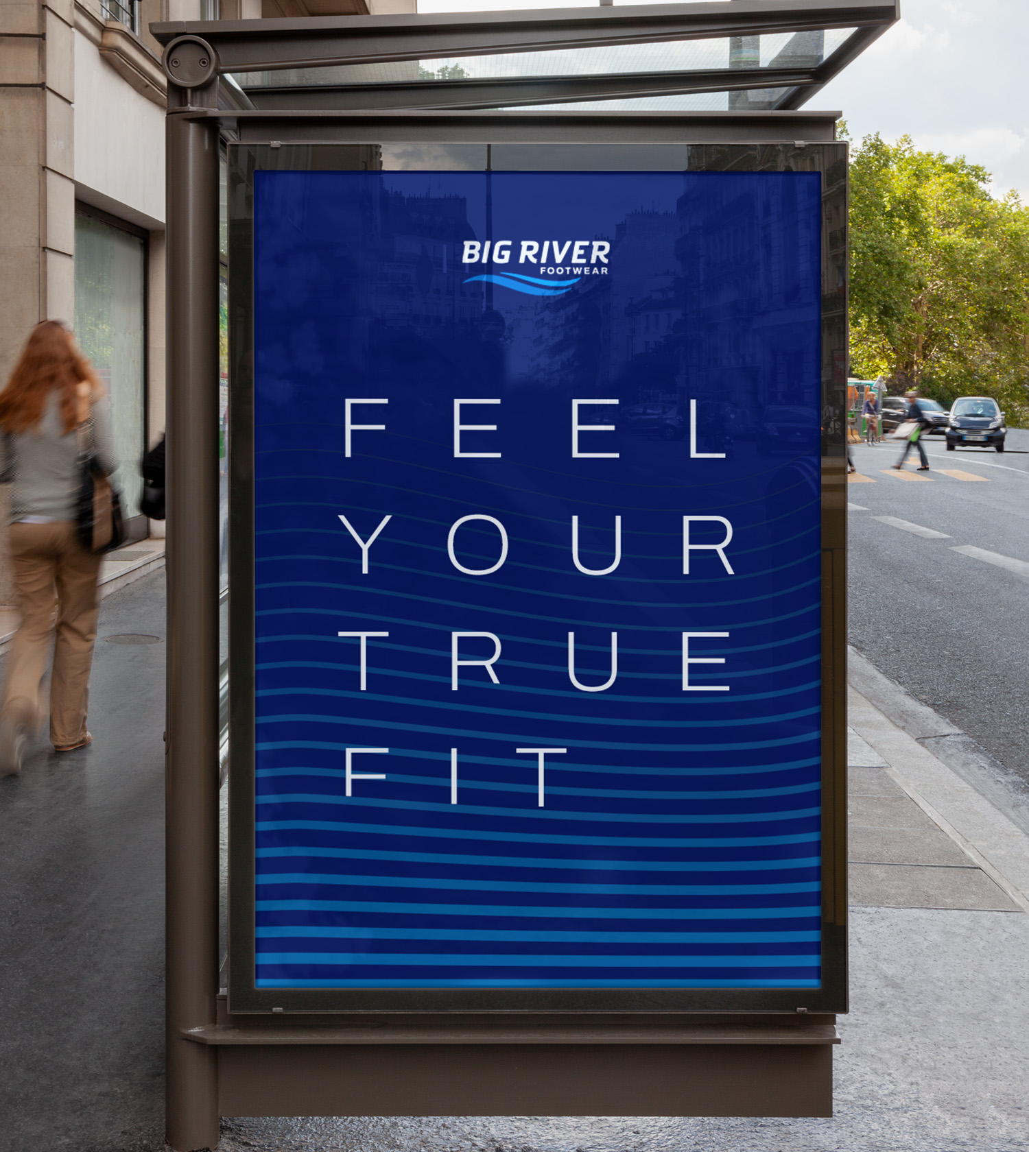
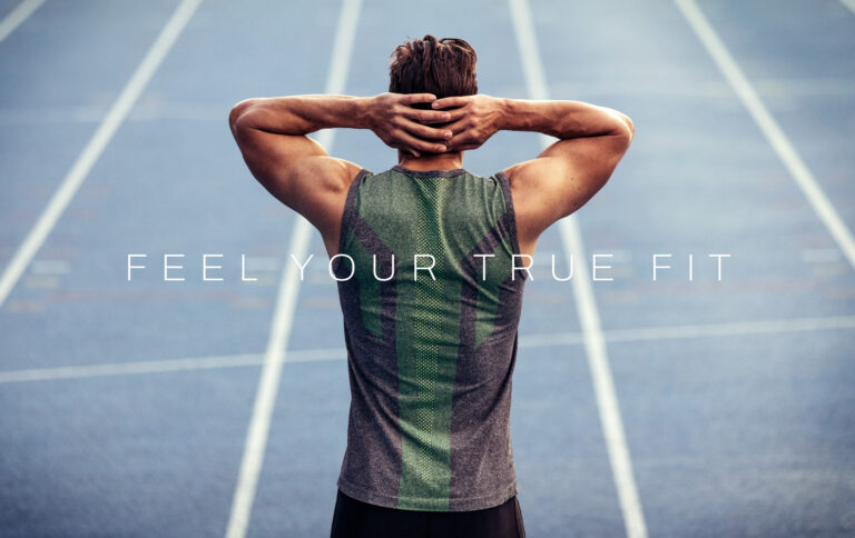
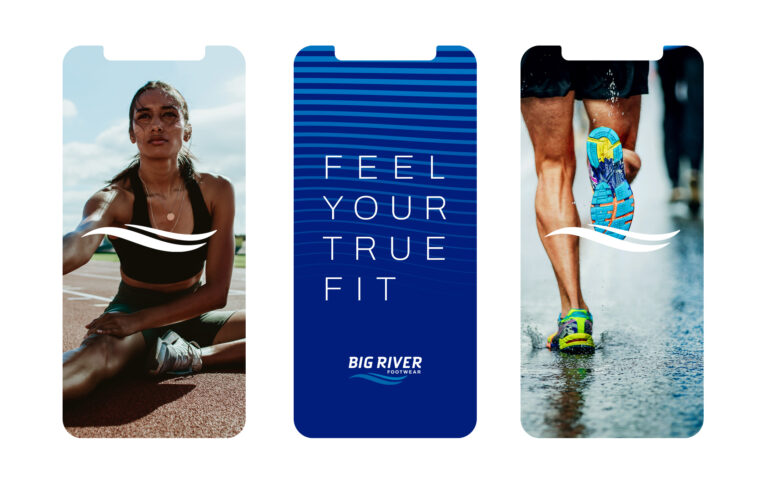
FEEL YOUR TRUE FIT
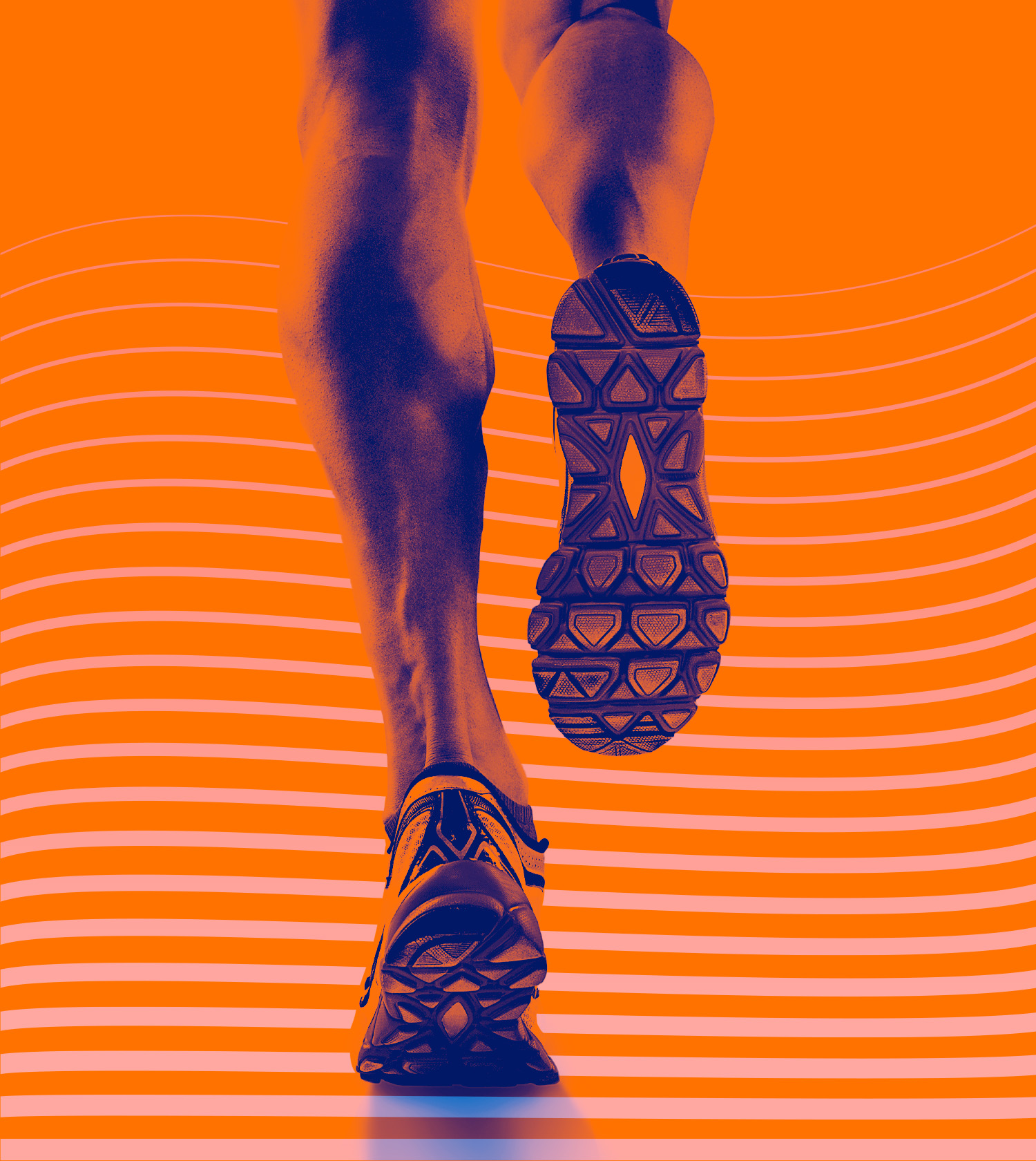
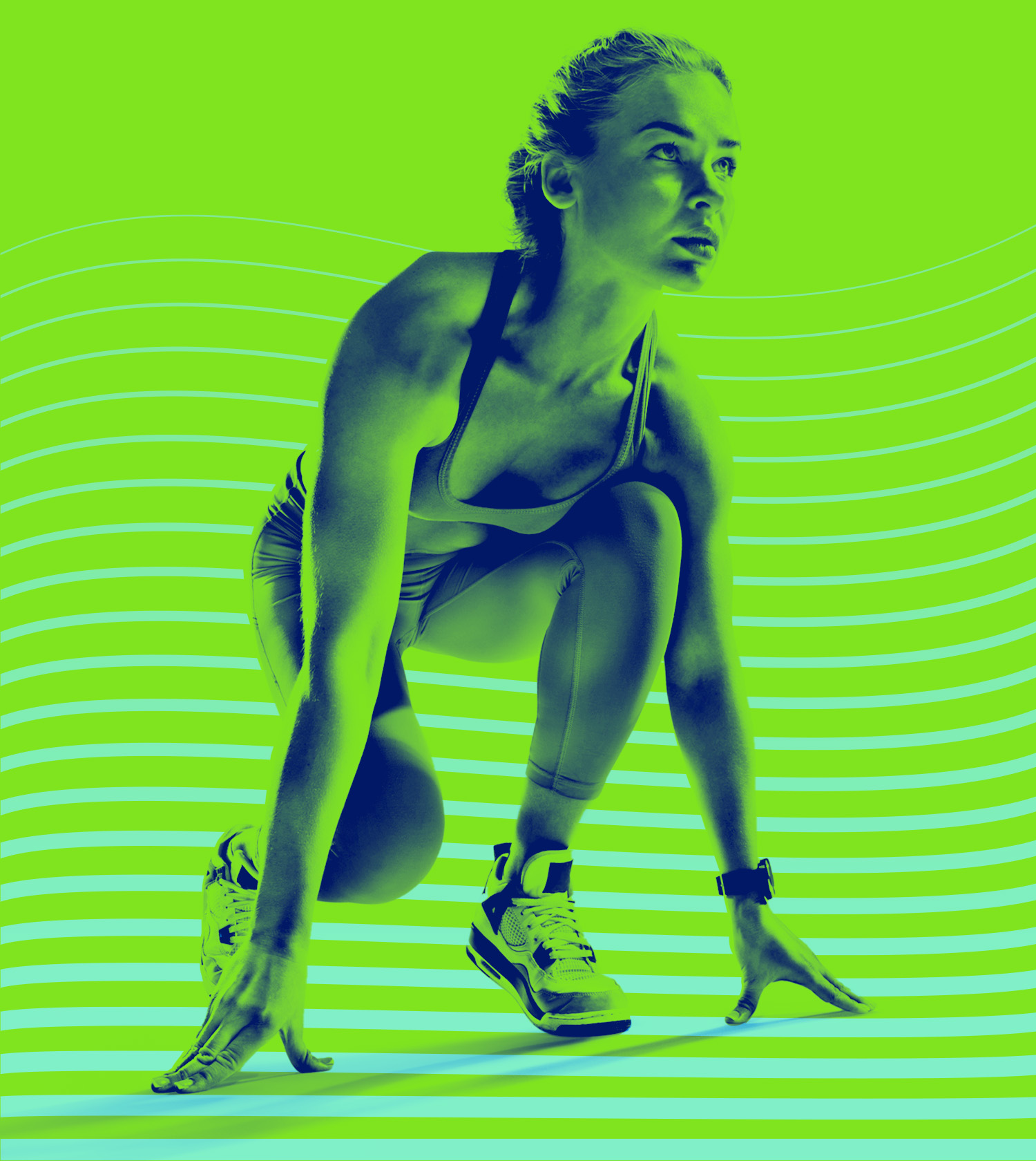
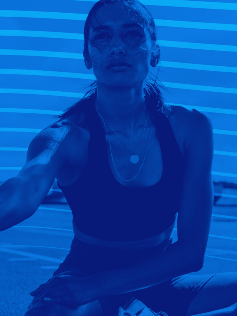
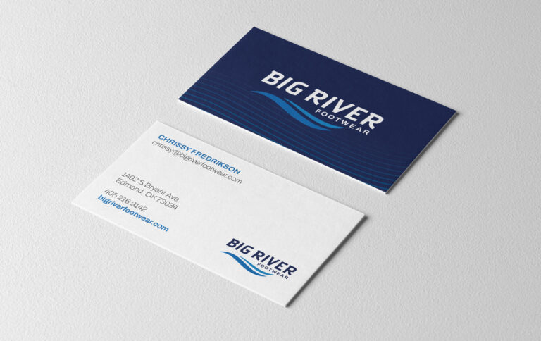
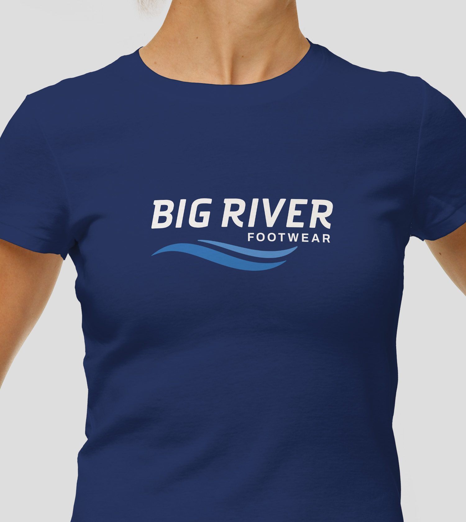
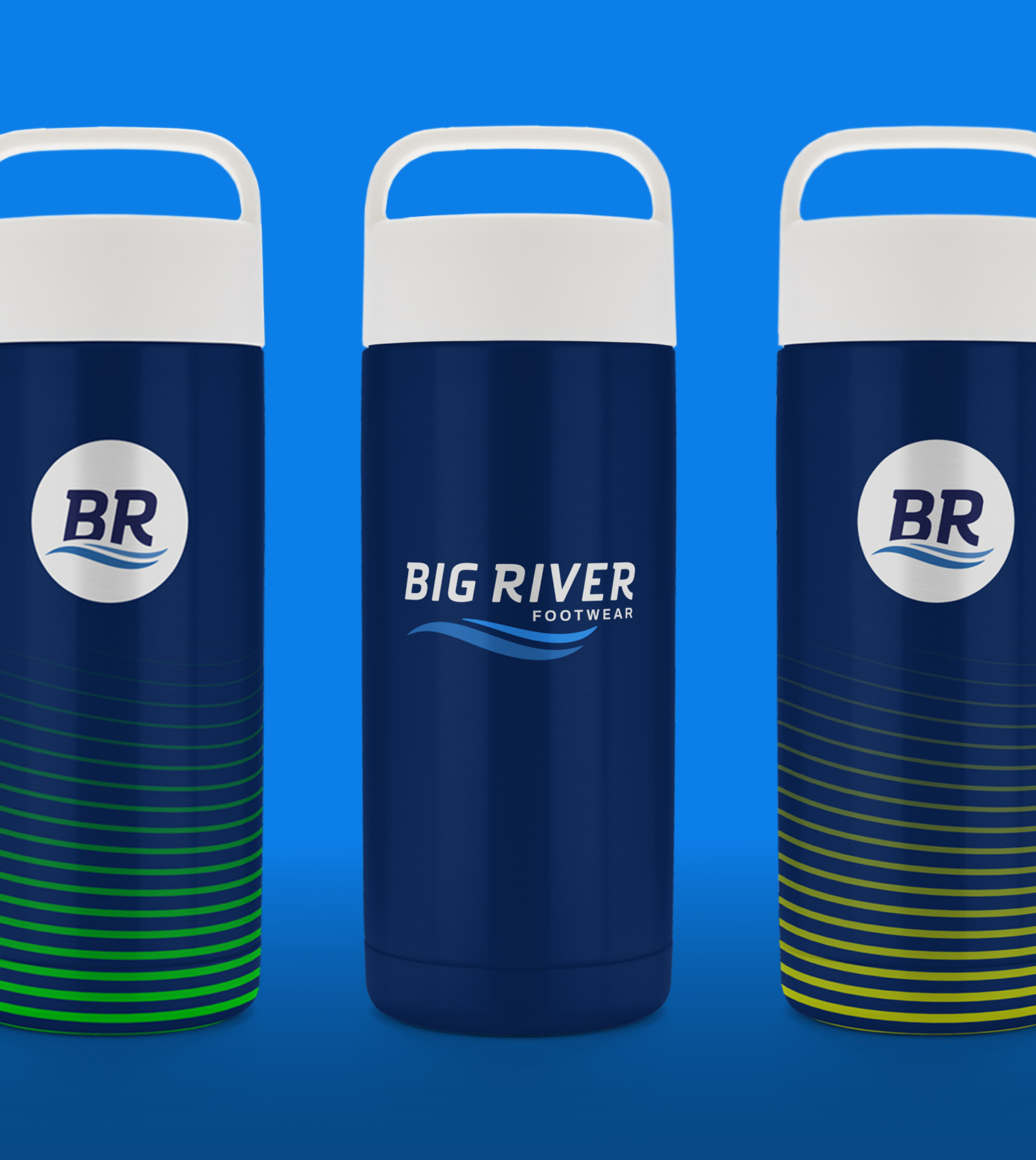
We created a message that speaks as much to customers’ aspirations of an active lifestyle as it does to the shoes they wear while they live it. Especially when it’s set against vibrant colors, active imagery, and a ripple-inspired pattern that represents the constant motion of a river and layers of compression in a comfortable, athletic shoe.