Baileys’ Range
Overview
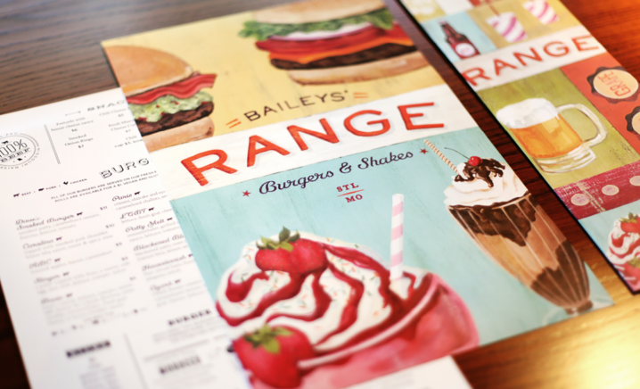
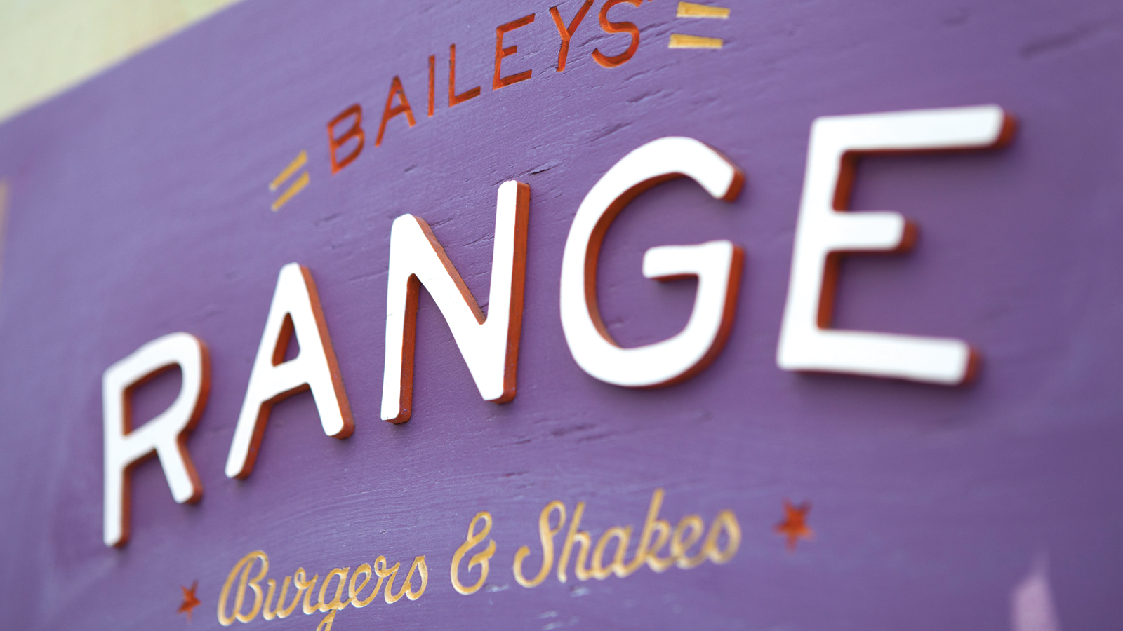
We developed a cheerfully warm identity for Dave Bailey’s much-anticipated burgers-and-shakes spot — a down-home kitchen smack-dab in the middle of downtown St. Louis.
HOME ON THE RANGE
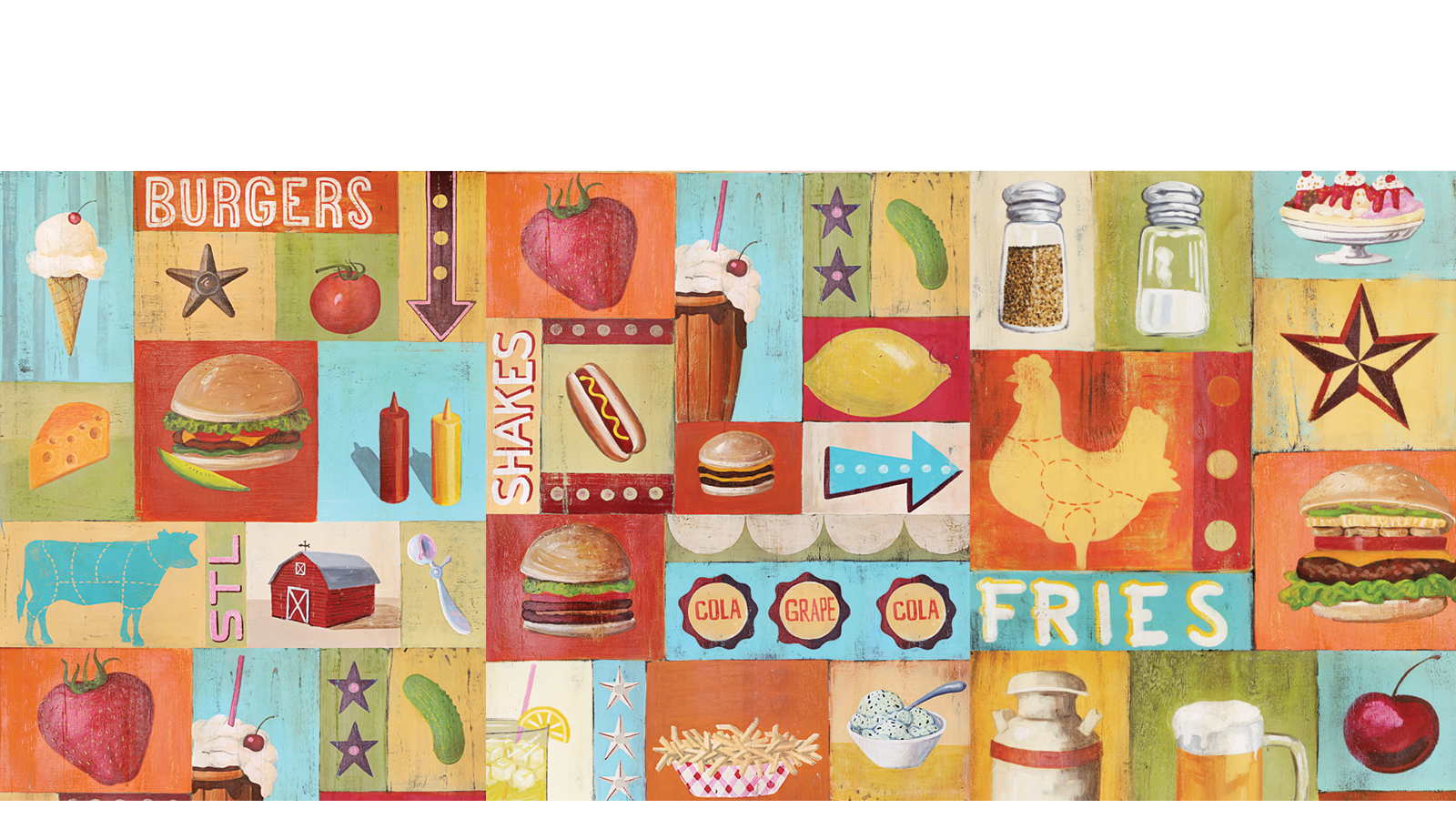
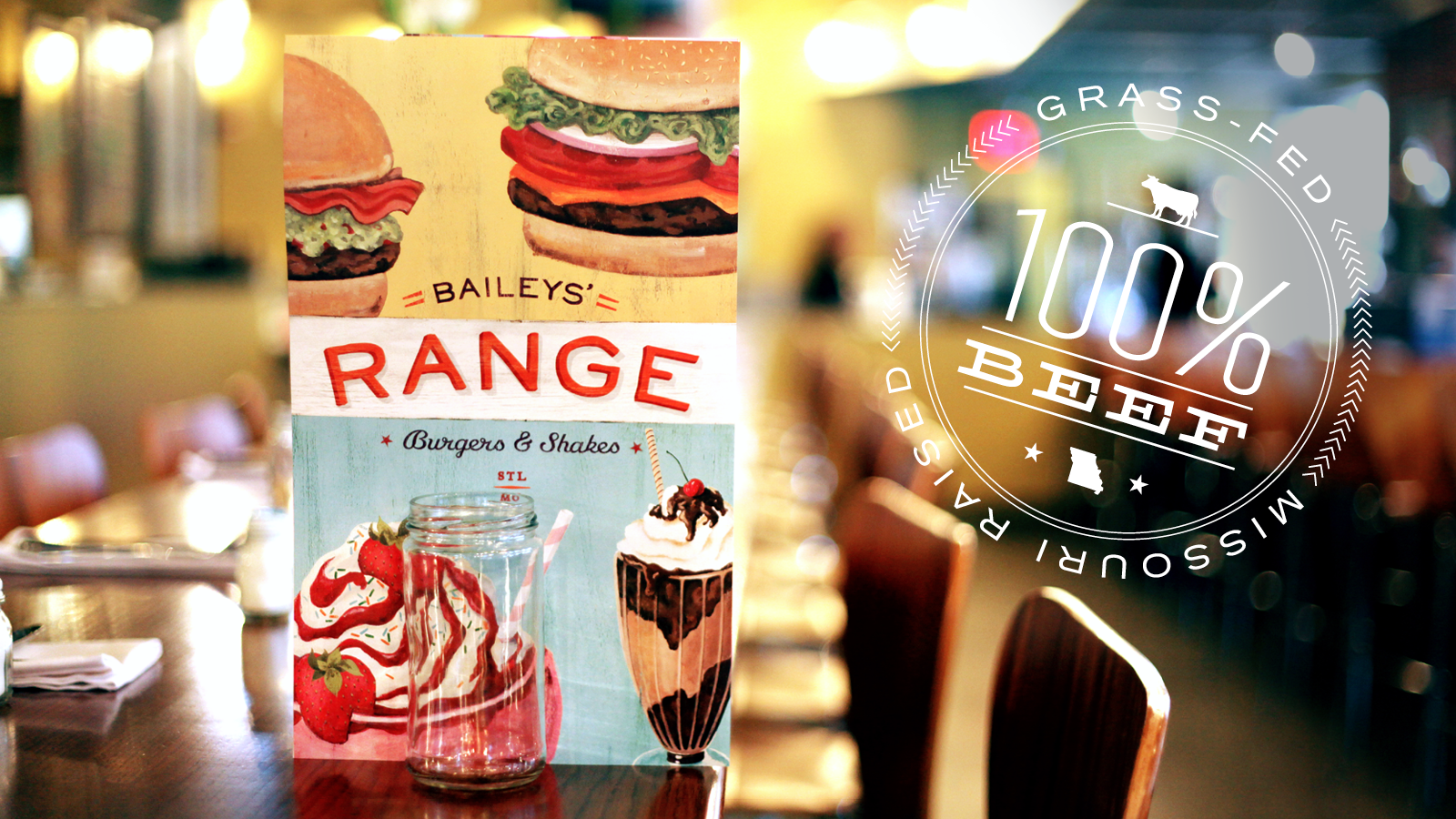
The name we created has a few different meanings: the range of options on the menu, the cook stove range, and the open, natural landscape — the range out on the farm. (All the beef here is grass-fed, free-range, and local). We knew, though, that we wanted to steer clear of all the clichés that can zap the joy out of those very meanings. No Western type. No longhorns.
“HIGHLY LICKABLE”
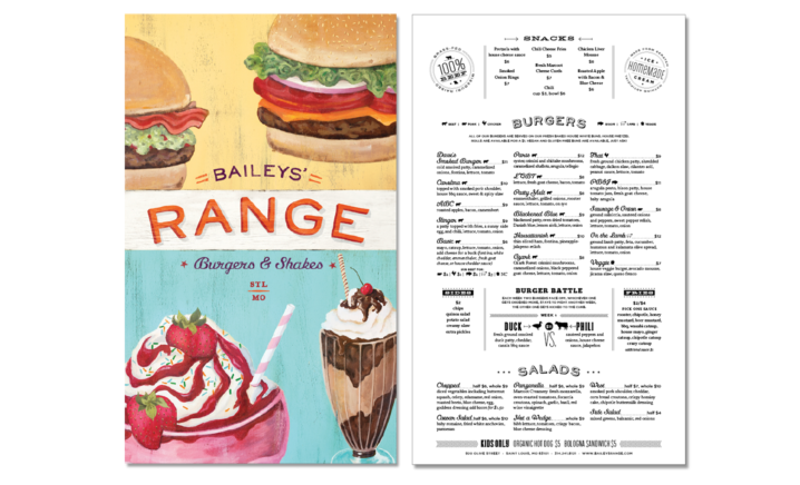
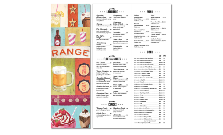
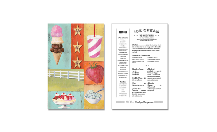
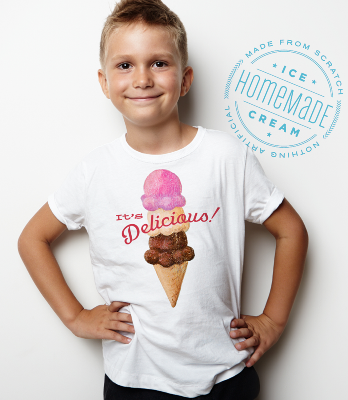
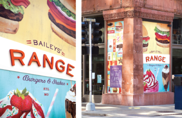
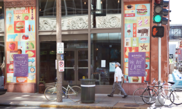
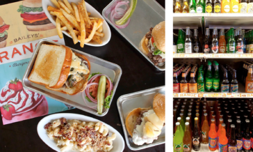
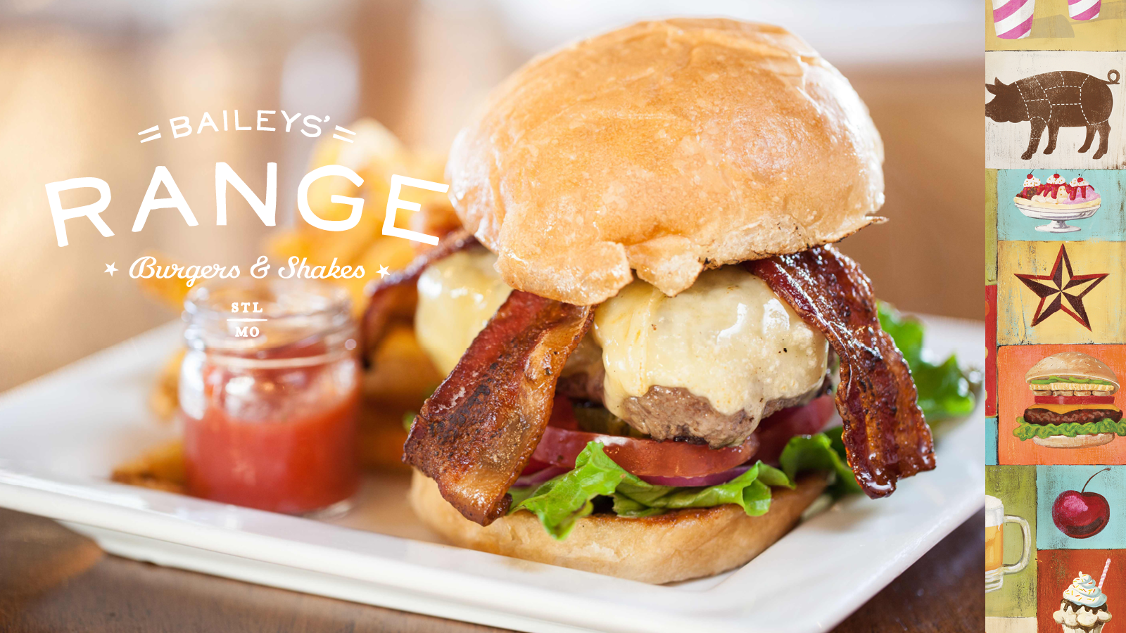
From the identity to the menus, signage, and clothing, we sought to create an authentic, warm, and cheerful vibe for a place you’d be happy to come with your family, have drinks with your friends, or end the evening with a freshly made shake. Art of the Menu called the work “highly lickable.”
Feedback
“Welcome home to the wide-open spaces of Baileys’ Range. The tall format leaves room for the eye to graze, seldom is heard a discouraging word about the deliciously hand-drawn sundaes and the skies are not cloudy all day.”
Services
Naming
Brand Identity
Print Collateral
Website Design
Website Development
Awards

Winner
HOW International Design Awards, Brand Identity

Featured
AIGA St. Louis Design Show, Brand Identity

Best of 2012
Art of the Menu, Menu Design
