AKRF
Overview
For more than 40 years, AKRF established their place as one of the most respected and reliable planning, engineering, and environmental firms in the Northeast and Mid-Atlantic. After experiencing an unprecedented season of growth, AKRF was faced with a challenge: their brand felt static and out of step with their rapid expansion and evolution.
Bringing Belief to the Surface
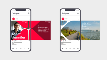
With messaging, TOKY tapped into a long-held— but infrequently expressed—belief that originality is everything. TOKY developed a platform around the central promise of “Original Perspective Breaks Through.” This not only outwardly expressed their core belief, but also was built to extend this belief into a wide range of messaging applications.
Research Objectives
In designing the research methodology, AKRF and TOKY identified a target audience of public and private clients concentrated in four market sectors as well as current and prospective employees. With 400 employees working in 15 offices across six states, this level of input was critical in making sure the branding efforts were guided by input from across the entire organization, no matter the market, service, or geography.
- 4Months of brand research and discovery
- 15Qualitative client interviews
- 18Leadership interviews
- 162Respondents to qualitative staff survey
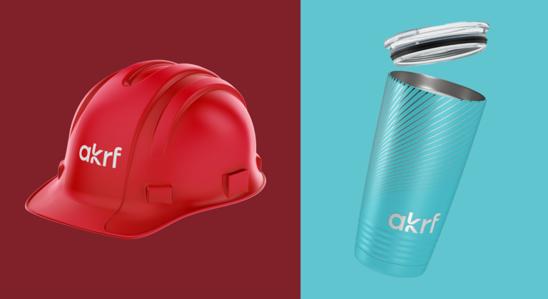
a bright transformation
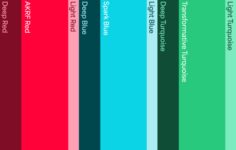
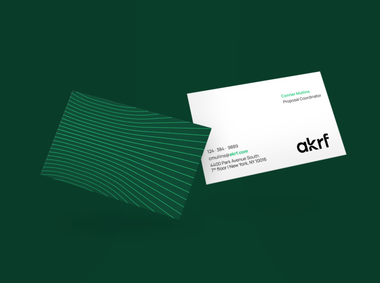
The new logo mark draws focus on a custom-drawn “k,” inspired by the phenomenon of light bursting through silhouetted buildings. A conduit for luminescence, the logo establishes a tone for the rest of identity to build from. The new identity features elements that exude energy, expression, and movement, including a rich, differentiating color palette and a dynamic signature pattern that alludes to the bending and refracting of light.
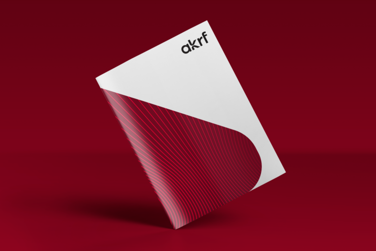
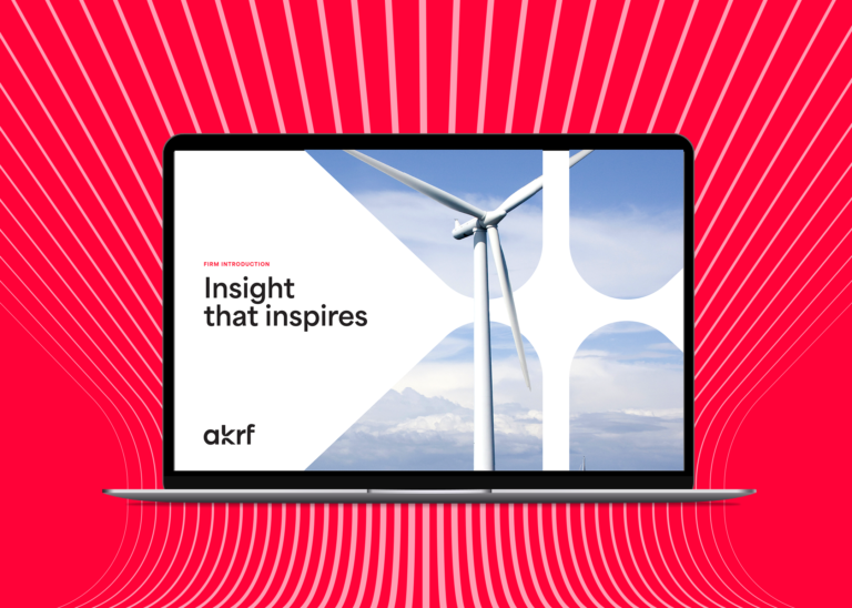
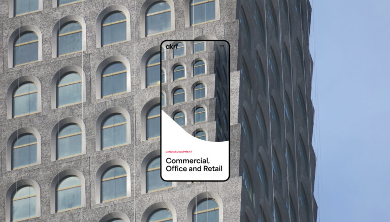
a dynamic system
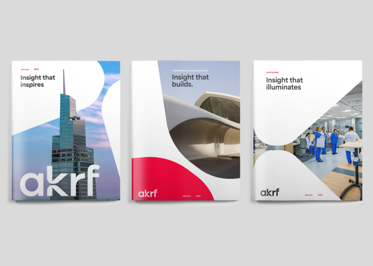
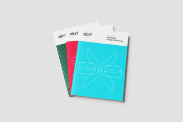
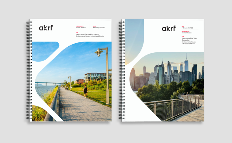
Sweeping compositions born out of the contours of the logo’s “k” create a series of compelling brochure covers. These curved compositions become a signature motif across the AKRF brand.
brand in action
The new AKRF brand was embraced and implemented wholeheartedly by the team, unifying the entire company around a single visual identity and messaging platform. Since the launch, accolades from clients and partners poured into AKRF via emails, calls, and social media reactions, including “love the new branding and logo” from a client and “so exciting and revitalizing” from a partner.
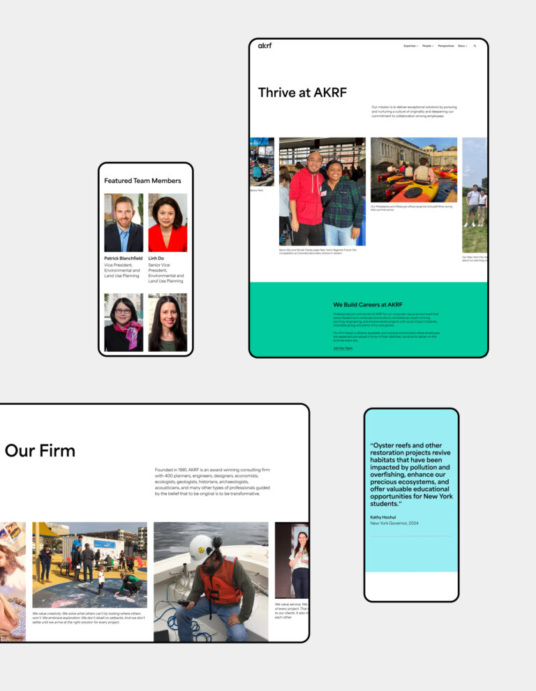
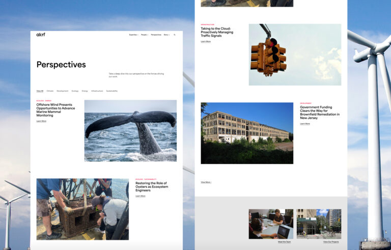
a dynamic site design
Asymmetrical balance governs the visual ethos of the website. Through the use of curved compositions, shape-reveal hover effects, and an unexpected interaction in the site’s footer, our team created a memorable digital experience that encapsulated AKRF’s brand voice while championing their expertise in the field.
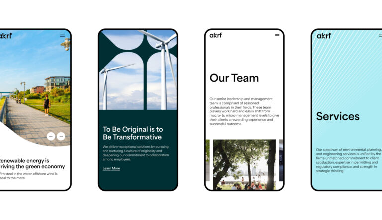
people at the forefront
The previous site’s analytics showed visitors were spending the most time on the Team Members page. Making sure this page was still easy to find, we improved on team member bios by giving them the ability to feature quotes and relevant thought leadership, news posts, and projects.