AIGA St. Louis Design Show 20
We’re thrilled and honored to have seven projects in this week’s AIGA St. Louis Design Show 20. Here’s a roundup of the work that is being highlighted this Friday. We hope to see you!
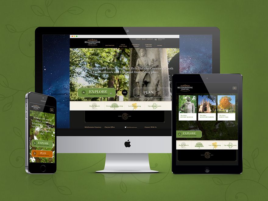
Bellefontaine Cemetery Website
Bellefontaine wanted a digital footprint for one of St. Louis’ best historical resources that maintained a proper respect for services and context as well as a forward-looking approach to the park’s deep cultural significance. The resulting website showcases the park as both a regional asset that is a pleasure to visit both on- and off-line. We’re pleased with our contribution in creating a decidedly un-gloomy cemetery website.
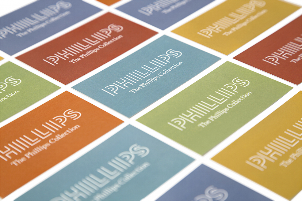
The Phillips Collection Branding
The Phillips Collected asked us to reinvent their image. This project required us to take a boutique museum with a rich history and create an entirely new visual voice that could be carried across every asset. Read up on the details in the case study. We especially love how the color palette pulled together.
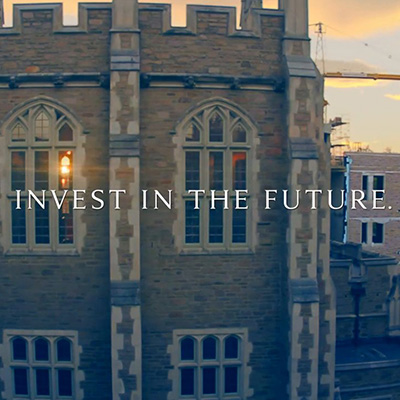
The Brown School at Washington University Capital Campaign Video
Crafting a capital campaign for the the nation’s premier school of social work and public health was a challenge we were excited to tackle. The campaign video is illustrative of the caliber of the Brown School and has proven to be an effective fundraising tool.
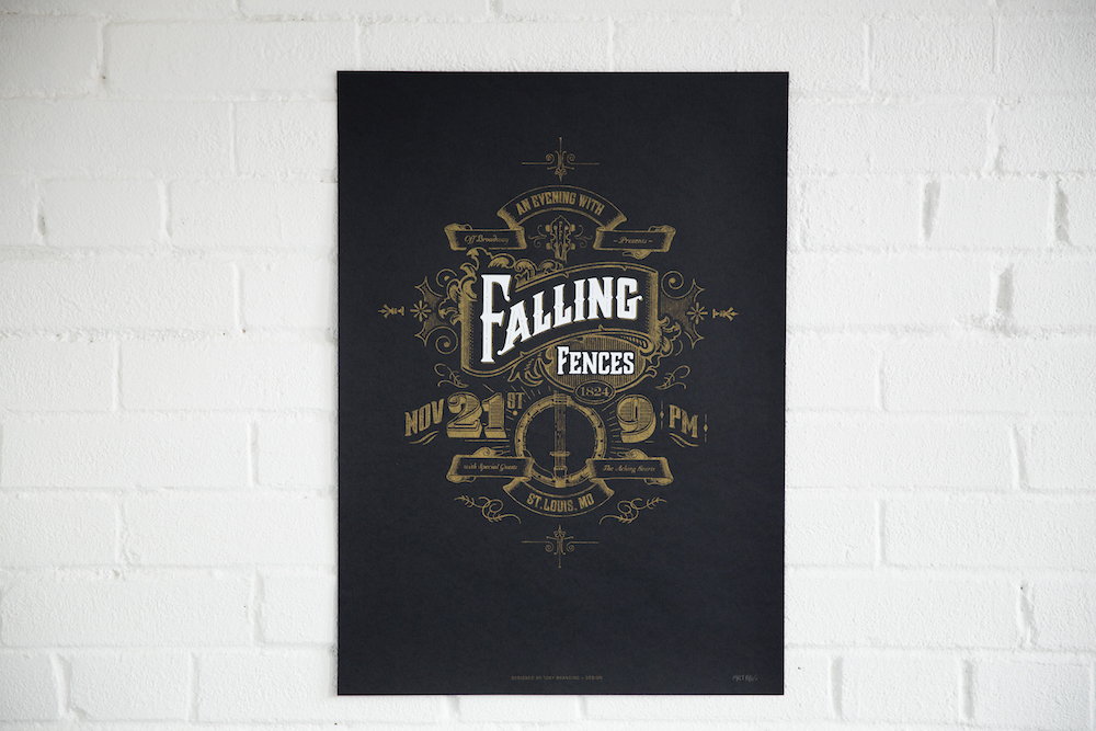
Falling Fences Album Release Concert Poster
This deceptively simple poster gave us opportunities to innovate and craft a method of production that helped the end result stay true to the initial artistic vision. We were able to deliver a poster for our friends that married their homespun aesthetic with an intricate design. Curious how we pulled it off? Read about our adventures in screenprinting!
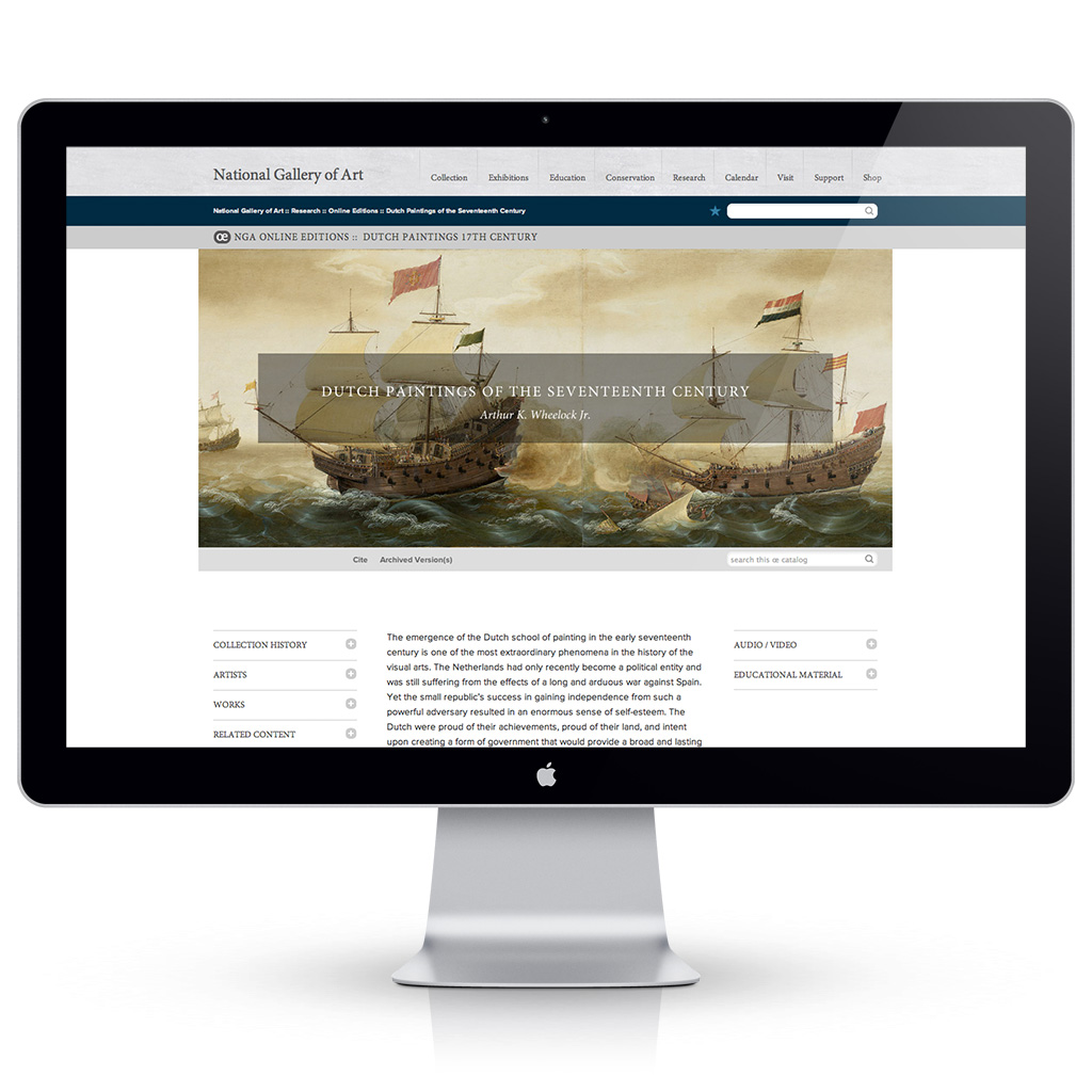
The National Gallery of Art Website for “Dutch Paintings of the 17th Century”
Bringing the Old Masters in to the world of 21st century technology was a wonderful project. Housing one of the best collections of art, the National Gallery of Art wanted to share Baroque beauty with the world through a capsule site of their Dutch Golden Age paintings. The austere simplicity of the regional style is pulled through the site design and creates a deliciously pleasing snapshot of the collection.
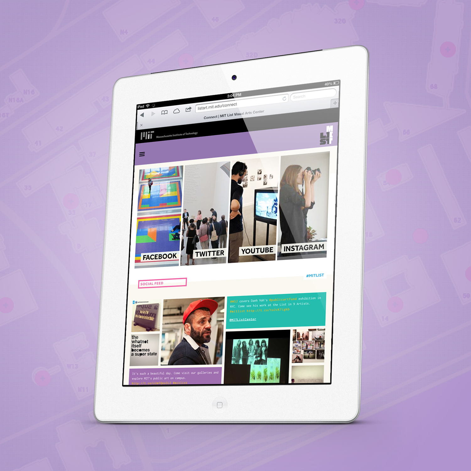
MIT List Visual Arts Center Website
Thinking outside of the box is actually “in” the box for MIT List. Whether its taking art out of the confines of the museum box or utilizing branding that proves to be as flexible as their approach to art, they wanted to push the limits of what was expected. Our website for MIT List Visual Arts Center is a critically recognized nimble platform for a constantly evolving and active art space.
Rainforest Alliance 2015 Gala
The Save the Dates and Invitations have already been mailed, but the full project is still in progress. The response so far has been wildly positive. We loved adding a high-fashion gloss to a traditionally star-studded event. Can you spot the hidden frog?
