Sjögren’s Foundation
Overview
Sjögren’s Foundation works to conquer the complexities of Sjögren’s syndrome, an autoimmune disease with symptoms including excessive dryness, fatigue, and chronic pain. With limited awareness of the disease among patients and even doctors, the Foundation sought to increase access to education, research, and resources while giving voice to the 4 million Americans living with Sjögren’s.

BRAND IDENTITY
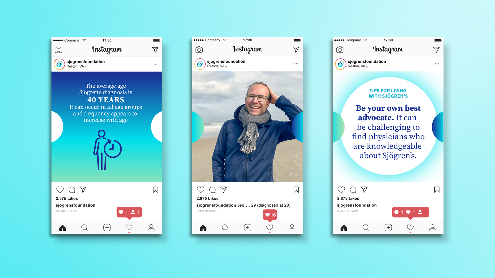
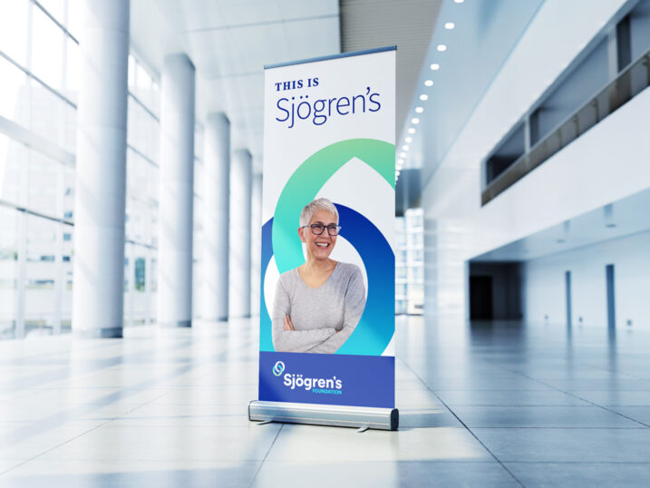
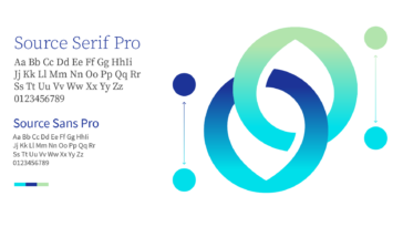
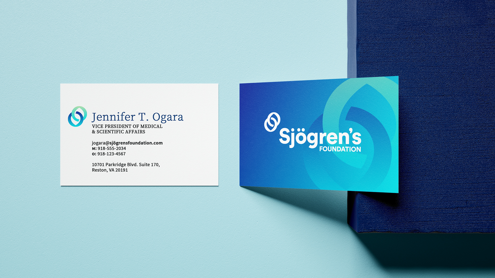
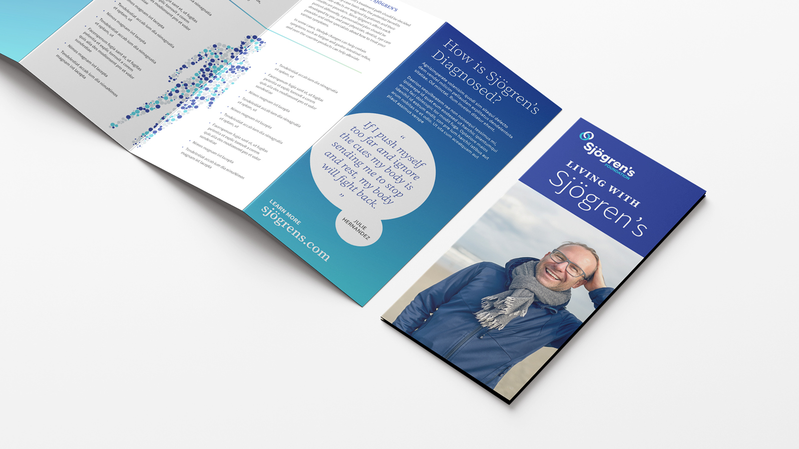
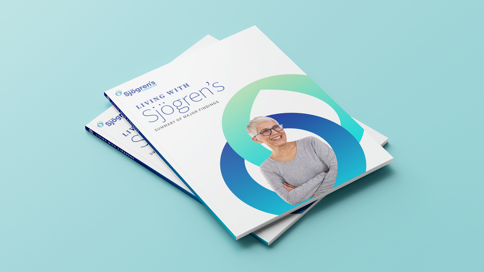
With a name change and brand platform already in place, TOKY began crafting an identity to capture the idea of support and shared experience among patients suffering from Sjögren’s. The mark’s interlinking circles symbolize community with a subtle teardrop nod to the disease’s primary symptoms. Soft gradients and an optimistic photographic style bring feelings of warmth, confidence, and camaraderie.
AS MANY AS
4 million Americans have Sjögren’s
WITH AN ESTIMATED 2.5 MILLION UNDIAGNOSED
Conquering complexity online
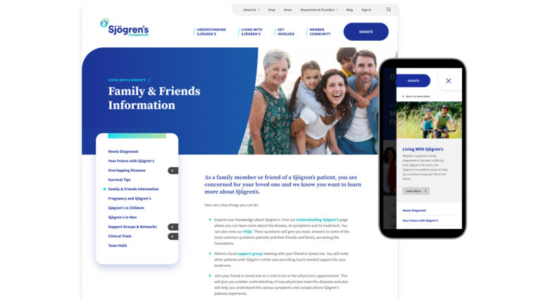
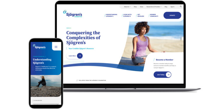
The Foundation’s website needed to be the pinnacle of education and support for patients on their Sjögren’s journey. As we carried the new brand into their web presence, we focused on establishing trust, delivering helpful resources, and building community. Along the way, we wanted each patient to have an experience that felt informative and inspiring.
Prioritizing Accessibility
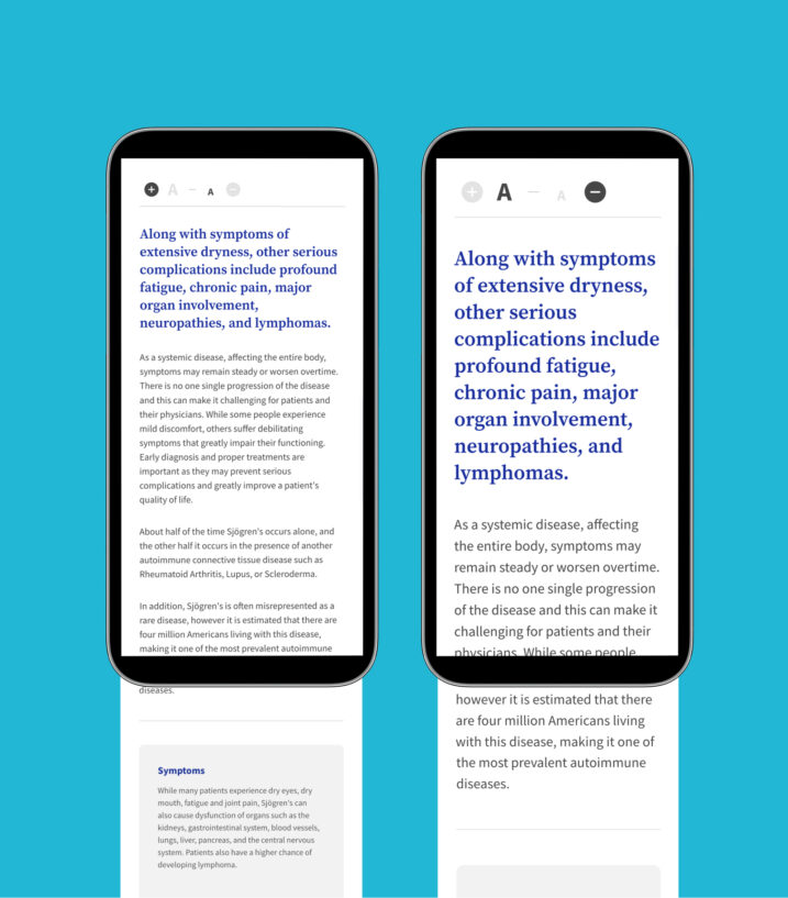
Since many Sjögren’s patients experience vision-related symptoms, accessibility was a top priority as we developed the new website. At every step of the process, we ensured our efforts were WCAG-AA compliant.
This included (but was not limited to):
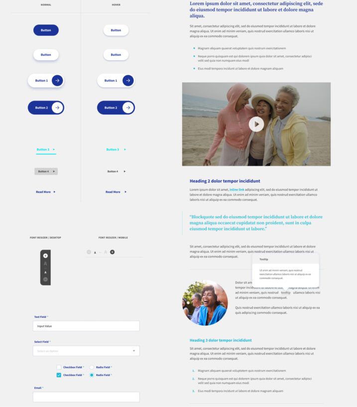
• Text that surpasses required contrast ratios
• A clear text hierarchy
• Specific sections with a resize-text ability
• Keyboard accessibility
• Buttons that are easy to identify and have apparent hover/focus states
Consideration for Various Audiences
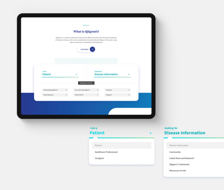
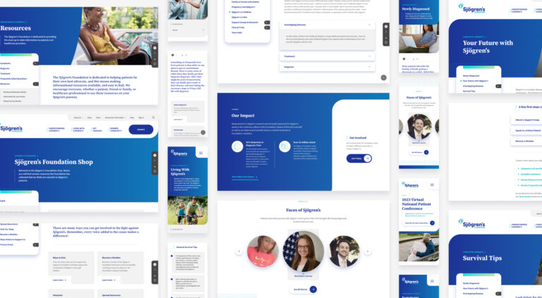
From a usability standpoint, the website was completely restructured to accommodate a variety of audiences, from patients to caregivers and healthcare professionals. TOKY addressed this by reorganizing resources, modernizing the menu structure, and providing a guided resource lookup.
