RNL Design
OVERVIEW
RNL is a deeply thoughtful architecture practice with work that spans scales, geographies, and disciplines. In preparation for its 60th anniversary, the firm asked TOKY to create messaging and a digital experience that would speak to its holistic design approach.

POINTS OF BALANCE
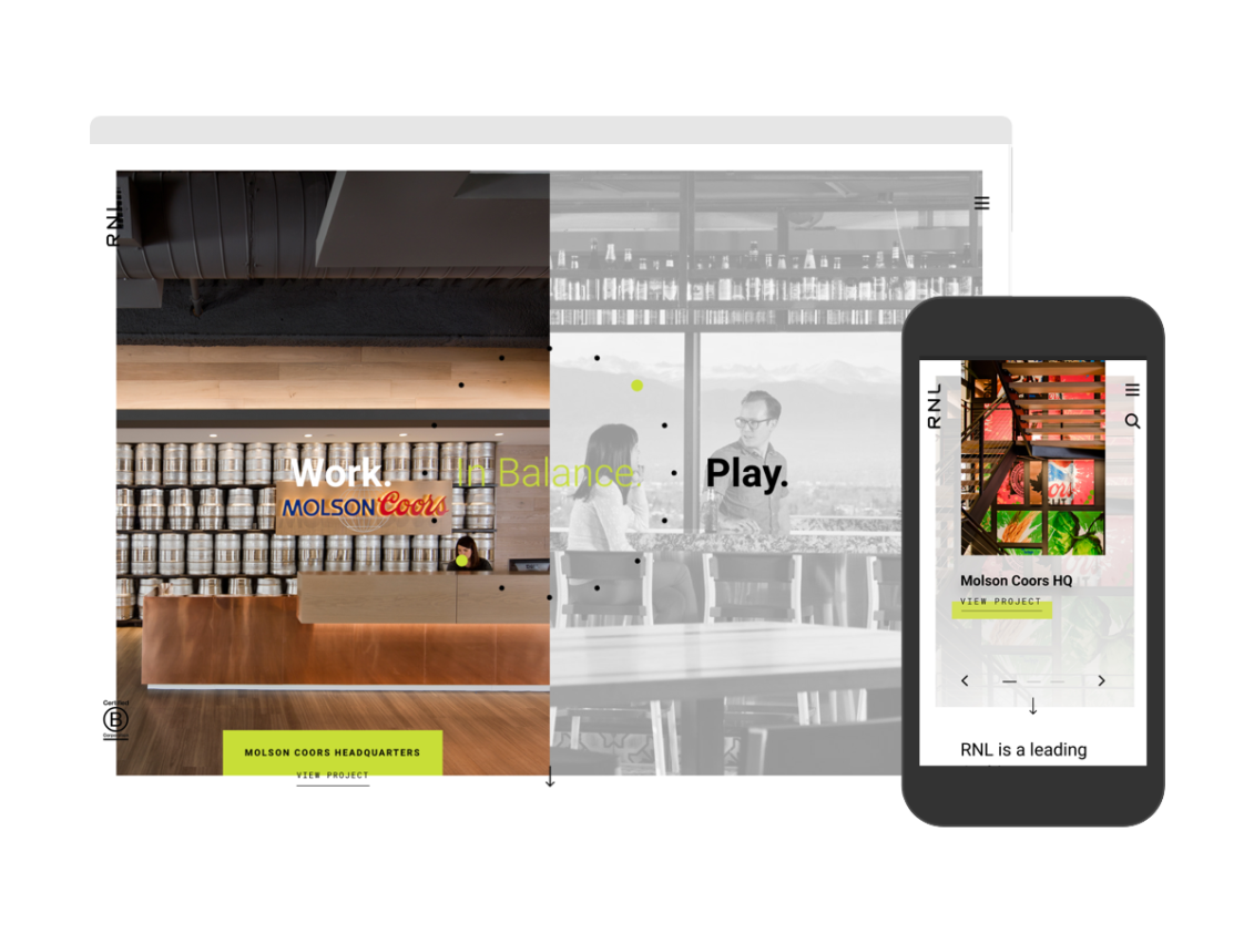
TOKY interviewed key stakeholders to gather insight for RNL’s new brand language. The messaging includes a primary tagline, “Performance. Aesthetics. In Balance.” as well as several secondary taglines, which apply the core idea of equilibrium across all of the firm’s practice areas.
TAKING THE ETHOS ONLINE
Featured front and center on the redesigned website, the new taglines are paired with featured work to demonstrate RNL’s balanced approached to design. These project images shift from black and white to color on mouse over, encouraging visitors to interact and explore the work.
PROJECT STORYTELLING
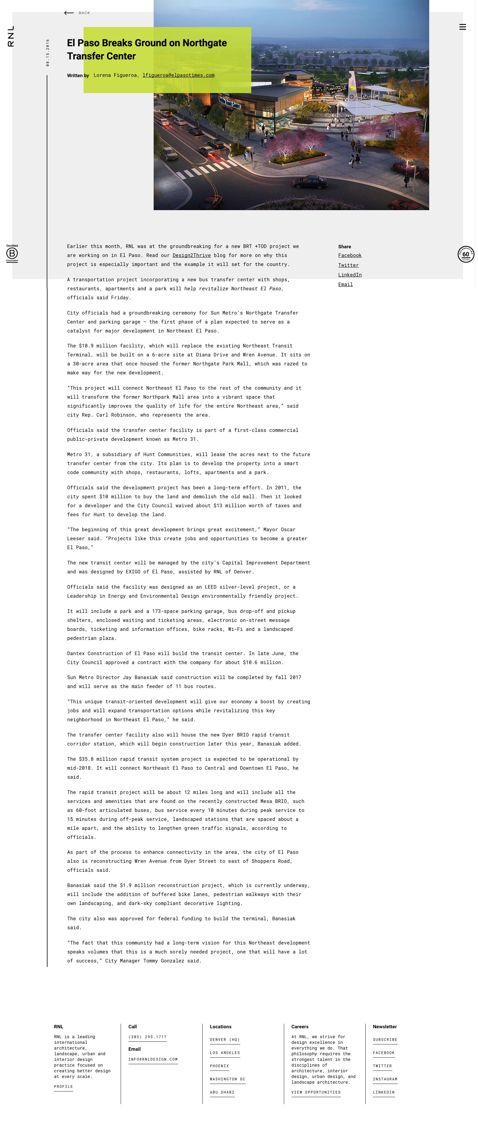
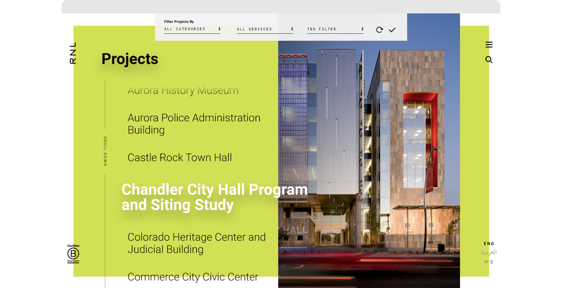
Like RNL’s work, the site’s project pages are built with balance in mind. We paired large images, quick-hitting stats, and short value statements with more in-depth text to ensure that every project story is told in a detailed yet engaging and highly visual way.
EMBRACING INDIVIDUALITY
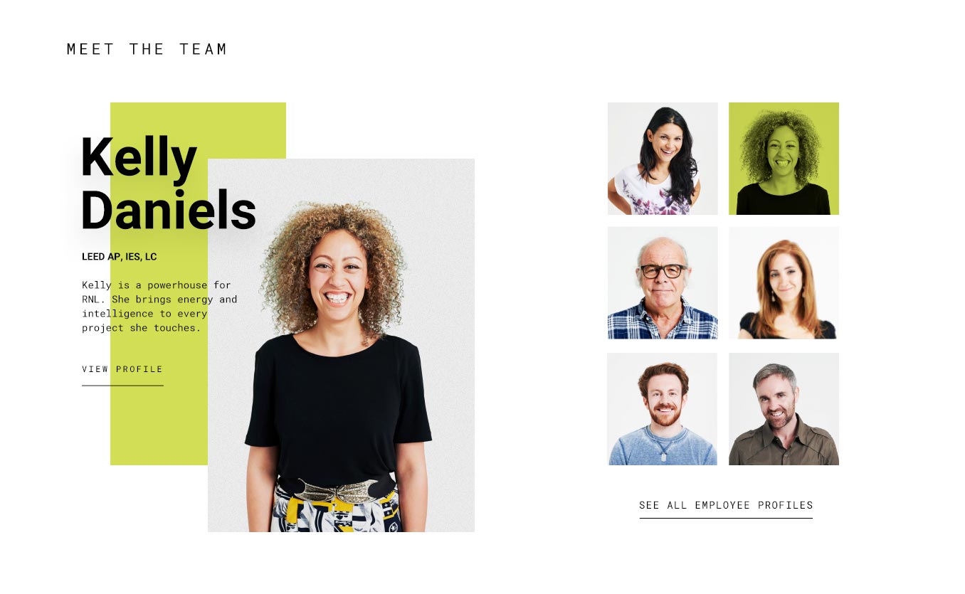
Mini team member profiles appear throughout the site, introducing prospective clients to the people behind the work. To give potential recruits a look at life inside the firm, the site pulls in a constantly updating feed of Instagram images — which means the site stays fresh, without requiring manual updates in the content management system.
Results
- 521%INCREASE IN TIME SPENT ON ABOUT/PROFILE PAGE
- 85%INCREASE IN UNIQUE VISITORS TO CONTACT PAGE
- 84%INCREASE IN TIME SPENT ON HOME PAGE
Services
Research
Brand Platform
Website Design
Website Development
Awards

Gold
St. Louis ADDY Awards, Digital Creative Technology Interface & Navigation

Best Website
SMPS Colorado Marketing Excellence Awards
