A Colorful New Identity for The Phillips Collection in Washington, D.C.
On a tree-lined street in the Dupont Circle neighborhood of northwest Washington, D.C. proudly stands a red brick, Georgian Revival-style manor.
Once the boyhood home of esteemed art collector Duncan Phillips, this tradition-bound mansion houses the explosion of color that is The Phillips Collection — America’s first museum of modern art. Inside you’ll find works from Renoir, Rothko, van Gogh, Degas, Cézanne, O’Keeffe, and many more.
Phillips boasts a gallery experience unlike any other, thanks in large part to its many unique, intimate spaces, from the meditative Rothko Room to The Wax Room, a beeswax-lined chamber that fits just two people at a time.
As the institution nears its Centennial Celebration in 2021, rebranding became critical — it was more important than ever to pay homage to the institution’s rich legacy while looking forward to the future.
Phillips selected TOKY to design a new identity system for the museum — an identity that would say more about their unique philosophy, and the impression it leaves upon visitors.
“Rebranding an art museum is a tall order,” Phillips’s Director of Marketing and Communications, Sarah Schaffer, said of the task at hand. “Everything in our world involves sensation, emotions; and so it’s hard to create a single visual identity that captures the feeling people get when they visit — the human response that’s out there in the ether.”
In order to capture that “feeling,” we kicked this project off with deep research, spending time exploring the galleries and tapping the extensive knowledge of Phillips’s Director Dorothy Kosinski, PhD. Our deep learning became the organizing principle and inspiration for the new Phillips Collection identity.
Daring, Traditional, and Idiosyncratic
Duncan Phillips once said of his collection, “I avoid the usual period rooms — the chronological sequence…My arrangements are for the purpose of contrast and analogy. I bring together congenial spirits.”
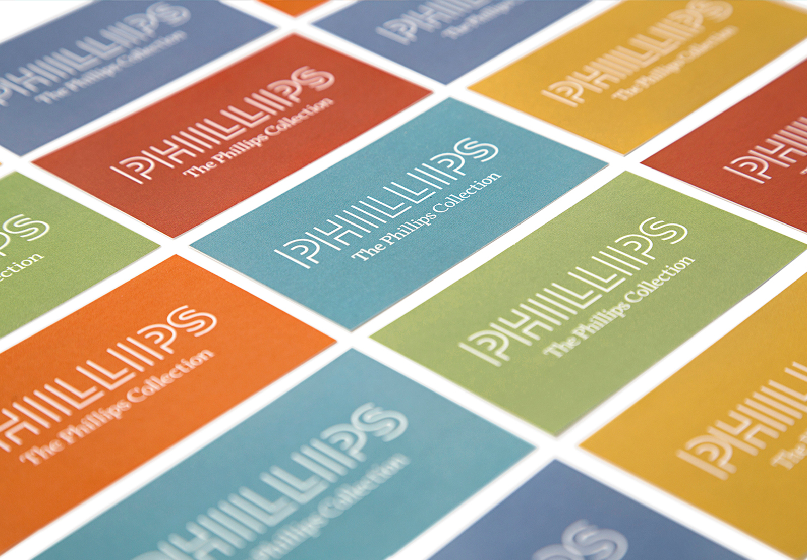
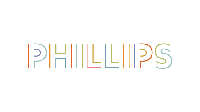
That contrast is reflected in the new logo, which, as TOKY Creative Director Eric Thoelke explains, “creates a complete wordmark while remaining an incomplete rendering of the letterforms. The logo is reduced to color, line, curve, edge, rhythm, and space. The word does not, strictly speaking, exist, but is created in the reader’s mind, just as modern art is less about narrative depiction than allowing for interpretation.”
As Phillips’s Director of Marketing Sarah Schaffer puts it, “the mark offers both sophistication and a little quirk, which definitely speaks to the institution’s unique personality. It feels ahistorical. It pushes boundaries.”
Reflecting an Intimate Gallery Experience
The space itself is such an important part of Phillips’s identity that we wanted to incorporate that experience into the new logo. “It’s a really intimate experience that is almost kind of jarring,” said TOKY Creative Director Katy Fischer after an initial visit to Phillips. “Where else do you see a Picasso in the hallway? We had to figure out a way to reflect these intimate spaces and the whole experience of going to a gallery in someone’s home.”
We used typography to recreate Phillips’s cluster of open rooms, intricate pathways, and intimate spaces — spaces we tucked within and between the characters of the new mark.
An Experimental Approach
Duncan Phillips often referred to the museum as an “experiment station” — a term that has held its ground over the years, and still lives on today as part of the museum’s mission statement. Dorothy Kosinski, Director of The Phillips Collection, explains that the founder “insisted that the Collection remain ‘vital’, never static, always open to new arrangements, new installations, and new juxtapositions”.
Phillips’s Director of Marketing, Sarah Schaffer, points out the experimental nature of the redesigned identity. “What I love about the new logo is that it authentically reflects our personality. It immediately gives a nod to the vibrancy of our programs and the museum’s permanent collection.”
A Craving for Color
Duncan Phillips was notorious for his intense appreciation for color. He strongly believed in color’s ability to heal and console — a belief that dates back to his early childhood years, as illustrated in this excerpt from art critic Robert Hughes’s 1999 essay, “Art and Intimacy.”
When Duncan Phillips was four, his parents took him to Europe. In Paris, at the circus, he was terrified into hysterics by the sight of a clown tossing dolls — which the little American boy thought were live babies — into the air. His terror lasted all the way back to the hotel and was only assuaged, Marjorie Phillips wrote in her memoir of her husband, by the sight of a vase of simple flowers in the lobby: blue cornflowers, red poppies, yellow buttercups. “He later remembered how he couldn’t let the bouquet out of his sight and always thought that was his first real aesthetic experience of color.
With that craving for color in mind, we designed a vibrant palette that pulls from some of the Collection’s most esteemed work: Pierre-Auguste Renoir’s Luncheon of the Boating Party, Jacob Lawrence’s The Migration Series, Panel No. 1., Mark Rothko’s Orange and Red on Red, and El Greco’s The Repentant St. Peter.

The Identity in Action
Phillips officially went live with the new identity last week and has since seen rave reviews from the art and museum community.

Congratulations to our friends and clients on the launch. Stay tuned for upcoming collaborations between Phillips and TOKY, from an exhibition microsite to a visitor guide.