Mercy Children’s

Overview
When Mercy, the sixth-largest Catholic healthcare system in the U.S., rebranded its 31 hospitals under a new logo, they found that their Children’s Hospitals no longer distinguished themselves within the Mercy system, nor in the hyper-competitive healthcare marketplace. TOKY was asked to create a strong yet playful new brand to unite Mercy Children’s Hospitals.

NURTURING THE NEXT GENERATION
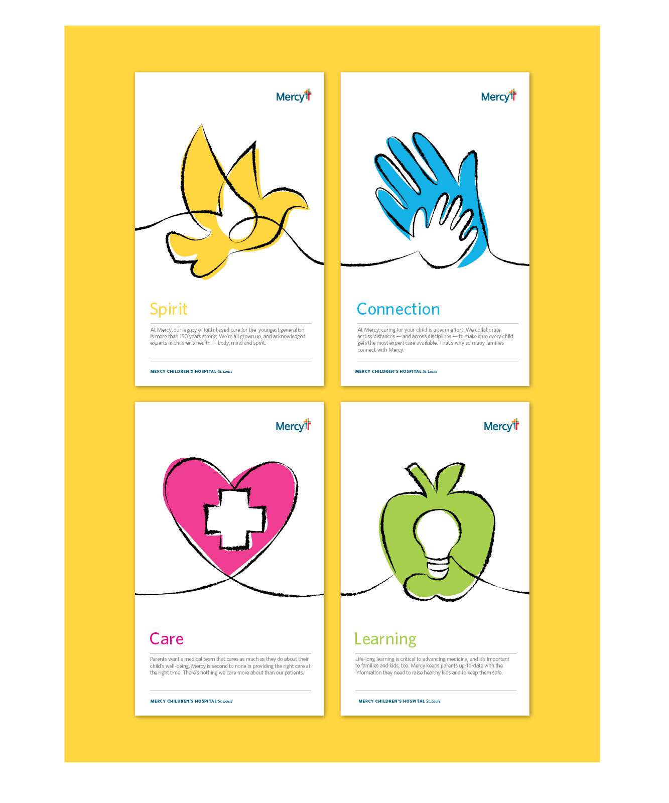
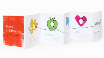
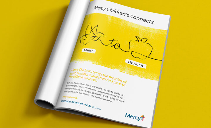
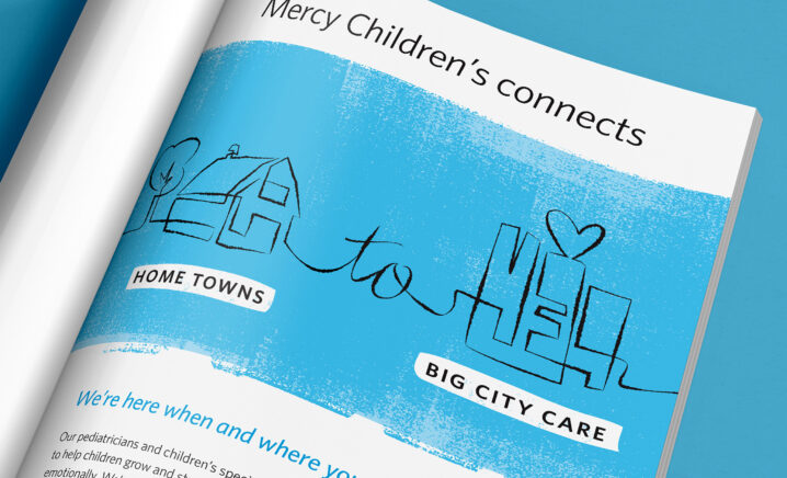
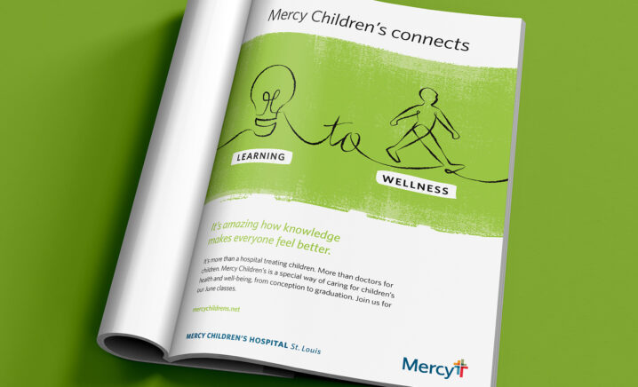
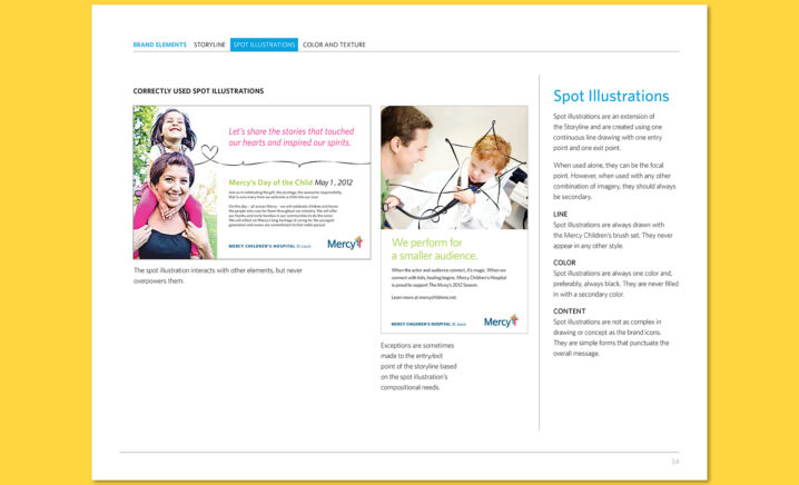
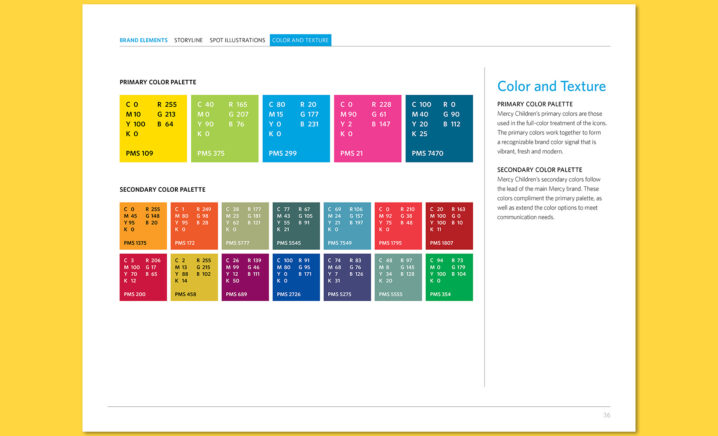
Rather than a single image or message, TOKY created a unique new brand language system for Mercy Children’s, with both a new icon system and new messaging. That system is based on four core values, or promises, each with its own icon: Spirit, Learning, Connection, and Care. In developing the new brand language, TOKY crafted a warm, friendly new tagline that conveys Mercy’s approach to care: “We connect to kids.”


PRINT TO PRIME TIME
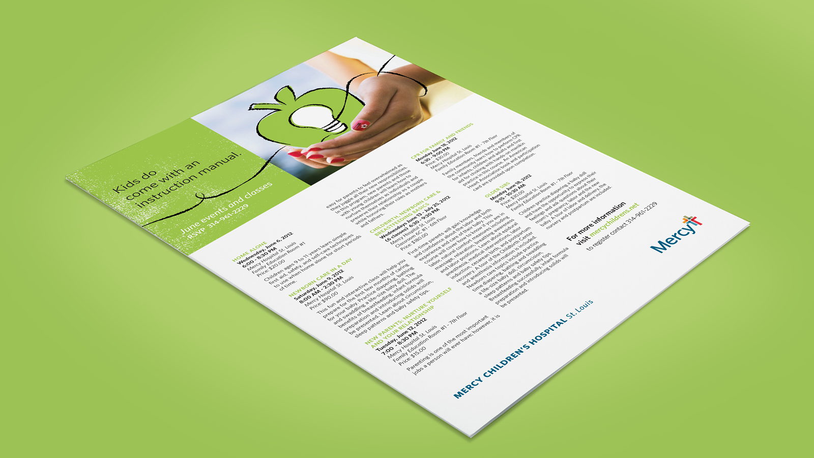
A fluid, continuous line plays a distinctive part in each new marketing piece, from print ads for Mercy’s “Day of the Child” to receiving blankets and TV spots shown during primetime coverage of the Summer Olympics.
Please to display this content.
Services
Brand Identity
Advertising
Print Collateral
Video, Script & Editing
Awards
Featured
Graphis Advertising Annual, Advertising Series