SAK Construction
Overview
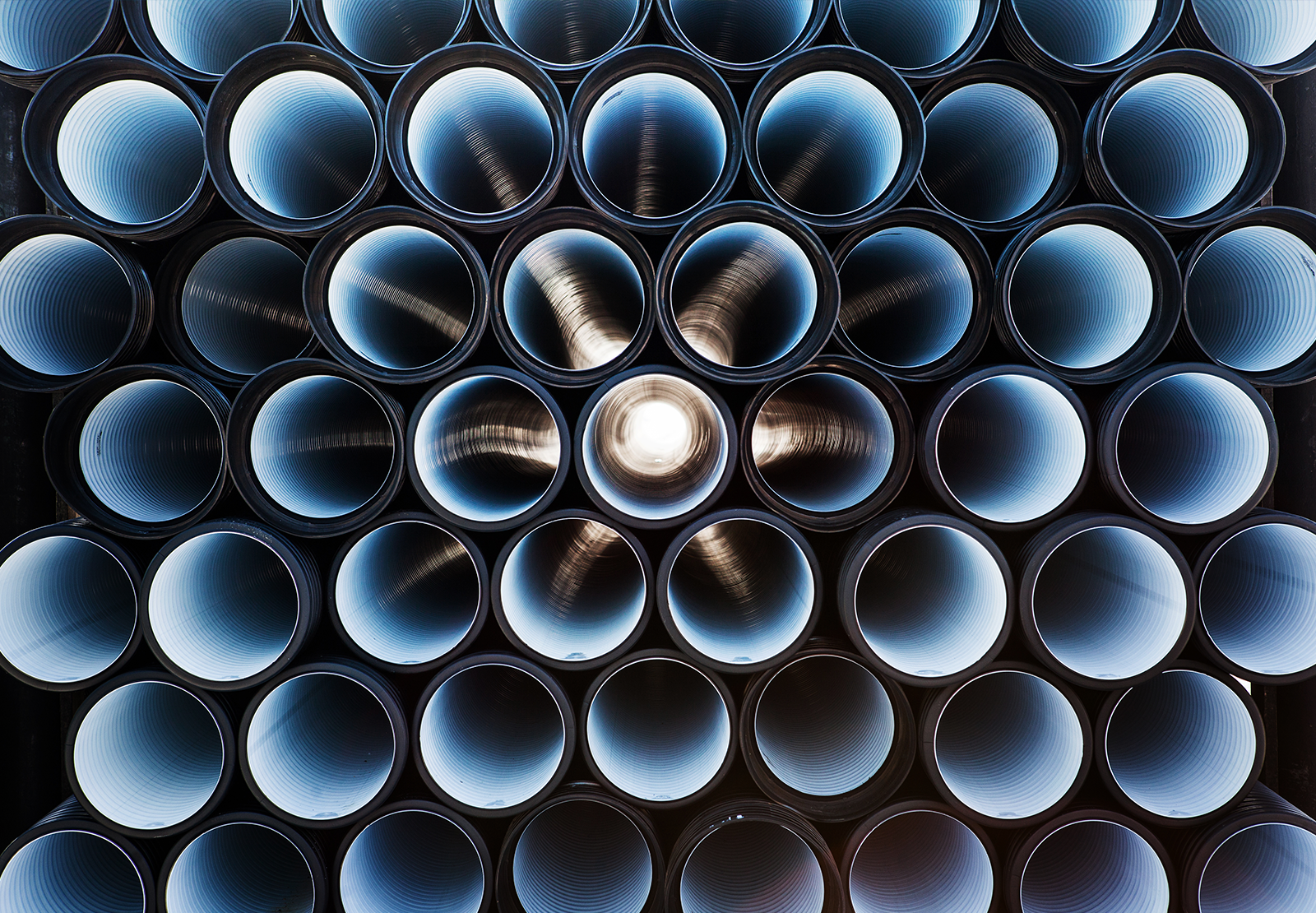
As one of the fastest growing pipeline rehabilitation and tunneling contractors in the United States, SAK Construction needed to communicate its services without turning visitors in circles or bombarding them with weighty industry jargon.
PIPELINE INFRASTRUCTURE. SOLVED.
After completing thorough competitive analysis and leadership interviews, TOKY developed a brand platform that clarifies SAK’s complex service offerings. The new tagline, “Pipeline Infrastructure. Solved.,” appears throughout the website and marketing materials.

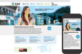
BRIGHTER LOOK
TOKY redesigned SAK’s logo and color scheme, pulling in earth tones to brighten up the website and marketing materials.
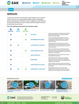
INTUITIVE SITE NAVIGATION
On SAK’s previous site, visitors were often confused about which services pair with which industry. With that in mind, we designed navigation dropdowns that demonstrate service and industry relationships right away. We also built a matrix breakdown to better explain service and industry pairings.
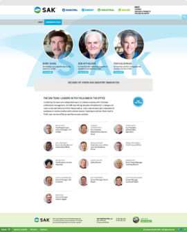
INDUSTRY LEADERSHIP
The firm’s three partners (Shaw, Affholder, and Kalishman) are leaders in their industry, so it was important to highlight their individual expertise on the site. We used photos, timelines, and text to highlight each partner’s experience.
Feedback
“SAK does important and complex projects that produce quantifiable results for communities. It was important to showcase these results on the site in an easy-to-comprehend way. No other competitor in this space was speaking to their audience this way, and it gave SAK a great opportunity to clearly communicate their benefit.”
Services
Brand Platform
Brand Identity
Print Collateral
Website Design
Website Development
Awards
Winner
St. Louis ADDY Awards, Website